'%3e%3cpath%20fill-rule='evenodd'%20clip-rule='evenodd'%20d='M51.1303%2019.2492C50.7278%2019.913%2050.1346%2020.4426%2049.3508%2020.838C48.5669%2021.2335%2047.6172%2021.4312%2046.5014%2021.4312C44.8208%2021.4312%2043.4367%2021.0216%2042.3492%2020.2025C41.2617%2019.3833%2040.6686%2018.2394%2040.5697%2016.7706H44.4253C44.4818%2017.3355%2044.6831%2017.7804%2045.0291%2018.1052C45.3751%2018.43%2045.8164%2018.5924%2046.3531%2018.5924C46.8192%2018.5924%2047.1864%2018.4653%2047.4547%2018.2111C47.7231%2017.9569%2047.8572%2017.618%2047.8572%2017.1943C47.8572%2016.8129%2047.7337%2016.4952%2047.4865%2016.241C47.2393%2015.9867%2046.9322%2015.7784%2046.565%2015.616C46.1978%2015.4536%2045.6893%2015.2594%2045.0397%2015.0334C44.0934%2014.7086%2043.3202%2014.3944%2042.72%2014.0907C42.1197%2013.7871%2041.6042%2013.3351%2041.1735%2012.7349C40.7427%2012.1347%2040.5273%2011.3544%2040.5273%2010.394C40.5273%209.50418%2040.7533%208.73448%2041.2053%208.08481C41.6572%207.43515%2042.2821%206.93731%2043.0801%206.5913C43.8781%206.24528%2044.7925%206.07227%2045.8235%206.07227C47.49%206.07227%2048.8141%206.46771%2049.7956%207.25861C50.7772%208.04951%2051.3315%209.13698%2051.4586%2010.5211H47.5395C47.4689%2010.0268%2047.2888%209.63483%2046.9993%209.3453C46.7097%209.05578%2046.3178%208.91102%2045.8235%208.91102C45.3998%208.91102%2045.0573%209.024%2044.7961%209.24997C44.5348%209.47594%2044.4041%209.80783%2044.4041%2010.2457C44.4041%2010.5988%2044.5207%2010.8989%2044.7537%2011.146C44.9867%2011.3932%2045.2798%2011.5944%2045.6328%2011.7498C45.9859%2011.9052%2046.4944%2012.1029%2047.1581%2012.343C48.1185%2012.6678%2048.9023%2012.9891%2049.5096%2013.3069C50.1169%2013.6246%2050.6395%2014.0872%2051.0773%2014.6945C51.5151%2015.3018%2051.734%2016.0927%2051.734%2017.0672C51.734%2017.8581%2051.5328%2018.5854%2051.1303%2019.2492ZM59.0242%206.3053V21.2829H55.4016V6.3053H59.0242ZM73.9409%206.3053V9.18642H69.8734V21.2829H66.2296V9.18642H62.2046V6.3053H73.9409ZM80.7438%209.18642V12.3218H85.8069V15.0546H80.7438V18.3806H86.4425V21.2829H77.1212V6.3053H86.4425V9.18642H80.7438ZM99.667%2016.0291V21.2829H96.0444V6.3053H101.913C103.692%206.3053%20105.048%206.74665%20105.98%207.62934C106.912%208.51204%20107.378%209.7019%20107.378%2011.199C107.378%2012.1311%20107.17%2012.9609%20106.753%2013.6882C106.337%2014.4155%20105.719%2014.9875%20104.9%2015.4042C104.08%2015.8208%20103.085%2016.0291%20101.913%2016.0291H99.667ZM103.692%2011.199C103.692%209.8855%20102.965%209.22879%20101.51%209.22879H99.667V13.1268H101.51C102.965%2013.1268%20103.692%2012.4842%20103.692%2011.199ZM120.092%2018.5501H114.478L113.546%2021.2829H109.732L115.219%206.41123H119.393L124.879%2021.2829H121.024L120.092%2018.5501ZM119.16%2015.7961L117.295%2010.2881L115.41%2015.7961H119.16ZM131.555%2018.5077H136.385V21.2829H127.933V6.3053H131.555V18.5077ZM143.337%209.18642V12.3218H148.4V15.0546H143.337V18.3806H149.035V21.2829H139.714V6.3053H149.035V9.18642H143.337ZM163.507%206.3053V9.18642H159.44V21.2829H155.796V9.18642H151.771V6.3053H163.507ZM177.449%206.3053V9.18642H173.382V21.2829H169.738V9.18642H165.713V6.3053H177.449ZM184.252%209.18642V12.3218H189.315V15.0546H184.252V18.3806H189.951V21.2829H180.629V6.3053H189.951V9.18642H184.252Z'%20fill='%23EEF0ED'/%3e%3cmask%20id='mask0_3101_7327'%20style='mask-type:alpha'%20maskUnits='userSpaceOnUse'%20x='0'%20y='0'%20width='27'%20height='28'%3e%3cpath%20d='M23.8328%200.759766H2.64808C1.18559%200.759766%200%201.94535%200%203.40785V24.5925C0%2026.055%201.18559%2027.2406%202.64808%2027.2406H23.8328C25.2952%2027.2406%2026.4808%2026.055%2026.4808%2024.5925V3.40785C26.4808%201.94535%2025.2952%200.759766%2023.8328%200.759766Z'%20fill='white'/%3e%3c/mask%3e%3cg%20mask='url(%23mask0_3101_7327)'%3e%3cpath%20d='M23.8328%200.759766H2.64808C1.18559%200.759766%200%201.94535%200%203.40785V24.5925C0%2026.055%201.18559%2027.2406%202.64808%2027.2406H23.8328C25.2952%2027.2406%2026.4808%2026.055%2026.4808%2024.5925V3.40785C26.4808%201.94535%2025.2952%200.759766%2023.8328%200.759766Z'%20fill='%23D8D8D8'/%3e%3cpath%20d='M13.2404%200.759766H0V14.0001H13.2404V0.759766Z'%20fill='%238C61FF'/%3e%3cpath%20d='M13.2404%2014H0V27.2404H13.2404V14Z'%20fill='%2336C3FE'/%3e%3cpath%20d='M26.4806%2014H13.2402V27.2404H26.4806V14Z'%20fill='%236592FE'/%3e%3cpath%20d='M26.4806%200.759766H13.2402V14.0002H26.4806V0.759766Z'%20fill='%236059F7'/%3e%3c/g%3e%3c/g%3e%3cdefs%3e%3cclipPath%20id='clip0_3101_7327'%3e%3crect%20width='190'%20height='28'%20fill='white'/%3e%3c/clipPath%3e%3c/defs%3e%3c/svg%3e)
'%3e%3cpath%20d='M23.8328%200.759521H2.64808C1.18559%200.759521%200%201.94511%200%203.40761V24.5923C0%2026.0548%201.18559%2027.2404%202.64808%2027.2404H23.8328C25.2952%2027.2404%2026.4808%2026.0548%2026.4808%2024.5923V3.40761C26.4808%201.94511%2025.2952%200.759521%2023.8328%200.759521Z'%20fill='%23D8D8D8'/%3e%3cpath%20d='M13.2404%200.759521H0V13.9999H13.2404V0.759521Z'%20fill='%238C61FF'/%3e%3cpath%20d='M13.2404%2013.9998H0V27.2402H13.2404V13.9998Z'%20fill='%2336C3FE'/%3e%3cpath%20d='M26.4809%2013.9998H13.2405V27.2402H26.4809V13.9998Z'%20fill='%236592FE'/%3e%3cpath%20d='M26.4809%200.759277H13.2405V13.9997H26.4809V0.759277Z'%20fill='%236059F7'/%3e%3c/g%3e%3c/svg%3e)
Natural Earth Tone Color Palettes in High-End Sportswear
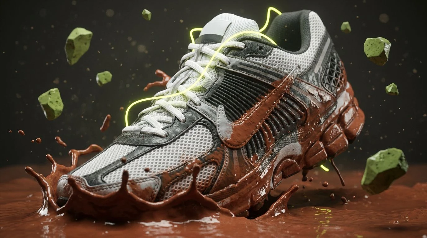
High-end athletic brands are trading neon for muddy terracotta color palettes to enhance performance psychology and visual endurance on the trail.
· 5 min readSustainable Navy Color Palettes for Professional Design

Deep oceanic hues meet earthy organic tones to redefine modern workwear. Master the balance of authority and nature with these refined palettes.
· 6 min readZen Color Palettes for Calming Digital Workspace Design
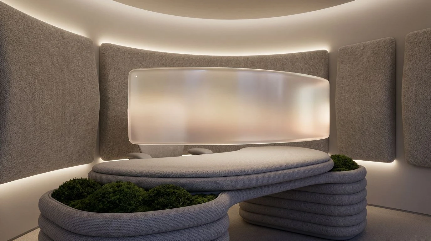
Transform your home office with warm grey and pastel pink tones. This guide uses color psychology to reduce eye strain and improve mental focus.
· 6 min readIndustrial Gray and Sky Blue Color Palette Design Ideas
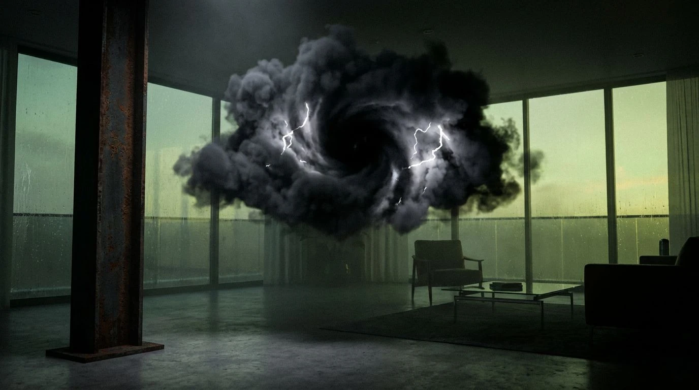
High-rise interiors transform into atmospheric theaters when heavy charcoal grays meet sky blue tones to manipulate spatial depth and psychology.
· 6 min read8 Calming Forest Green Color Palettes for Video Editors
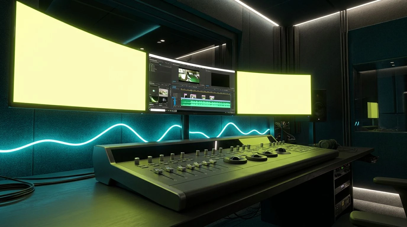
Deep green and teal hues offset harsh monitor glare and neon light, reducing eye fatigue while boosting creative focus in demanding post-production suites.
· 5 min readModern Cyber Green Color Palettes for High-End Design
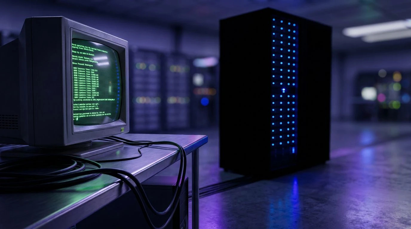
Matrix green evolves from hacker subculture into sophisticated architectural lighting. Trace the shift from 90s neon to moody corporate palettes.
· 6 min readAmber and Charcoal Color Palettes for Eyesight Protection
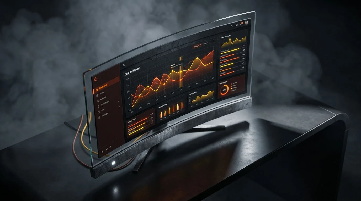
High-contrast dark mode themes like amber and charcoal reduce digital eye strain while keeping focus sharp. Transform your workspace into a shelter.
· 5 min readCorporate Color Palette Design: Authority in Wet Asphalt
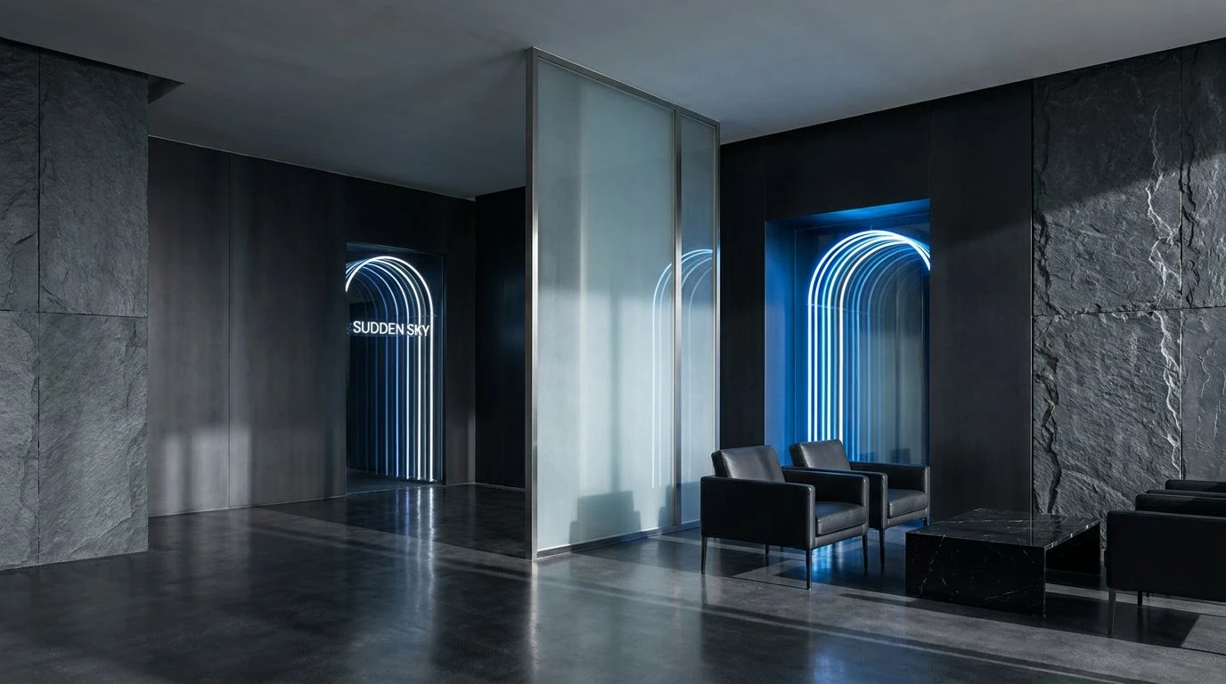
High-trust professional spaces emerge from these sophisticated gray and azure palettes inspired by urban rain to command silent authority.
· 6 min readNavy Color Palettes for Deep Sea Inspired Interface Design
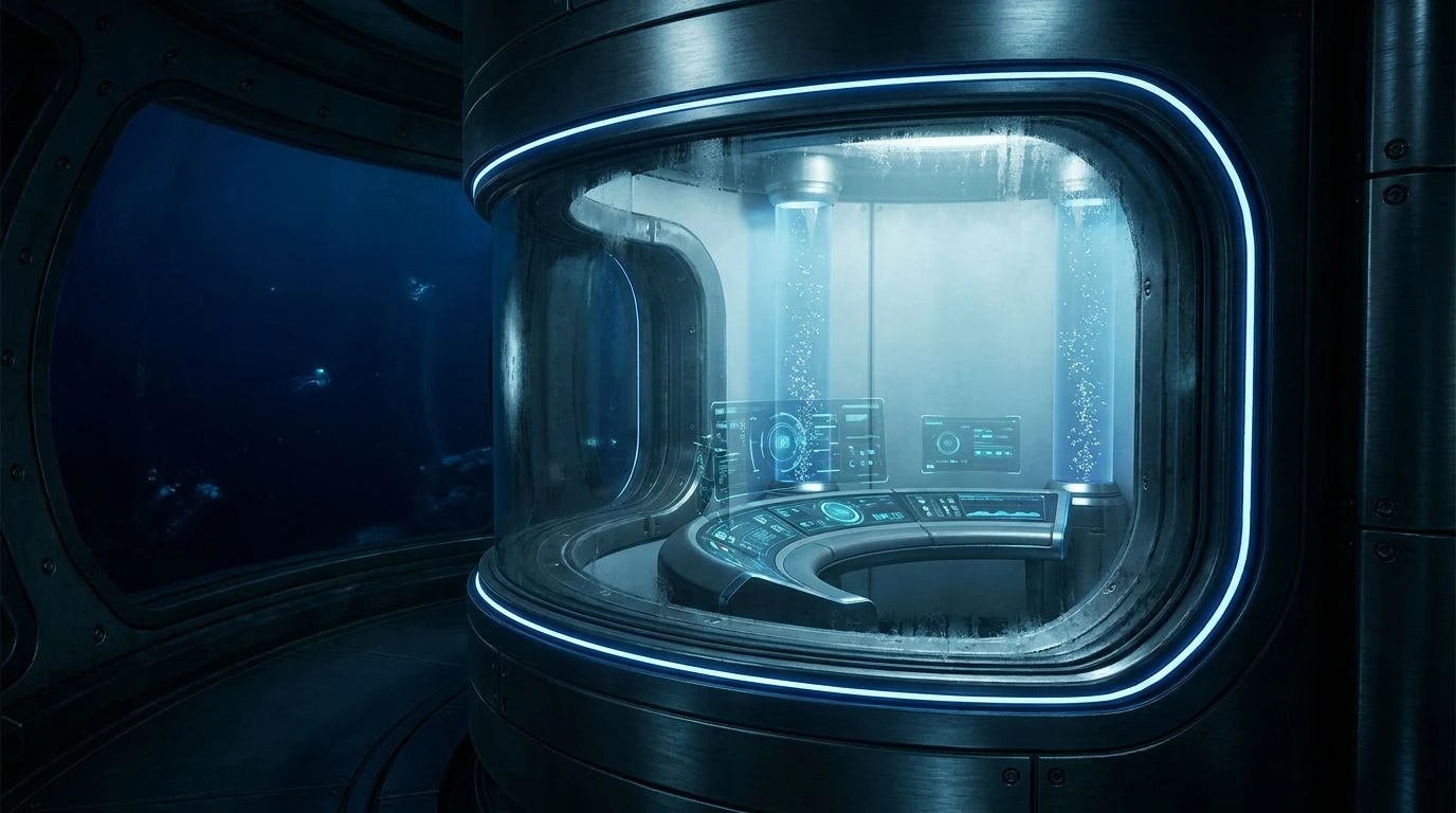
Deep navy hues and oceanic tones create a sense of trust and immense support. Transform your UI with five palettes inspired by the abyss.
· 5 min readUse F1 Racing Color Palettes to Boost E-Learning Energy
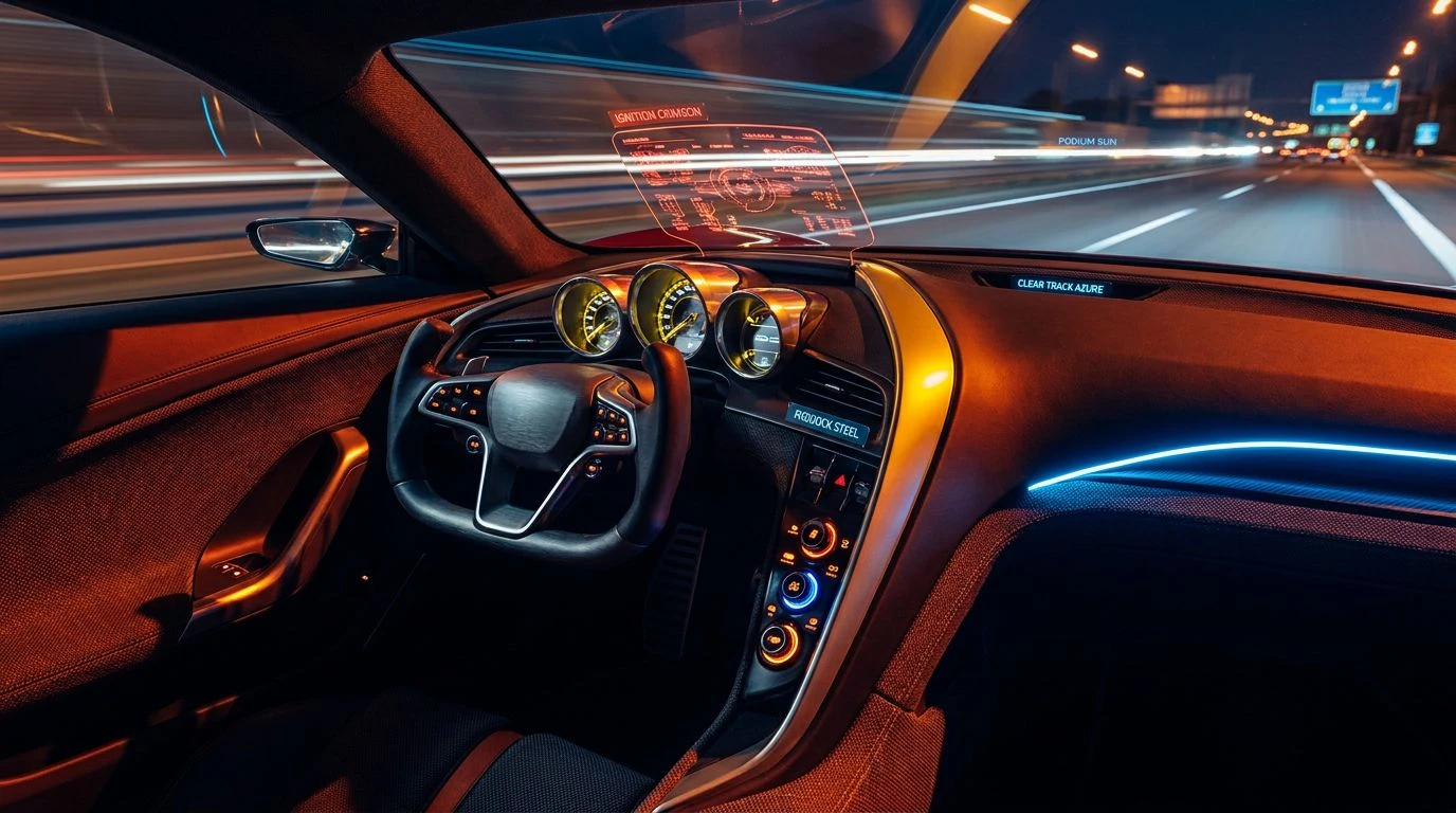
High-contrast yellow and violet schemes spark cognitive alertness and competitive drive, transforming dull digital classrooms into high-speed hubs.
· 5 min readDeep Violet Color Palettes for Science-Backed Sleep Design
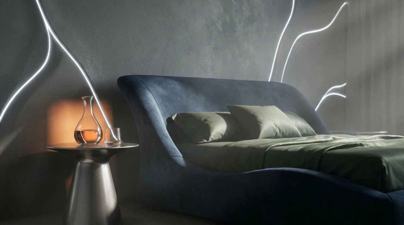
Deep purple and navy tones trigger biological rest states. Enhance recovery by using optical frequencies that lower stress and aid circadian health.
· 6 min readEarthy Clay and Sky Blue Color Palette Design Guide

Thermal contrast between sun-baked terracotta and icy blue replicates the relief of cold water in a desert through high-impact interior design.
· 6 min readIndustrial Gray Color Palettes from Chrome Engine Blocks
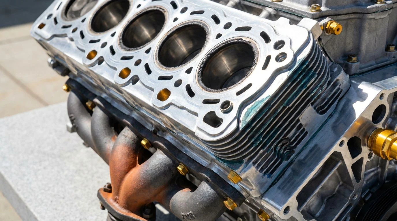
Master high-contrast design using the physics of light on metal. Analyze specular highlights and deep shadows to create powerful, modern aesthetics.
· 5 min readCerulean and Amber Color Palette Ideas for Calm Interiors
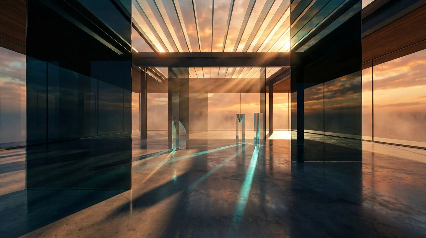
Transform your home with radiant glasshouse-inspired hues. This guide balances sunbaked gold and coastal blues to create restorative, airy spaces.
· 6 min readFuturistic Color Palettes: Designing the 2085 Greenhouse
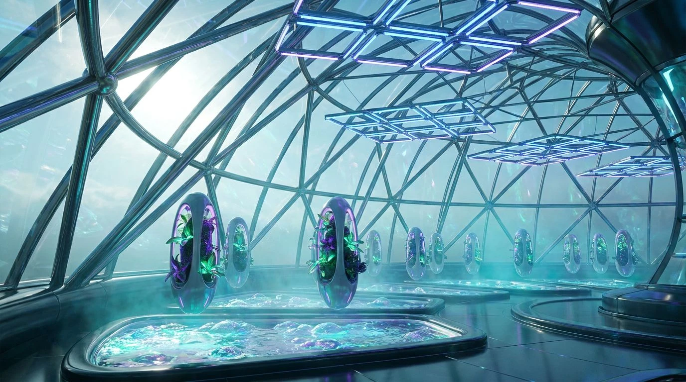
Synthetic greens and electric cyans define the high-tech aesthetic of future agriculture. Master this clinical, neon-lit design style today.
· 5 min readEmerald Green Kitchen Design: High-End Color Palettes
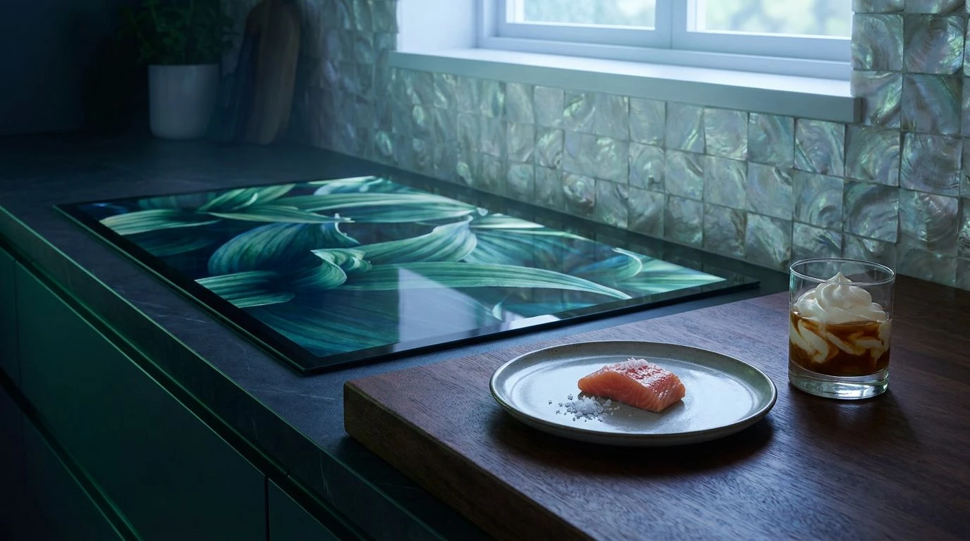
Transform digital spaces with luxurious botanical greens and crisp whites. Evoke fine dining vibes and wellness through sensory-driven aesthetics.
· 6 min readBoost EdTech Design with cornflower blue color palettes
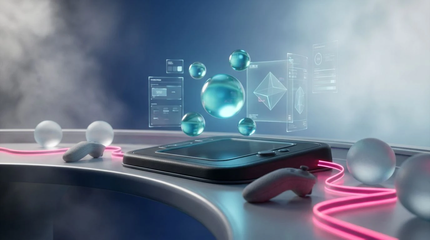
Mid-range blue hues reduce student anxiety and bridge the gap between academic rigor and playful design in digital learning environments.
· 6 min readLogistics Color Palette Ideas: Harvest Moon Design Guide
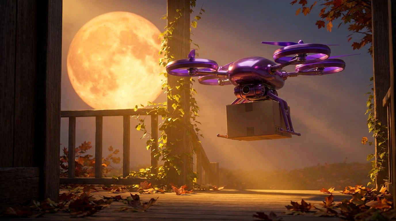
Transform shipping brands with warm oranges and deep purples. This guide uses seasonal colors to evoke reliability and human warmth in logistics.
· 5 min readMastering Safety Orange in Modern Digital Color Palettes
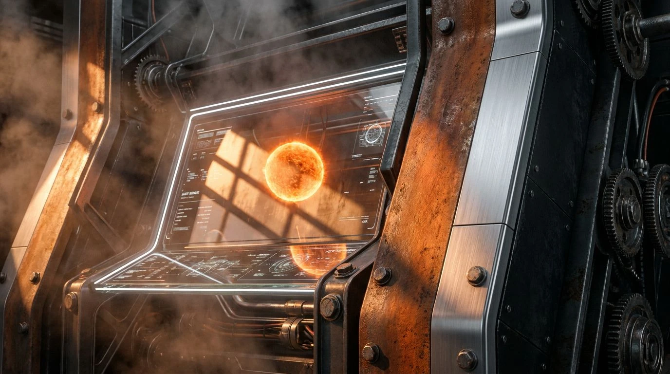
Aggressive safety orange can ruin UI design. Master architectural precision and high-energy contrast to turn visual noise into a sleek aesthetic.
· 5 min readUse a Noir Blue Color Palette to Triple Conversion Rates
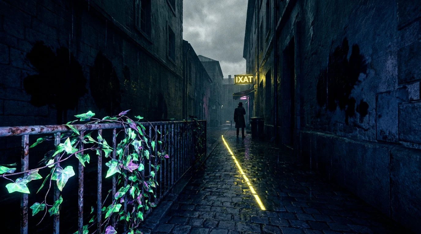
Inky blues and high-contrast dark tones create a magnetic mystery that hooks users. Master the horror noir aesthetic to drive psychological engagement.
· 5 min read