90s Tech Color Palette: Designing With Violet and Mint
· 6 min readHuman visual perception often links specific chromatic wavelengths to historical memory and emotional states. The late 1990s introduced a striking visual shift in consumer electronics, replacing opaque beige boxes with translucent, jewel-toned plastics. This era, characterized by rapid technological advancement and a profound belief in a connected future, encoded a specific kind of optimism into our collective visual lexicon. When we observe the high-contrast pairing of deep violet and mint green today, our brains recall the glowing cathode ray tubes and frosted polycarbonate shells of early personal computing. Translating this visual language into spaces designed for developing minds, such as playrooms, offers a fascinating perceptual experiment. By pairing stimulating, short-wavelength violets with calming, middle-wavelength mint greens, designers can create environments that support both focused attention and positive, forward-looking emotional states, recalling the specific technological hopefulness of the turn of the millennium.
Translucent Circuits 💾
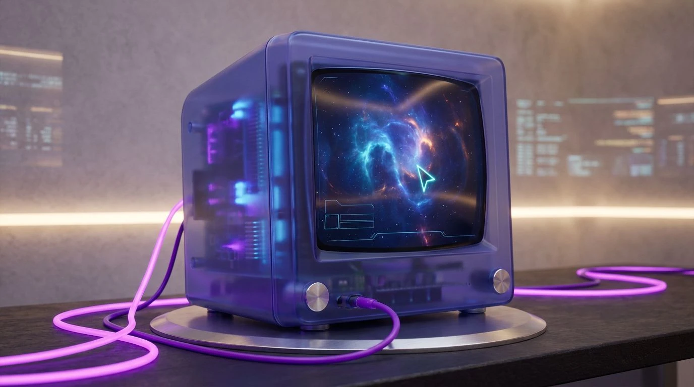
The visual impact of this selection relies on extreme contrast, positioning the highly active Phosphor Mint against neutral backgrounds like Platinum Plastic and Obsidian Screen. In cognitive psychology, high-contrast environments can command attention, making this an effective strategy for areas where children engage in focused play. The sudden appearance of Magenta Click acts as a visual stimulant, much like a flashing cursor on a blank screen, prompting exploration and curiosity. When applied to a playroom setting, these colors recreate the material language of early translucent electronics, where brightly colored internal components were visible through muted, frosted casings. This specific visual arrangement encourages developing brains to investigate their surroundings, drawing a direct line between the tactile discovery of a physical space and the navigational curiosity of early internet exploration. The neutral tones ground the space, preventing sensory overload while allowing the mint and magenta to draw the eye toward specific interactive zones.
Boot Sequence 🌐
Human color vision is particularly sensitive to the boundaries between warm and cool tones, a phenomenon utilized effectively in this complex grouping. The transition from the earthy Beige Case to the highly synthetic Electric Modem Blue and Bubblegum Glitch mirrors the historical shift from analog hardware to digital interfaces. In early childhood environments, this wide spectral range provides distinct visual cues that can assist in spatial organization and task categorization. The cooling presence of Soft Teal Glass and Deep Motherboard offers resting points for the visual system, lowering cognitive load after periods of high activity. Meanwhile, the strategic placement of Tang Button stimulates the visual cortex, encouraging physical interaction. This specific arrangement channels the anticipation of a machine powering up, translating the electric hum of a desktop computer into an environment that supports active, joyful learning. It bridges the gap between natural, grounded materials and the artificial, luminous glow of early screens.
Ultraviolet Cathode 💽
This selection isolates the specific short-wavelength dominance of the late 1990s digital aesthetic, centering on the profound visual depth of Hyperlink Violet and Indigo Plastic. Violets and deep blues are processed uniquely by the human eye, often perceived as receding in space, which can create an illusion of expansive depth within a confined playroom. Against this dark, recessive background, the high-luminance Aqua Cursor becomes incredibly prominent. This extreme figure-ground relationship mimics the glow of a phosphor screen in a darkened room, a visual cue deeply associated with early digital exploration. The psychological effect of this pairing balances the calming, introspective nature of dark purples with the alertness triggered by bright mint greens. In a space designed for developing minds, this combination promotes a state of relaxed focus, ideal for complex problem-solving tasks like puzzle-building or reading. It captures the quiet, late-night optimism of discovering new information on a newly connected global network.
Silicon Memories 🖱️
By grounding its most active colors in a foundation of Floppy Label White and Beige Tower, this arrangement explores the physical reality of legacy technology. The human visual system interprets these desaturated earth tones as stable and familiar, which provides a psychological safety net. Against this backdrop, the introduction of Circuit Trace and Window Border Blue activates the space without causing visual fatigue. The addition of Yellow Interface acts as a sharp peak in luminance, drawing immediate attention and signaling interactivity. In a nursery, this method of color application allows designers to create a highly structured environment where different zones are clearly demarcated by specific chromatic signals. The historical connection to early computing hardware, where brightly colored cables and chips were housed in unremarkable beige boxes, creates a playful secret language within the room. It suggests that behind ordinary surfaces lie complex, fascinating systems waiting to be discovered by curious minds.
Dial-Up Dawn 🌅
The phenomenon of simultaneous contrast is highly active in this grouping, where the split-complementary relationship between Tangerine Port, Blush Pixel, and Laser Mint intensifies the perception of all involved colors. Because these hues sit across from each other in a complex geometric relationship on the color wheel, the eye constantly jumps between them, creating a sense of visual vibration and high energy. To prevent this from becoming overwhelming to a developing nervous system, Pure Vapor and Aluminium Bezel act as crucial visual buffers, separating the highly active wavelengths with neutral space. This specific configuration is incredibly effective for active play zones, as it stimulates the optic nerve and encourages physical movement. The psychological association with the bright, optimistic plastics of the Y2K era translates perfectly into a space dedicated to uninhibited play. It captures the sheer joy and approachability that industrial designers of the time sought to inject into consumer electronics, turning complex machines into friendly, colorful companions.
The interaction between human vision and specific chromatic wavelengths reveals how deeply historical aesthetics can influence modern psychology. By dissecting the visual language of the turn of the millennium, specifically the interplay of short-wavelength violets and mid-wavelength mints, we can construct spaces that trigger both focus and positive anticipation. These combinations do more than just decorate a room; they manipulate spatial perception and cognitive load to support developing minds. Returning to the colorful, translucent aesthetic of early desktop computers provides a framework for designing environments that feel technologically aware yet inherently soft and human. Through careful calibration of contrast, luminance, and spectral distribution, these arrangements successfully translate the boundless optimism of the early internet era into physical spaces where a new generation can explore, learn, and grow.