Fintech Design Guide: Neutral Color Palettes for UI UX
· 6 min readImagine stepping off a train onto a misty platform, wrapping a thick canvas coat around your shoulders as you prepare for a long journey. Digital finance often feels like untethered numbers floating in a void, a cold expanse of glowing glass and sterile pixels. Yet, there is a profound comfort to be found in the tactile world, in materials that have weathered storms and protected travelers across generations. When we bring the rugged textures of heavy textiles into high-end financial interfaces, we ground those floating numbers into something remarkably solid. Picture the heavy sails of a merchant ship cutting through icy waters, or the tightly woven fibers of a mountaineer's pack. These materials speak of endurance, reliability, and careful craftsmanship. Bringing this sensory landscape to a digital screen transforms an abstract transaction into a steady, grounded passage. We are charting a course through color, navigating away from stark sterility toward a rich terrain where wealth management feels as dependable as the woven threads of a sturdy overcoat against the winter wind.
Alpine Loom 🏔️
Imagine waking in a timber-framed cabin high in the Swiss Alps, the morning light catching the rough textures of a heavy woolen blanket. Alpine Loom captures this exact moment, anchoring a financial interface in a landscape of quiet strength. The foundation is built upon Frost Thread and Weathered Stone, offering a clean, expansive backdrop that feels like stepping out into crisp mountain air. Moving deeper, Slate Warp and Midnight Charcoal provide a solid, unwavering structure, much like the ancient rocks protruding from snowdrifts, ideal for framing critical portfolios. The sudden warmth of Spiced Ochre recalls a crackling hearth, guiding the user toward a primary action or a milestone achieved. Finally, Pine Needle anchors the entire experience with a breath of ancient forests, adding a layer of enduring trust. Navigating this interface feels like a well-guided expedition, where every transaction is securely wrapped in heavy, protective fabrics.
Nordic Sail ⛵
Stand on the wooden deck of a traditional schooner navigating the icy waters off the coast of Svalbard, and you will understand the power of Nordic Sail. This collection strips away the unnecessary, leaving only what is required to brave the open ocean. Glacial Canvas stretches out like sails catching the arctic wind, providing a vast, unblemished surface for reviewing personal wealth. Contrast this with the absolute depth of Obsidian Pitch, a shade as dark as the deep ocean trenches, providing stark typography that never wavers. Sea Mist Linen softens the transition, introducing the tactile memory of damp rigging and salt-washed fabric to the screen, bringing warmth to an otherwise stark environment. Faded Fjord brings a wash of muted aquatic tones, acting as a calming guidepost for the eyes during intense moments of monetary planning. The journey through this interface is bracing, clear, and perfectly engineered for long voyages.
Moroccan Tannery 🏜️
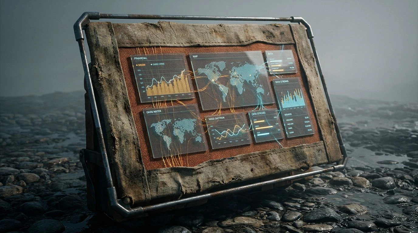
Wandering through the bustling alleys of Marrakech, you eventually reach the leather vats, where heavy hides are transformed by sun and dye into treasured goods. Moroccan Tannery captures this vibrant, earthy transformation, perfect for an interface that celebrates dynamic wealth building. Sunbleached Flint and River Cobble act as the dusty, sunlit pathways, giving the user a comfortable path to walk upon. The deep shadows cast by high city walls are found in Desert Night, grounding the layout with intense, structural borders. Then come the spices, Woven Terracotta and Aged Saffron, injecting a pulse of human energy and warmth, ideal for highlighting growth charts or active investment opportunities. Piercing through this heat is Oasis Water, a brilliant splash of cool relief that draws attention to success markers and positive returns. This collection turns the solitary act of banking into a sensory expedition through a rich, historic marketplace where value is carefully crafted by hand.
Tuscan Atelier 🏺
Step into a sunlit artisan workshop nestled in the rolling hills of Florence, where heavy bolts of fabric rest on ancient wooden tables. Tuscan Atelier translates this centuries-old dedication to craft into a digital layout meant for careful asset curation. The interface breathes easily against Chalk Dust, a shade reminiscent of limestone walls baked by the summer sun. Cast Iron provides a strong, unyielding structure, anchoring the typography much like the sturdy tools used by master craftsmen. Across this setting, Raw Muslin and Cobblestone spread out like unrolled textiles, adding a tactile softness that puts the user at absolute ease when navigating their accounts. The signature touch is Baked Clay, a muted, earthy orange mimicking terracotta roof tiles, offering a reassuring burst of color for crucial notifications. Utilizing this palette transforms a simple banking application into a bespoke advisory room, where every interaction feels tailored, permanent, and deeply trusted.
Highland Tweed 🐑
Imagine a brisk hike across the windswept moors of the Scottish Highlands, protected from the elements by a heavy, expertly spun wool coat. Highland Tweed brings this rugged dependability straight to the user, creating a fortress of financial security. Peat Bog sets a dramatically dark and fertile foundation, wrapping the digital experience in the comforting enclosure of a warm fireside study on a rainy afternoon. Storm Cloud and Worn Granite layer seamlessly over this dark base, mimicking the rolling mist and ancient standing stones, creating a sophisticated visual hierarchy that guides the eye naturally through personal portfolios. The brilliant contrast arrives with Unbleached Wool, providing soft, luminous areas for vital text and primary actions, ensuring the layout never feels overwhelmingly dark. This environment is built for longevity and comfort, reassuring the user that their assets are shielded from the wildest economic storms.
Journeying through these tactile landscapes proves that digital banking does not have to be a cold, sterile environment of empty white space and neon blue lines. By drawing upon the robust textures of canvas, wool, and heavy linen, we create environments that feel like protective garments for our personal wealth. These colors carry the memory of wind, salt, and sunbaked earth, reminding users of the real world materials that have guarded humanity for generations. Stepping back from the screen, the lasting impression is one of unwavering fortitude and careful craftsmanship. A thoughtfully designed financial application becomes a sanctuary, a quiet place of refuge where users can chart their future with the same confidence as a seasoned traveler setting sail on a meticulously planned voyage.