Fintech Color Palettes: Italian Vineyard Design Strategy
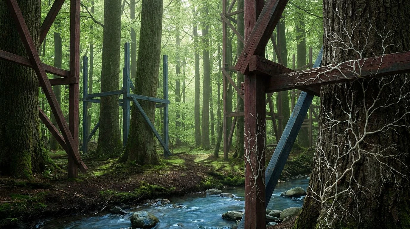
· 6 min readIn the sterile landscape of modern financial technology, where neon greens and stark blacks have long signaled a cold, algorithmic efficiency, a counter-movement is quietly taking root. Designers are looking far beyond the fluorescent screens of Silicon Valley, turning instead to the weathered, sun-baked hills of old-world agriculture to find a visual language that speaks to human trust. The color strategy of an abandoned Italian vineyard offers an unexpected blueprint for the next generation of wealth management platforms. By adopting the oxidized oranges of rusted trellises, the deep navy of twilight over the Apennines, and the rich burgundies of forgotten cellars, digital currency interfaces can discard their clinical detachment. This approach grounds the abstract nature of blockchain and digital assets in something tactile and enduring, suggesting a permanence that modern money often lacks. The visual vocabulary of aged terroir provides a mature, grounded aesthetic that reassures users, transforming the act of managing digital wealth into an experience that feels as rooted as a centuries-old estate.
Piedmont Rust 🍇
The Piedmont Rust collection captures the quiet decay and eventual rebirth of a forgotten agricultural estate, translating that natural progression into a visual system for modern finance. Midnight Slate and Crushed Chalk provide a stark, high-contrast foundation for financial ledgers, ensuring legibility while avoiding the harshness of pure black and white. Oxidized Terracotta and Sunlit Must inject a measured warmth, recalling rusted iron gates and late summer harvests. These tones serve as highly effective indicators for portfolio growth or alert states, sidestepping the aggressive reds typically found in trading terminals. Indigo Barrel and Clear Apennine Sky introduce a stabilizing authority, linking the application to traditional banking aesthetics while softening the overall impression. For a digital currency application, this combination of weathered earth and deep twilight creates an interface that feels both historically established and forward-looking, signaling to users that their wealth is managed with the careful, deliberate patience required of fine viticulture.
Tuscan Sunbaked 🏺
Tuscan Sunbaked embraces the bold, unyielding light of the Mediterranean, offering a high-energy yet firmly grounded aesthetic for a modern wealth management tool. Ripe Persimmon delivers a striking, confident burst of energy, drawing the eye to crucial interactive elements like transfer buttons or investment summaries without resorting to artificial neon. This vibrant warmth is immediately anchored by Clove Soil and Aged Parchment, tones that suggest old ledgers and fertile earth, giving the digital interface a tactile, reassuring presence. Spring Leaf and Patina Copper introduce fresh, organic counterpoints, ideal for visualizing asset diversification and positive market movements in a way that feels natural rather than manufactured. The entire system is held together by Midnight Grape, a deep, near-black navy that frames the brighter elements with quiet authority. This careful balance of intense vitality and dark, stabilizing soil allows a financial application to feel accessible and alive, proving that digital currency platforms can be engaging without sacrificing their necessary seriousness.
Cellar Gold 🗝️
Cellar Gold draws its inspiration from the hidden, cool interiors of an aged wine cellar and the sudden brilliance of a sunlit vintage, offering a sophisticated contrast for high-net-worth digital platforms. Deep Espresso and Damp Clay establish an incredibly rich, dark mode environment, replacing standard charcoal with colors that breathe with subtle warmth and history. Against this deeply grounded background, Pressed Goldenrod and Pale Chablis shine with remarkable clarity, functioning as perfect highlights for premium features, exclusive investment tiers, or significant wealth milestones. The transition into the financial sector is completed by Midnight Adriatic and Cobalt Shadow, strong, trustworthy blues that communicate security and institutional reliability. Frosted Glass provides a gentle, airy contrast, preventing the darker tones from feeling oppressive. By applying these rich, organic colors to a fintech interface, designers can craft a user experience that mirrors the exclusivity and careful curation of collecting rare vintages, reassuring clients that their digital assets are stored with the utmost care and respect.
Sangiovese Data 🍷
Sangiovese Data presents a striking collision between the organic warmth of an old-world vineyard and the crisp, exacting needs of a modern data-driven application. Pure Linen and Charred Cask establish a stark, highly readable canvas, essential for parsing complex financial charts and cryptocurrency market fluctuations. Crushed Ochre and Morning Prosecco introduce a highly approachable warmth, ideal for onboarding screens or educational modules within the app, lowering the barrier to entry for novice investors. The unexpected inclusion of Oxidized Copper acts as a sharp, modern interruption, a jolt of digital clarity that highlights real-time trading updates or dynamic data visualizations. Tarnished Silver and Slate Vault provide a neutral, calming middle ground, organizing information without visual clutter. Finally, Spilled Sangiovese adds a critical punch of urgency, replacing standard alarm reds with a deep, sophisticated wine tone that commands attention without inducing panic. This collection proves that an interface can maintain strict analytical precision while still breathing with the rich, historical life of an ancient agricultural estate.
Agrarian Vault 🏛️
Agrarian Vault relies on a restrained, highly disciplined visual language that marries the structural integrity of historical architecture with the fluidity of modern decentralized finance. Alabaster Dust and Weathered Stone provide a muted, highly professional backdrop that allows complex wealth management dashboards to breathe, minimizing visual fatigue for users who monitor their portfolios daily. Rich Loam and Sunburnt Clay anchor the application in the physical world, offering a deeply tactile warmth that contrasts beautifully with the abstract nature of digital tokens and blockchain transactions. These earth tones are particularly effective for highlighting long-term savings goals or stable, low-risk asset classes. Cerulean Stream acts as a sharp, contemporary accent, guiding the user's eye toward immediate actions or live market shifts. Obsidian Grape and Deep Indigo frame the entire experience, securing the interface with a profound sense of institutional safety and enduring permanence. By adopting the solemn, lasting colors of a rural Italian estate, a financial application can project an atmosphere of unwavering stability in a notoriously volatile digital market.
The adoption of agricultural and viticultural tones in financial technology represents a significant departure from the sterile interfaces of the past decade. By looking to the weathered hills of Italy, designers are proving that digital wealth management does not require a visual language defined by cold neon and stark geometry. The rich, oxidized oranges and deep, authoritative navies discussed here offer a path toward applications that feel grounded, mature, and deeply human. This approach acknowledges that while the mechanisms of money have become entirely abstract and digitized, the human desire for stability, permanence, and careful stewardship remains unchanged. Transforming a screen into an environment that echoes a centuries-old estate ultimately builds a lasting trust between the user and the platform, proving that the future of digital currency is best served by remembering the soil from which historical wealth originally grew.