Boost UI Engagement With Burnt Orange Color Palettes
· 6 min readThere is a prevailing orthodoxy in high-end engineering circles that serious machinery must look entirely devoid of human feeling. Walk into a luxury automotive garage or examine the interface of a chronometer, and you are immediately struck by a sea of clinical silvers, stark blacks, and impenetrable grays. It is a visual language that screams absolute control, yet it often leaves the user entirely cold. The question arises: what happens when you introduce a jolt of unapologetic warmth into these meticulously ordered spaces? Injecting saturated burnt orange into a field of slate and graphite does not destroy the illusion of accuracy; rather, it introduces a necessary friction. It reminds us that behind every perfectly calibrated gear and every flawlessly machined surface sits a human being, making rapid, high-stakes decisions. This unexpected flash of color transforms sterile data into urgent, legible action. Let us examine how applying this precise calibration of temperature shifts the way we read modern mechanical interfaces.
High-Octane Horology ⚙️
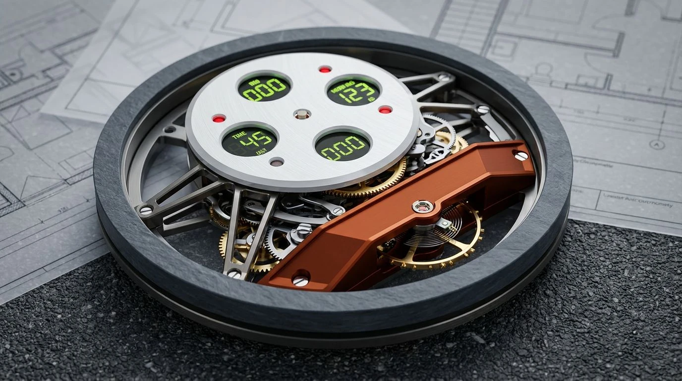
Consider the impact of placing a stark, glowing band of Molten Tangerine directly against the severe backdrop of Engine Oil and Graphite Dust. This palette practically vibrates with a sense of barely contained kinetic energy. It directly challenges the tired assumption that premium repair diagnostics must look like a spreadsheet. The immediate leap from Milled Steel to Oxidized Iron creates a visual hierarchy that guides the eye exactly where it needs to go, long before the conscious mind registers a warning light. Adding that strange, acidic touch of Volt Tracer is a rather brilliant bit of misdirection, pulling the user away from purely traditional automotive tropes and into a space that feels distinctly modern and slightly hazardous. It proves that mechanical accuracy does not require visual anesthesia. Instead of politely whispering information, this combination commands attention with the sharp, unyielding authority of a revving engine on a test track.
Calibrated Friction 🔧
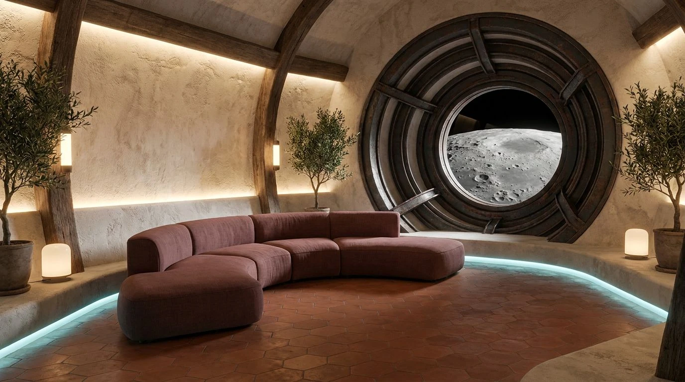
There is a surprising domesticity lurking within this arrangement, completely at odds with the usual macho posturing of grease and gears. Replacing a screaming neon with the subdued warmth of Worn Terracotta creates an interface that feels lived-in and deeply reliable, like a favorite wrench polished smooth by years of labor. The background remains appropriately industrial, leaning heavily on Vulcanized Rubber and Bead-Blasted Aluminum to maintain a strict, professional atmosphere. Yet, the sudden appearance of Coolant Spill acts as a palate cleanser against the heavier, earthen tones. It is an unorthodox choice for a dashboard or a digital dial, but it works tremendously well. The bright blue-green cuts through the warmth of Brass Shavings, providing an instantaneous read for critical metrics without resorting to panic-inducing reds. The result is a user experience that feels less like defusing a bomb and more like conversing with a master mechanic who has seen it all before.
Thermal Dynamics 🏎️
If you want to understand how a simple shift in temperature dictates human behavior, look no further than the aggressive gradient running from Heated Copper to Ignition Spark. This is not a polite collection of colors; it is a visual representation of rising temperature and impending action. Nestled against the uncompromising darkness of Carbon Fiber and the flat, utilitarian stretch of Gunmetal, the orange elements refuse to be ignored. In a high-performance setting, whether monitoring exhaust temperatures or tracking lap times, the eye naturally seeks out contrast. Titanium Chassis provides just enough lightness to keep the interface from descending into total gloom, acting as a neutral staging ground for the brighter data points. The transition into the deep, dirty red of Brake Dust anchors the brighter oranges, preventing them from floating away into mere decoration. It is a masterclass in using color as a functional tool for survival and speed, rather than just an aesthetic afterthought.
Analog Overdrive ⏱️
Nostalgia is a tricky tool in design, often resulting in pastiche rather than progress, but this arrangement sidesteps the usual traps by remaining fiercely functional. The stark, brilliant white of Porcelain Dial offers an incredibly clean field for data, immediately recognizable to anyone who has ever stared down the face of a classic racing chronograph. Surrounding this bright expanse with the muted, gentlemanly gray of Tungsten Weight establishes a perimeter of quiet authority. The true genius here is the interplay between the deep, historical tone of Burnt Sienna Varnish and the unapologetic brightness of the Cadmium Indicator. It bridges the gap between old-world craftsmanship and contemporary data tracking. When applied to an engineering platform, this color scheme lowers the user's resting heart rate while still pointing an accusatory finger at exactly which valve is failing. It brings a quiet, almost analog dignity to the often chaotic digital screens we rely on for diagnostics.
Telemetry Grid 🚥
Navigating this vast array of colors feels a bit like sitting down at the control board of a particle accelerator. It borders on visual overload, yet it somehow remains tightly organized thanks to the grounding presence of Slate Trim and Asphalt. When building a dashboard for complex diagnostics, you need a vocabulary large enough to separate entirely different streams of information. Warning Light Red and Acid Green Readout serve their traditional roles perfectly, demanding immediate, reflexive reactions from the user. However, introducing Anodized Gold and the deep, rich tone of Blueprints adds a layer of sophistication that prevents the whole affair from looking like a cheap arcade game. The crispness of Ceramic White cuts cleanly through the heavier tones, offering a sanctuary of negative space where the eye can rest. By deploying this many distinct signals against a backdrop of industrial gray, the interface successfully translates an overwhelming flood of telemetry into a language that a human brain can parse in milliseconds.
The assumption that serious machinery demands a joyless, monochromatic aesthetic is rapidly becoming obsolete. As we have seen across these varying approaches, introducing highly saturated, warm tones into environments typically dominated by slate and charcoal does not compromise accuracy. It actively improves readability and human engagement. A strategically placed flash of bright tangerine or oxidized red against a dark, metallic background cuts through visual noise faster than any gray-on-gray dial ever could. It respects the biological reality that human eyes are drawn to heat and contrast, especially in moments of high cognitive load. Whether applied to the delicate face of a luxury watch or the grimy, high-stakes diagnostic screen of an auto repair bay, these color combinations prove that emotion and engineering are not mutually exclusive. A perfectly calibrated machine becomes infinitely more useful when it finally learns how to speak to us in a language we instinctively understand.