Industrial Color Palettes: Bold UI Design for Engagement
· 6 min readWe have reached a point of terminal politeness in digital design. The modern smartphone screen is a vast, unthreatening expanse of mint greens, whisper-soft blues, and greys so pale they barely register to the human eye. Designers, terrified of offending anyone, have successfully anesthetized the mind. Users are simply scrolling in a low-grade coma, detached from the tools they rely on daily. It is time to look away from the spa and towards the construction site. There is a brutal, entirely necessary utility in the high-visibility world of heavy industry. When a piece of machinery can sever a limb, its interface does not politely suggest caution with a muted pastel. It screams in uncompromising orange and black. Importing this warning-label aesthetic into our daily software offers a much-needed shock to the system. It wakes people up, directs their attention with unapologetic force, and introduces a visual friction that actually makes an interface memorable.
High Voltage Alert ⚡
High Voltage Alert borrows its vocabulary straight from the factory floor, refusing to apologize for its aggressive visibility. The pairing of Danger Orange with the cold, unfeeling Industrial Slate creates a deliberate clash that demands immediate attention. When a person opens a tool painted in these tones, there is no drifting off into passive consumption. The eye is abruptly caught by Thermal Flare and Oxidized Iron, pulling focus toward critical actions and unignorable alerts. The backdrop of Sterile White and Scaffolding Grey offers just enough neutral space to prevent total visual exhaustion, yet the overall atmosphere remains relentlessly alert. This approach is not about making a person feel calm; it is about keeping them sharp, present, and painfully aware of where they need to tap next. It transforms a standard task management or finance tool into a command center, where every swipe feels like pulling a heavy, consequential lever.
Blast Furnace 🏭
A true lesson in visual hostility, Blast Furnace relies on temperatures so hot they practically singe the eyebrows off the viewer. Here, we abandon any pretense of delicate design. Blaze Orange and Warning Amber are set against Pitch Soot, mimicking the blinding glare of molten metal in a dark foundry. This combination is highly effective for breaking through the endless fatigue of doomscrolling. An interface wrapped in Burnt Slag and Steel Grate feels weighty, serious, and entirely resistant to being ignored. The stark Safety White operates strictly as an overhead glare, exposing the dark corners rather than softening the blow. Applying these tones to a fitness tracker or a productivity dashboard tells the user that this is not playtime. It establishes an environment of strict discipline and mechanical precision, forcing the brain out of its comfortable stupor and demanding active, intentional engagement with the screen.
Rust and Concrete 🏗️
Not every warning sign is freshly painted; some have been out in the elements for decades. Rust and Concrete reflects the gritty reality of aging infrastructure, deploying Corroded Copper as its lone, desperate cry for help amidst an oppressive sea of greys. Poured Cement and Weathered Rebar build a bleak, brutalist foundation that feels intentionally unwelcoming. Against Chalk Dust and Vantablack, the muted orange acts as a distressed flare gun. It is an incredibly sophisticated way to approach app design, offering the stark utility of the industrial aesthetic without blinding the viewer. The inclusion of Trench Mud adds a dirty, terrestrial weight to the layout. Using this collection in a news reader or a travel booking platform creates a sense of grave importance. The audience is compelled to pay attention, not because the colors are loud, but because the contrast is so stark and the mood so uncompromisingly severe. It treats the user as an adult capable of handling raw, unvarnished information.
Barricade Tape 🚧
The brilliance of Barricade Tape lies in its extreme restraint. It gives you the exact tools required to block off a hazardous area and absolutely nothing else. Traffic Cone sits entirely isolated against Asphalt Void and Carbon Smudge, commanding the screen with uncompromising authority. There are no smooth transitions to soften the jump from Bleached Bone to Aluminum Siding. The jump between light, dark, and neon is abrupt and jarring. This deliberate clashing is exactly what modern user interfaces are missing. By stripping away decorative elements and relying purely on high-contrast signals, designers can cut through the noise of a cluttered operating system. An application styled with this rigid, unyielding color scheme behaves like emergency signage. It tells you exactly where the danger lies, where the exits are, and which button to press to avoid total system failure. It is design as survival mechanism, keeping the brain awake through pure, unadulterated tension.
Radioactive Zone ☢️
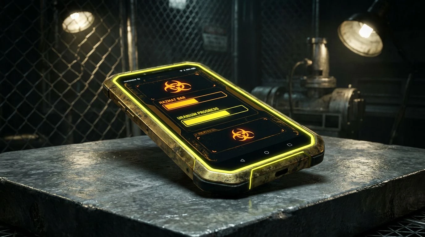
Moving sideways from the classic orange, Radioactive Zone adopts the equally alarming language of biohazard and nuclear caution. The inclusion of Uranium Yellow and Faint Sulfur alongside Total Eclipse creates a sickly, luminous effect that is impossible to ignore. Tarnished Brass and Lead Shield provide a heavy, militaristic backdrop that makes the bright yellows pop with alarming intensity. This collection brings a different flavor of industrial anxiety to the screen, one that feels slightly more toxic and strange than a standard construction site. Applying this to a data analytics tool or a security app immediately raises the stakes. The user is no longer just browsing numbers; they are monitoring a highly volatile situation. The stark white of Hazmat Suit acts as a sterile laboratory light, ensuring every warning metric and critical error message burns itself into the retina. It is a brilliant lesson in using discomfort to guarantee total focus.
There is a distinct bravery in choosing to make an interface slightly hostile. We have spent over a decade smoothing off the rough edges of our digital environments, striving for a frictionless experience that ultimately leaves us feeling nothing at all. Returning to the aggressive, unapologetic visual language of the factory floor offers a genuine remedy to this modern malaise. Whether it is the screaming heat of bright orange or the toxic glow of safety yellow set against bottomless black, these color arrangements refuse to be treated as background noise. They demand participation, provoke a physical reaction, and treat the user like an active operator rather than a passive consumer. Sometimes, the best way to improve an experience is to introduce a little controlled chaos.