Modern Color Palettes: Disco Vibes Meet Finnish Design
· 6 min readHuman vision is uniquely adapted to seek out contrasts, constantly scanning the environment for shifts in luminance and wavelength. When the hyper-stimulating, synthetic wavelengths of late-twentieth-century nightlife intersect with the austere, organic materials of Nordic bathing culture, an unusual perceptual phenomenon occurs. The human nervous system oscillates between parasympathetic rest and sympathetic arousal. Visually, this translates into environments that pair the grounding, long-wavelength absorption of natural timber with the sudden, high-frequency optic shocks of artificial illumination. This juxtaposition challenges our visual processing, demanding that our eyes adjust rapidly between the absorbing surfaces of a quiet heated room and the scattered, aggressive light of a kinetic dance floor. Exploring these specific color environments reveals how our brains process opposing sensory inputs, turning contradictory stimuli into an entirely new perceptual standard.
Thermal Luminescence ♨️
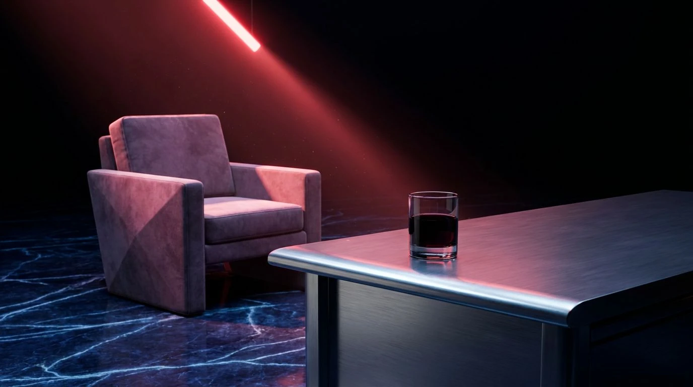
The visual cortex responds immediately to sudden spikes in saturation, a biological mechanism designed to alert us to environmental anomalies. Thermal Luminescence pairs the extreme artificiality of Neon Perspiration and Cooled Magma with the biologically soothing properties of Bleached Pine and Roasted Cedar. When observing these colors together, the eye first locks onto the aggressive pink-red wavelengths, mimicking the physiological arousal triggered by sudden, bright flashes in a dark space. However, instead of sustaining this state of high visual tension, the optic nerve finds relief in the surrounding wood and glacial tones. Snow Glare and Glacial Melt act as visual coolants. The resulting environment pushes the occupant into a state of alternating stimulation and rest. The bright artificial colors mimic the kinetic energy of a crowded, fast-paced room, while the earthy, low-reflectance browns absorb excess light, anchoring the physical space and lowering the heart rate.
Ultraviolet Midnight 🪩
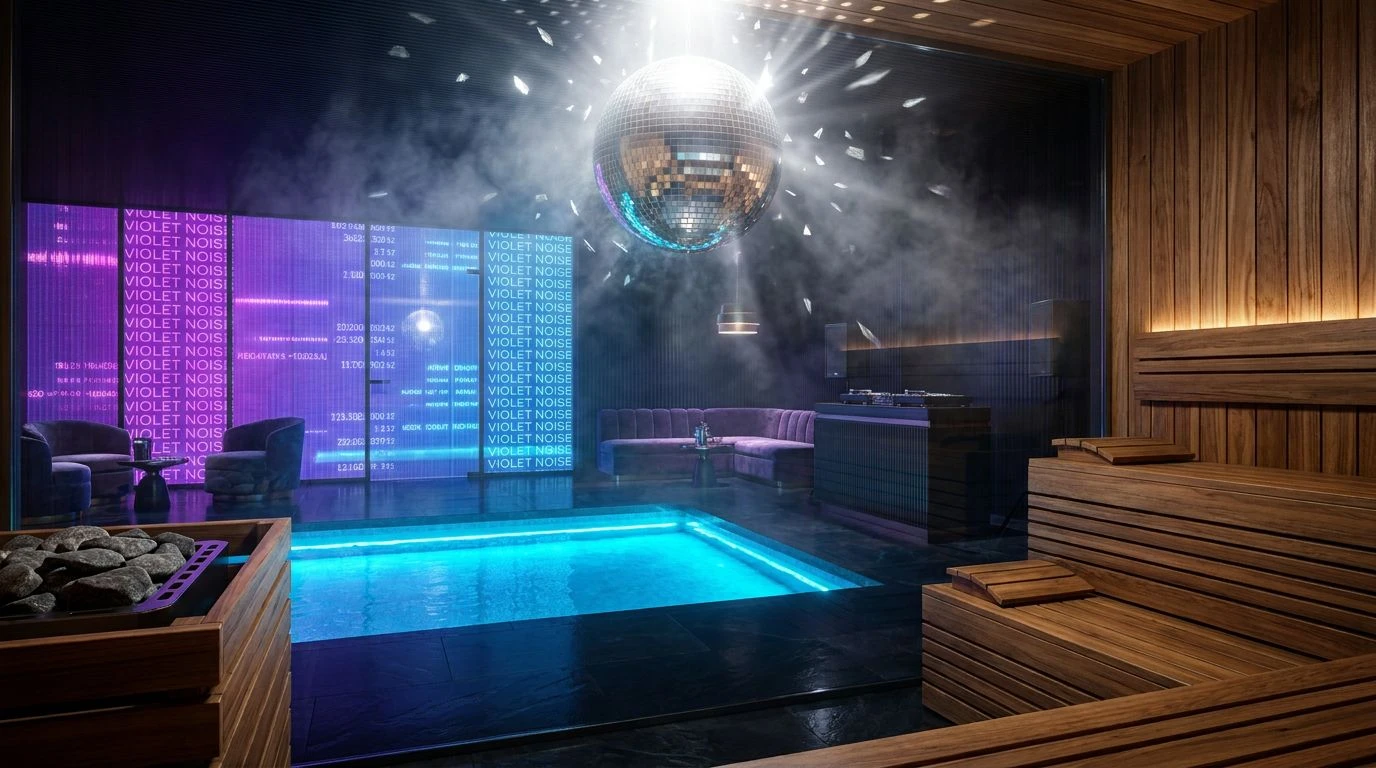
In low-light conditions, human vision shifts from relying on cone cells to rod cells, making us highly sensitive to shifts in shadow and specific short wavelengths. Ultraviolet Midnight constructs a space defined by sensory deprivation and sudden, localized bursts of color. Absolute Dark and Shadowed Birch create an environment that absorbs almost all ambient light, simulating the enclosed, light-tight architecture of traditional heat rooms. Into this void, Electric Lavender introduces a concentrated spike of high-frequency energy. Purple and violet wavelengths are notoriously difficult for the human eye to focus on, creating a slight blurring effect that mimics the perceptual distortion of staring at a blacklight or moving through a densely heated, vapor-filled room. Steaming Basalt bridges the gap between total darkness and the vibrant purple, offering a mid-tone that prevents visual fatigue. This combination manipulates depth perception, making walls seem to recede while the bright lavender elements appear to float suspended in the air.
Photonic Timber 🌲
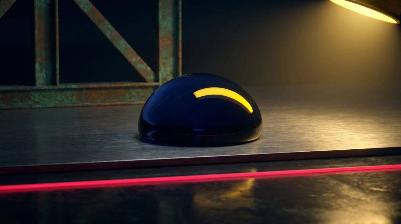
Attention capture in human vision is heavily dictated by the contrast between background and foreground. Photonic Timber isolates this phenomenon by surrounding a high-intensity stimulus with completely neutral, light-absorbing surfaces. The deep, warm surface of Smoked Mahogany and the muted presence of Ash Steam establish a quiet, biologically familiar baseline. These colors absorb light, quieting the visual field. Suddenly, Strobe Yellow disrupts this quietude. Yellow reflects a massive amount of light across the middle of the visible spectrum, ensuring it reaches the retina with maximum efficiency. Optic White and Void Black provide maximum contrast, ensuring the yellow acts almost like a physical jolt to the optic nerve. This environment operates like a controlled shock to the system, mirroring the physiological gasp of cold water after intense heat. The yellow operates as the kinetic energy of a flashing light, while the wood tones ensure the nervous system is not entirely overwhelmed.
Infrared Obeche 🌡️
Thermoreception, the body's ability to sense temperature, is tightly linked to our visual perception of color. Infrared Obeche plays on this cross-modal association by heavily featuring colors that the brain associates with thermal radiation. Radiant Heater and Aged Bark sit in the long-wavelength portion of the spectrum. When the eyes take in these deep rust and dark wood tones, the brain often anticipates physical warmth. Planed Obeche provides a lighter, less saturated surface that reflects soft, scattered light, preventing the darker colors from closing in and creating a feeling of claustrophobia. Winter Vapor and Obsidian Coal act as absolute boundaries, defining the edges of the room with sharp precision. The lack of synthetic, neon hues here keeps the arousal levels relatively low, yet the intensity of the dark red-brown mimics the glowing embers of a heating element. The environment manipulates the occupant into feeling enveloped in a dense, heavy atmosphere, perfectly imitating the physical weight of heated air.
Chromatic Vapor 🌀
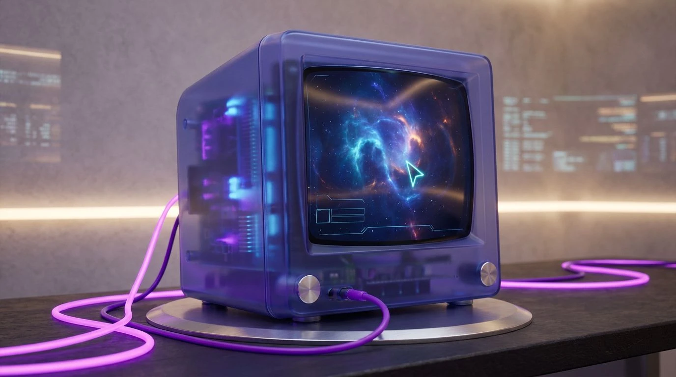
When the retina is exposed to multiple highly saturated, opposing wavelengths simultaneously, the brain experiences a state of visual vibration. Chromatic Vapor engineers this exact phenomenon by placing the short wavelengths of Ionized Cyan and Deep Plunge directly adjacent to the long wavelengths of Cured Teak and Halogen Flash. The eye struggles to focus on these contrasting colors at the same time, generating a restless, electric energy that feels distinctly artificial and kinetic. Vapor Mist acts as the sole resting place for the gaze, a neutral surface that diffuses the intensity of the surrounding colors. Violet Noise introduces a final, destabilizing element, pulling the visual temperature back and forth between hot and cold. This produces an environment that feels perpetually in motion, tricking the brain into perceiving movement even when the space is static. It perfectly captures the sensory overload of a rapidly changing, light-filled room while retaining just enough organic warmth in the teak to ground the physical structure.
The intersection of high-arousal artificial lighting and low-arousal organic materials forces the human perceptual system into a fascinating state of adaptation. By controlling the distribution of long and short wavelengths, as well as the balance between highly reflective and light-absorbing surfaces, these environments manipulate both the optic nerve and the autonomic nervous system. The sudden shocks of neon yellow or bright magenta elevate the heart rate and demand immediate visual attention, while the deep woods, basalts, and muted steams absorb excess light and offer the eyes a place to recover. This deliberate control over sensory input transforms physical spaces into psychological tools, dictating how a person moves, rests, and processes their surroundings. The tension between absolute stillness and kinetic energy proves that manipulating color is not merely an aesthetic choice, but a precise mechanism for altering human biology and spatial perception.