

Sustainable Color Palette Secrets for Skincare Branding

Deep sage green and earthy clay tones build consumer trust. Master the muted aesthetics driving success in modern inclusive beauty design.
· 5 min readDusty Rose Color Palettes for Warm Nostalgic Home Design
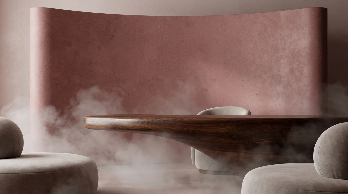
Ditch clinical white for the nurturing warmth of vintage rose and aged paper tones to create inclusive, accessible, and hospitable visual spaces.
· 5 min readWarm Color Palette Trends for Calming Digital Design

Sandy beige and charcoal tones turn mobile apps into serene sanctuaries, offering commuters visual comfort amid the chaos of daily transit routes.
· 5 min readRed and Charcoal Fitness App Color Palettes for High Energy

Ditch boring corporate blues for aggressive red and charcoal design schemes that capture the raw intensity of heavyweight combat sports and grit.
· 5 min readZen Garden Color Palettes to Reduce UI Cognitive Load

Muted gray and slate blue palettes transform chaotic workspaces into calm digital retreats, lowering user anxiety through intentional design.
· 5 min readDusty Coral Color Palettes for Calm Financial Planning
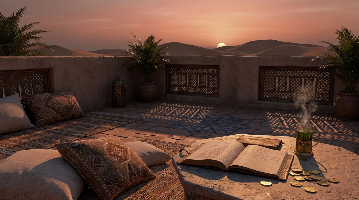
Earth red and dusty coral tones soften the stress of budgeting. Use these Moroccan-inspired color schemes to turn money management into a ritual.
· 6 min readEarth Tone Color Palettes for High-Contrast Modern Design

Master the balance of clinical charcoal grays and rugged natural tones. These sophisticated palettes bridge the gap between academic rigor and grit.
· 6 min readMaster Russet Color Palettes for Professional Design
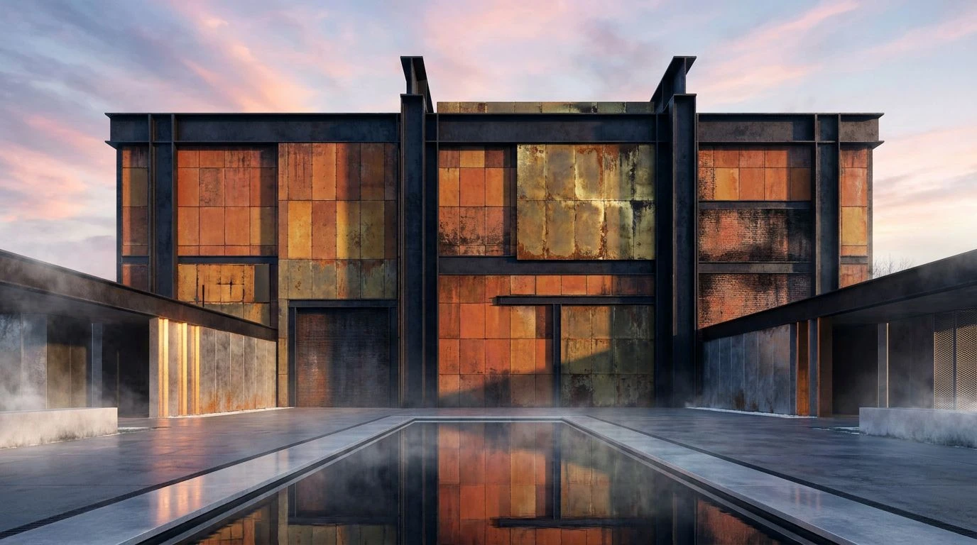
Oxidized iron and industrial red hues lend structural integrity to digital resumes, creating a sense of professional longevity and authority.
· 6 min readTactical Olive Green Color Palettes for Calm Workspace Design

Military-inspired tones create psychological armor for stock traders, turning high-stakes chaos into a disciplined zone of calculated focus.
· 6 min readModern UI Color Palettes for Data Visualization Design

Transform messy spreadsheets into high-contrast workspaces using mountain-inspired cerulean and slate grey hues for maximum mental clarity.
· 5 min readMinimalist Desert Color Palettes for Crypto Dashboards

Transform volatile trading interfaces into stable sanctuaries using parched earth tones and sun-bleached whites for focused, calm decision-making.
· 5 min readEarth Red Color Palettes: The New Trend in Modern Design
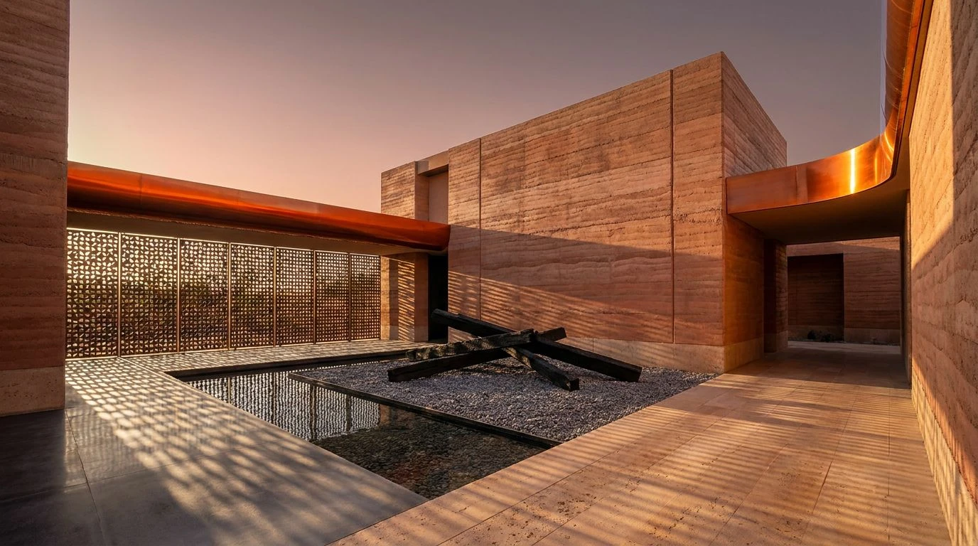
Top architects are ditching glass for clay and burnt timber. See how raw earth red tones create sustainable, tactile, and ancient-modern spaces.
· 5 min readAmber & Charcoal Color Palettes in Luxury Hotel Design
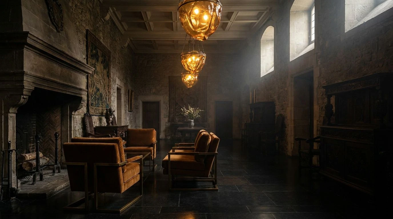
Boutique hospitality is trading sterile marble for moody amber and charcoal palettes. Experience the shift toward dramatic, heritage-inspired luxury.
· 5 min readDigital Violet Color Palette: Future of Sustainable Design

Synthetic purple is replacing earthy tones in high-fashion. This shift signals a tech-driven era for recycled apparel and circular economies.
· 5 min readParisian Boutique Garden Color Palettes & Design Guide
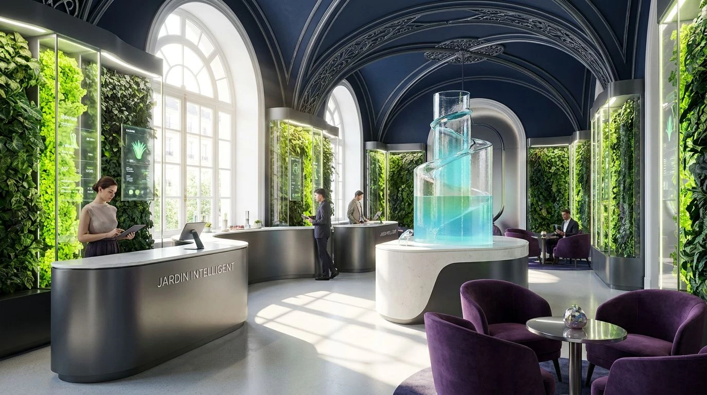
Smart garden design meets French luxury fashion. Elevate indoor spaces with preppy botanical color schemes that blend high-end retail with nature.
· 5 min readIndustrial Brown Color Palettes for Sustainable Design

Earthy brown tones and raw textures replace sterile whites to honor the grit, machinery, and honest labor behind ethical textile manufacturing.
· 6 min readFintech Color Palette: Slate and Sage Design Strategies
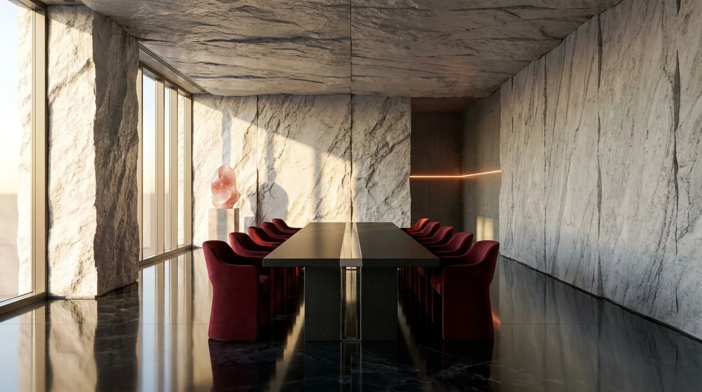
Bridge industrial authority and organic trust using the #929982 hex code to transform financial proposals into sophisticated sensory experiences.
· 5 min readWhy Modern Activewear Brands Love Blue Color Palettes

Biological secrets behind the electric blue and slate gray design trend. Master the high-contrast palettes driving billion-dollar fashion sales.
· 6 min readIndustrial Color Palettes: Soften Logistics With Dusty Rose

Industrial design meets human warmth. Integrate dusty rose and clay tones into warehouse spaces to balance cold steel with modern color theory.
· 5 min readMaster High-Saturation Color Palettes for Framer Portfolios

High-impact color contrasts turn passive portfolios into commercial weapons. Use bold maximalism to arrest the scroll and command digital attention.
· 5 min read