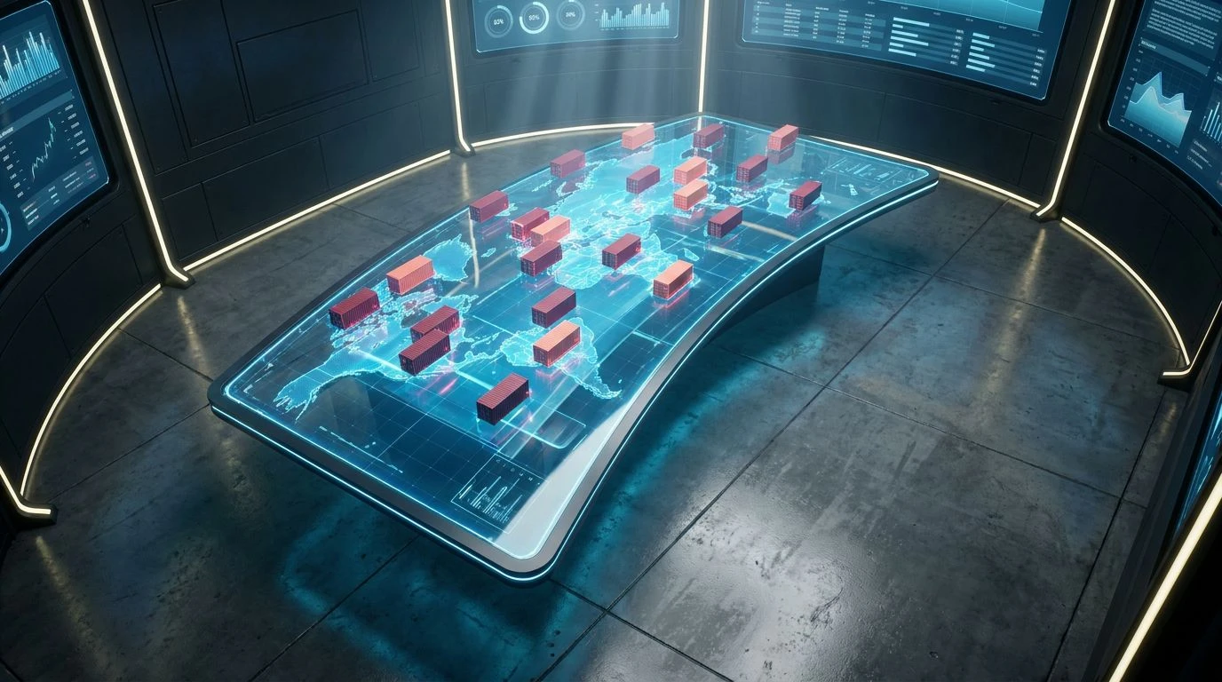
Red Color Palettes: Impact on Supply Chain Design Logic
· 6 min readLogistics has traditionally relied on safe, invisible interface designs. Moving goods across oceans and borders is a high-stress operation, usually managed on screens dominated by muted blues and grays that fade quietly into the background. Recently, a shift toward high-alert, energetic color selections asks a critical question about human attention and operational speed. Can the exact shade of a shipping port dashboard dictate the urgency of its workers? Does flooding an interface with a striking red accelerate decision-making, or does it merely induce visual fatigue over a long shift? The intersection of pure utility and visual vibrancy demands careful examination, challenging the assumption that digital management tools must be visually dormant to be effective.
Transoceanic Pulse 🚢
The visual language of moving freight often relies on a strict dichotomy between action and observation. Transoceanic Pulse captures this exact tension, placing the aggressive demand of Alert Coral directly against the stabilizing weight of Maritime Navy and Deep Transit. When an operator tracks a delayed cargo vessel, the eye naturally seeks out the most critical information first. A screen washed in Crimson Freight commands immediate response, signaling a bottleneck or a missed port call. Yet, a system cannot function purely on alarm. It requires the quiet space provided by Terminal White and Industrial Silver to process the surrounding data safely. By structuring an interface where Clear Airway serves as a gentle navigational guide, the aggressive reds function strictly as necessary interventions rather than overwhelming the daily routine. This equilibrium ensures that human operators remain sharp and attentive without succumbing to the exhaustion typically associated with highly energetic interfaces.
Navigational Current 🌊
While debates continue over the efficacy of alarming reds, there remains a compelling argument for operational systems built entirely on varying degrees of calm. Navigational Current discards the high-alert strategy in favor of methodical, uninterrupted flow. Relying on a progression from the light touch of Glacier Channel to the authoritative weight of Submarine Route, this spectrum establishes a state of pure utility. An operator managing global supply chains across time zones often requires sustained concentration rather than sudden shocks of adrenaline. The cool properties of Oceanic Depth and Electric Gulf provide an environment where thousands of data points can be tracked simultaneously without inducing cognitive strain. By utilizing Cyan Logistics to highlight specific shipping lanes against a backdrop of Pacific Routing, the system maintains legibility and precision. Such an approach suggests that efficiency is perhaps best achieved not through the constant provocation of the user, but through the seamless, undisturbed presentation of complex routing paths.
Ground Transport 🚛
True operational efficiency often grounds itself in the physical realities of the shipping yard. Ground Transport borrows its visual cues directly from the physical materials of global trade, translating them into a reliable digital experience. The stark contrast of Asphalt Night against Paper Manifest ensures maximum legibility for late-night inventory checks. When a package requires attention, the warm, recognizable tone of Safety Amber draws the eye naturally, mimicking the warning lights of a warehouse floor without the aggressive panic of a pure red. This is anchored by the serious, traditional hue of Logistics Indigo, which communicates security and established protocols. The addition of Cardboard Parcel and Steel Container reminds the digital operator of the tangible goods moving through the system, bridging the gap between screen and warehouse. This combination proves that utility does not require total visual silence; rather, a methodical application of earthy, industrial tones can guide a worker through complex scheduling systems with both speed and professional composure.
System Override 🚨
Testing the extreme edges of interface design requires a willingness to provoke. System Override embraces the exact debate surrounding energetic visual strategies, pushing Coral Flash and Urgency Maroon to the forefront of the user experience. In a high-stakes logistics center, fractions of a second matter, and a pale notification often goes unnoticed amidst a sea of moving numbers. By deploying Transit Azure and Midnight Cargo as the structural background, the interface creates a deep, dark canvas specifically designed to make those aggressive reds leap forward. Concrete Tarmac serves as a neutral buffer, preventing the tones from clashing violently while allowing Caution Pale to function as a secondary, less severe warning tier. This aggressive visual strategy demands immediate action, effectively forcing the global supply chain to run faster by simply not allowing the human operator to ignore a delay. It is a bold, uncompromising approach to utility, prioritizing rapid response times over visual comfort.
Operational Metric 📊
Moving beyond the binary of calm blues and panicked reds, there is a space where multiple streams of information must be parsed instantly. Operational Metric approaches the supply chain dashboard as a complex instrument panel requiring distinct, recognizable markers. Clear Horizon and Deep Harbor establish the foundational environment, offering a trustworthy and professional setting for the majority of the screen space. Against this reliable backdrop, Freight Rust acts as a definitive stop signal for severe disruptions, while Courier Orange functions effectively for ongoing, active rerouting tasks. The inclusion of Optimization Green introduces a vital psychological reward, signaling successful deliveries and cleared customs checkpoints. By assigning highly specific meanings to these distinct hues, the digital environment transforms into a highly functional map of global movement. It proves that efficiency relies on clear categorization, allowing workers to interpret the exact status of a shipping network with a single, practiced glance across the monitor.
The question of whether a specific hue accelerates the global movement of goods reveals a deeper truth about human interaction with digital infrastructure. A supply chain is not merely a collection of ships, planes, and trucks; it is a sprawling network governed by human operators interpreting screens in real time. While vibrant, demanding reds can force immediate attention and correct delays instantly, they must be weighed against the calming authority of deep navies to prevent operational burnout. Ultimately, the visual environment of logistics dictates the rhythm of international trade. Careful selection of these interface elements ensures that the speed of global commerce is guided by deliberate design rather than panicked reaction, proving that visual balance is an operational necessity.