

Modern Color Palette Contrast: Stability vs. Boredom

High-contrast color palettes define the thin line between professional reliability and visual stagnation in modern interior and UI design.
· 6 min readHome Office Color Palette: Grey and Yellow Design Tips
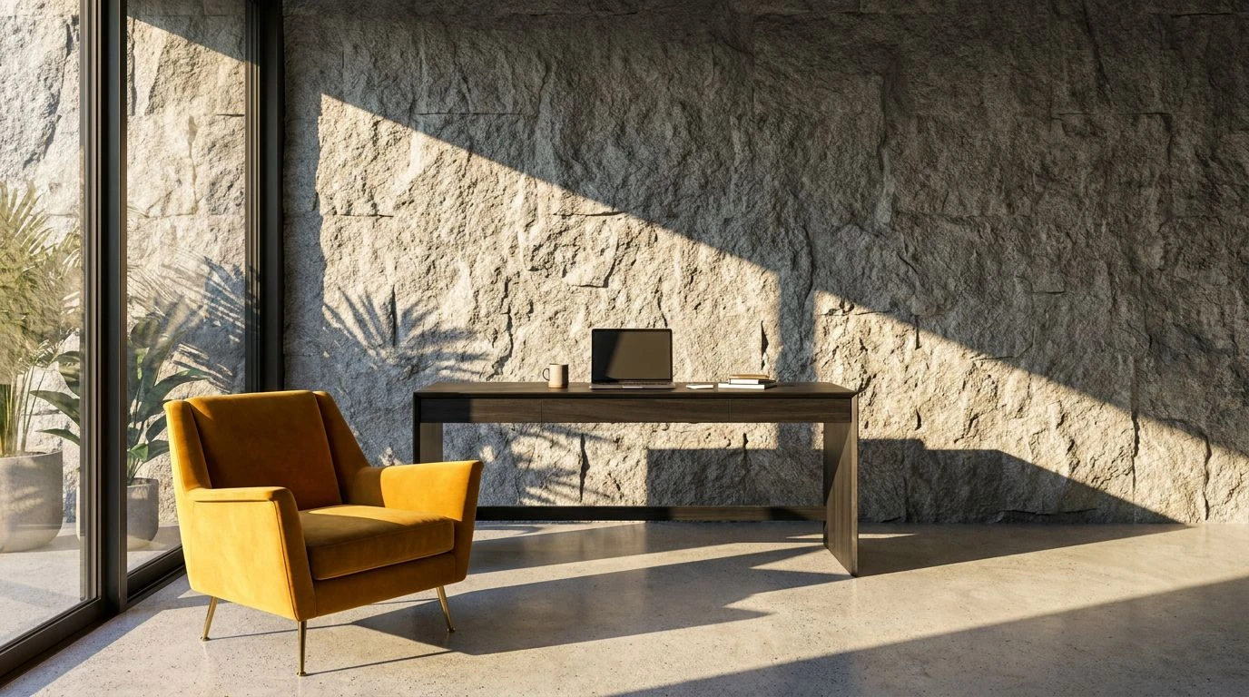
Transform a dull workspace with strategic grey and yellow tones. Master lighting and color balance to boost mental endurance and professional focus.
· 5 min readVintage Color Palettes: Havana Library Meets Urban Beats

Earth tones blend with neon reggaeton hues to create a vibrant design aesthetic. Master the art of mixing historic charm with street-style energy.
· 5 min readDeep Green Color Palettes for Professional Focus and Design
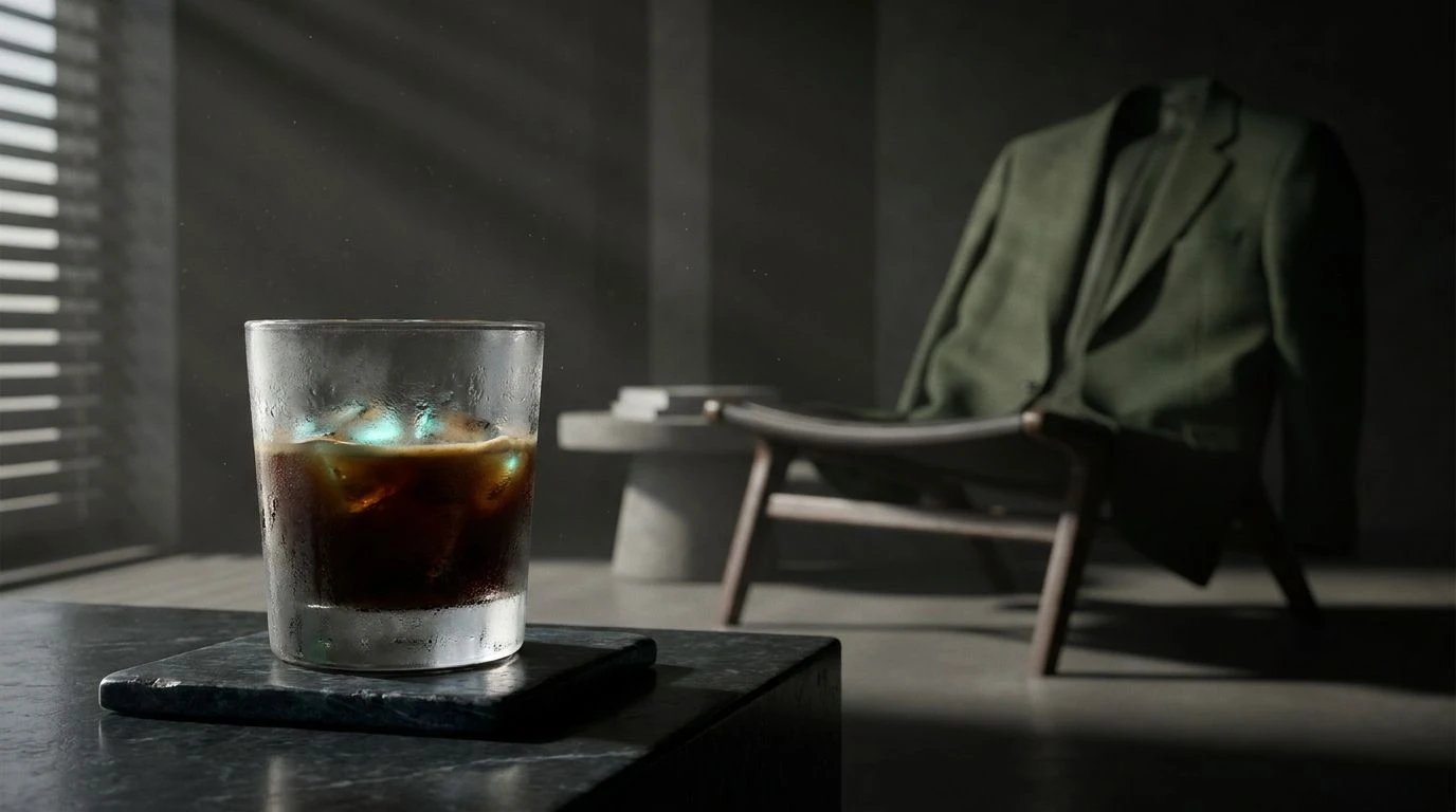
Transform your morning ritual with moody moss greens and cool tones that sharpen the mind. Curate a workspace of quiet authority and intent.
· 6 min readFintech Color Palettes: Using Green for Sustainable Design
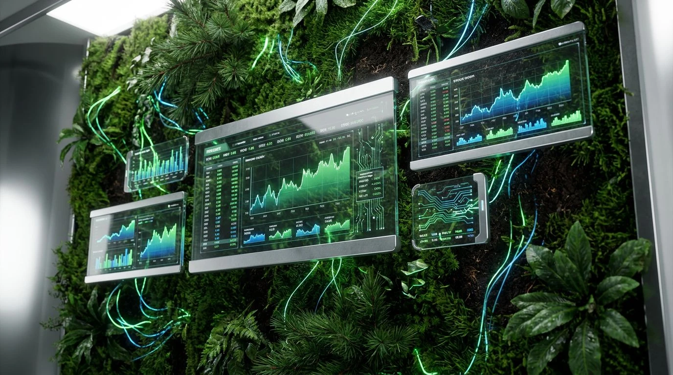
Biophilic design meets fintech precision. Master how moss green and technical greys build user trust in sustainable finance application interfaces.
· 5 min readDeep Sleep Color Palettes: Navy and Grey Bedroom Design
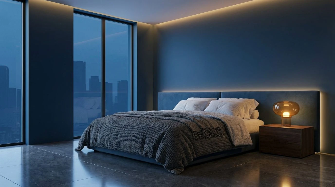
Transform your bedroom into a sanctuary using dark navy and soft grey. These light-absorbing tones lower cortisol and trigger restorative sleep.
· 5 min readFuture Mars Interior Design: A Space Color Palette Guide

Astronaut sanity depends on a visual balance of tech cyan and grounding earth tones. See the five color palettes shaping life on the red planet.
· 6 min readIndustrial Grey Color Palettes for Luxury Skincare Design
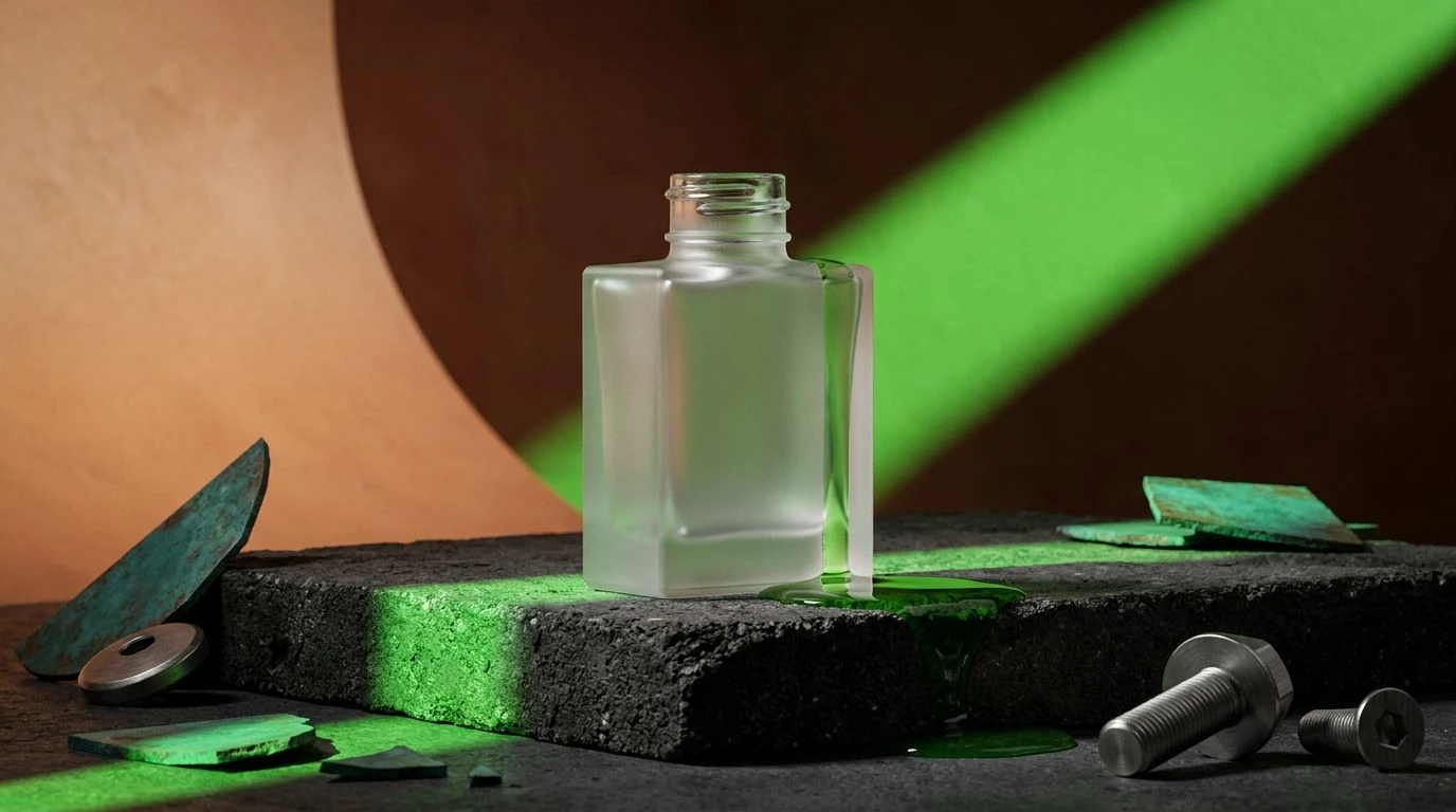
Premium beauty brands are trading clinical white for raw asphalt tones. Elevate packaging with brutalist color schemes that feel tactile and real.
· 5 min readEclectic Color Palettes for High-Tech Art Gallery Design
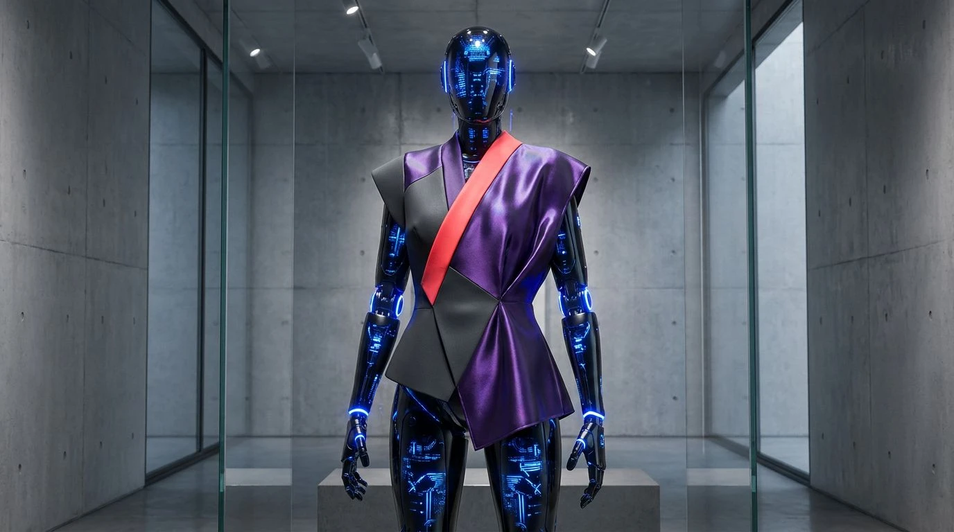
Surgical precision meets bohemian flair in these unique color palettes. Master the art of clinical surrealism through bold, algorithmic aesthetics.
· 5 min readHealing Color Palettes Inspired by Muted Festival Tones
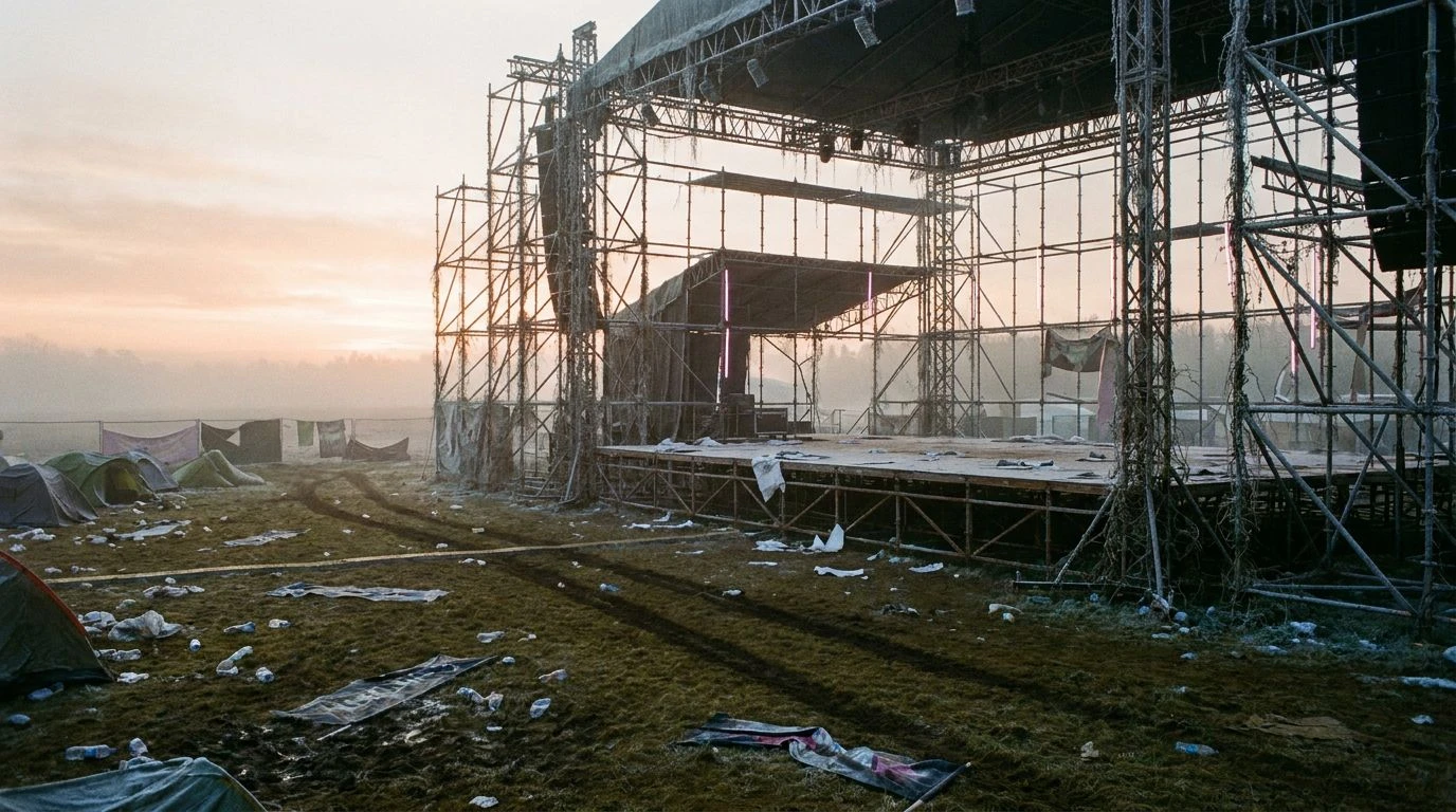
Transform high-energy adrenaline into peaceful home decor using industrial greys and morning peach hues inspired by the silence of festival dawn.
· 5 min readMidnight Navy Color Palettes for Modern Jazz Branding

Modern soundscapes meet deep navy hues in this design guide. See how #1a1a2e creates the perfect rhythmic backdrop for musical visual identities.
· 6 min readMustard Yellow Color Palettes for Creative Interior Design

Earthy yellow tones provide a beacon of energy in moody, atmospheric spaces. Elevate your aesthetic with five unique music-inspired color schemes.
· 5 min readAmber & Olive Color Palettes: Desert Decor Design Ideas

Rich amber and olive tones harmonize to create nostalgic, desert-inspired spaces. Use these five earthy palettes to ground your home with warmth.
· 6 min readCybersecurity Color Palettes: Using Navy for Tech Trust

Deep blue tones establish institutional authority and digital stability. Master high-end design strategies to build trust through visual security.
· 5 min readNeon 80s Color Palettes for Modern Professional Design
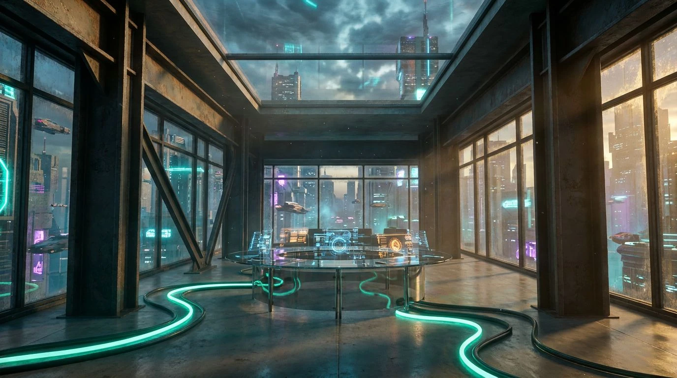
Transform rigid corporate layouts with retro synthwave energy. Use these vibrant neon color schemes to balance authority with late-night rebellion.
· 6 min readModern Navy and Silver Color Palettes for UI Dashboard Design

Institutional design is moving from alarmist reds to calm navy and silver tones to build user trust and reduce cognitive fatigue in data interfaces.
· 5 min readDark Fantasy Color Palettes for Modern Executive Branding
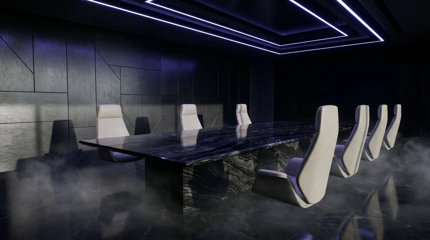
Moody, saturated tones project authority and exclusivity. Master the shift from sterile corporate neutrals to powerful, theatrical design motifs.
· 5 min readModern Color Palettes for Sophisticated Web Design Impact
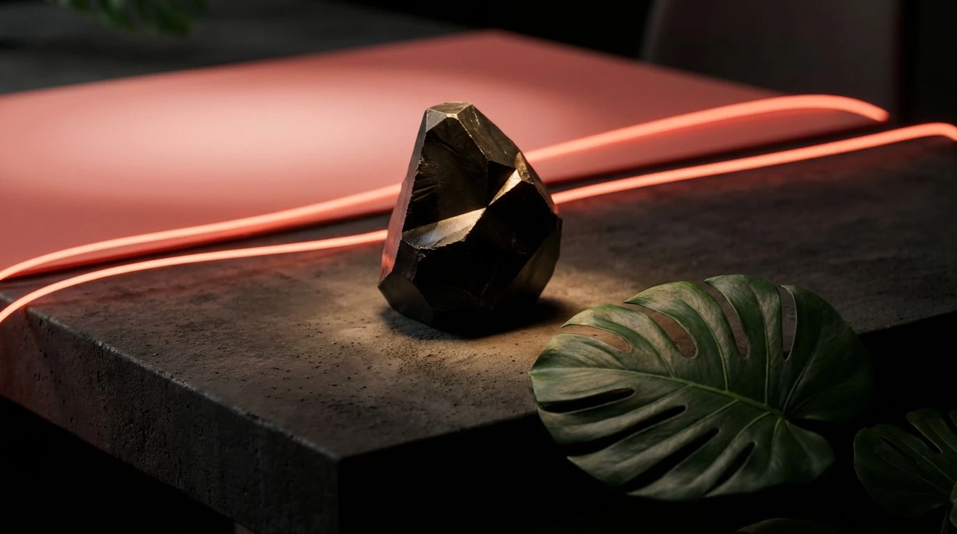
Sophisticated magenta and navy pairings trigger deeper visual arousal than basic primary hues. Master high-intensity design with these five palettes.
· 6 min readAcademic Color Palette Trends for Art Gallery Branding
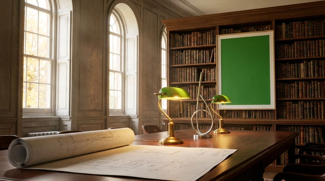
Bridge scholarly tradition and modern energy using autumnal tones. Master the art of using ochre and dusty rose to build soulful museum identities.
· 5 min readWarm Peach Color Palettes for Modern Industrial Design
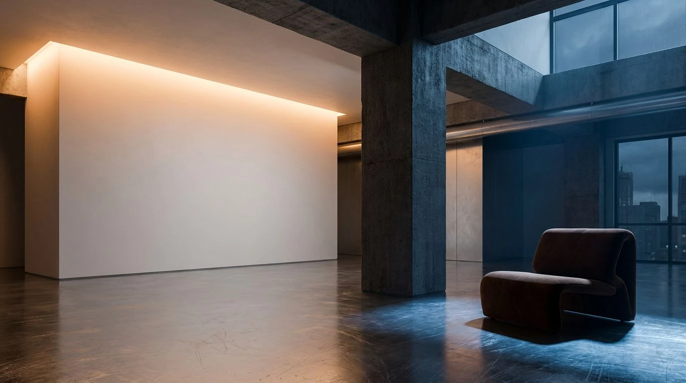
Raw concrete meets soft apricot tones to balance cold industrial materials. Create inviting digital spaces using our five curated color palettes.
· 6 min read