Academic Color Palette Trends for Art Gallery Branding
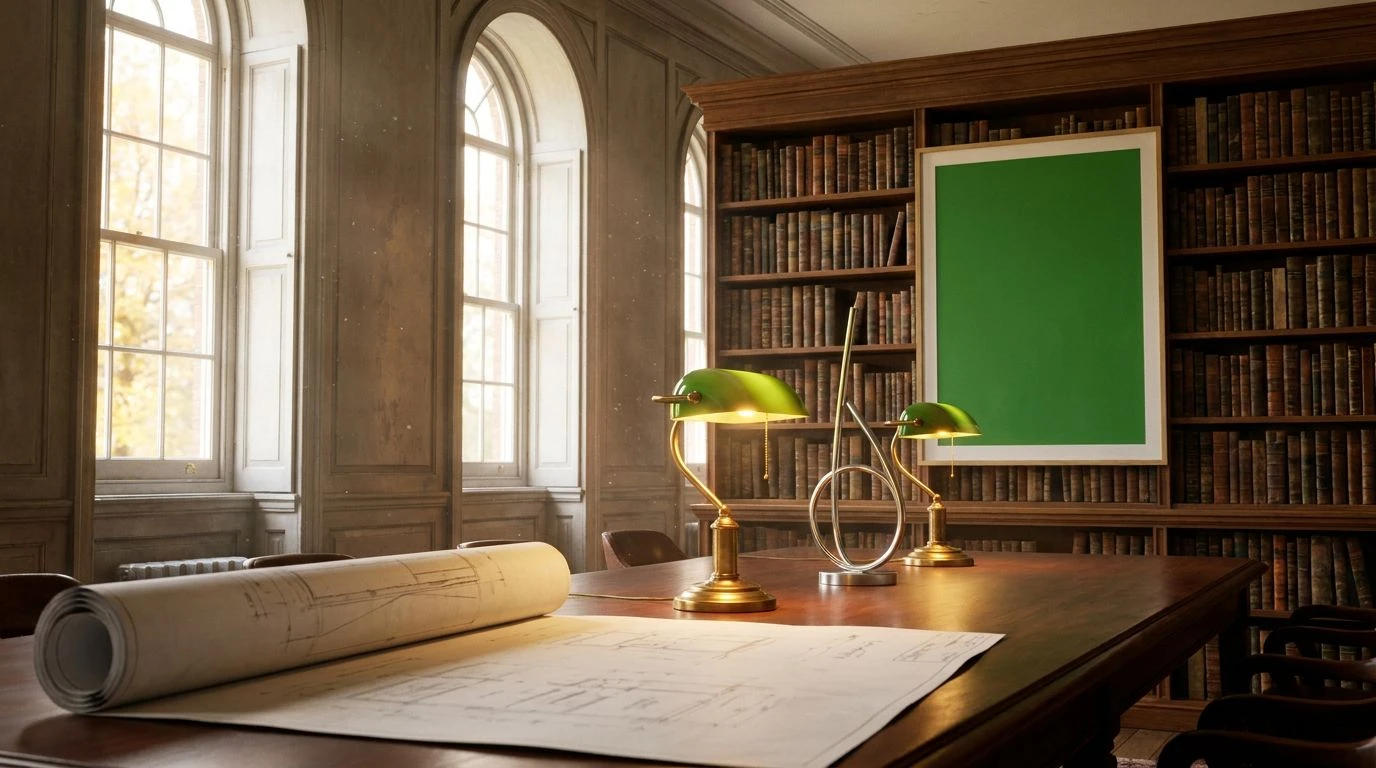
· 5 min readThere is a specific quality to the light inside an old university gallery when autumn peaks outside. It filters through large sash windows, catching dust motes hanging in the air, landing on worn leather bindings and contemporary curation alike. For modern art institutions, capturing this exact intersection of scholarly tradition and lively creative energy is a massive branding challenge. Moving away from the stark, clinical white cube, contemporary gallery identities are finding comfort in palettes that feel both academic and alive. By bringing dusty rose, sharp yellow, and deep ochre into the mix, these platforms establish a visual language that respects archival history while pushing a fresh, engaging aesthetic forward. It is about creating digital spaces that feel tactile, where users can almost smell the old paper and see the bold strokes of modern paint.
Archival Reserve 🏛️
The quiet authority of an academic institution heavily relies on its typography and structural framing, which is exactly where True Ink and Oxford Blue anchor this selection. These deep, authoritative tones provide the necessary weight for serious curatorial writing and navigation menus. Against this strict framework, Faded Peony and Dried Rose introduce a highly specific, soft tension. They recall the fabric covers of forgotten exhibition catalogues, adding a layer of approachability that prevents the interface from feeling excessively rigid. Slate Archive and Alabaster Vellum act as the resting spaces, offering broad, generous margins that let artwork breathe on the screen. The resulting atmosphere feels much like wandering through a hushed private collection, where the historical weight of the architecture is playfully disrupted by contemporary, soft-toned curation.
Highlighter Annotation ✏️
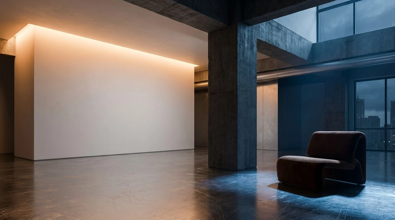
Graphic design in the contemporary art sector frequently falls back on the strict binary of black and white, treating the browser window as an empty gallery space. Gallery Wall and Carbon Black execute this minimalist function perfectly, providing an invisible grid for high-resolution imagery. However, it is the sharp, unexpected disruption of Margin Yellow that shifts the entire mood from static to active. This bright flash mimics a scholar marking a crucial passage in a textbook or a neon sticker placed on a physical map. Steel Shelving and Concrete Pillar offer mid-tone transitional areas, perfect for secondary text or subtle hover states without distracting from the main exhibition. This setup perfectly captures the feeling of a highly modern annex attached to a historic library, where raw industrial materials meet sudden, intentional bursts of pure graphic energy.
Reading Room 🕰️
There is a distinct warmth to this selection that directly recalls late afternoon sun hitting wooden shelves and aged pages. Foxed Paper provides a beautifully textured backdrop that feels much easier on the eyes than a pure digital white, ideal for long-form essays on art history or detailed artist biographies. Vanta Shadow and Bronze Bust deliver the typographic grounding, securing the layout with a sense of historical permanence. What makes this grouping genuinely compelling for an art platform is the interaction between Gilded Ochre and Terracotta Dust. These tones break away from traditional academic severity, introducing a welcoming, almost domestic warmth to the interface. They function beautifully as call-to-action buttons or subtle framing devices around featured works, capturing the exact feeling of discovering a brightly painted contemporary canvas hanging quietly in a nineteenth-century reading room.
Campus Exhibition 🎫
Moving away from quiet observation, this arrangement leans heavily into the lively, conversational side of university galleries. The high-contrast relationship between Lemon Acid and Cobalt Ink demands attention, making them ideal for striking typographic headers or bold promotional banners for upcoming student shows. Clay Brick and Moss Binding tie the loud colors back to a physical, architectural reality, bringing to mind traditional campus masonry and ivy-covered walls. Bound Canvas acts as the neutral ground, allowing these strong personalities to exist side by side without overwhelming the visitor. Walnut Desk secures the footer and structural lines, ensuring the layout maintains its professional standing. This is the visual equivalent of a lively opening night in an autumn semester, where loud conversations echo down historic corridors and fresh ideas challenge old institutional frameworks.
Bauhaus Autumn 🍂
Taking direct cues from modernist design principles, this collection applies primary colors through a slightly aged, seasonal lens. Chrome Yellow, Kelly Green, and Blueprint offer a strict, almost theoretical approach to color coding, perfect for distinguishing different exhibition wings, ticketing categories, or curatorial departments on a complex website. Yet, they are not purely digital primaries; they possess a heavy, physical quality. Silver Gelatin provides a cool, industrial background that allows the bolder tones to jump off the screen. Mahogany Frame and Burnished Brass add an unexpected layer of traditional warmth, grounding the modernist elements in something much older and more tactile. The result is a highly functional, deeply structural design language that feels like browsing a mid-century poster archive housed within a much older, wood-paneled institution.
The shift toward these warmer, historically rooted color strategies marks a significant departure from the sterile interfaces that have long dominated the cultural sector. By leaning into the physical sensations of an autumn afternoon inside an old library, digital platforms can cultivate spaces that feel genuinely inviting rather than intimidatingly exclusive. The tactical placement of acidic yellows alongside muted roses and deep ochres creates a precise tension between the past and the present. It proves that an institution can respect its scholarly foundations while simultaneously projecting a bold, energetic presence. Ultimately, these visual choices allow galleries to build websites that behave less like cold digital archives and more like living, breathing rooms where art and audiences can comfortably meet.