Modern Color Palette Contrast: Stability vs. Boredom
· 6 min readWhen humans look at a perfectly uniform color field, our visual system eventually stops registering it, a phenomenon known as the Troxler fading effect. In the realm of visual design, a similar perceptual blind spot occurs when professional environments become overly uniform. A screen awash in identical shades of steel gray and royal blue might initially signal reliability, but without visual friction, this same reliability rapidly devolves into sensory deprivation. This raises a fascinating question about artificial intelligence and user experience: at what specific perceptual coordinate does an interface cross from being reassuringly stable to functionally invisible? By examining varying degrees of high visual contrast, we can map the exact boundaries where a rigid, modern design either engages the human mind or lulls it into a state of profound apathy.
Cognitive Architecture 🏛️
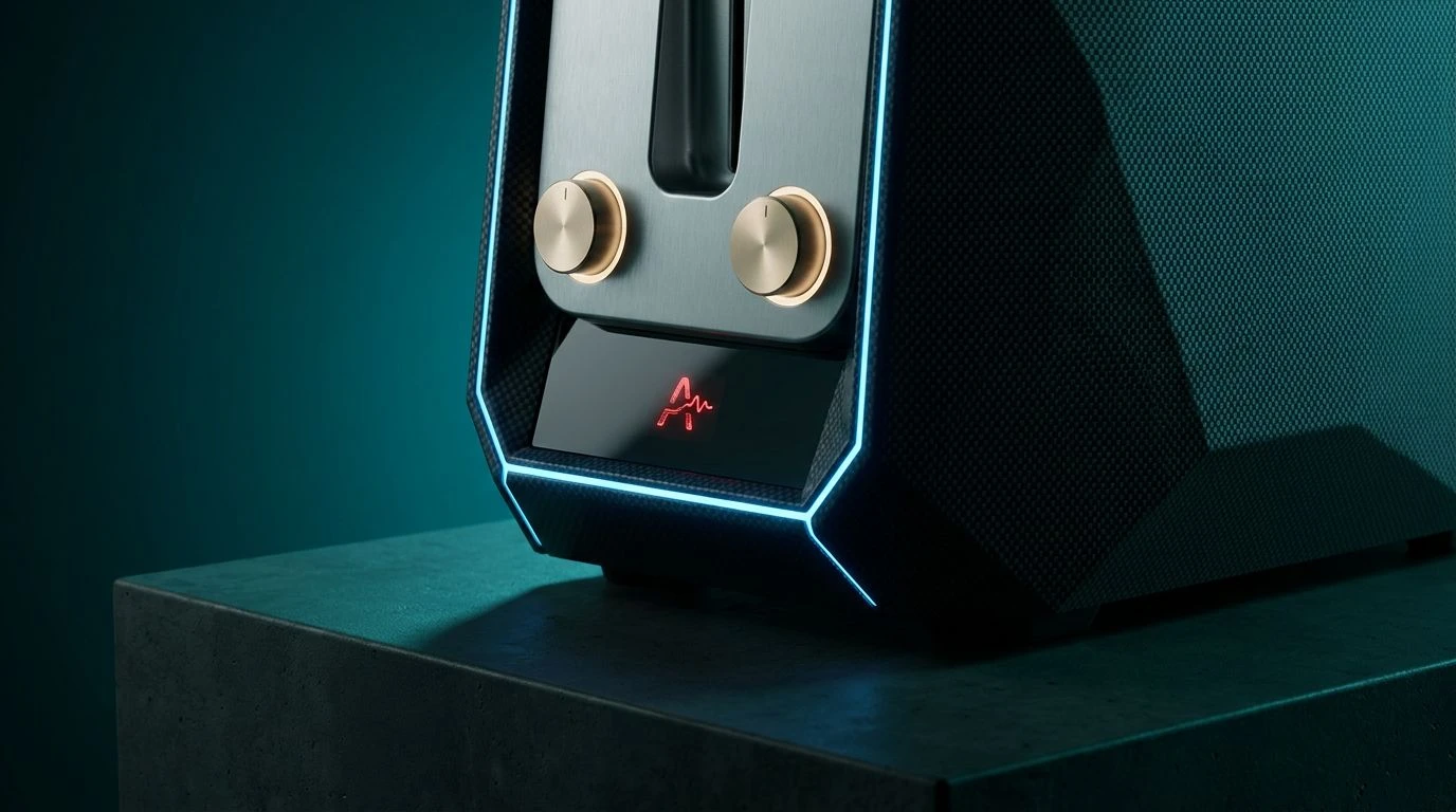
The visual spectrum of Cognitive Architecture operates as a study in unexpected perceptual jolts. It anchors itself with the stark emptiness of Blank Slate and the heavy, grounding presence of Deep Void, creating an immense perceptual distance. Within this expanse, the biological warmth of Bronze Schema and Weathered Brass introduces a grounded, earthy predictability. Yet, it is the sharp, almost aggressive insertion of Electric Yellow that disrupts the visual field, preventing the eye from resting too long on the industrial coolness of Titanium Hull. This specific arrangement tests the limits of cognitive fatigue. If a machine learning model were trained to optimize for human attention, it would find that the Soft Glare acting as a bridge between these extremes prevents the high contrast from becoming hostile. The design remains highly professional, yet the sharp yellow prevents the user's focus from slipping into the quiet background of standard corporate environments, perfectly balancing on the edge of stimulation and order.
Algorithmic Pulse ⚡
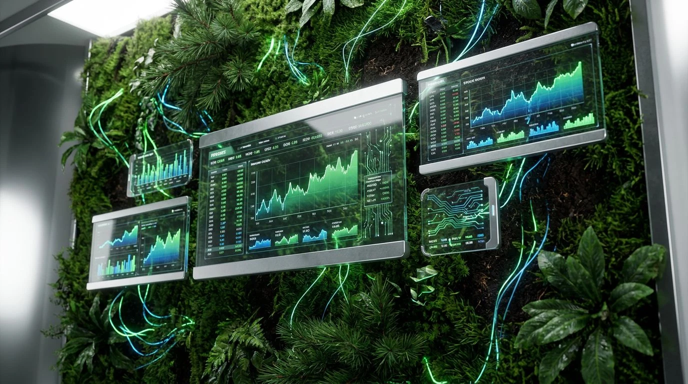
Stripping away all organic warmth, Algorithmic Pulse relies on a strictly achromatic baseline punctuated by a single, high-frequency wavelength. The progression from the blinding Snow Static down through Ash Cloud and Iron Ore to the light-absorbing Vantablack creates a grayscale gradient of absolute, unyielding order. This is the visual equivalent of a flawless mathematical proof, communicating pure, unadulterated stability. However, the human brain requires novelty to maintain arousal. This is where Cobalt Spark acts as a critical neurological trigger. Set against the grayscale vacuum, this vivid blue functions like an electrical signal firing across a synapse. In the context of interface design, an algorithm adjusting these variables would observe that without the blue, the design induces rapid visual habituation, otherwise known as boredom. The sudden burst of color forces the optic nerve to constantly recalibrate, ensuring that the environment feels relentlessly modern and active rather than dead and static.
Threshold of Variance 📊
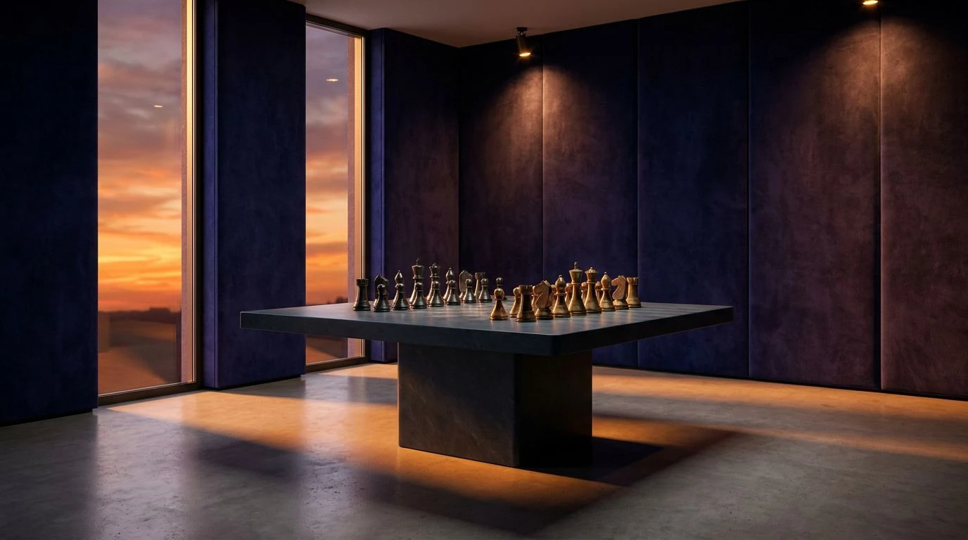
To understand the physiological impact of Threshold of Variance, one must look at how the eye manages competing focal points. The foundation rests on a precarious balance between Graphite Smudge and the impenetrable Obsidian Field, setting a deeply serious tone. Oxidized Silver and Tarnished Gold offer a nod to traditional, enduring materials, whispering of long-term reliability. But the true experiment begins with the clash of Cyanide Wash, Glacier Ice, and Lapis Lazuli against the abrupt, visceral shock of Alarm Red. This is an environment of maximum cognitive load. The algorithm monitoring user interaction here would detect heightened heart rates and rapid saccadic eye movements. The red does not just contrast with the blues; it violently opposes them. This creates a state of perpetual alertness, proving that professionalism does not have to be quiet. By pushing the boundaries of contrast to their absolute limits, this spectrum demonstrates how calculated visual friction can completely eradicate the possibility of monotony.
Steady State 🌊
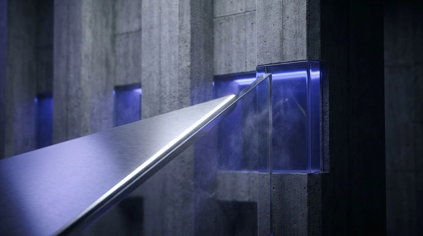
The perceptual mechanics of Steady State are deliberately restrained, utilizing low-frequency shifts to maintain a calm, unbroken visual rhythm. The transition from Chalk Dust to Aluminum Shard and further into Concrete Pillar mirrors the physical sensation of stepping into a brutalist architectural structure. It is solid, unmoving, and deeply reassuring. Slate Shadow adds just enough depth to define edges without demanding attention. The only true color, Deep Royal, operates differently than the neon shocks of other environments. It is a stable, anchoring hue that commands authority while maintaining a low physiological arousal profile. An AI analyzing human behavioral data within this visual field would note sustained, long-term focus with very few error spikes. It represents the idealized version of modern corporate design, where the goal is to eliminate all distraction. Yet, it sits dangerously close to the threshold of under-stimulation, demanding that the blue be used with exact precision to keep the mind tethered to the task at hand.
Predictable Anomaly 🔭
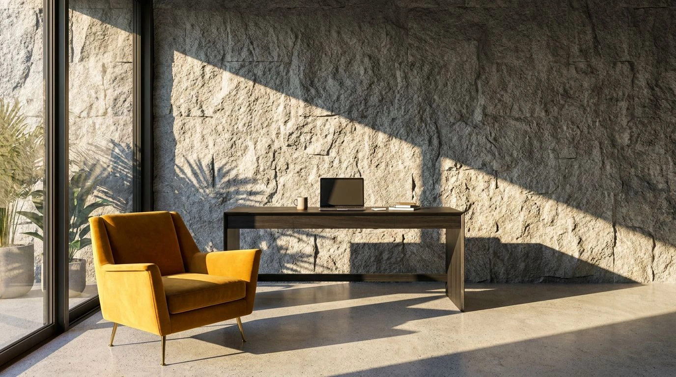
Operating on the principles of atmospheric scattering, Predictable Anomaly uses the calming effects of natural gradients to maintain order while preventing visual stagnation. The starkness of Photon White is immediately softened by Meteorite Ash and Lunar Dust, creating a mid-tone resting space for the retina. The introduction of Stratosphere Blue and Ocean Trench provides a deep, receding visual depth, mimicking the way humans perceive distance in the natural world. This creates a feeling of vastness and calm capability. The heavy Carbon Slag grounds the entire sequence, providing a necessary anchor for the lighter, airy blues. From an algorithmic perspective, this spectrum is highly effective for maintaining engagement over long periods. The varied blues provide just enough visual interest to keep the brain's pattern-recognition software running smoothly, while the soft grays prevent sensory overload. It is a study in how precise, calculated shifts in lightness and temperature can construct an environment that feels both relentlessly dependable and quietly alive.
Our visual systems are remarkably efficient machines, constantly filtering out the predictable to focus on the novel. The boundary where a professional, stable environment becomes a stagnant one is not merely a matter of subjective taste, but a measurable physiological threshold. By adjusting the specific frequencies and contrasts of colors like royal blue and steel gray, designers can actively manipulate cognitive engagement. Too little contrast, and the brain conserves energy by ignoring the environment. Too much, and the user becomes overwhelmed. The precise application of color allows us to construct modern spaces that communicate total reliability while still providing the necessary visual friction to keep the human mind awake, alert, and entirely present.