Warm Peach Color Palettes for Modern Industrial Design
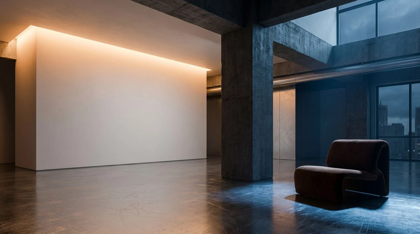
· 6 min readStepping into an expansive concrete loft, the air feels momentarily vast, almost unforgiving in its sheer industrial scale. Yet, a singular, deeply considered stroke of color can instantly transform that cavernous space into an intimate sanctuary. It was within such walls that an architect revealed a masterful secret: pairing the stark, unyielding nature of raw materials with the tender flush of warm, human-centric tones. This dialogue between the severe and the soft creates a mesmerizing visual tension. When transposed to digital environments, this exact relationship translates into spaces that feel both incredibly reliable and undeniably inviting. By grounding the eye with deep, rich roasted hues and lifting the spirit with tender, nectar-like blushes, we craft digital rooms that people genuinely want to linger in. The brutalism of wireframes and digital architecture suddenly breathes, becoming a tactile, sensorial experience that speaks directly to the human desire for warmth amidst strict, mathematical structure.
Velvet Brutalism 🏗️
Velvet Brutalism captures that exact moment when morning light softens the sharp edges of an unfinished city space. The profound depth of Midnight Espresso anchors the digital layout, acting much like a heavy iron beam that promises undeniable stability and shelter. Against this dark weight, Silk Peach blooms with surprising vulnerability. It is the color of a living presence moving through a structured grid, bringing a soft, skin-like warmth that makes stark layouts feel remarkably approachable. When paired with the quiet, steadfast nature of Cast Iron and Weathered Concrete, the soft peach tone feels like a tender luxury rather than a mere accent. Sweeps of Cashmere White offer necessary breathing room, mimicking the vastness of gallery walls. This palette constructs an online experience that feels highly curated and deeply personal, proving that rigid industrial foundations can house the softest of human moments.
Gilded Steel 🌇
Moving through a space bathed in the tones of Gilded Steel feels akin to watching a sunset reflect off factory windows. The vivid heat of Molten Nectar acts as a beating pulse against a backdrop of strict, utilitarian greys. This vibrant, almost glowing apricot shade interrupts the quiet stoicism of Exposed Steel and Polished Cement, delivering a shock of life that feels entirely intentional and beautifully restrained. The addition of Burnished Brass and Urban Moss brings an organic, weathered quality, reminiscent of creeping vines on old brick or the patina of well-loved machinery. In a virtual landscape, this palette creates a mood of sophisticated reclamation. The warm, radiant orange draws the user forward, acting as a welcoming guide through an otherwise cool, structured interface. It balances the raw predictability of industrial design with a spirited, glowing energy that feels incredibly alive and welcoming.
Blueprint Awakening 📐
There is a strict, undeniable confidence in Blueprint Awakening, a palette that mirrors an architect’s drafting table just before dawn. The foundation is built upon uncompromising darks and greys: Absolute Obsidian and Graphite Shadow provide a sharp, clean structural framework that commands immediate trust. Morning Slate cools the atmosphere, leaving the stage perfectly set for the sudden, grounding warmth of Rich Espresso. This deep, woody tone acts as a bridge to Rusted Peach, a muted, weathered blush that brings the mind to aged terracotta floors or sun-baked bricks. Suddenly, a flash of Electric Blueprint cuts through the stillness. This sharp architectural blue adds a shock of modern intellect, preventing the warmer tones from feeling overly nostalgic. Applied to an interface, this collection offers a journey through highly professional, calculated spaces that still manage to cradle a deeply human touch, ensuring the user feels securely guided and wonderfully surprised.
Studio Twilight 🌆
The atmosphere woven by Studio Twilight brings to mind an expansive loft settling into the evening, where shadows stretch and the air cools. Scratched Aluminum and Charcoal Pillar set a definitively urban scene, presenting surfaces that feel raw and industrial, yet quietly refined. Placed within this moody, structured setting, Soft Apricot shines like a solitary lamp glowing against a vast window. It offers a gentle, inviting reprieve from the stark industrial reality. The intense, grounding weight of Roasted Bean grounds the lighter peach tones, adding a luxurious, tactile richness that feels like pouring over leather-bound sketchbooks. Midnight Draft deepens the shadows, creating a sense of boundless, starry space, while Gallery White keeps the composition breathing freely. For a digital environment, this palette crafts a deeply elegant, contemplative mood. It builds a sanctuary of quiet luxury, where users can navigate structural interfaces while continually finding pockets of gentle, soothing warmth.
Loft Canvas 🎨
Loft Canvas is a celebration of the raw and the refined living in the same breathtaking space. Here, the deeply comforting warmth of Caffe Crema provides an immediate sense of tactile reliability, much like the scent of fresh coffee in an open-plan studio. Set against the stark, infinite expanse of Void Black, this rich brown tone becomes an anchor. From this grounding base rises Luminous Apricot, a remarkably vivid peach tone that sings with vibrant energy. It acts as a beacon of joy and human connection, cutting through the quieter, stoic tones of Taupe Stone and Dust. Vanilla Plaster offers a creamy, forgiving background that softens the overall visual impact, making the stark contrasts feel luxurious rather than harsh. A sudden strike of Architect's Blue adds a crisp, technical edge. In virtual spaces, this translates to an experience of high creative energy, where users feel the robust dependability of industrial architecture alongside the thrilling, tactile pulse of vibrant human expression.
The conversation between stark, utilitarian structures and tender, sun-baked tones creates a visual language that speaks deeply to our modern desires. By pairing the unrelenting weight of deep roasted browns and industrial greys with the gentle flush of apricot and peach, we construct spaces that offer both strict reliability and profound comfort. These thoughtfully chosen shades transform rigid digital environments into tactile, inviting rooms where the eye can rest and the mind can wander freely. The architectural discipline of the concrete loft is not lost; rather, it is beautifully softened by the presence of a beating, human heart. Bringing these tones to life online promises interfaces that not only guide and perform but also welcome, shelter, and inspire.