Modern Color Palettes for Sophisticated Web Design Impact
· 6 min readFor decades, the default visual shorthand for excitement has relied heavily on the stark, unmistakable wavelengths of basic red, yellow, and blue. We are conditioned by early childhood associations and mid-century advertising to view these foundational hues as the ultimate triggers of arousal and attention. However, human visual perception and cognitive processing are far more complex than simple high-contrast signaling. As our visual landscape becomes increasingly crowded, the physiological response to these jarring, basic hues is often one of fatigue rather than genuine engagement. Researchers in color psychology note that intensity can be communicated much more effectively through sophisticated combinations that challenge the optic nerve without overwhelming it. By moving away from rudimentary palettes and exploring the interaction of deep shadows, unexpected midtones, and electric accents, we can trigger a more mature, sustained state of visual arousal that draws the viewer in rather than shouting at them from a distance.
Midnight Ultraviolet 🌌
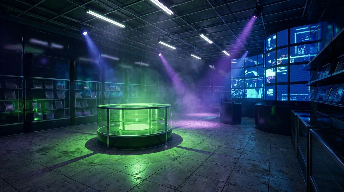
The Midnight Ultraviolet palette perfectly demonstrates how discarding rudimentary basic hues in favor of deep, absorptive tones can create a profound sense of anticipation. Here, Deep Space Navy and Storm Cloud act as an expansive void, lowering the visual noise and allowing the human eye to relax and dilate. Against this quiet background, the sudden appearance of Ultraviolet Flash and Electric Magenta acts like a sudden burst of bioluminescence in the deep ocean. The visual cortex registers these highly active, short-wavelength colors as thrilling anomalies. This contrast relies on the phenomenon of simultaneous contrast, where the dark borders make the vivid pinks and purples appear to glow from within. Rather than the superficial alarm triggered by a standard bright red, the inclusion of Dark Berry creates a gradient of intensity that pulls the viewer into the composition. It generates an atmosphere of sophisticated energy, ideal for modern visual communication that seeks to stimulate the mind while respecting the optical limits of the audience.
Thermospheric Glow ☄️
Moving beyond predictable color pairings, Thermospheric Glow relies on temperature contrasts to excite the optic nerve. The interaction between the icy depth of Deep Ocean Navy and the radiating heat of Plasma Pink and Solar Flare Orange creates a phenomenon known as chromostereopsis. This optical illusion causes warm and cool colors to appear on different depth planes, tricking the brain into perceiving a three dimensional space on a flat surface. Obsidian Void anchors the bottom of the visual hierarchy, absorbing ambient light so that Pale Lunar Dust and Twilight Heather can act as gentle visual resting points. Instead of assaulting the retina with pure, unmixed pigments, this combination introduces Rusting Iron to ground the high energy accents in organic reality. The physiological result is a feeling of dynamic motion and warmth that avoids the cheap, aggressive urgency often associated with standard loud graphics. Viewers experience a lingering, complex arousal, making the communication feel both urgent and highly refined.
Kinetic Refraction 🔭
Kinetic Refraction offers a fascinating study in how we can selectively deploy high energy signals without resorting to a chaotic, childlike arrangement of basic pigments. While Arterial Red and Solar Yellow carry the energetic frequencies of traditional warning colors, they are entirely reframed by the surrounding context of Carbon Ash and Atmospheric Grey. Our visual processing systems are highly sensitive to context; a bright color placed next to a muted, light absorbing tone feels intentional and focused rather than overwhelming. Glacial Cyan and Stratosphere Blue introduce a sudden shift in wavelength, providing a cooling counterpoint that prevents the warmer tones from causing visual fatigue. Tarnished Brass acts as a crucial transitional frequency, softening the jump between stark yellow and heavy grey. The resulting visual experience mimics the scattering of light through a prism, producing a highly active, vibrating surface that communicates rapid movement and modern intensity, guiding the eye with precision rather than brute force.
Chlorophyll and Cinnabar 🌿
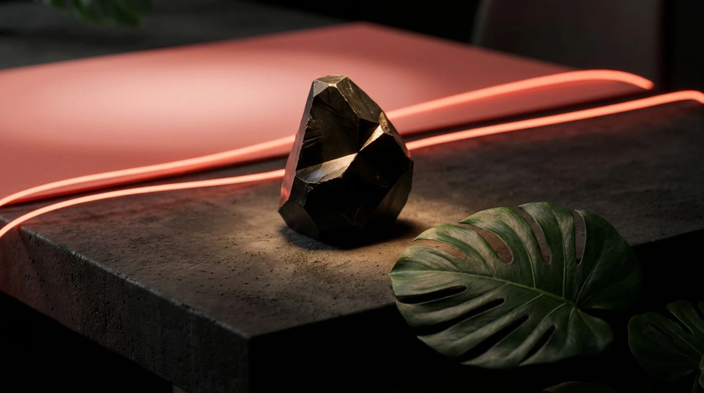
The psychological impact of Chlorophyll and Cinnabar lies in its precise control of visual stimuli against a neutral, unyielding background. When designers plaster a surface with pure basics, the brain struggles to prioritize information. Here, Urban Concrete and Basalt Rock consume the majority of the visual field, establishing a quiet, brutalist foundation that significantly lowers the baseline of cognitive load. Against this rocky silence, Cinnabar Flash and Crushed Coral command immediate attention. The biological response to these blood red wavelengths is deeply ingrained, signaling vitality and immediate action. However, the unexpected introduction of Photosynthetic Green completely alters the psychological equation. Instead of a standard danger signal, the complementary tension between the red and green wavelengths creates an electric boundary where the two meet, known to researchers as visual vibration. This highly calculated deployment of intense color communicates an organic, living energy that feels purposeful, intelligent, and thrilling to observe.
Ionized Carbon ⚡
Ionized Carbon strips away the unnecessary clutter of broad spectrum colors to focus entirely on the physiological impact of focused, high energy wavelengths emerging from total darkness. Graphite Mass and Tungsten Shadow simulate the physical properties of a light absorbing chamber, removing all stray visual data. When the optic nerve is deprived of varied stimuli, it becomes hypersensitive to whatever remains. Snow Reflection provides a sharp, blinding contrast, acting as a mental reset before the viewer encounters the true active agents of the composition. Magenta Pulse and Deep Crimson represent the absolute extreme of the visual spectrum, delivering a concentrated dose of intensity that feels almost radioactive. The brain processes this specific intersection of dark shadow and vivid pink red as a sign of high heat or extreme energy, similar to glowing neon gases in a vacuum tube. It is a masterful demonstration of how restraint and darkness can multiply the perceived excitement of a design exponentially, far surpassing the effectiveness of a universally bright canvas.
The shift away from rudimentary pigment combinations represents a significant leap forward in our understanding of visual processing. By manipulating shadows, complementary tensions, and precise wavelengths, we can trigger genuine psychological arousal without exhausting the viewer's optic nerve. Dark, absorptive tones provide the crucial negative space required for high energy pinks, reds, and cyans to truly radiate. Ultimately, communicating excitement is not about covering a surface in the loudest possible signals, but about controlling the contrast and flow of light. This measured approach to visual stimulation produces a much deeper, more memorable physical response, allowing modern communication to trigger a lasting impression with both power and sophisticated restraint.