Fintech Color Palettes: Using Green for Sustainable Design
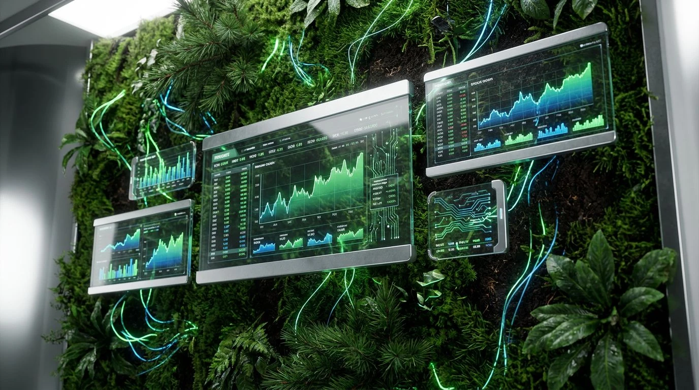
· 5 min readHuman vision developed largely to navigate the natural world, differentiating ripe fruits from toxic leaves and tracking the shifting weather against the sky. Today, our screens hijack these ancient visual pathways. When developers build sustainable finance applications, they are not just arranging pixels; they are sending specific perceptual signals to the brain. Combining the grounded reliability of forest tones with the sharp, calculated precision of modern technology requires careful calibration of wavelengths. The visual weight of a deep green signals vitality and security, speaking directly to our biophilic instincts. Meanwhile, cool, unyielding greys suggest structure and permanence. By observing how these colors interact on a digital display, we can understand why some financial tools feel like sterile spreadsheets, while others create a sensation akin to standing in a highly engineered, high-tech forest, promoting both trust and an expectation of ecological progress.
Bioluminescent Canopy 🌲
In the natural environment, sudden bursts of bright color against dark, organic backdrops often signal biological activity or chemical energy. Bioluminescent Canopy captures this phenomenon by placing the striking, electric charge of Neon Spore and Acidic Moss against the shadowy depths of Obsidian Black and Deep Forest Canopy. The human eye is highly sensitive to the yellow-green spectrum, meaning these energetic tones immediately capture attention, functioning much like warning lights or status indicators on advanced machinery. Grounding these intense signals are the muted, earthly tones of Faded Bark, Pale Lichen, and Bleached Wood, which provide a stabilizing visual anchor. For a tool managing sustainable investments, this combination creates a psychological balance between organic growth and rapid algorithmic processing. The user experiences the interface not as a static ledger, but as a living ecosystem where financial data pulses with the active, driving energy of a glowing digital woodland.
Cybernetic Wetlands 💧
Water acts as both an essential biological resource and a powerful metaphor for liquidity and flow in economics. Cybernetic Wetlands translates this dual meaning into the visual domain through the inclusion of Cyan Glitch, Oceanic Trench, and Plasma Blue. These cool wavelengths recede in human vision, creating a sense of vast, open space, while the dense, carbon-rich tones of Peat Soil and Basalt Rock ground the user in solid materiality. Wet Moss and Weathered Slate act as transitional elements, softening the stark contrast between the bright aquatic tones and the darker foundations. Set against the stark clarity of Frost Crisp, the entire arrangement mirrors the precise, orderly systems found in both advanced hydro-engineering and structured data visualization. Navigating an interface designed with these colors feels akin to examining a complex environmental data feed, where every financial metric is processed with cool, calculated efficiency and ecological awareness.
Mineral Algorithms 🌿
The psychological perception of wealth has long been tied to the earth's geological offerings, from precious metals to fertile soils. Mineral Algorithms modernizes this association by stripping away traditional gold and replacing it with Oxidized Copper and Tarnished Silver. These colors communicate longevity and the passage of time, qualities essential for long-term ecological investments. Glacial Mint introduces a sharp, crisp wavelength that cuts through the visual heaviness of the metallic tones, drawing the eye toward critical action points or positive growth metrics. This minty hue signals pure, unpolluted environments, an entirely different visual strategy than dense forest greens. Anchored by the absolute light absorption of Vantablack and the expansive lightness of Cloud Vapor, the interface feels both endlessly deep and refreshingly airy. The resulting user experience feels highly calibrated, transforming the act of wealth management into a precise, earth-conscious scientific observation.
Photosynthetic Data 🔋
Chlorophyll absorbs blue and red light while reflecting green, a biological mechanism that dominates terrestrial landscapes. Photosynthetic Data utilizes a highly saturated Photosynthetic Green to trigger immediate recognition of vitality and biological prosperity. This vibrant, life-affirming wavelength is framed by the sterile, clinical precision of Ash Grey, Void Black, and Bone White, creating a stark visual boundary that mimics laboratory conditions or controlled agricultural environments. The addition of Sulfur Yellow acts as a highly visible alert signal, naturally drawing the fovea to changing variables or real-time market fluctuations. By isolating these organic colors against neutral, achromatic backgrounds, the interface prevents visual fatigue while maintaining a distinctly modern, engineered aesthetic. The user is continually reminded of the biological reality their capital supports, without losing the sharp, analytical edge required for serious financial navigation.
Steel Arboretum 🍃
Architecture frequently pairs living plants with industrial materials to create environments that are both structurally sound and psychologically calming. Steel Arboretum applies this architectural principle to graphic interfaces. The dominant presence of Matte Aluminum and Polished Steel establishes a framework of rigid, unyielding logic. These grey tones lack color information, pushing the brain to seek out the highly pigmented Spring Sprout and Deep Ocean Pine. This deliberate scarcity of chroma ensures that when green appears, it carries significant cognitive weight, signaling positive financial yields or successful ecological outcomes. Titanium White provides maximum contrast, ensuring typography and data graphics remain razor-sharp and legible under any lighting condition. Grounding this industrial framework is the subtle warmth of Rich Humus, an earthy brown that prevents the interface from feeling entirely mechanized. It creates an atmosphere of calculated conservation, where nature is preserved and managed through advanced technological infrastructure.
The human brain continuously scans its surroundings for signs of safety, resources, and structural order. By applying the visual strategies of the natural world to software interfaces, designers manipulate wavelengths to shape user behavior and emotional states. A well-constructed financial tool does much more than display numbers; it calibrates perception. The precise balancing of dense, organic greens against clinical, achromatic greys signals to the visual cortex that a system is both grounded in ecological reality and driven by advanced technological processing. Observing these interactions reveals a profound truth about modern interface engineering: we are still biological creatures, and we build trust fastest in environments that mimic the stable, thriving ecosystems our ancestors originally inhabited.