Home Office Color Palette: Grey and Yellow Design Tips
· 5 min readThe sudden transition to remote labor forced the domestic sphere to accommodate professional ambition. In doing so, the home office became a visible theater of performance, meant to signal productivity and intellect to oneself and to colleagues viewed through a screen. Often, this results in a dull sea of mid-range greys, aiming for a safe neutrality but achieving only a depressing mediocrity. Adding yellow can inject necessary vitality, but the exact balance between these tones dictates whether a space feels sharp and deliberate or merely chaotic. We must look at how varying levels of light and shadow, alongside pointed bursts of color, construct an environment that genuinely supports mental endurance and focus.
Industrial Urgency ⏱️
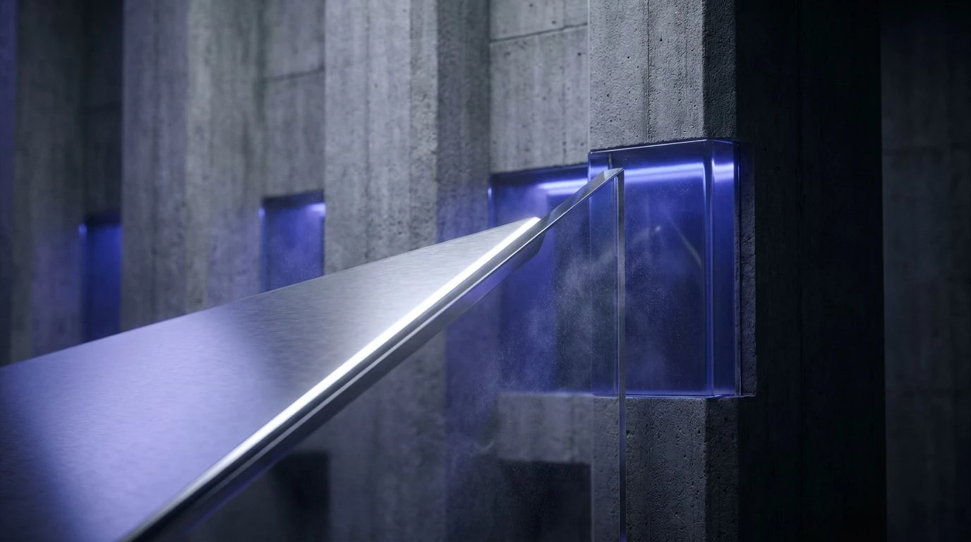
The modern workspace often falls into the trap of assuming neutrality equals concentration. Industrial Urgency challenges this by introducing a severe visual hierarchy. Frosted Iron and Slate Shadow establish a serious, unyielding foundation, preventing the mind from wandering. However, the sudden intrusion of Siren Red introduces an aggressive note, demanding immediate attention and creating a sense of deadline-driven panic rather than sustained focus. Electric Azure provides a brief visual relief, yet the overall experience remains tense. This is not a room designed for quiet contemplation. It is built for rapid, perhaps stressful, execution. It demonstrates the risk of relying purely on high-contrast extremes, where the pursuit of an energetic environment instead creates a fatiguing visual battleground.
Measured Optimism 📝
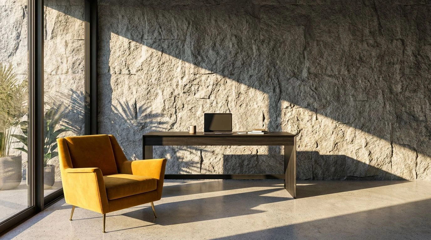
When designing a room for deep thought, consistency proves more valuable than shock value. Measured Optimism provides a masterclass in controlled stimulation. The transition from Pumice to the heavier Stone Wall creates a dependable, grounding backdrop that refuses to compete for attention. Against this steady environment, Morning Sunlight and Turmeric operate not as distractions, but as necessary psychological lifts. They mimic the gentle progression of daylight across a desk, offering a sense of forward momentum without disrupting concentration. This specific arrangement prevents the mind from succumbing to the lethargy often associated with monochromatic grey spaces. It strikes a precise balance, ensuring the room remains professional and serious while remaining genuinely pleasant to occupy over long hours.
Creative Friction ⚡
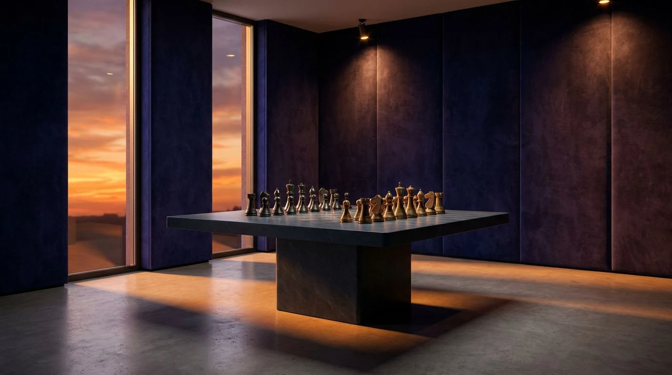
A home office requires a certain tension to maintain mental acuity, an idea perfectly realized within Creative Friction. The arrangement relies on the sharp disagreement between Bright Yolk and Deep Espresso, pairing a cheerful, unapologetic bright tone against an almost aggressive dark weight. This prevents the atmosphere from becoming too relaxed. Concrete and Cloud Cover act as the necessary neutral territory, giving the eye a place to rest amid the competing extremes. The unexpected addition of Neon Aqua serves as a sharp, modern interjection, suggesting a space geared toward technological innovation rather than traditional paper-bound tasks. This environment rejects monotony entirely, demanding alertness from its occupant and proving that a workspace can be highly functional while embracing an almost confrontational visual attitude.
Information Overload 📊
Attempting to signal high intelligence through complexity often yields diminishing returns. Information Overload illustrates this principle perfectly. By introducing a vast array of strong signals ranging from Alert Red to Cobalt and Deep Cyan, the environment mimics the chaotic feeling of a constantly refreshing digital dashboard. While Glacial Grey and Steel attempt to enforce a sense of order, they are entirely overwhelmed by the aggressive demands of the competing brilliant tones. A workspace employing this arrangement quickly becomes visually exhausting, mirroring the anxiety of an overbooked calendar rather than the calm of a focused mind. It stands as a cautionary example of overdesigning a room. When an office tries to be energetic, serious, creative, and urgent all at once, it ultimately fails to support any single state of mind effectively.
Scholarly Light 🏛️
True intellectual spaces do not need to shout their purpose. Scholarly Light demonstrates how careful gradations of light can construct an environment that feels both expansive and highly disciplined. The vast, unmarked territory of Pure Paper and Morning Mist opens the room, suggesting clear thinking and boundless potential. The intelligence here lies in the measured application of warmth. Canary and Chiffon offer a gentle, pervasive cheerfulness, while Antique Gold and Library Bronze provide historical weight and seriousness. Gunmetal anchors the entire arrangement, ensuring the lightness does not drift into frivolity. This creates a room that feels simultaneously modern and rooted in traditional academic rigor. It is an environment designed for sustained, clear-headed analysis, proving that a space can project vitality without sacrificing an ounce of authority.
The spaces we construct for our daily labor do more than just house our monitors and files. They govern our mental endurance over long hours. Opting for a generic, middling slate tone guarantees nothing but a slow creep toward apathy. The deliberate calibration of light, shadow, and targeted color determines the difference between an ordinary spare bedroom and a dedicated theater of professional thought. By actively managing the relationship between grounding neutrals and stimulating brights, individuals can architect an environment that actively participates in their success, ensuring their physical surroundings remain as sharp and alert as the work they produce within them.