Industrial Grey Color Palettes for Luxury Skincare Design
· 5 min readHigh-end beauty spaces have long obsessed over pristine surfaces, favoring clinical whites and soft botanical greens to signal purity. But the modern bathroom shelf resembles an architectural studio more than a traditional vanity. Consumers are shifting toward heavier, tactile materials like poured concrete, oxidized steel, and frosted glass. Introducing a heavy, asphalt-like dark grey into a palette of natural olives and rich clays strips away the delicate, over-polished veneer of premium skincare. It roots the brand in a physical, tactile reality. This raw, industrial weight anchors natural ingredients, making the packaging feel substantial, modern, and unapologetically real.
Brutalist Botanica 🌿
Brutalist Botanica introduces a warmth that directly challenges the sterile, cold aesthetics of yesteryear. The pairing of Fired Terracotta and Oxidized Soil creates a rich, clay-like foundation, recalling unglazed ceramic vessels and raw earth. Alabaster Plaster acts as a quiet, matte canvas, allowing the muted greens of Crushed Sage and Heavy Olive to step forward as the botanical identifiers. This is where the dark, shadowy depths of Deep Obsidian step in to ground the entire visual system. Rather than floating in an airy, spa-like space, this collection feels anchored and architectural. Imagine heavy glass bottles with dark, textured metal caps resting on a travertine counter. The deep, almost charcoal shadow brings an undeniable gravity, proving that natural ingredients can carry an edgy, substantial presence without losing their premium appeal.
Asphalt Apothecary 🧫
The stark contrast in Asphalt Apothecary strips skincare packaging down to its most structural elements. Industrial Carbon acts as the heavy, unyielding anchor, instantly transforming a lightweight visual identity into something that demands space on a shelf. When placed alongside the pale, slightly acidic Sulfur Cream, the dark shadow feels intentional and modern, like heavy typography printed on textured, recycled stock. Foraged Khaki and Oxidized Copper bring just enough natural reference to signal botanical efficacy, yet they remain muted and dusty, avoiding any overly lush or tropical associations. Framed by crisp Titanium White, the tension between the clinical and the industrial takes center stage. This palette thrives in minimalist environments featuring stainless steel fixtures and unpolished concrete floors, giving the product line an authoritative, no-nonsense credibility that feels highly engineered.
Concrete Flora 🥀
Concrete Flora demonstrates how unexpected color relationships can redefine luxury beauty. The soft, powdery touch of Raw Sandstone sets a familiar skin-centric tone, but it is quickly disrupted by the cool, architectural weight of Poured Concrete. This mid-tone grey serves as a structural bridge to Asphalt Shadow, a deep, brooding tone that gives the brand an undeniable street-level realism. The inclusion of Crushed Brick and Bruised Plum introduces a muted, slightly subversive floral note, recalling dried petals pressed against a city pavement. It creates a tactile, slightly moody atmosphere for products like exfoliating masks or heavy night creams. The design language here speaks to thick, matte tubes and heavy jars that feel cold to the touch, appealing to an audience that values authenticity and raw materials over high-gloss perfection.
Utilitarian Edge 🔧
In Utilitarian Edge, the collision of muted metals and bright, synthetic pops creates a highly technical, lab-driven aesthetic. Scaffolding Silver and Matte Zinc build a clinical, sterile environment, mirroring the anodized aluminum tubes and metallic labels seen in forward-thinking apothecary brands. Tar Pitch delivers the necessary dark, heavy baseline, ensuring the lighter greys do not float away into obscurity. Against this stark, brutalist backdrop, Rusted Iron and Industrial Brass add an earthy, aged quality, suggesting time-tested formulations and raw extraction processes. The sudden jolt of Electric Cobalt alongside Acidic Moss introduces a hyper-modern, almost chemical vibrancy, signaling active ingredients and potent serums. The resulting mood is distinctly unisex and performance-oriented, turning the daily skincare routine into an act of precision maintenance rather than passive pampering.
Oxidized Canopy 🏭
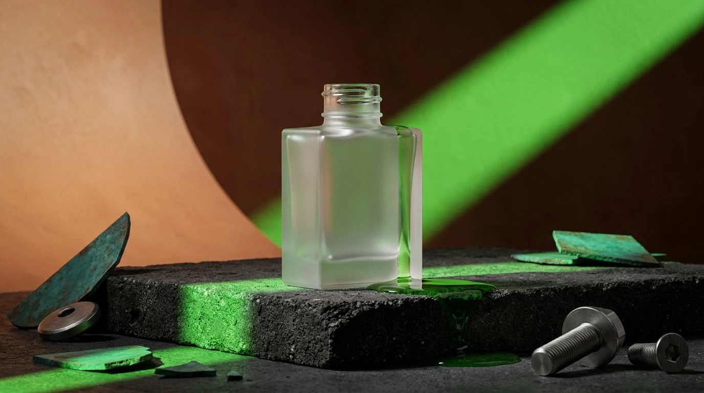
Oxidized Canopy explores the intersection of untamed nature and built environments. The foundational warmth of Cured Tobacco and Sunbaked Clay establishes a rich, organic base, reminiscent of mud masks and botanical balms. However, the introduction of Brushed Steel shifts the entire narrative away from the spa and into an industrial laboratory. This cool, metallic tone acts as a palette cleanser, preparing the eye for the aggressive, vibrant strike of Synthetic Chlorophyll and the muted, oxidized feel of Patina Teal. This combination works exceptionally well for brands emphasizing sustainability through technical innovation. The packaging translates beautifully to brushed aluminum bottles with heavy, dark grey pumps, offering a tactile experience that feels permanent and considered. The contrast between rich earth and cold metal secures a premium, highly intentional presence on the vanity.
Stepping away from the delicate, airy visuals historically associated with high-end beauty opens the door to a more grounded, tactile design language. Introducing heavy, asphalt-like tones into natural botanical color schemes completely changes how a product occupies physical space. It shifts the perception from fragile luxury to something robust, architectural, and deeply authentic. Consumers are looking for brands that feel real to the touch, with visual identities that match the weight of poured concrete and oxidized metal. By anchoring earthy greens and warm clays with unyielding, industrial darks, packaging design becomes a permanent fixture in the modern, minimalist home, demanding attention through raw material presence rather than polished artifice.