

Bold Recruitment Color Palettes for High-Impact Design
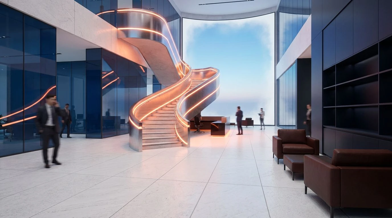
Olive and yellow tones transform dull career pages into vibrant hiring hubs. Boost engagement by using sophisticated color theory to attract talent.
· 5 min readAggressive Color Palettes for High-Performance Design

Bold magenta and dark grey pairings create high-energy social media assets. Master this striking color contrast to drive engagement and results.
· 6 min readRetro Neon Color Palettes for High-Converting Sales Pages
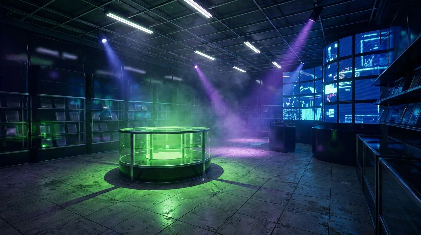
High-contrast 80s aesthetics can shatter scroll fatigue. Master the use of electric neon and dark modes to drive urgency and boost digital sales.
· 5 min readCoral Pink & Steel Gray: Best Color Palette for Tech Design
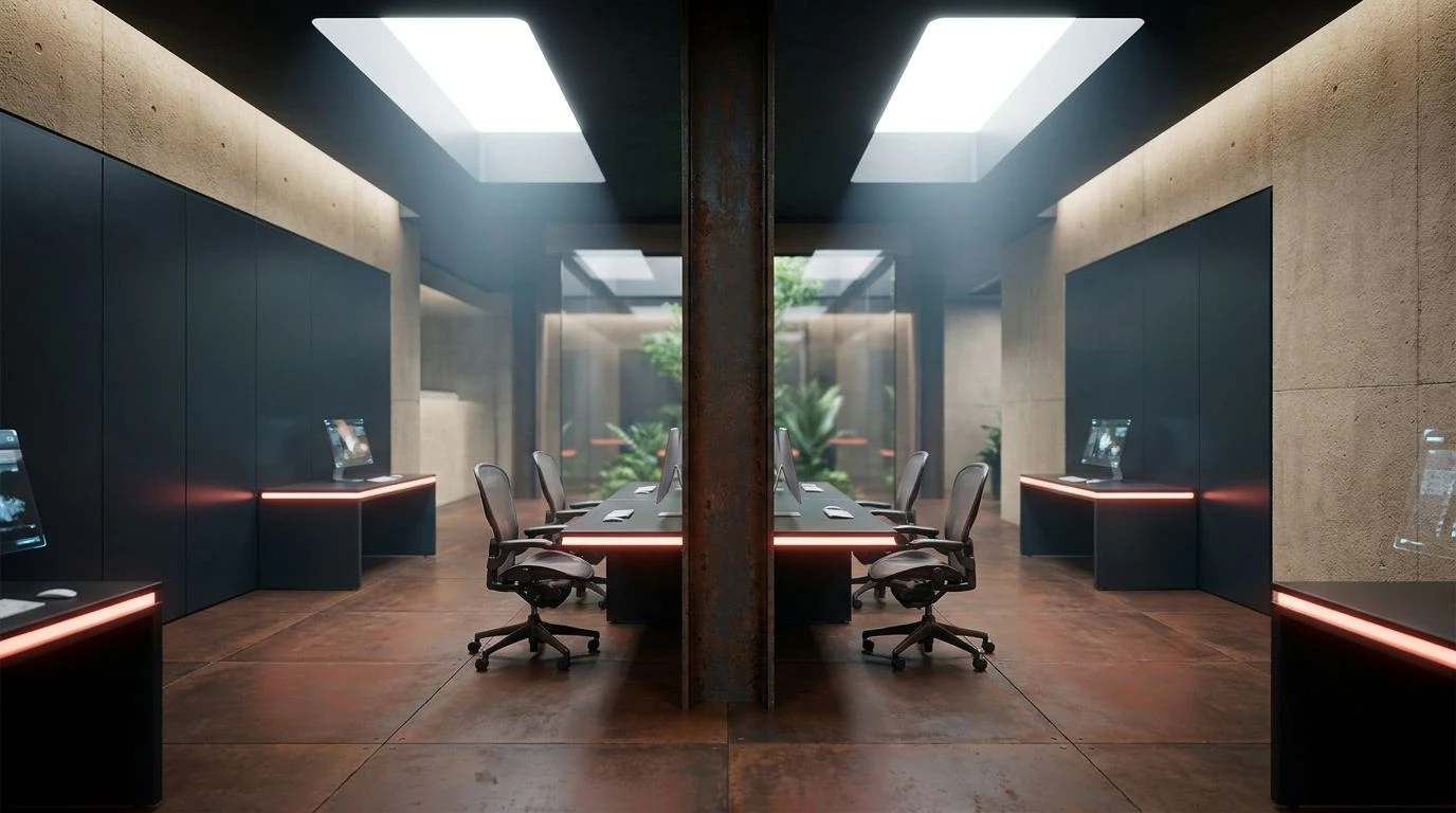
Coral pink and technical gray #6d7881 create a cognitive harmony that boosts creativity and focus in modern tech-driven workspace branding.
· 6 min readHigh Visibility Color Palettes: A Bold Interior Design Trend
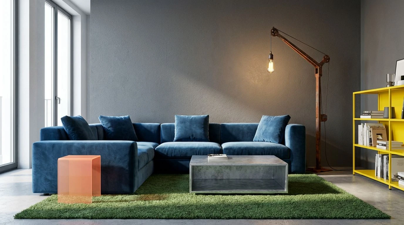
Hazard orange and neon lime transform modern homes. Safety gear hues bring high-voltage energy to living rooms through industrial-chic accents.
· 5 min readIndustrial Color Palettes: Using Blue for Icon Design

Master industrial grit by pairing heavy charcoal tones with electric blue. Create high-contrast UI designs that balance raw textures and clarity.
· 6 min readAmber and Black Color Palettes for Moody Dining Room Design
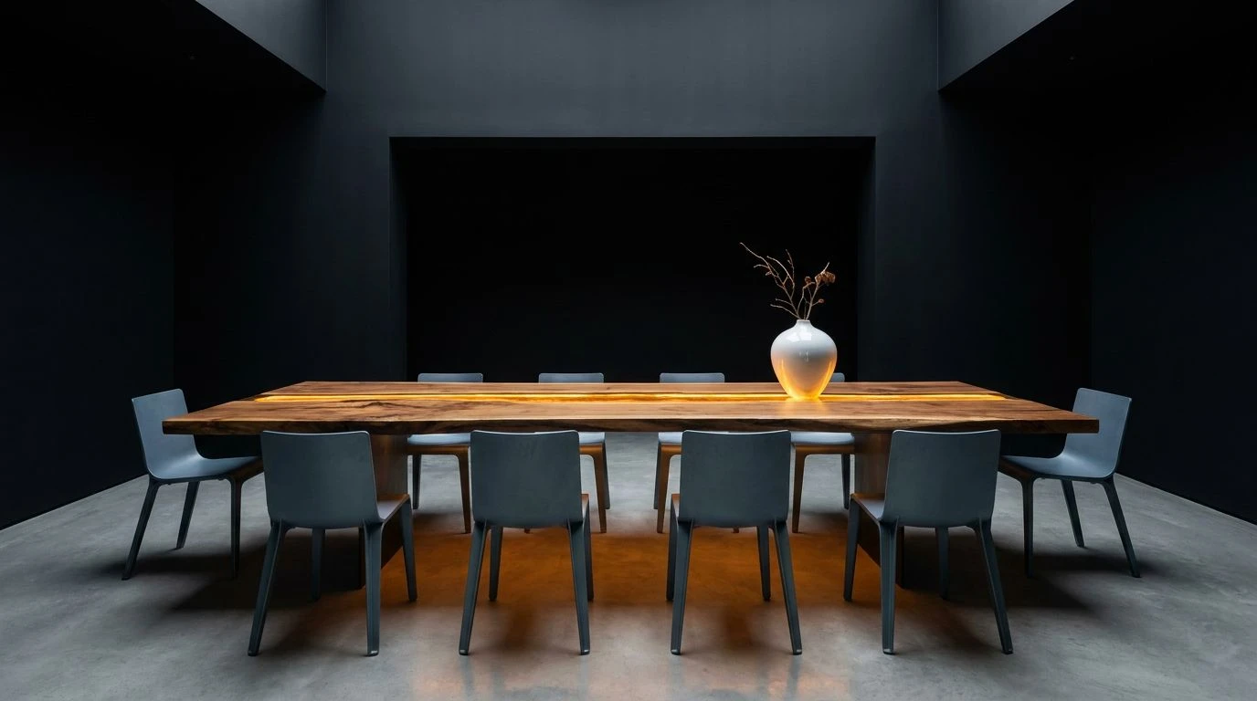
Transform chaotic interiors into focused gathering spaces using high-contrast tones that mimic the hearth to improve communal bonding and focus.
· 5 min readIndustrial Pink Color Palettes for Modern Interior Design

Steel mill aesthetics meet coral tones in this unique design study. Master the art of balancing heavy industrial blues with soft organic pinks.
· 6 min readMed Spa Color Palettes: Burnt Sienna & Gold Design Trends
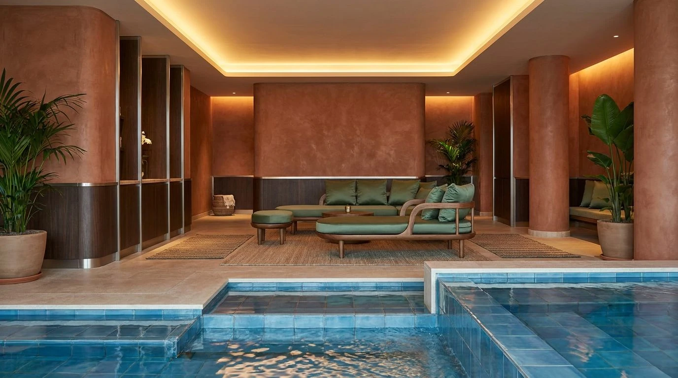
High-end wellness spaces are replacing clinical white with warm earth tones to boost client comfort and redefine modern luxury interiors.
· 5 min readIndustrial Blue and Charcoal Color Palettes for Hardware

Hardware startups utilize heavy grays and technical blues to signal reliability. Master the visual language of engineering and precise design.
· 5 min readBlack and Gold Kitchen Color Palette Design Trends 2024
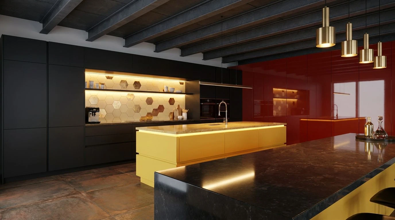
Bold yellowish-gold and matte black cabinetry create a high-contrast kitchen space that balances formal elegance with vibrant, energetic warmth.
· 6 min readMastering Spa Color Palettes: Balancing Urgency and Peace
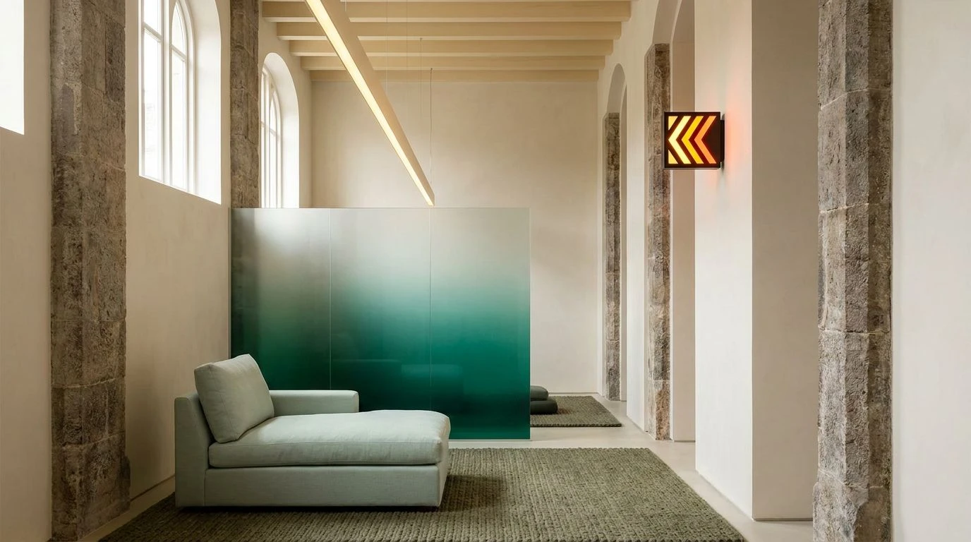
Vivid citrus accents meet deep oceanic blues to create safe, restorative interiors. Achieve a visual balance between safety alerts and sanctuary.
· 5 min readNavy Color Palettes for Grounded Holographic Home Offices
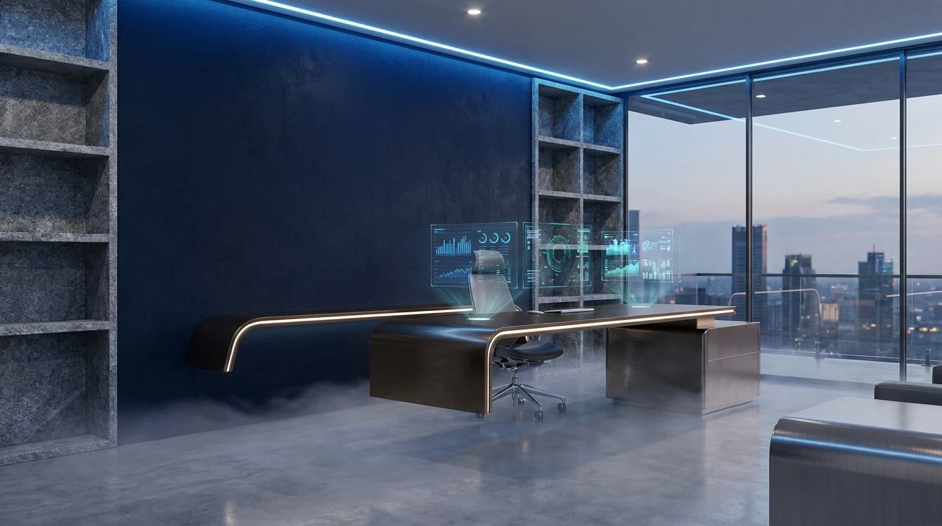
Deep navy backgrounds stabilize virtual reality workspaces, reducing eye strain and enhancing focus by anchoring luminous holographic interfaces.
· 6 min readSage Green Color Palettes: A New Vision for Wellness Design
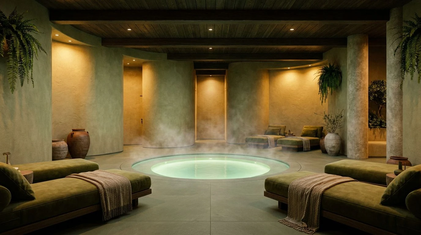
Muted botanicals and sage green hues are replacing clinical white in modern spas to create restoration through visual warmth and organic tones.
· 5 min readElectric Blue Color Palettes in Modern Tech Branding

High-octane blue hues dominate tech design by signaling artificial intelligence and innovation through specific neurological triggers and optics.
· 5 min readMahogany and Turquoise Color Palettes for Gaming Rooms
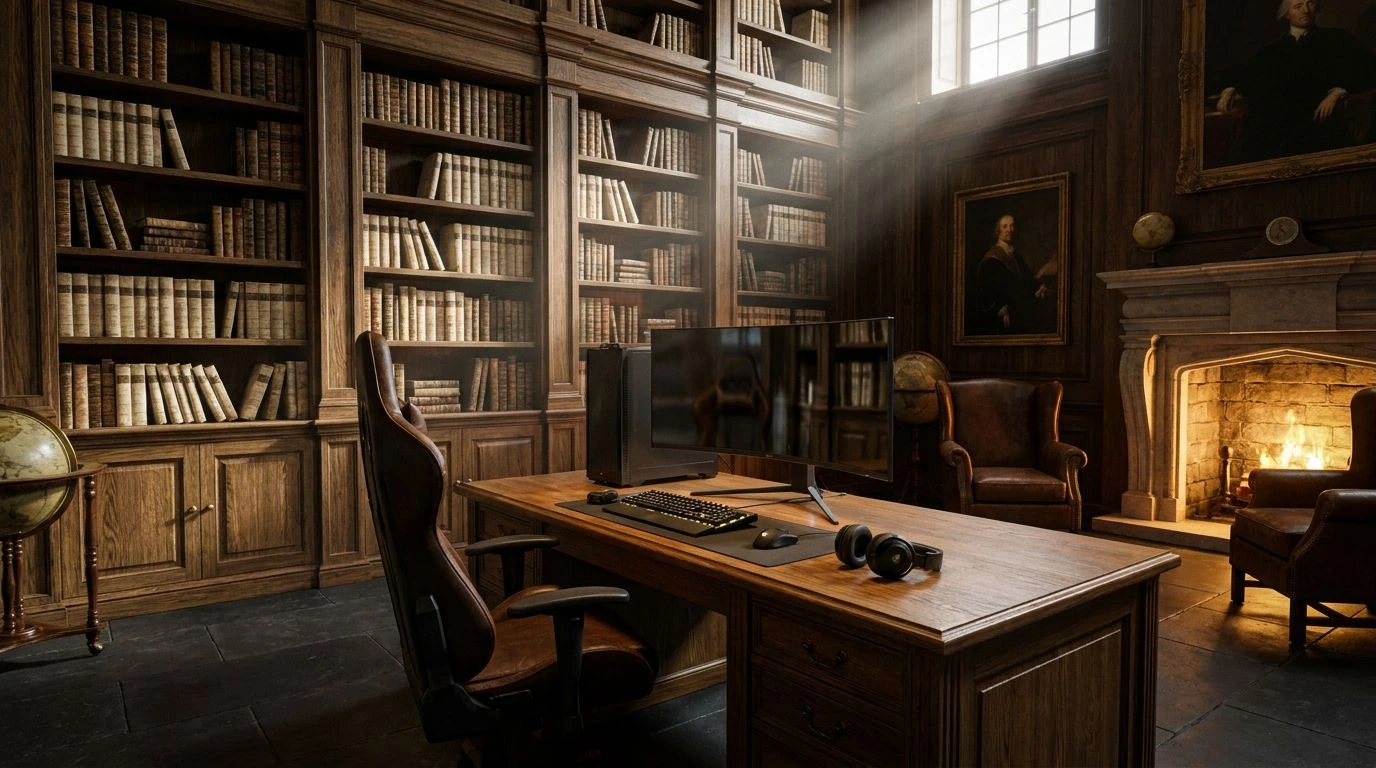
Mahogany and turquoise design elements bridge the gap between digital play and academic luxury. Transform your gaming suite into a classic library.
· 6 min readHigh-Visibility Orange Color Palettes for Brand Design

Industrial safety meets modern finance in this guide to aggressive orange color schemes. Master high-impact branding using maritime-inspired hues.
· 6 min readDreamcore Design: Pink and White Industrial Color Palettes

Neo-surrealism meets logistics in this study of pink fog aesthetics. Master the art of ethereal industrial design for surreal, nostalgic spaces.
· 6 min readBold Pop Art Color Palettes for Modern App Interface Design
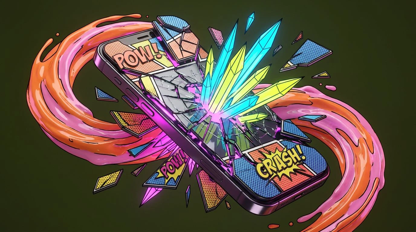
Transform digital screens with primary colors and De Stijl geometry. These high-contrast palettes bring comic book energy to mobile UI layouts.
· 6 min readBoost User Retention with De Stijl Color Palette Design
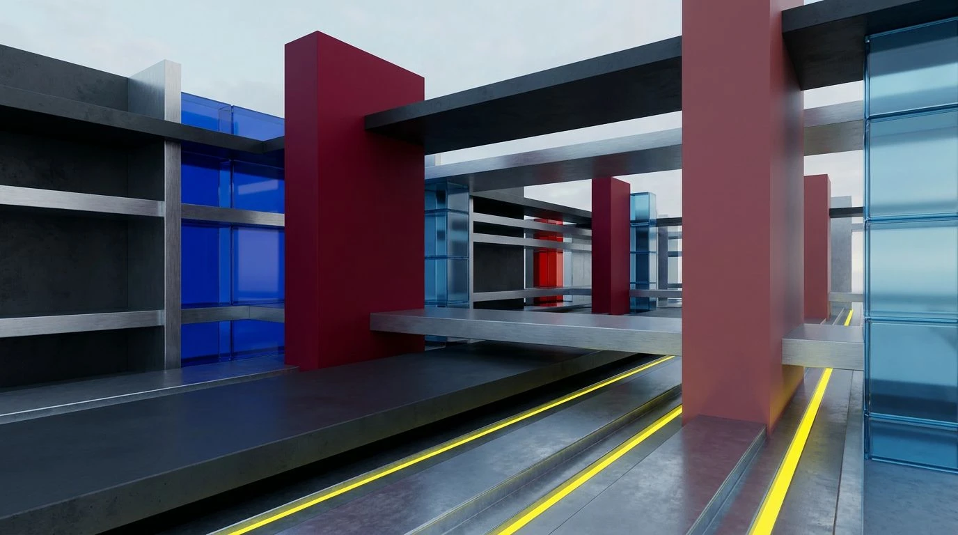
Master high-contrast neo-plasticism principles to reduce cognitive load and guide user flow with bold red and blue primary color hierarchies.
· 6 min read