Boost User Retention with De Stijl Color Palette Design
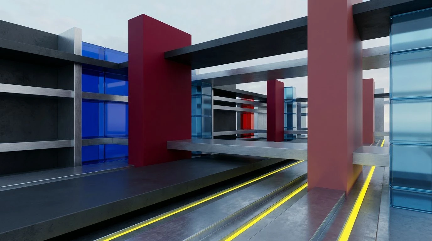
· 6 min readWhen the human visual system processes digital interfaces, cognitive overload is a constant threat. The principles of De Stijl, an early twentieth-century art movement built on strict geometry and primary colors, offer a remarkably effective solution for guiding modern visual attention. By stripping visual information down to pure horizontal and vertical lines populated by bold reds and deep blues, this aesthetic creates a functional industrial style that drastically reduces visual noise. The brain is naturally wired to notice sharp contrasts and distinct boundaries. Applying these neo-plasticism concepts to user flow transforms a chaotic screen into an orderly, predictable space. Red activates the optic nerve, signaling urgency and interactive potential, while blue grounds the visual field, establishing a calm, authoritative structure. Together, they create a high-contrast rhythm that directs the eye exactly where it needs to go, maintaining engagement and optimizing user retention through psychological clarity and structural confidence.
Primary Momentum 🟦
Primary Momentum 🟦 uses a complex variation of the De Stijl methodology, introducing varying weights of color to manage cognitive processing. Engine Red and Oxidized Crimson act as the primary visual anchors. When the retina detects these long-wavelength colors, it immediately flags them as high-priority information, making them ideal for critical action buttons or urgent notifications. Opposing this thermal intensity, Electric Cyan and Deep Abyss provide necessary visual rest. The human eye finds shorter wavelengths like blue less taxing to process over long periods. By constructing a digital environment where Steel Blueprint and Atmospheric Blue form the structural foundation, the interface feels remarkably stable and organized. Small interventions of Industrial Brass and Sulphur Yellow can be deployed to gently break the monotony of the blue expanse without triggering the full alarm response of the reds. This precise control over physiological arousal prevents user fatigue, encouraging a sustained state of flow that is critical for keeping individuals engaged with a digital tool over extended sessions.
Engineered Cognition ⚙️
The arrangement within Engineered Cognition ⚙️ demonstrates how desaturation can modify the stark nature of pure neoplasticism into a more measured functional industrial style. Kiln Brick replaces the typical primary red, offering a slightly muted but still highly visible stimulus that draws attention without causing visual strain. This is particularly useful in complex dashboards where users must monitor data for hours. The heavy presence of Carbon Graphite and Concrete Dust provides a neutral, high-contrast background that allows the functional colors to stand out sharply. When Blueprint Azure and Static Indigo are introduced as navigational guides, they create a clear, logical pathway through the information architecture. The visual cortex relies on such consistent color coding to build spatial maps of an interface. Adding sudden pops of Welder Spark or Machine Moss creates secondary points of interest, directing gaze toward changing statuses or new inputs. By organizing color to mimic the predictable layout of a physical control panel, this palette builds user trust and structural confidence, drastically lowering the mental effort required to navigate complex systems.
Neo-Plastic Flow 🟥
Neo-Plastic Flow 🟥 is the most direct application of pure De Stijl principles, relying on stark, uncompromising contrasts to dictate eye movement. By utilizing Matte Iron and Galvanized Steel as the structural grid, the interface establishes a rigid, industrial framework. Against this monochromatic scaffolding, Signal Crimson and Hazard Yellow behave as powerful optical interrupts. The contrast ratio between these vivid colors and the grayscale background forces the viewer to process the highlighted elements first. This phenomenon, known as pop-out search, means the user does not have to consciously scan the screen to find the next step in a sequence; their attention is automatically pulled there. Cobalt Construct and Ozone Blue serve to balance the aggression of the warm colors, providing a cool, stable zone for secondary information or persistent menus. The resulting experience is one of pure functional clarity. The user feels a sense of speed as they are guided effortlessly from one interaction to the next, entirely avoiding the decision fatigue that typically causes early abandonment of a digital task.
Optic Grid 🔲
Though diverging from traditional primary reds, Optic Grid 🔲 utilizes the same perceptual mechanics of De Stijl through intense, high-frequency contrasts. Instead of red, Phosphor Green and Laser Indigo act as the high-energy activators against the vast, empty space of Sterile White. The sheer luminosity of Glacial Cyan and Ultraviolet Mist creates a sensation of digital electricity, mirroring the functional industrial style but moving it into a highly active context. When the brain encounters such sharp, saturated colors enclosed by dark boundaries like Void Navy, it registers a strong sense of hierarchy. The dark tones recede, forming deep structural channels, while the bright colors advance toward the viewer, demanding immediate interaction. This creates an optical push and pull that drives the user forward through a workflow. Fired Clay provides a rare moment of organic warmth in an otherwise highly synthetic environment, offering a subtle visual reset. By strictly controlling these aggressive visual elements, a designer can construct a pathway that holds attention completely, preventing the gaze from drifting and keeping the user locked into the intended sequence.
Structural Stimulus 🏗️
Structural Stimulus 🏗️ strips the interface down to its most raw and communicative elements, heavily favoring the activating power of red to command attention. Warning Red and Thermal Flare dominate the visual field, acting as unmistakable signals for action. Because long-wavelength colors are processed rapidly by the visual system, using them against the stark neutrality of Girders Gray and Ash Cement ensures that interactive elements cannot be ignored. The grayscale tones provide the necessary architectural weight, creating the firm, unyielding boundaries characteristic of early twentieth-century geometric art. Industrial Acid introduces a subtle shift in the color spectrum, providing just enough variety to prevent habituation, a phenomenon where the brain stops noticing a stimulus after prolonged exposure. By maintaining a strict, almost brutalist approach to color distribution, this arrangement removes all unnecessary decoration. The resulting environment feels purposeful and highly functional. Users move through the provided architecture with speed and certainty, drastically improving task completion rates and fostering a sense of mastery over the digital environment.
The visual processing required to navigate digital spaces is deeply influenced by the strict, geometric organization of color. By adopting a functional industrial style inspired by early twentieth-century art, designers can manipulate human perception to create highly structured, readable environments. High-contrast elements act as immediate visual cues, while deep, stable tones provide the necessary spatial grounding to prevent cognitive overload. This careful orchestration of wavelength and contrast reduces visual friction, allowing the brain to process pathways and hierarchies without conscious effort. Ultimately, constructing an interface with such deliberate, purposeful geometry leads to a more confident and sustained interaction, keeping users actively engaged through sheer perceptual clarity.