Bold Pop Art Color Palettes for Modern App Interface Design
· 6 min readEvery time you tap an app icon, you are silently participating in a visual rebellion. Forget the soothing, muted restraint of the early smartphone era, where rounded corners and pastel gradients promised a zen like digital existence. The modern interface is bored of being polite. Instead, it wants to scream off the screen, channeling the high octane, hyper colored madness of a mid century comic book while tearing up the structural rulebook of early twentieth century art. It is a visual shift that takes the rigid geometry of De Stijl and crashes it into the loud, mass produced provocations of pop culture. We are looking at screens that demand attention through sharp contrasts, unapologetic primary colors, and a shattered approach to layout. This is not about making your daily scrolling smoother. It is about waking you up with a visual slap in the face, turning mundane tasks like checking a bank balance or ordering a pizza into a high stakes graphic novel.
Acid Pop Overload 💥
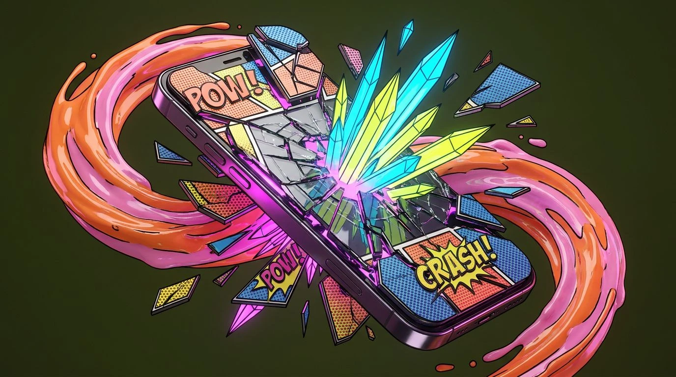
There is nothing quiet about Acid Pop Overload. It feels like a comic book villain has hacked into your daily calendar and rewritten the schedule in toxic markers. Tangy Tangerine and Radioactive Lemon collide with an almost aggressive cheerfulness, while Bruised Olive grounds the madness just enough to keep your eyes from watering. When Electric Cyan cuts across the screen, it serves as a digital highlighter for the things you cannot ignore. Then come the pinks. Bubblegum Static and Magenta Pulse do not just sit on a page; they vibrate, creating a relentless tension that mimics the adrenaline rush of endless scrolling. Applying this scheme to an interface means throwing out the idea of user comfort and replacing it with pure, unadulterated stimulation. It transforms a normal notification into a screaming headline, ensuring that whoever is looking at the screen feels an immediate, almost jittery sense of urgency. It is loud, it is brash, and it refuses to apologize for taking up space.
Mondrian's Gridlock 🔲
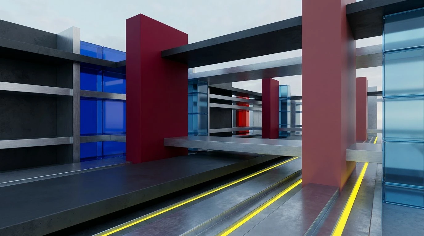
Mondrian's Gridlock takes the strict, disciplined geometry of early modernism and drags it into the hyperactive swiping of the modern smartphone. The foundation here is stark, relying on Void White and Concrete Shadow to build a seemingly stable, ordinary structure. But that stability is a trap. Suddenly, Manifesto Red punches through the interface like a warning sign, demanding immediate action. Tarnished Brass and Schoolbus Yellow offer flashes of caution and commercialism, reminiscent of cheap print ads from a bygone era, while Asphalt Gray provides a heavy, brutalist anchor to keep the layout from flying apart completely. A sudden flash of Teal Interruption breaks the primary color monopoly, adding a weirdly modern twist to an otherwise retro rebellion. When an app uses these shades, it divides the screen into rigid, uncompromising blocks of content that fight for dominance. It is a strictly organized chaos, turning a simple navigation menu into a high stakes architectural floor plan.
Constructivist Swipe 📱
If early twentieth century political posters were redesigned for a contemporary mobile application, they would look exactly like Constructivist Swipe. The visual weight here is heavy and uncompromising. Propaganda Red acts as the undisputed loudmouth of the group, grabbing you by the collar the second the app loads. It is dragged down into the gritty reality of Rusted Iron, a shade that feels like industrial machinery grinding against the glass of your phone. Faded Newsprint offers a cynical backdrop, a dingy off white that makes the bolder choices stand out with even more aggression. The surprise comes from Spearmint Glitch, a sharp, artificial mint tone that feels like a software error interrupting a vintage broadcast. Finally, Midnight Ink swallows the remaining space, providing deep, bottomless contrast. Navigating an environment draped in these tones feels like flipping through a radical zine. The layout becomes less about smooth transitions and more about abrupt, demanding statements that force you to interact whether you want to or not.
Lichtenstein's Ghost 👻
The stark emptiness of True Black and Blank Canvas sets a deceptive stage in Lichtenstein's Ghost, whispering promises of a clean, corporate experience before completely pulling the rug out from under you. Once the background is established, Burnt Orange Peel bursts onto the scene with the dramatic flair of a cartoon explosion, leaving little room for polite navigation. Apricot Halftone softens the blow just a fraction, mimicking the dotted shading techniques of cheap vintage printing, only to be immediately overpowered by Warning Yellow. This yellow does not ask for your attention; it flashes like a hazard light on a broken down arcade machine. Anchoring this erratic energy is Poolside Turquoise, a weirdly nostalgic splash of cool water that feels completely out of place and yet exactly right. An app draped in this scheme turns every button into a sound effect and every swipe into a page turn. It brings an inescapable sense of melodrama to the digital realm, making even the most boring forms feel like a thrilling cliffhanger.
Bauhaus Breakdown 🧩
There is a frantic, shattered quality to Bauhaus Breakdown, as if a highly organized design system fell down a flight of stairs and decided it liked the way the pieces landed. Alarm Bell Red and Cerulean Shock act as the primary antagonists, loudly competing for eye tracking supremacy across your screen. They are grounded by the vintage, weathered feel of Oxidized Gold and Custard Stain, colors that smell faintly of old paper and dusty drafting tables. But this is not a museum piece. Carbon Dust and Fogged Glass add a harsh, industrial screen quality, creating a clinical cage for the brighter tones to bounce around in. Patina Green and Indigo Blueprint serve as the functional, utilitarian workers of the group, the colors of hyperlinked text and actionable buttons that have been twisted into something far more aggressive. Exploring an environment painted in these shades feels like walking through a deconstructed machine. It demands that the user figure out how the fractured puzzle fits together, making the act of clicking feel like a bold architectural decision.
The era of the invisible, polite digital space is officially dead. We are now carrying pocket sized galleries of rebellion, where every swipe and click is an interaction with aggressive color blocking and fractured layouts. These choices prove that our daily screens do not need to be soothing or seamless to be effective. By embracing the brash, defiant ethos of comic books and the rigid, broken rules of historical art movements, modern design has found a way to make us actually feel something when we look at our phones. The visual assault of bright yellows, heavy reds, and stark contrasts serves as a necessary wake up call in a sea of beige monotony. It turns the simple act of operating a device into a vibrant, provocative statement, proving that even the most mundane chores can hold the thrilling, unpredictable energy of a freshly printed graphic novel.