Industrial Pink Color Palettes for Modern Interior Design
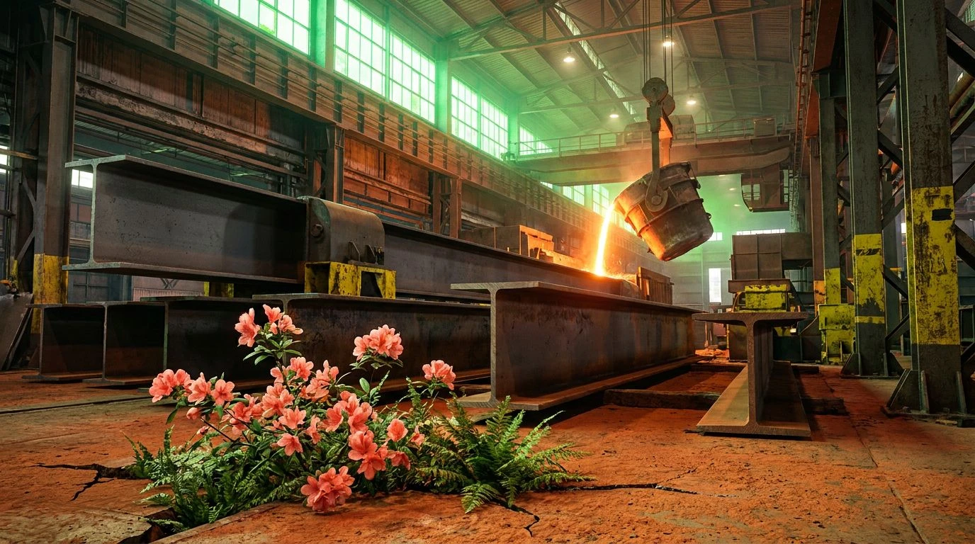
· 6 min readThere is a distinct, visceral charge that happens when the raw, heavy weight of manufacturing meets the sudden softness of a seasonal shift. Think of a sprawling steel mill, defined by acres of structural I-beams, cold concrete, and endless expanses of utilitarian grey. Now introduce a shock of coral pink. This unexpected collision offers a fresh take on industrial design styling. It is a visual dialogue between the relentless churn of heavy industry and the irrepressible energy of new growth. We are looking at environments where cool, engineered blues press right up against warm, organic corals, creating spaces that feel both highly functional and boldly alive. The contrast is sharp but wildly effective, stripping away the sterile reputation of raw manufacturing zones and replacing it with a vibrant, diverse material language. By placing delicate tones against unyielding backgrounds, designers can build interiors and brand identities that feel grounded yet entirely forward-looking.
Blast Furnace Flora 🏭
With Blast Furnace Flora, the conversation between heavy industry and seasonal growth becomes impossible to ignore. The deep, heavy grounding of Cast Iron and Machinist Blue sets a utilitarian stage, mirroring the sprawling, functional spaces of a working factory floor. Against this stern backdrop, Molten Coral breaks through with surprising warmth. This specific pink acts as a visual disruptor, pulling the eye and softening the severe edges of Brushed Aluminum. Factory Moss and Rust Slag add organic texture, recalling the sight of opportunistic plants reclaiming the edges of a metalworks. Designers could apply this color logic to large-scale hospitality or retail interiors, wrapping vast warehouse spaces in Welders Chambray while reserving the bright, energetic pink for key interactive touchpoints or custom powder-coated seating. The resulting space feels incredibly active and diverse, balancing the cool, calculated weight of metalwork with a sudden, joyful burst of spring.
Heavy Machinery Bloom 🌸
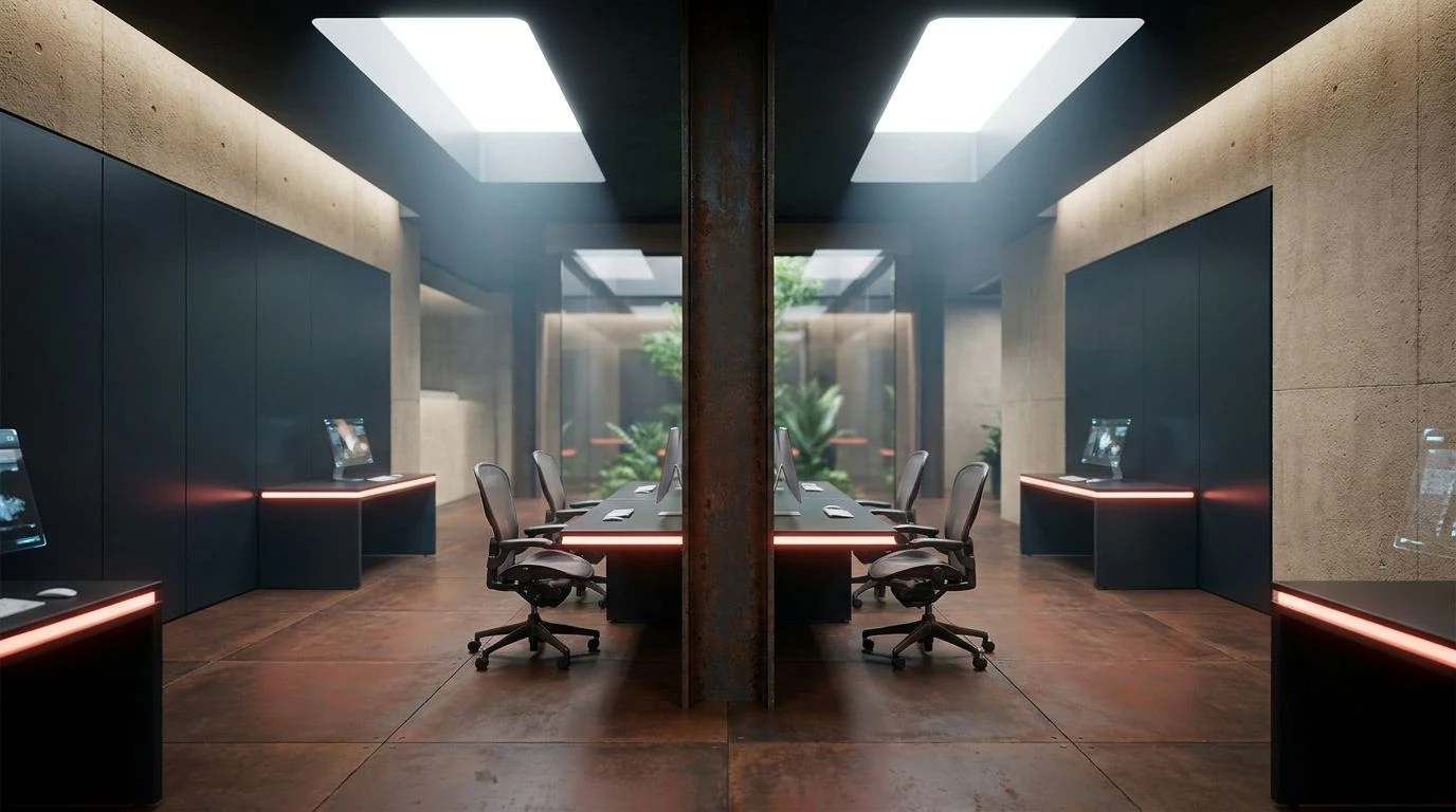
Heavy Machinery Bloom takes the raw materials of construction and gives them an unexpected botanical twist. You can almost smell the cold metal and fresh rain. Here, the utilitarian foundation is built upon Galvanized Steel and Anodized Grey, providing a distinctly architectural and rigid baseline. But the space completely transforms with the introduction of Oxidized Peach. This soft, dusty coral behaves like a sudden bloom breaking through the concrete, creating a sharp material contrast against the dark, oily presence of Soot Black. Blueprint Teal acts as a structural bridge, maintaining the engineered aesthetic while cooling down the warmth of the peach and Workwear Khaki. In practice, this color strategy works beautifully for modern workplace designs, where exposed ceilings and Bleached Concrete floors can be paired with bright, sculptural furniture pieces. The pairing establishes a diverse material language that feels highly engineered yet remarkably human, softening the imposing nature of brutalist structures.
Spring Assembly Line 🌿
Though leaning heavily into crisp greens and cool greys, Spring Assembly Line captures the exact moment a dormant manufacturing facility wakes up. The industrial baseline is carved out by Carbon Dust and Sheet Metal, echoing the sprawling, unyielding surfaces of a production line. Blueprint Slate offers a technical, drafting-table coolness that grounds the space in pure function. The unexpected energy comes from Neo Mint Spring and Smudged Emerald, injecting a startlingly fresh organic quality into the otherwise mechanical environment. Accented by the aged, utilitarian warmth of Industrial Brass, the entire arrangement speaks to an environment in transition. For product design or modern architectural interventions, you might use Raw Porcelain to wrap the vast exterior, while hiding these electric, vegetative greens inside elevator shafts or along internal stairwells. It creates an experience of discovery, where the stoic, reliable nature of heavy manufacturing suddenly reveals a diverse, energetic interior life.
Smelter Spring Awakening 🏗️
Smelter Spring Awakening thrives on extreme visual friction. The combination aggressively pits the high-visibility world of safety equipment against the organic warmth of a new season. Forge Cinders provides a dark, scorched foundation, immediately communicating the immense heat and scale of heavy manufacturing. Piercing through this darkness, Heated Coral and Warning Light Red demand immediate attention. The coral tone brings an unexpected softness to the aggressive red, softening the blow without losing the industrial edge. Heavy Cobalt and Milled Aluminum serve as the cool, structural counterpoints, reminding the viewer of rigid steel beams and protective metal casings. Finally, Verdigris Pop adds an oxidized, chemical green that bridges the gap between natural decay and factory production. Applied to a modern gallery or experimental retail space, using this palette means letting the raw, heavy metals dominate the architecture while utilizing the vibrant corals and oxidized greens for soft furnishings and temporary installations.
Mill Yard Botanical 🌼
The chaotic, vibrant energy of a factory exterior being reclaimed by nature defines Mill Yard Botanical. This palette refuses to be quiet, mixing the muted, functional tones of heavy labor with violently bright seasonal markers. Charcoal Slag and Steel Scrap build the necessary scaffolding, grounding the eye in recognizable industrial materials. The scene completely shifts with the introduction of Acid Spring and Overgrown Fern, bringing a hyper-real, almost synthetic botanical energy that fights against the grey. Molten Orange and Terracotta Dust introduce the rusted, oxidized warmth of aging metal, while Caution Tape Yellow screams with the urgency of a factory floor. This high-octane mix is perfect for streetwear retail design or youth-oriented tech campuses. The strategy involves embracing the rough, unfinished qualities of the greys and browns, then applying the intensely bright greens and oranges as glossy, high-finish accents, maximizing the material tension and visual diversity.
The collision of heavy manufacturing aesthetics with the soft, vibrant tones of seasonal growth offers a masterclass in visual tension. By pitting delicate, dusty pinks and bright botanical greens against cold, unyielding metals and deep utilitarian blues, designers can radically alter the atmosphere of a space. These material and color conversations prove that industrial design does not have to rely solely on stark, monochromatic minimalism to be effective. Instead, introducing an unexpected shock of organic warmth humanizes rigid architecture, creating environments that feel distinctly alive and highly considered. The resulting spaces push past standard factory aesthetics, proving that the brutal weight of a steel mill and the quiet arrival of new flora can share the same compelling canvas.