Bold Recruitment Color Palettes for High-Impact Design
· 5 min readThe modern internet is a crowded landscape of predictable corporate blues and sterile white spaces, particularly in the realm of employment platforms. When a prospective applicant arrives at a careers page, the visual language communicates the company culture long before a single word of text is read. Organizations often default to safe, unremarkable tones, inadvertently signaling a bureaucratic or stagnant environment. To counter this, a recruitment page must assert itself visually without appearing desperate. Implementing an unexpected color strategy challenges the standard aesthetic, turning an ordinary job board into a distinct destination. A sophisticated approach to color establishes an environment that feels both professional and remarkably alive, guiding the eye and signaling to high-tier talent that the organization values both vitality and distinction.
Executive Alertness 💼
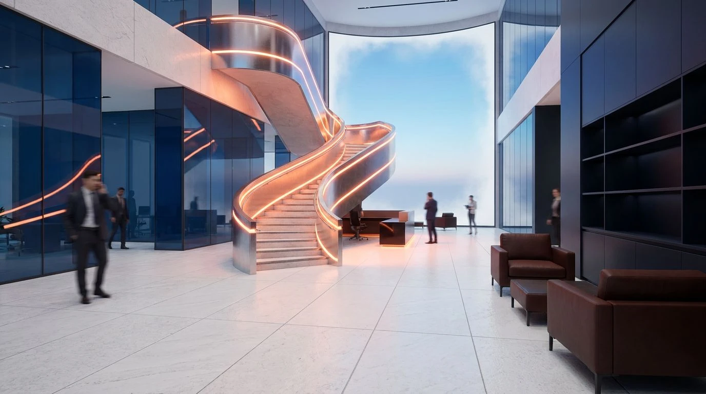
Standing out in a crowded market requires a balance between authoritative weight and welcoming energy, a balance achieved effectively by Executive Alertness. The grounding presence of Espresso Anchor and Slate Neutral establishes a reliable, professional foundation, assuring applicants of the company stability. Against this serious backdrop, unexpected flashes of Crimson Signal and Apricot Glow catch the eye, functioning perfectly for crucial interactive elements like application buttons or urgent hiring announcements. These warmer tones break the monotony of traditional corporate design, offering a refreshing visual break that feels entirely intentional. When paired with Azure Clarity, the overall effect remains highly professional but refuses to fade into the background. The visual experience is akin to walking into a well-appointed, modern architectural office space: serious about its work, yet entirely approachable for the right candidate.
Botanical Ambition 🌿
Bringing the specific demand for inviting, green-and-yellow-driven visibility to life, Botanical Ambition presents a highly sophisticated alternative to standard employment portals. The arrangement relies on the quiet strength of Graphite Foundation and Midnight Pitch, providing high-contrast readability against the soft Fog Canvas. This allows the defining colors to perform their intended function: Olive Canopy and Chartreuse Spark introduce an organic, energetic atmosphere that feels distinctly refreshing. The yellow-green tones act as a beacon for job seekers, directing attention to open roles and company benefits without the aggressive visual noise of pure primary colors. Supported by the cooler notes of Aqua Breeze and Cobalt Horizon, this selection communicates growth and progressive thinking. It builds a digital environment that prospective employees perceive as both structurally sound and abundantly welcoming, ensuring the careers page commands attention effortlessly.
Modern Prospect 🏢
A successful hiring platform must navigate the tension between vast amounts of information and the need for immediate visual engagement. Modern Prospect solves this by utilizing Crisp Paper and Glacial Mist to create expansive, readable areas that do not exhaust the viewer. The introduction of Russet Earth and Indigo Depth provides grounding typography and framing, ensuring the layout maintains its structural integrity. What pulls the page out of obscurity, however, is the strategic application of Peach Warmth and Persimmon Strike. These optimistic, high-visibility oranges inject a sense of forward momentum and enthusiasm into the user journey, ideal for highlighting testimonials or paths for career advancement. Cerulean Vista cools the warmer tones, creating a highly readable, balanced interface. The resulting design signals an environment that is organized, active, and distinctly modern, capturing the attention of professionals who might otherwise scroll past another monotonous job listing.
Vitality Protocol 🔋
Some organizations require a visual identity that immediately projects high energy and decisive action, qualities expertly delivered by Vitality Protocol. The stark contrast between Pure White and Obsidian Weight provides the necessary canvas for the more aggressive tones to operate effectively. Stone Path and Bark Shadow act as sophisticated transitional shades, softening the leap between the extreme darks and lights. The true character of this selection emerges through the pairing of Garnet Drive with Spring Lime and Electric Fern. This unexpected intersection of deep, authoritative red and vivid, energetic greens creates an interface that is impossible to ignore. It is a bold aesthetic choice for a recruitment platform, signaling a workplace that thrives on innovation and rapid development. The electric greens draw the eye directly to application forms and key hiring metrics, ensuring the most vital information remains highly visible to any visiting job seeker.
Dynamic Outreach 🎯
For a careers site to truly distinguish itself, it must offer an experience that feels both multidimensional and entirely deliberate. Dynamic Outreach constructs a highly engaging interface through an unusually varied spectrum. Alabaster Space and Steel Cloud serve as the necessary quiet zones, allowing complex information about company culture and benefits to be absorbed easily. The structural weight of Navy Anchor keeps the design grounded. Yet, it is the vibrant interplay of Wheat Ochre, Tangerine Push, and Emerald Growth that builds the inviting, refreshing atmosphere critical to modern hiring. These colors suggest an organization that values diverse perspectives and creative problem-solving. When punctuated by Ultramarine Bolt and Magenta Pulse, the page transforms into a highly active, visually stimulating destination. It tells the prospective employee that the company is confident enough to step outside traditional design boundaries, presenting a lively and highly visible platform.
The visual presentation of an employment portal speaks volumes about the priorities and culture of the institution behind it. Moving away from safe, expected designs requires a calculated approach to color, where every shade serves a specific psychological and practical function. By adopting unexpected pairings, from earthy olives and vibrant ochres to striking ceruleans and commanding reds, organizations can construct a digital presence that refuses to be ignored. These choices transform a simple list of vacancies into a compelling narrative about growth, professionalism, and forward momentum. Ultimately, a carefully considered palette not only captures the attention of top-tier professionals but also sets a tone of confidence, ensuring the first impression is both memorable and highly effective.