High-Visibility Orange Color Palettes for Brand Design
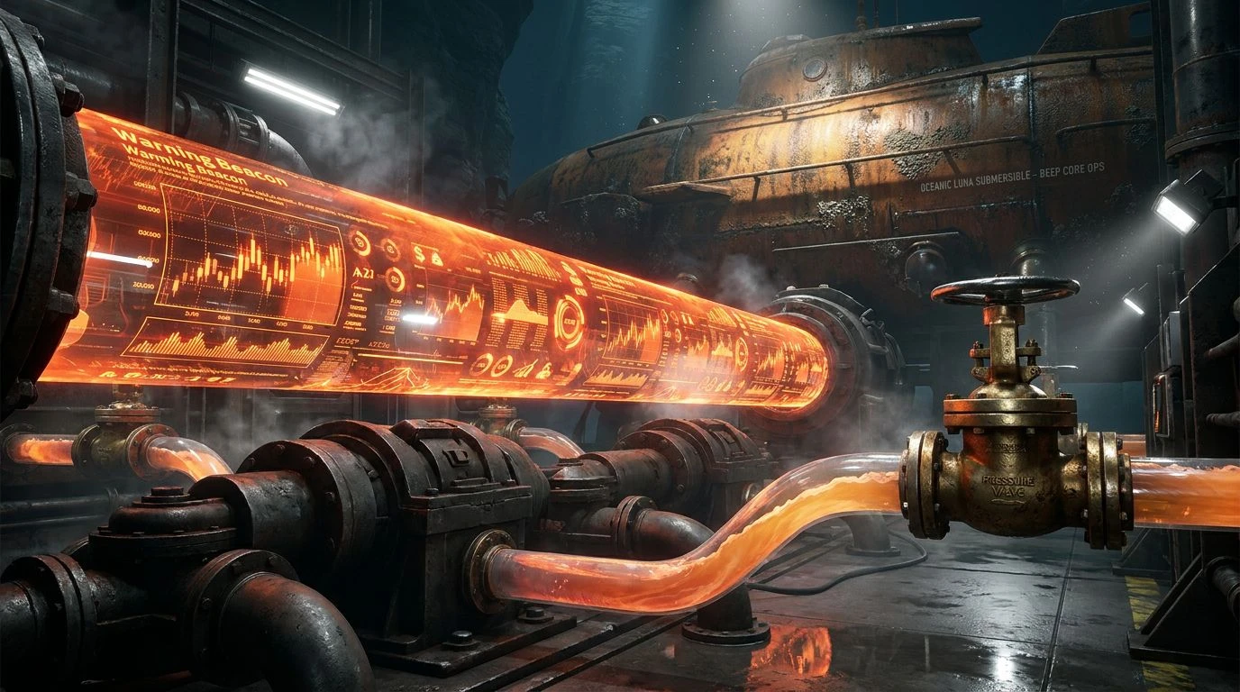
· 6 min readThere is a particular shade of orange born not from nature, but from the urgent necessity of survival. Imagine the crushing, velvet blackness of the deep ocean, where light goes to die. Against this endless abyss, a sudden, blinding flash of neon orange cuts through the water like a siren. Originally engineered to save lives on industrial diving suits and heavy machinery, this fiercely unapologetic hue has migrated from the treacherous depths of the sea to the equally ruthless floors of modern finance. High-visibility orange is no longer just a beacon for rescue; it is a declaration of speed, power, and unapologetic ambition. As we trace its journey from the oxidized hulls of maritime expeditions to the sleek, glowing interfaces of contemporary wealth platforms, we witness a fascinating transformation. The color of caution has become the color of conquest, commanding attention in spaces where milliseconds mean millions.
Abyssal Flare 🛟
The Abyssal Flare collection reads like a love letter to the purest form of urgency. We begin with Sunlit Rust and Apricot Froth, delicate yet persistent shades that recall the oxidized surface of an aging bathysphere breaking the water. But the true gravity of this spectrum lies in the deep, commanding presence of Iron Slag and Pressure Valve, heavy, rusted tones that ground the lighter hues in industrial reality. Right in the middle pulses Warning Beacon, a searing strike of pure visibility. In the world of high-stakes financial technology, this pure gradient of heat acts as a visual adrenaline shot. A screen dominated by these shades does not ask for permission; it demands immediate reaction. The atmosphere it creates is fiercely competitive, stripping away the sterile detachment of traditional banking and replacing it with the raw, mechanical pulse of a trading floor running at maximum capacity. It is a spectrum designed for environments where hesitation is fatal and bold action is the only currency that matters.
Submersible Interface 📟
Stepping into the visual landscape of Submersible Interface is akin to watching a high-tech dashboard power up in the pitch dark. Midnight Trench and Salt Spray provide an uncompromising backdrop of absolute black and stark white, creating a clinical, high-contrast arena. Against this void, Titanium Gage and Wet Canvas introduce the cold, utilitarian touch of milled steel and weather-beaten canvas straps. Suddenly, the eye is arrested by the dual shock of Bioluminescent Glow and Signal Flare, a sharp, piercing cyan paired with an aggressive, life-saving orange. This is the exact visual language of a deep-sea diver's wrist computer, translated seamlessly into the digital architecture of modern wealth management. The dark, brooding presence of Deep Current and Oxidized Hull add a sense of calculated risk, while the bright accents scream of instant execution. The resulting mood is one of calculated thrill, perfect for platforms where users track fluctuating global markets with the same intensity as a diver monitoring oxygen levels in the abyss.
Tactical Descent 🤿
Tactical Descent paints a picture of rugged, unyielding machinery operating under extreme pressure. The foundational tones of Abyssal Crag and Gunmetal Weight establish a tough, impenetrable base, reminiscent of the thickened steel of a submarine hull. Overlaid upon this heavy machinery are the organic, murky shades of Kelp Forest and Aluminum Housing, creating a sense of a rugged environment where only the strongest survive. Piercing through the aquatic gloom, Rescue Line and Neon Algae provide flashes of artificial, high-visibility brilliance. These jarring, radioactive hits of color capture the exact sensation of a flashing hazard light in a dark, watery expanse. When this aesthetic is applied to a financial interface, it creates a sense of navigating dangerous, highly lucrative waters. Hydrodynamic and Mariana Indigo cool the composition down just enough to maintain a professional edge, yet the persistent pulse of orange and lime keeps the viewer on high alert. The atmosphere is sharp, agile, and fiercely modern, turning the simple act of transferring assets into a high-octane operation.
Hyperbaric Chamber 🔋
The atmosphere of Hyperbaric Chamber is electric, buzzing with the frantic energy of a rapidly ascending gauge. This spectrum captures the dramatic shift from the sunlit surface to the crushing depths. We dive straight into Cobalt Current and Pressure Drop, deep and inky shades that envelop the viewer in a cool, calculating vastness. Mid-tones like Submarine Port, Shallow Reef, and Polished Chrome offer the sleek, reflective sheen of high-grade diving equipment catching the last rays of sunlight. But the undisputed protagonists of this visual story are Flash Burn and Helium Yellow, two searingly bright, toxic hues that demand total focus. In a digital interface, this combination is incredibly potent, mirroring the aesthetics of competitive gaming and translating them into the financial arena. The sharp contrast between the icy, professional blues and the scorching, high-visibility orange creates an environment of controlled chaos. It is a thrilling, visually aggressive space that speaks directly to a generation of investors who view wealth building not as a slow accumulation, but as a fast-paced, high-stakes competition.
Trench Navigator 🧭
Trench Navigator explores the darker, older history of the maritime industrial aesthetic, tracing the roots of visibility before neon orange conquered the sea. Scratched Steel and Rusted Anchor ground the viewer in a tactile, historical reality, whispering of old shipwrecks and heavy, unrefined iron diving bells. The aquatic environment is painted through Foggy Horizon, Oceanic Trench, and Midnight Sonar, sweeping gradients of frigid, unforgiving water that threaten to swallow all light. Against this vast, melancholic backdrop, Glacial Ice offers a fragile, piercing clarity, while Faded Coral introduces an unexpected, ghostly warmth. The climax of this spectrum is Emergency Flare, a deep, urgent crimson that serves as the immediate ancestor to modern high-visibility orange. This palette brings a mature, narrative-driven weight to digital platforms. It trades the screaming speed of neon for the heavy, calculated gravitas of a deep ocean expedition. When applied to financial branding, it creates an environment of immense depth and historical weight, reminding the user that navigating capital is much like navigating the ocean floor—it requires respect, specialized equipment, and an eye trained on the warning signs.
The journey of these colors from the freezing depths of the ocean to the glowing screens of modern finance reveals a profound truth about human perception. High-visibility hues, once strictly utilitarian tools meant to snatch life back from the abyss, have been entirely reimagined as symbols of speed, aggression, and relentless forward motion. By pairing the cold, clinical grays and infinite dark blues of heavy industry with the scorching heat of rescue orange, these visual stories create an atmosphere of thrilling urgency. They transform the abstract, often sterile world of data and capital into a highly tactile, physical experience. Ultimately, this vibrant aesthetic proves that the instincts which keep us alive in the most hostile environments on earth are the exact same instincts that drive us to conquer the modern, hyper-competitive arenas of wealth and technology.