High Visibility Color Palettes: A Bold Interior Design Trend
· 5 min readDomestic interiors are currently experiencing a radical shift away from subdued minimalism, looking instead to the stark, utilitarian vocabulary of construction sites and roadwork. Designers are borrowing the aggressively bright tones of reflective gear to inject unexpected joy into living spaces. Imagine a plush velvet sofa standing against a lime wash wall, abruptly punctuated by an acrylic side table in blazing lime or a powder-coated shelving unit in hazard orange. This trend treats emergency shades not as warnings, but as playful punctuation marks within a sophisticated room. The approach completely upends the traditional rules of domestic styling. A space that initially reads as calm and collected suddenly gains a sense of humor and high-voltage energy when pierced by these unapologetic pigments.
Construction Site Rave 🚧
The Construction Site Rave palette introduces an electric shock of color against an otherwise grounded, earthy base. Starting with the quiet reliability of Cardboard Brown and Plaster Dust, the scheme quickly escalates into full-blown visual rebellion. Reflective Vest and Laser Level Green act as the disruptors, perfect for powder-coated steel chairs or a chunky, oversized ceramic lamp sitting on a mid-century credenza. Cyan Tape and Blueprint Ink add a slightly retro-futuristic edge, while Magenta Flag delivers a final punch of unapologetic brightness. In a domestic living room, this combination creates an environment of controlled chaos. You might see a neutral, textured boucle sofa anchored by a rug featuring jagged geometric strikes of these neon shades. The tension between the muddy neutrals and the synthetic brights keeps the eye moving constantly across the space.
Traffic Cone Chic 🦺
Taking cues from urban infrastructure, Traffic Cone Chic pairs deep, moody shadows with sudden bursts of luminescence. Highway Cone serves as the main attraction, a bold statement color ideal for a standalone lounge chair or an exaggerated, tubular metal coffee table. This intense hue is grounded by the raw, unpolished feel of Plywood and the severe depth of Tarmac Black. Concrete Wash provides a breathing space, a cool neutral that allows the richer tones to stand out without overwhelming the senses. Worker Coverall adds a layer of dark, utilitarian green, contrasting sharply with the crispness of Scaffolding Blue and Surveyor Pink. This palette feels perfectly suited for an apartment that honors its industrial bones with exposed brick or concrete floors, using the intense pinks and oranges to create moments of unexpected playfulness within a serious architectural shell.
Workzone Playground 🏗️
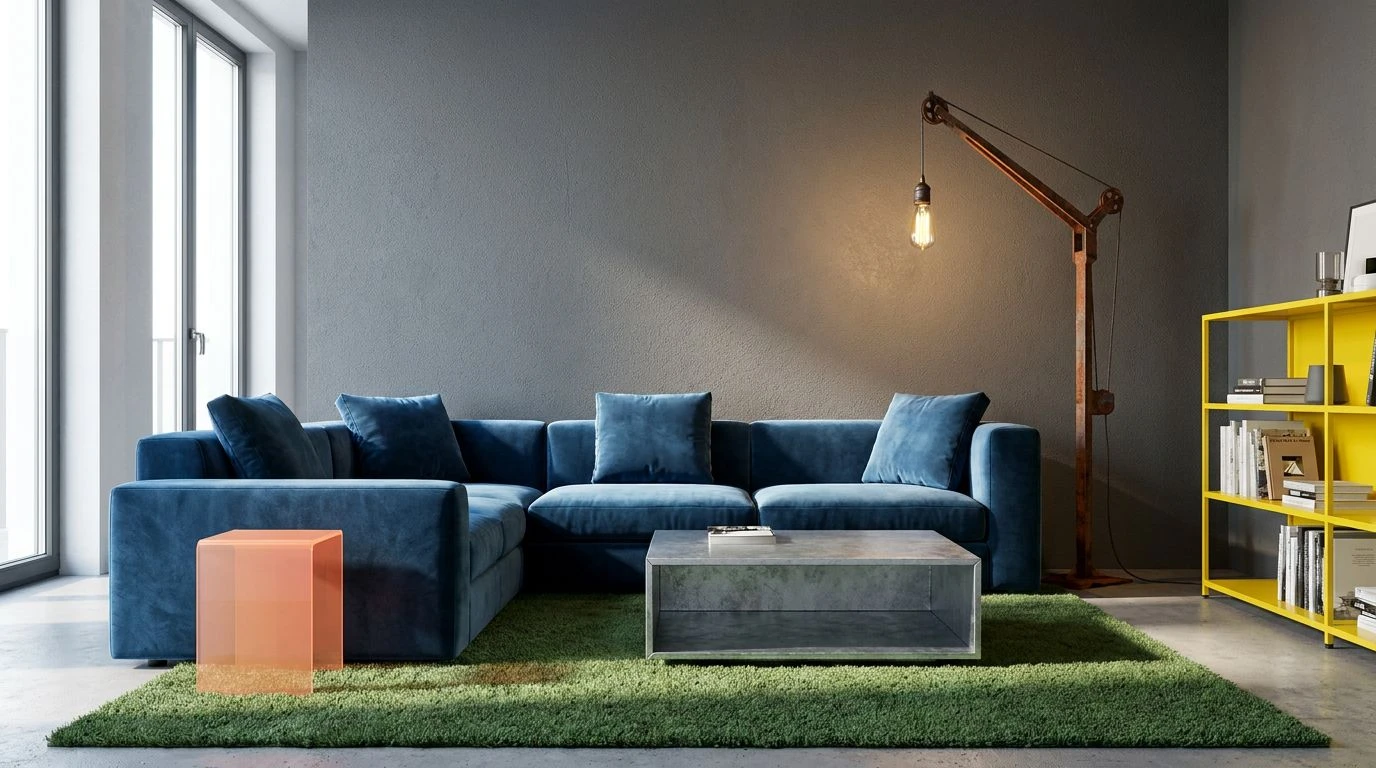
Workzone Playground translates the rough-and-tumble aesthetics of an active building site into a highly curated living space. Safety Peach and Rusted Crane offer a warmer, slightly faded take on standard hazard gear, suggesting materials that have seen real labor. Hard Hat Yellow provides a sharp, acidic sting, working brilliantly for small accents like bookends, light switches, or a single floating shelf. These warm and acidic tones are balanced by the brutalist weight of Fresh Asphalt and Galvanized Steel. Turf Green and Tarp Blue bring a refreshing, almost outdoor quality to the mix. Within a living room, you could apply this scheme through a combination of heavy, brutalist concrete furniture paired with highly saturated, glossy metal fixtures. The resulting atmosphere is both tough and inviting, turning heavy-duty visual cues into a deeply comfortable, visually stimulating retreat.
Industrial Leisure 🎾
Stripping back to a leaner selection of high-impact shades, Industrial Leisure feels athletic and intensely modern. The base relies on Sandbag, a gentle khaki that acts as a blank canvas for the visual assault of Caution Tape and Hi-Vis Trim. These twin neons demand attention, mirroring the exact pigments used to keep workers visible in pitch-black conditions. When brought indoors, they translate into pure kinetic energy. Picture a matte sand-colored living room where the curtains feature a thick, striking border of that neon yellow, or a bespoke rug weaving Wet Moss and Sea Glass with sharp lines of Warning Light Blue. The cool, watery tones of the aqua and deep blue cool down the radioactive greens, making the overall scheme surprisingly livable. It speaks to a design approach where functionality is playfully subverted for purely aesthetic thrills.
Neon Scaffolding 🪩
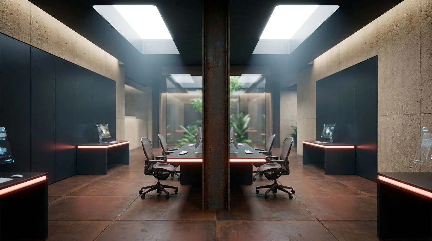
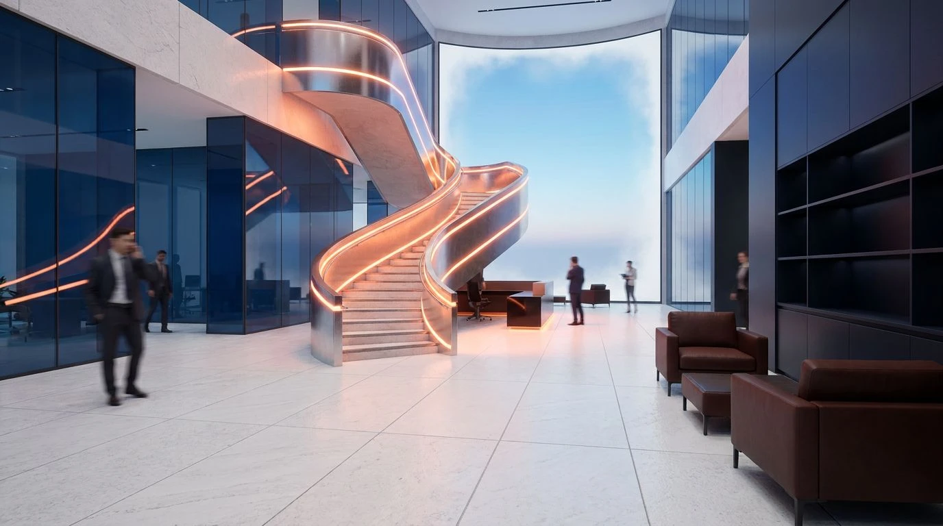
Neon Scaffolding offers a masterclass in high-contrast decorating, pitting deep industrial shadows against blindingly bright highlights. Roadwork Orange and Fluorescent Marker are the undeniable stars, demanding to be used in high-gloss finishes like a lacquered media console or a series of glossy enamel pendant lights. These intense focal points are anchored by the metallic coolness of Patina Copper and Aluminum Casing, alongside the heavy, grounding presence of Cast Iron. Insulating Tape Blue and Denim Utility add a reliable, almost collegiate classicism to the mix, while Primer White offers stark relief. In a living room setting, this creates a deeply layered aesthetic. The stark white and dark iron provide a gallery-like backdrop, allowing the neon accents to pop with maximum intensity. It is a look that feels confident, slightly irreverent, and thoroughly contemporary.
The adoption of extreme visibility shades in domestic living quarters marks a fascinating turning point in contemporary interior styling. Homeowners and designers are no longer hiding the raw, mechanical, or industrial aspects of urban living; they are celebrating them through color. These palettes prove that intense, aggressive pigments can coexist beautifully with muted plasters, raw woods, and heavy concrete. By applying these high-voltage hues through sophisticated forms like lacquered lighting, powder-coated metals, and thick wool rugs, spaces gain a playful yet highly calculated edge. The living room becomes a place of visual stimulation rather than pure sedation, challenging outdated notions of what makes a house feel like a home. It transforms the utilitarian markers of the street into the most joyful elements of the interior landscape.