Amber and Black Color Palettes for Moody Dining Room Design
· 5 min readHuman vision evolved to rapidly distinguish between environments of safety and potential chaos. In the modern home, the dining room frequently registers to our visual cortex as a space of sensory overload, flooded with competing stimuli from open-plan architecture and relentless domestic activity. By radically restricting the visual field to the deepest shadows and the specific wavelengths of glowing firelight, we manipulate optical processing to artificially induce focus. Dark environments absorb scattered light, quieting the retinal noise that triggers distraction, while the narrow frequency band of golden-orange warmth commands human attention, mimicking the prehistoric hearth. Applying this strict chromatic boundary limits visual wandering, drawing individuals physically and psychologically toward a shared point of luminance.
Obsidian Hearth 🪨
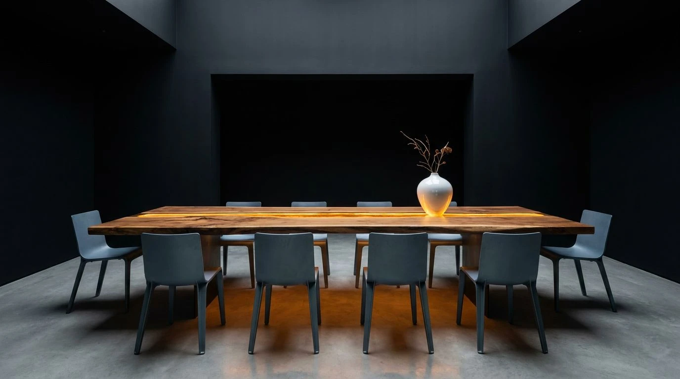
The visual strategy of Obsidian Hearth relies on dramatic light absorption to quiet a frantic room. When wavelengths are swallowed by the expansive use of Vantablack and Slate Shadow, the human eye naturally seeks out the single point of thermal radiation. In this environment, Burnt Ochre acts as a visual anchor. The rods in our eyes process the surrounding Ash Grey and Titanium White as receding negative space, while our color-sensitive cones lock onto the warm orange tones. This physiological response forces inhabitants to gather around the colored zone, usually the dining table itself. By stripping away extraneous hues, the brain abandons peripheral scanning and settles into localized attention, producing a quiet optimism through visual stillness.
Embers and Ash 🔥
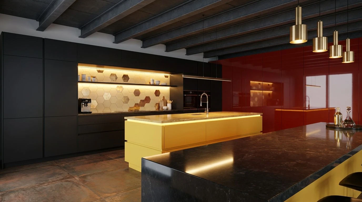
Embers and Ash experiments with a slightly wider band of warm wavelengths against a heavily light-absorbent background. Void Black and Charcoal establish a sensory void, suppressing the visual clutter common in active kitchens. Against this dark perimeter, the eye is drawn to the high-visibility sequence of Pale Clay, Golden Resin, and Smoldering Rust. These colors fall precisely within the spectrum that human vision associates with heat and sustenance. A subtle inclusion of Crimson Spark triggers immediate visual alertness, drawing focus toward the center of the communal eating space. The contrast between the stark Concrete Dust and the energetic warm tones creates an optical boundary, effectively trapping attention within the safety of the glow and fostering an intimate group atmosphere.
Hearthfire Focus 🕯️
With Hearthfire Focus, the psychological effect of color temperature takes precedence. The gradient from Pitch to Coagulated Red and Raw Umber simulates the physical decay of light near an open flame, a phenomenon that predictably lowers human heart rates and encourages lingering. When a dining area is enveloped in these deep darks, the brighter points of Blaze Orange and Sunlit Topaz become inescapable focal targets. Bone White and Stone Dust provide just enough reflective surface to bounce this simulated firelight across faces, promoting the recognition of facial expressions and thus social bonding. This manipulation of light and shadow physically limits how far the gaze can travel, confining visual interest to the immediate community gathered at the table.
Bioluminescent Glow 🏮
Bioluminescent Glow utilizes extreme contrast ratios to hijack our depth perception and direct attention. Absolute Night functions as an optical boundary, pushing the walls of a noisy room into an indeterminate background. Against this void, Liquid Amber and Oxidized Copper emerge with intense clarity. Because warm colors optically advance toward the viewer while cool or dark colors recede, these specific tones pull the dining table into the extreme foreground of human perception. Muted Terracotta bridges the gap between the blinding warmth and the chilling Frost Grey. This precise combination restricts peripheral distraction and creates an enclosed psychological bubble, signaling to the brain that the glowing area is the only relevant zone for interaction and shared optimism.
Thermal Contrast 🌌
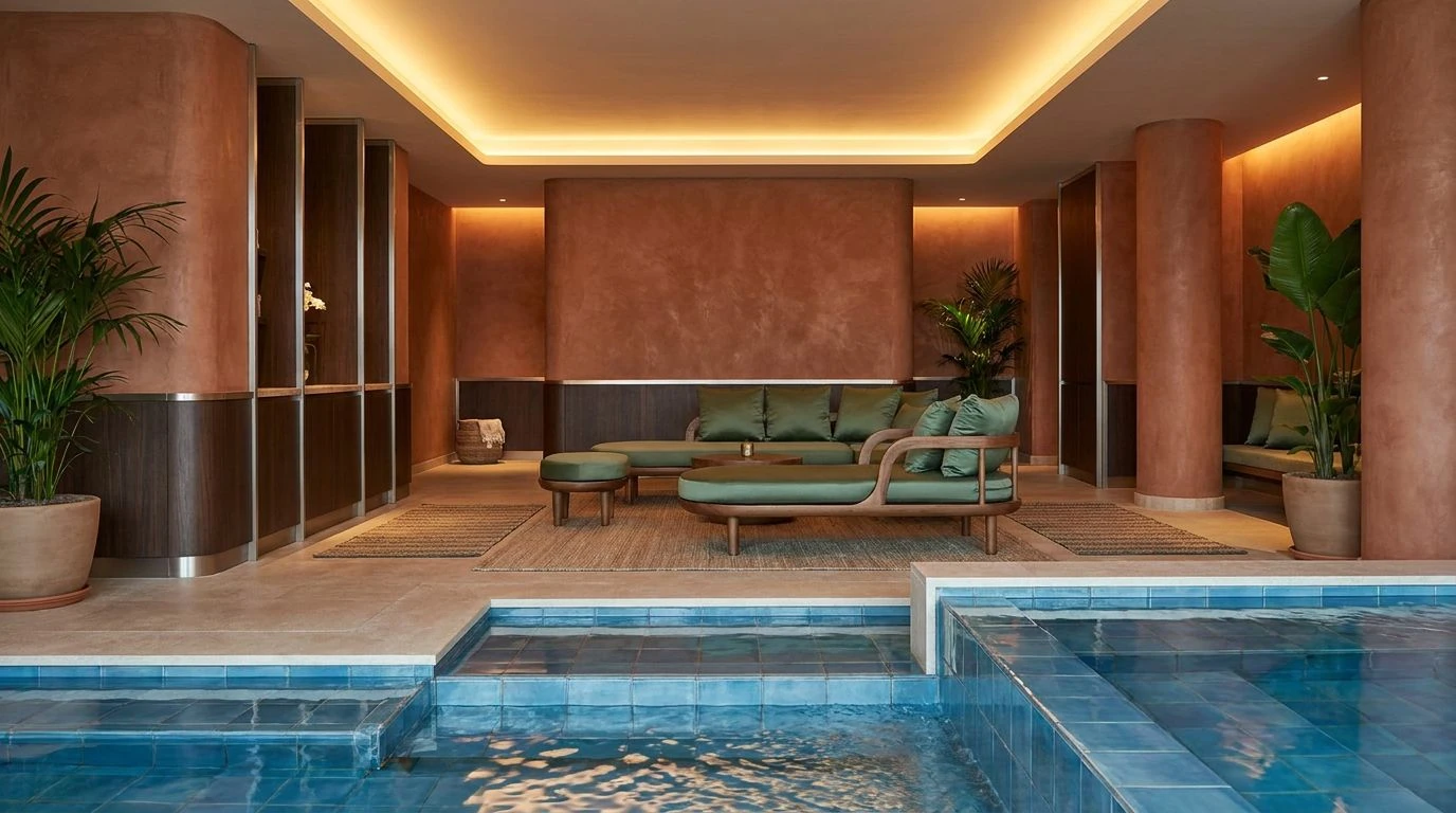
Thermal Contrast introduces short-wavelength light into the environmental equation, providing a fascinating study in physiological reactions. Deep Graphite and Warm Basalt anchor the room in shadow, but the introduction of Cobalt Ray and Abyss Blue alongside Honeycomb and Clove Brown creates simultaneous contrast. The human retina struggles to focus on extreme warm and cool tones simultaneously. By placing Cerulean Frost on the periphery and containing the Alabaster Sand and Honeycomb strictly where food is consumed, you create a visual magnet. The brain interprets the blue zones as cold, retreating spaces and instinctively drives the body toward the warm, amber center. This instinctual migration turns a chaotic space into a highly regulated communal hub defined by optical temperature.
Understanding how the human eye and brain process specific wavelengths offers a powerful tool for environmental design. By applying strict contrast rules, we can manipulate visual processing to alter behavior in domestic spaces. Dark fields function as sensory deprivation zones, effectively muting the visual noise of modern life, while the targeted application of warm, glowing tones simulates ancestral gathering points. This calculated restriction of the color spectrum forces localized attention, physically drawing individuals together and transforming a distracting environment into an enclosed sphere of focus. The physiological response to this visual strategy is a measurable increase in localized attention and communal bonding.