Red and Charcoal Fitness App Color Palettes for High Energy
· 5 min readMost fitness applications treat exercise as a mildly bureaucratic chore, wrapping their interfaces in soothing, corporate blues that suggest you are applying for a mortgage rather than preparing to push your physical limits. This sanitized aesthetic fundamentally misreads the psychology of exertion. When you step into the gym, especially when channeling the raw, lung-burning intensity of combat sports, you do not want to be placated. You want to be provoked. Moving away from these polite, trust-inducing palettes toward aggressive combinations of vibrant red and charcoal signals a necessary shift. It transforms a digital tool from a passive tracker into an active provocateur, capturing the sweat, the adrenaline, and the brutal poetry of a heavyweight title fight. The screen should feel less like a wellness clinic and more like the worn canvas of a boxing ring.
Canvas and Corner 🥊
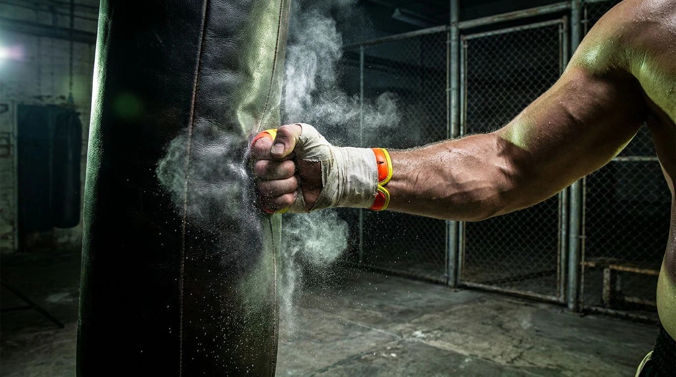
There is a specific scent to an old-school boxing gym, a mixture of worn equipment and stale air, captured perfectly by Canvas and Corner. The introduction of Mouthguard Red against Pitch Black delivers an immediate visual shock, mimicking the sudden snap of a jab. Meanwhile, Old Leather and Rosin Tan ground the experience in physical reality, reminding the user of heavy bags and taped hands. The inclusion of Corner Blue and Contender Navy offers a brief visual breather, akin to the sixty seconds of rest between rounds. In a digital interface, this combination strips away the sterile veneer of modern fitness tracking. It replaces polite encouragement with a demanding, high-stakes visual environment, daring the user to step up and perform rather than merely logging another tepid workout.
Midnight Sparring 🌃
Midnight Sparring channels the chaotic, underground energy of an unsanctioned bout. It is loud, unapologetic, and aggressively modern. Knockout Black and Iron Weight set a grim, unforgiving stage, which is then violently disrupted by Arterial Red and Bell Ring Orange. The real genius here lies in the disorienting flashes of Acid Sweat, Bruise Teal, and Adrenaline Pink, which mimic the dizzying, neon-lit exhaustion of pushing a body to failure. Applying this to a screen turns a mundane dashboard into a sensory assault. It is an aesthetic choice that refuses to be ignored, perfectly suited for high-intensity interval training or combat conditioning where polite typography and calming layouts would feel offensively out of place. It demands attention and rewards only sheer, unadulterated effort.
Tenth Round ⏳
Exhaustion has a color, and it looks remarkably like Tenth Round. This collection strips away anything flashy, leaving only the grim reality of endurance. Void Black and Speed Bag Brown create a heavy, suffocating atmosphere, while Bone Wrap and Heavy Dust provide just enough light to see the damage done. The visual strike comes from Dried Blood and Blistering Orange, serving as urgent reminders to keep moving when the lungs burn. For an application aiming to capture raw passion, this setup is brutally effective. It does not promise a fun or easy journey. Instead, it frames the workout as a serious, grueling task, appealing to the kind of user who finds motivation in suffering and triumph in simply surviving the session. It turns the interface into a testament to grit.
Prize Fight 🏆
Prize Fight operates with the graphic intensity of a vintage promotional poster plastered on a brick wall. The stark contrast between Glaring Floodlight and Deep Shadow creates a cinematic drama before the workout even begins. Title Red serves as the undisputed heavyweight of the layout, demanding immediate focus and driving the primary action, whether that is starting a timer or recording a maximum lift. Charcoal Ash acts as a stabilizing force, while Split Lip Pink and Brass Bell add unexpected, fleshy warmth and metallic tension. When applied to digital space, this approach feels highly editorial and fiercely competitive. It frames the user's daily exercise not as a routine maintenance task, but as a marquee event, a main attraction where personal records are meant to be violently broken.
Undisputed Champion ⚡
Marrying the gritty textures of a weight room with the hyper-visible styling of modern athletic gear, Undisputed Champion is relentlessly energetic. Pure Chalk and Cement Floor provide a stark, industrial background, immediately throwing Explosive Orange and Electrolyte Lime into sharp relief. These neon accents function like a sudden rush of pre-workout hitting the bloodstream, impossible to ignore and engineered for maximum output. Trainer Yellow and Steel Bar balance this manic energy with functional, utilitarian restraint. Implementing these shades creates an environment that feels fast, loud, and uncompromising. It speaks directly to the performance-obsessed athlete, transforming a mobile device into a high-octane dashboard that practically yells at the user to pick up the pace and finish the set.
Swapping sterile tech blues for aggressive, combat-ready tones fundamentally changes the conversation between the user and the screen. These visual strategies prove that utility does not require polite, forgettable design. By embracing the stark contrast of shadow and blood, or the neon shock of physical exhaustion, a digital space can accurately reflect the reality of intense physical labor. The interface ceases to be a mere administrative tool for counting calories or logging miles. It transforms into an active participant in the ritual of exercise, adopting a posture that is unapologetically raw. The resulting aesthetic finally matches the heavy breathing, the calloused hands, and the sheer, unpolished theater of pushing human limits to their absolute breaking point.