Tactical Olive Green Color Palettes for Calm Workspace Design
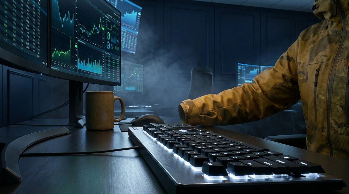
· 6 min readPicture the modern trading floor, not as a physical room of screaming brokers, but a quiet, intensely glowing sanctuary of screens. The air crackles with the invisible weight of global markets shifting by the millisecond. In this frantic theater of high finance, the eye craves a place to rest, a visual fortress against the relentless strobe of red and green digits. Enter the unexpected savior: the measured, disciplined language of military-inspired color. Olive green and slate grey offer a quiet authority, transforming the trading terminal into a command center. These are not merely colors; they are psychological armaments. They bring a profound sense of tactical quiet to a space defined by chaos, wrapping the trader in an invisible armor of focus and duty, turning panic into calculated strategy.
Command Center Quiet 🪖
This collection speaks to the absolute stillness required before a major market movement. Field Slate and Trench Charcoal lay down an impenetrable foundation, a somber and serious background that absorbs the frantic energy of the trading day. Against this muted, protective backdrop, Ivory Parachute offers a breath of fresh air, a moment of visual pause. The true protagonist here is Signal Flare Green. It acts as the ultimate punctuation mark, slicing through the heavy, disciplined greys with the urgency of a flashing tactical beacon. When applied to the interfaces of high-stakes financial environments, this arrangement provides a sensory shield. It wraps the user in an atmosphere of strict duty and unwavering attention, stripping away the frivolous to leave only what is immediately actionable. The eye is guided effortlessly, protected from visual fatigue while remaining fiercely alert to sudden shifts in the financial tide.
Tactical Operations 🚁
Imagine the sheer velocity of international markets translated into a visual landscape. Here, the raw, earthy grit of Desert Khaki and Boot Leather grounds the composition, rooting the frantic pace of stock exchanges in something tangible and undeniably tough. It is a nod to the physical reality behind the digital numbers. Piercing this rugged base are flashes of Laser Sight Green and Radar Blue, acting as high-visibility markers in a sea of data. These vibrant interruptions act like sudden intel reports flashing across a screen, directing attention with military precision. Gunmetal Grey and Aviation Silver maintain the strict, orderly mood, ensuring the brighter tones never overwhelm the senses. In the high-pressure cooker of real-time trading, this exact arrangement acts as a visual metronome. It keeps the mind paced, grounded, and perpetually prepared for the next rapid-fire decision, making the chaotic rhythm of the stock market feel entirely manageable.
Night Watch Division 🦉
The deepest hours of global trading require an environment that commands respect while offering quiet comfort. Midnight Black and Optic White create an environment of absolute contrast, a stark digital terrain where every detail is laid bare for immediate inspection. This uncompromising severity is beautifully tempered by the introduction of Trench Mud and Camouflage Mustard. These specific, military-drawn tones introduce a human element, a reminder of the physical world outside the glow of the monitors. The real genius lies in the cool, measured presence of Steel Fog and Officer Navy. They wash over the interface like a calm night sky, cooling down the temperature of the room. A trader surrounded by these shades feels the quiet authority of an elite task force. The mind is sharpened, the peripheral noise of the outside world is silenced, and the singular focus remains on the glowing numbers, turning a terrifying plummet or a dizzying spike into just another operation to be executed with flawless precision.
Field Intelligence 📡
There is a distinct rhythm to absorbing incoming market data, a continuous flow of information that demands constant triage. Brass Casings and Deep Jungle provide a stabilizing, earthy baseline, creating a psychological bunker that protects the viewer from the dizzying speed of the ticker tape. Out of this dark, leafy depth springs the electric jolt of Warning Yellow and Phosphor Mint. These are the colors of immediate action, screaming across the terminal with the intensity of a live wire. Yet, because they are set against the protective, muted coolness of Battalion Grey and Submarine Slate, they never cause panic. Instead, they produce a state of heightened, calculated readiness. This arrangement effectively translates the adrenaline of the trading floor into a highly organized visual language. It gives the user the sensation of being intimately connected to the pulse of the market while remaining safely encased behind a screen of impenetrable, disciplined color.
Airborne Strategy ✈️
Sometimes, the most tactical approach to a chaotic environment is to rise entirely above it. Moving away from the dense, earthy greens, this collection relies on the stark, industrial beauty of Aluminum Hull and Ballistic Grey. These metallic shades establish an atmosphere of pure, unfeeling logic, stripping away any emotional attachment to the rising and falling numbers. Midnight Trench anchors the composition with a heavy, gravitational pull, offering a vast, dark canvas for the brighter elements to pop against. Sapphire Radar and Stratosphere Blue provide the critical, life-saving information, glowing with the sterile, uncompromising brilliance of an aviation instrument panel. In the context of a frantic trading desk, this cool, blue-grey landscape acts as a psychological cooling mechanism. It drastically lowers the internal temperature of the user, forcing a sense of detached, aerial perspective. From this vantage point, the terrifying fluctuations of the market look less like a storm and more like a map waiting to be navigated.
The visual language of the armed forces does far more than simply dress a digital display; it fundamentally rewrites the psychological state of the person sitting before it. By adopting these rigorous, disciplined tones of slate, khaki, and navy, the high-stakes arena of financial trading is robbed of its terrifying unpredictability. These specific shades supply a much-needed mental armor, changing a theater of frantic speculation into an environment of measured, calculated action. They offer the eye a quiet refuge, while strategically deployed brights guarantee that urgent data is never ignored. Ultimately, stepping into a workspace governed by this tactical aesthetic grants the viewer a profound sense of command, turning the wild, roaring ocean of global commerce into a deeply focused, expertly navigated mission.