Industrial Color Palettes: Soften Logistics With Dusty Rose
· 5 min readA logistics terminal is a cathedral of cold efficiency, a sprawling expanse governed by rigid geometry and the relentless hum of commerce. Cinder block corridors and cavernous storage bays are designed for moving goods, not holding the human gaze. Yet, within these brutalist shells, there exists an opportunity to introduce warmth, to soften the severe angles and heavy steel with a quiet, unexpected vulnerability. Bringing a muted, flesh-toned pink into a space defined by grease and iron creates a deliberate friction. It asks the eye to rest. It transforms a site of sheer utility into an environment that acknowledges the people operating within it, blurring the lines between a high-volume transit hub and a curated gallery space.
Concrete Bloom 🥀
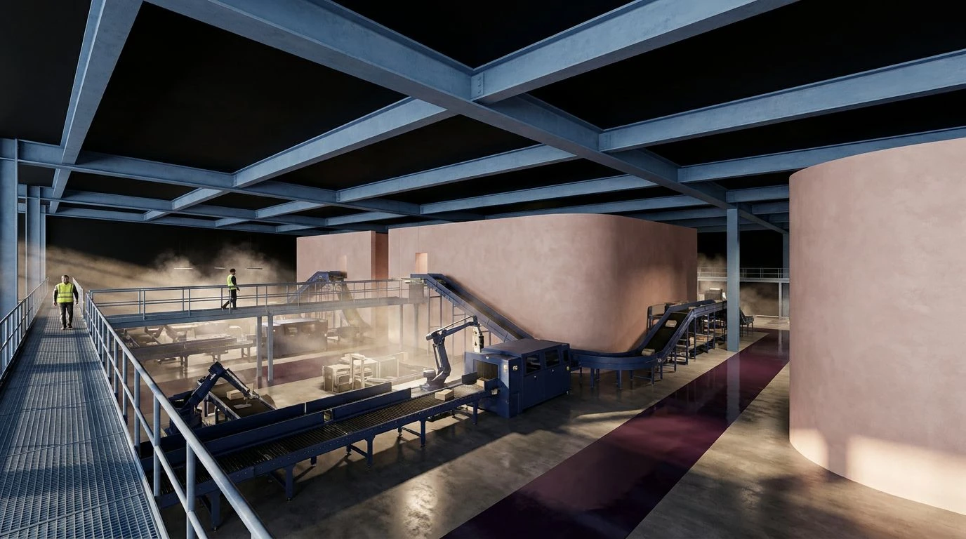
Walking through a loading bay draped in Concrete Bloom feels like stumbling upon a quiet painting hung in a vast, empty warehouse. The sheer weight of Midnight Asphalt and the metallic sheen of Brushed Aluminum construct a familiar utilitarian realism. They are the colors of machinery, of heavy tires on pavement, of work done in the margins of the night. Yet, sweeping across a massive cinder block wall, Faded Peony disrupts this mechanical predictability. The tender blush of the paint leans against the sharp edge of Weathered Steel, while Muted Clay settles into the shadows like dust gathering on a windowsill. This application of soft pink demands nothing from the viewer, offering only a gentle reprieve from the endless gray. It turns a space of pure function into an architectural still life, where human vulnerability meets immovable concrete.
Warehouse Still Life 🎨
Here, the visual language of a shipping facility borrows directly from the quiet restraint of a painter's studio. Warehouse Still Life constructs a deliberate tension between the monumental and the fragile. Deep Crane Blue and Overcast Steel establish a backdrop of heavy industry, vast and unyielding, mirroring the towering machinery that populates the terminal. Against these cold giants, a wash of Powdered Rose acts as a human signature, a deliberate stroke of warmth across a sterile corridor. Trench Coat Khaki grounds the visual weight in the realism of daily labor, while a sliver of Sodium Vapor mimics the yellowed light of streetlamps bleeding through a high clerestory window. The pink does not shout; it merely exists alongside the grit, changing the temperature of the room and reminding the workers that this massive, echoing shed was built by and for human hands.
Twilight Freight 🚂
As the sun dips below the horizon, the terminal takes on the melancholic beauty captured in Twilight Freight. The sheer scale of the building dissolves into Void Black, leaving only the structural bones visible against the evening sky. Inside the staff corridors, Chalk Dust and Blush Plaster coat the walls, their soft, cosmetic warmth absorbing the harsh fluorescent lighting. This gentle pink treatment acts as a buffer against the demanding reality of Workwear Indigo and the fading architectural promises of Faded Blueprint. When paired with Bruised Plum, the pink takes on a darkened, artistic quality, reminiscent of a muted watercolor washed over heavy drafting paper. Applying these tones to break rooms and transit halls softens the psychological weight of the logistics industry. The colors ask the weary eye to linger on something delicate before returning to the relentless rhythm of the freight line.
Archive Dust 📦
There is an undeniable poetry hidden within the bureaucratic side of shipping and receiving, a quiet rhythm celebrated by Archive Dust. This grouping steps away from the loading docks and enters the record rooms, where endless paperwork tracks the movement of physical goods. Manila Folder and Oiled Canvas smell of aging paper and waxed fabric, speaking to the history of the trade. Carbon Shadow provides the sharp contrast of fresh ink on a ledger. Cutting through this nostalgic, earthy atmosphere is a generous splash of Terracotta Rose. This grounded, dusky pink warms the oxidized metals and brown heavy duty textiles, acting like a setting sun catching the edge of a filing cabinet. By painting an entire transit corridor or administrative wing in this rosy hue, the terminal borrows the quiet, contemplative air of a museum archive. The harsh, metallic reality of logistics melts into a soft, textured realism.
Industrial Canvas 🏗️
To look upon an active freight terminal is to see a massive, kinetic sculpture made of raw materials and heavy metals. Industrial Canvas embraces this sprawling utilitarian aesthetic while introducing unexpected, painterly strokes. Bleached Concrete and Cinder Block stretch across the floors and walls, a vast expanse of neutral gray waiting to be marked. Galvanized Zinc and Iron Slag represent the rolling doors and reinforced beams, cold and entirely functional. Amidst this gray desolation, a sudden structural column painted in Dried Madder Root offers a ruddy, grounded translation of a dusty rose, a flash of fine art pigment amid the machinery. Nearby, a rusted beam painted in Verdigris Teal strikes a beautiful, contrasting chord. This unexpected splash of earthy red and oxidized copper shifts the perspective, proving that even a building designed strictly for the transportation of goods can hold the sophisticated, striking composition of a contemporary gallery.
Transforming a space built for sheer volume into an environment that holds genuine visual poetry requires nothing more than a deliberate shift in tone. Introducing a cosmetic, flesh-toned blush into an arena of heavy metals and roaring engines changes the very air within the room. It demands a pause. It replaces cold predictability with a striking, gallery-like intentionality. By allowing gentle roses and muted clays to stand beside iron and asphalt, the terminal ceases to be just a machine for moving boxes. It becomes a testament to utilitarian realism, a place where the heavy, unyielding nature of industry yields, if only for a moment, to the quiet grace of the human experience.