'%3e%3cpath%20fill-rule='evenodd'%20clip-rule='evenodd'%20d='M51.1303%2019.2492C50.7278%2019.913%2050.1346%2020.4426%2049.3508%2020.838C48.5669%2021.2335%2047.6172%2021.4312%2046.5014%2021.4312C44.8208%2021.4312%2043.4367%2021.0216%2042.3492%2020.2025C41.2617%2019.3833%2040.6686%2018.2394%2040.5697%2016.7706H44.4253C44.4818%2017.3355%2044.6831%2017.7804%2045.0291%2018.1052C45.3751%2018.43%2045.8164%2018.5924%2046.3531%2018.5924C46.8192%2018.5924%2047.1864%2018.4653%2047.4547%2018.2111C47.7231%2017.9569%2047.8572%2017.618%2047.8572%2017.1943C47.8572%2016.8129%2047.7337%2016.4952%2047.4865%2016.241C47.2393%2015.9867%2046.9322%2015.7784%2046.565%2015.616C46.1978%2015.4536%2045.6893%2015.2594%2045.0397%2015.0334C44.0934%2014.7086%2043.3202%2014.3944%2042.72%2014.0907C42.1197%2013.7871%2041.6042%2013.3351%2041.1735%2012.7349C40.7427%2012.1347%2040.5273%2011.3544%2040.5273%2010.394C40.5273%209.50418%2040.7533%208.73448%2041.2053%208.08481C41.6572%207.43515%2042.2821%206.93731%2043.0801%206.5913C43.8781%206.24528%2044.7925%206.07227%2045.8235%206.07227C47.49%206.07227%2048.8141%206.46771%2049.7956%207.25861C50.7772%208.04951%2051.3315%209.13698%2051.4586%2010.5211H47.5395C47.4689%2010.0268%2047.2888%209.63483%2046.9993%209.3453C46.7097%209.05578%2046.3178%208.91102%2045.8235%208.91102C45.3998%208.91102%2045.0573%209.024%2044.7961%209.24997C44.5348%209.47594%2044.4041%209.80783%2044.4041%2010.2457C44.4041%2010.5988%2044.5207%2010.8989%2044.7537%2011.146C44.9867%2011.3932%2045.2798%2011.5944%2045.6328%2011.7498C45.9859%2011.9052%2046.4944%2012.1029%2047.1581%2012.343C48.1185%2012.6678%2048.9023%2012.9891%2049.5096%2013.3069C50.1169%2013.6246%2050.6395%2014.0872%2051.0773%2014.6945C51.5151%2015.3018%2051.734%2016.0927%2051.734%2017.0672C51.734%2017.8581%2051.5328%2018.5854%2051.1303%2019.2492ZM59.0242%206.3053V21.2829H55.4016V6.3053H59.0242ZM73.9409%206.3053V9.18642H69.8734V21.2829H66.2296V9.18642H62.2046V6.3053H73.9409ZM80.7438%209.18642V12.3218H85.8069V15.0546H80.7438V18.3806H86.4425V21.2829H77.1212V6.3053H86.4425V9.18642H80.7438ZM99.667%2016.0291V21.2829H96.0444V6.3053H101.913C103.692%206.3053%20105.048%206.74665%20105.98%207.62934C106.912%208.51204%20107.378%209.7019%20107.378%2011.199C107.378%2012.1311%20107.17%2012.9609%20106.753%2013.6882C106.337%2014.4155%20105.719%2014.9875%20104.9%2015.4042C104.08%2015.8208%20103.085%2016.0291%20101.913%2016.0291H99.667ZM103.692%2011.199C103.692%209.8855%20102.965%209.22879%20101.51%209.22879H99.667V13.1268H101.51C102.965%2013.1268%20103.692%2012.4842%20103.692%2011.199ZM120.092%2018.5501H114.478L113.546%2021.2829H109.732L115.219%206.41123H119.393L124.879%2021.2829H121.024L120.092%2018.5501ZM119.16%2015.7961L117.295%2010.2881L115.41%2015.7961H119.16ZM131.555%2018.5077H136.385V21.2829H127.933V6.3053H131.555V18.5077ZM143.337%209.18642V12.3218H148.4V15.0546H143.337V18.3806H149.035V21.2829H139.714V6.3053H149.035V9.18642H143.337ZM163.507%206.3053V9.18642H159.44V21.2829H155.796V9.18642H151.771V6.3053H163.507ZM177.449%206.3053V9.18642H173.382V21.2829H169.738V9.18642H165.713V6.3053H177.449ZM184.252%209.18642V12.3218H189.315V15.0546H184.252V18.3806H189.951V21.2829H180.629V6.3053H189.951V9.18642H184.252Z'%20fill='%23EEF0ED'/%3e%3cmask%20id='mask0_3101_7327'%20style='mask-type:alpha'%20maskUnits='userSpaceOnUse'%20x='0'%20y='0'%20width='27'%20height='28'%3e%3cpath%20d='M23.8328%200.759766H2.64808C1.18559%200.759766%200%201.94535%200%203.40785V24.5925C0%2026.055%201.18559%2027.2406%202.64808%2027.2406H23.8328C25.2952%2027.2406%2026.4808%2026.055%2026.4808%2024.5925V3.40785C26.4808%201.94535%2025.2952%200.759766%2023.8328%200.759766Z'%20fill='white'/%3e%3c/mask%3e%3cg%20mask='url(%23mask0_3101_7327)'%3e%3cpath%20d='M23.8328%200.759766H2.64808C1.18559%200.759766%200%201.94535%200%203.40785V24.5925C0%2026.055%201.18559%2027.2406%202.64808%2027.2406H23.8328C25.2952%2027.2406%2026.4808%2026.055%2026.4808%2024.5925V3.40785C26.4808%201.94535%2025.2952%200.759766%2023.8328%200.759766Z'%20fill='%23D8D8D8'/%3e%3cpath%20d='M13.2404%200.759766H0V14.0001H13.2404V0.759766Z'%20fill='%238C61FF'/%3e%3cpath%20d='M13.2404%2014H0V27.2404H13.2404V14Z'%20fill='%2336C3FE'/%3e%3cpath%20d='M26.4806%2014H13.2402V27.2404H26.4806V14Z'%20fill='%236592FE'/%3e%3cpath%20d='M26.4806%200.759766H13.2402V14.0002H26.4806V0.759766Z'%20fill='%236059F7'/%3e%3c/g%3e%3c/g%3e%3cdefs%3e%3cclipPath%20id='clip0_3101_7327'%3e%3crect%20width='190'%20height='28'%20fill='white'/%3e%3c/clipPath%3e%3c/defs%3e%3c/svg%3e)
'%3e%3cpath%20d='M23.8328%200.759521H2.64808C1.18559%200.759521%200%201.94511%200%203.40761V24.5923C0%2026.0548%201.18559%2027.2404%202.64808%2027.2404H23.8328C25.2952%2027.2404%2026.4808%2026.0548%2026.4808%2024.5923V3.40761C26.4808%201.94511%2025.2952%200.759521%2023.8328%200.759521Z'%20fill='%23D8D8D8'/%3e%3cpath%20d='M13.2404%200.759521H0V13.9999H13.2404V0.759521Z'%20fill='%238C61FF'/%3e%3cpath%20d='M13.2404%2013.9998H0V27.2402H13.2404V13.9998Z'%20fill='%2336C3FE'/%3e%3cpath%20d='M26.4809%2013.9998H13.2405V27.2402H26.4809V13.9998Z'%20fill='%236592FE'/%3e%3cpath%20d='M26.4809%200.759277H13.2405V13.9997H26.4809V0.759277Z'%20fill='%236059F7'/%3e%3c/g%3e%3c/svg%3e)
Mood Board Match: Find Your Perfect Calm Palette
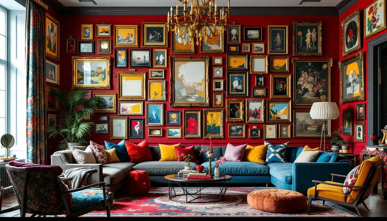
· 3 min readColor, that silent language, speaks volumes. It wraps us in feelings, sculpts our perceptions, and quietly dictates the rhythm of our days. Think of a sun-drenched afternoon, lazy and golden, or the deep velvet hush of twilight. Each scene, painted with light and shadow, conjures a specific mood, a particular sense of being. The quest for calm amid the constant clamor is a pursuit as timeless as the horizon. This is precisely where carefully curated color palettes become invaluable tools. They offer a shortcut to serenity, a visual vocabulary for crafting spaces and moments of tranquil refuge. Imagine breathing in the cool air of a secluded Nordic cabin, all whitewashed wood and soft greys, or the quiet focus found under the dappled green canopy of a forest. These aren't just settings; they are orchestrated symphonies of color, intentionally designed to soothe and center. We seek not just colors, but experiences; the promise of escape, of mental clarity that resides within a perfectly balanced composition. Ready to begin matching your inner landscape to the perfect calm palette?
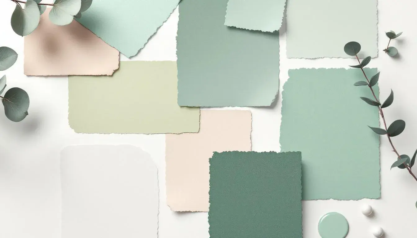
The Elicit Palette presents a curious juxtaposition. Imagine a sunlit room, its walls the palest beige, almost whispering of color. Suddenly, a burst of pale mint green appears, like the first buds of spring pushing through the frost. Dusty blue-green adds a grounding element, reminiscent of sea glass smoothed by the waves, or perhaps the distant silhouette of pine trees on a misty morning. Then comes a surprise, a dusty rose, hinting at sunsets and romance, while the bright rust introduces a note of intriguing energy, like copper catching the light. Dark olive brown serves as an anchor, a solid presence, suggesting rich soil and the grounding of nature. Deep teal, like a hidden lagoon, offers a sense of depth, sophistication, and promises unspoken. Finally, jet black provides stark contrast, a framing that accentuates the luminosity of the lighter tones. This is not a palette of instant relaxation, but of considered calm. It evokes the image of a creative professional's workspace: organized chaos, thoughtful arrangements, a place where measured ideas take root and flourish. It's the palette of someone who finds tranquility not in void, but in carefully curated complexity, a controlled dance of light and shadow. The visual narrative suggests a world of considered choices, where even the seemingly discordant voices contribute to a greater, more nuanced peace.
The Turkish Palette is a study in faded grandeur. Pale beige suggests ancient plaster walls, imbued with stories whispered over centuries. Then, seafoam green emerges, reminiscent of the Aegean Sea viewed from a whitewashed terrace, its gentle sway a constant invitation to breathe deeply. Steel blue adds a touch of nobility, reflecting the vast skies above and the intricate patterns of Iznik tiles. Olive drab contributes a grounded, earthy counterpoint, evoking images of sun-baked hillsides dotted with ancient olive groves. Finally, a slate blue anchors the composition, offering a sense of quiet strength and enduring elegance. This palette doesn't shout; it murmurs of history, of timeless beauty, and the slow, deliberate passage of time. Picture a sun-dappled courtyard filled with the scent of jasmine, a place where conversation drifts lazily on the breeze and the only urgency is the setting sun. This is a palette for those who find calm in connection, in the echoes of the past, a reminder that even in the face of change, beauty endures. It's an invitation to slow down, to savor the moment, and to find peace in the richness of cultural heritage.
Medical Calm introduces a refreshing approach. Imagine a pristine space, bathed in the soft glow of natural light. Light mint green, like the earliest shoots of spring, inspires a sense of rejuvenation and renewal. Amidst this freshness, dusty rose emerges, carrying a feeling of gentle compassion, a calming touch evoking warmth and care. Vibrant green amplifies the sensation of health and vitality, mirroring the healing energy found in nature. Neutral gray brings a balanced, grounding effect while dark gray adds a sense of depth without being imposing. This palette invites a sense of ease and tranquility in typically sterile environment, turning it into a place of healing. It's not just about the absence of chaos—it's about the conscious crafting of an environment that whispers reassurance and encourages the body and mind to find their natural equilibrium. It speaks to a progressive understanding of wellness, where aesthetics play a subtle but significant role in overall care.
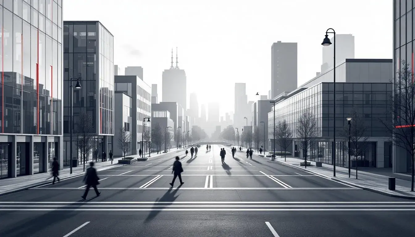
Modern Palette embraces an urban sensibility. Off white provides a quiet, unassuming foundation, like the blank canvas of a newly renovated loft. Then light gray steps in, suggesting polished concrete floors or the elegant simplicity of raw materials. Salmon red adds a touch of unexpected warmth, a subtle flicker of energy that prevents the palette from feeling sterile. Light blue introduces a cool, calming element, reminiscent of a cloudless summer sky or the gentle flow of a nearby river. Medium gray offers a grounding presence, lending a sense of stability and refined sophistication. Black anchors the composition, providing a crisp definition and dramatic contrast. This isn't the calm of a secluded beach, but the curated calm of a mindful urbanite. Picture a minimalist apartment, bathed in natural light, with carefully chosen pieces of art and furniture. It speaks to those who thrive in the city but seek refuge from its relentless energy. This palette offers a sense of control, of deliberate choices, creating a haven of tranquility amidst the bustle. It suggests a life lived with intention, where calm is not something stumbled upon, but consciously cultivated.
Corporate Calm presents a composed and trustworthy atmosphere with a thoughtful selection of tones. Pure white evokes a sense of clarity and openness, a refreshing foundation for modern workspaces. Light slate gray then adds a grounding presence, reminiscent of professional suits, while reflecting soft, natural light. Olive drab suggests a sense of tradition with a hint of sophistication, echoing the warmth and comfort of carefully curated décor. Deep steel blue then adds a level of sophistication, suggesting both dependable competence and forward-thinking. Brick red introduces a muted energy, a comforting accent with personality and subtle strength. Creating a cohesive environment filled with dependability and integrity, inviting a sense of serenity and focused energy. Picture light, open office spaces creating an environment where success and productivity are nurtured. This is the ideal for professionals, where calm is essential for navigating complex challenges with grace and precision.
Ultimately, the pursuit of calm is a deeply personal journey. It's about finding the visual cues that resonate with your inner state, the palettes that speak to your soul. Each of these offers a unique pathway to tranquility. Whether through the curated complexities of Elicit Palette's balanced composition, the faded grandeur whispers of Turkish Palette's rich heritage, the Modern Palette understated sophistication, the Medical Calm's soothing energy, or the professional tranquility of Corporate Calm, there is a vibration waiting to be matched. Consider these not just as color combinations, but as invitations—to pause, to breathe, and to design a world where calm is not a fleeting moment, but a constant companion. Let these palettes be your guide, and allow the transformative power of color to shape a life imbued with serenity and intention.