'%3e%3cpath%20fill-rule='evenodd'%20clip-rule='evenodd'%20d='M51.1303%2019.2492C50.7278%2019.913%2050.1346%2020.4426%2049.3508%2020.838C48.5669%2021.2335%2047.6172%2021.4312%2046.5014%2021.4312C44.8208%2021.4312%2043.4367%2021.0216%2042.3492%2020.2025C41.2617%2019.3833%2040.6686%2018.2394%2040.5697%2016.7706H44.4253C44.4818%2017.3355%2044.6831%2017.7804%2045.0291%2018.1052C45.3751%2018.43%2045.8164%2018.5924%2046.3531%2018.5924C46.8192%2018.5924%2047.1864%2018.4653%2047.4547%2018.2111C47.7231%2017.9569%2047.8572%2017.618%2047.8572%2017.1943C47.8572%2016.8129%2047.7337%2016.4952%2047.4865%2016.241C47.2393%2015.9867%2046.9322%2015.7784%2046.565%2015.616C46.1978%2015.4536%2045.6893%2015.2594%2045.0397%2015.0334C44.0934%2014.7086%2043.3202%2014.3944%2042.72%2014.0907C42.1197%2013.7871%2041.6042%2013.3351%2041.1735%2012.7349C40.7427%2012.1347%2040.5273%2011.3544%2040.5273%2010.394C40.5273%209.50418%2040.7533%208.73448%2041.2053%208.08481C41.6572%207.43515%2042.2821%206.93731%2043.0801%206.5913C43.8781%206.24528%2044.7925%206.07227%2045.8235%206.07227C47.49%206.07227%2048.8141%206.46771%2049.7956%207.25861C50.7772%208.04951%2051.3315%209.13698%2051.4586%2010.5211H47.5395C47.4689%2010.0268%2047.2888%209.63483%2046.9993%209.3453C46.7097%209.05578%2046.3178%208.91102%2045.8235%208.91102C45.3998%208.91102%2045.0573%209.024%2044.7961%209.24997C44.5348%209.47594%2044.4041%209.80783%2044.4041%2010.2457C44.4041%2010.5988%2044.5207%2010.8989%2044.7537%2011.146C44.9867%2011.3932%2045.2798%2011.5944%2045.6328%2011.7498C45.9859%2011.9052%2046.4944%2012.1029%2047.1581%2012.343C48.1185%2012.6678%2048.9023%2012.9891%2049.5096%2013.3069C50.1169%2013.6246%2050.6395%2014.0872%2051.0773%2014.6945C51.5151%2015.3018%2051.734%2016.0927%2051.734%2017.0672C51.734%2017.8581%2051.5328%2018.5854%2051.1303%2019.2492ZM59.0242%206.3053V21.2829H55.4016V6.3053H59.0242ZM73.9409%206.3053V9.18642H69.8734V21.2829H66.2296V9.18642H62.2046V6.3053H73.9409ZM80.7438%209.18642V12.3218H85.8069V15.0546H80.7438V18.3806H86.4425V21.2829H77.1212V6.3053H86.4425V9.18642H80.7438ZM99.667%2016.0291V21.2829H96.0444V6.3053H101.913C103.692%206.3053%20105.048%206.74665%20105.98%207.62934C106.912%208.51204%20107.378%209.7019%20107.378%2011.199C107.378%2012.1311%20107.17%2012.9609%20106.753%2013.6882C106.337%2014.4155%20105.719%2014.9875%20104.9%2015.4042C104.08%2015.8208%20103.085%2016.0291%20101.913%2016.0291H99.667ZM103.692%2011.199C103.692%209.8855%20102.965%209.22879%20101.51%209.22879H99.667V13.1268H101.51C102.965%2013.1268%20103.692%2012.4842%20103.692%2011.199ZM120.092%2018.5501H114.478L113.546%2021.2829H109.732L115.219%206.41123H119.393L124.879%2021.2829H121.024L120.092%2018.5501ZM119.16%2015.7961L117.295%2010.2881L115.41%2015.7961H119.16ZM131.555%2018.5077H136.385V21.2829H127.933V6.3053H131.555V18.5077ZM143.337%209.18642V12.3218H148.4V15.0546H143.337V18.3806H149.035V21.2829H139.714V6.3053H149.035V9.18642H143.337ZM163.507%206.3053V9.18642H159.44V21.2829H155.796V9.18642H151.771V6.3053H163.507ZM177.449%206.3053V9.18642H173.382V21.2829H169.738V9.18642H165.713V6.3053H177.449ZM184.252%209.18642V12.3218H189.315V15.0546H184.252V18.3806H189.951V21.2829H180.629V6.3053H189.951V9.18642H184.252Z'%20fill='%23EEF0ED'/%3e%3cmask%20id='mask0_3101_7327'%20style='mask-type:alpha'%20maskUnits='userSpaceOnUse'%20x='0'%20y='0'%20width='27'%20height='28'%3e%3cpath%20d='M23.8328%200.759766H2.64808C1.18559%200.759766%200%201.94535%200%203.40785V24.5925C0%2026.055%201.18559%2027.2406%202.64808%2027.2406H23.8328C25.2952%2027.2406%2026.4808%2026.055%2026.4808%2024.5925V3.40785C26.4808%201.94535%2025.2952%200.759766%2023.8328%200.759766Z'%20fill='white'/%3e%3c/mask%3e%3cg%20mask='url(%23mask0_3101_7327)'%3e%3cpath%20d='M23.8328%200.759766H2.64808C1.18559%200.759766%200%201.94535%200%203.40785V24.5925C0%2026.055%201.18559%2027.2406%202.64808%2027.2406H23.8328C25.2952%2027.2406%2026.4808%2026.055%2026.4808%2024.5925V3.40785C26.4808%201.94535%2025.2952%200.759766%2023.8328%200.759766Z'%20fill='%23D8D8D8'/%3e%3cpath%20d='M13.2404%200.759766H0V14.0001H13.2404V0.759766Z'%20fill='%238C61FF'/%3e%3cpath%20d='M13.2404%2014H0V27.2404H13.2404V14Z'%20fill='%2336C3FE'/%3e%3cpath%20d='M26.4806%2014H13.2402V27.2404H26.4806V14Z'%20fill='%236592FE'/%3e%3cpath%20d='M26.4806%200.759766H13.2402V14.0002H26.4806V0.759766Z'%20fill='%236059F7'/%3e%3c/g%3e%3c/g%3e%3cdefs%3e%3cclipPath%20id='clip0_3101_7327'%3e%3crect%20width='190'%20height='28'%20fill='white'/%3e%3c/clipPath%3e%3c/defs%3e%3c/svg%3e)
'%3e%3cpath%20d='M23.8328%200.759521H2.64808C1.18559%200.759521%200%201.94511%200%203.40761V24.5923C0%2026.0548%201.18559%2027.2404%202.64808%2027.2404H23.8328C25.2952%2027.2404%2026.4808%2026.0548%2026.4808%2024.5923V3.40761C26.4808%201.94511%2025.2952%200.759521%2023.8328%200.759521Z'%20fill='%23D8D8D8'/%3e%3cpath%20d='M13.2404%200.759521H0V13.9999H13.2404V0.759521Z'%20fill='%238C61FF'/%3e%3cpath%20d='M13.2404%2013.9998H0V27.2402H13.2404V13.9998Z'%20fill='%2336C3FE'/%3e%3cpath%20d='M26.4809%2013.9998H13.2405V27.2402H26.4809V13.9998Z'%20fill='%236592FE'/%3e%3cpath%20d='M26.4809%200.759277H13.2405V13.9997H26.4809V0.759277Z'%20fill='%236059F7'/%3e%3c/g%3e%3c/svg%3e)

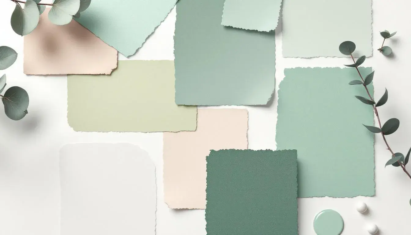
From Energetic to Understated: Tracking Mood Shifts Through Color Palettes
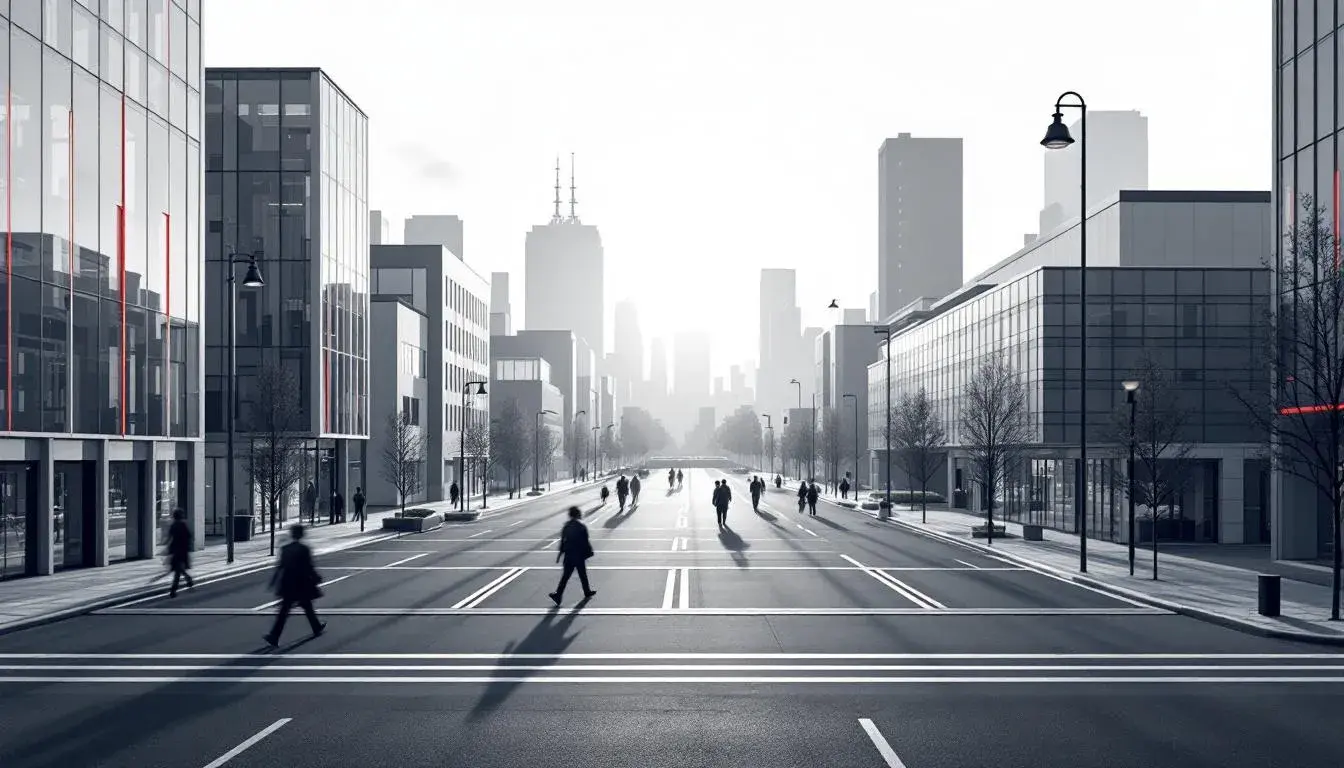
· 3 min readColor possesses the paradoxical ability to both ignite and soothe, to shout from billboards yet whisper in the details of a still life. It is the emotional bedrock upon which our visual world is built, a silent language that dictates our perceptions of space, time, and mood. From the electric thrum of a bustling city street to the hushed tranquility of a forest at dawn, color orchestrates the tempo of our experiences, shaping our feelings without uttering a single word. The art of selecting the perfect set of colors mirrors the careful curation of a symphony, and where a single note, or in this case, shade, can bring the theme crashing or elevate it to the heavens. How then can various carefully chosen color combinations influence one's perceptions?
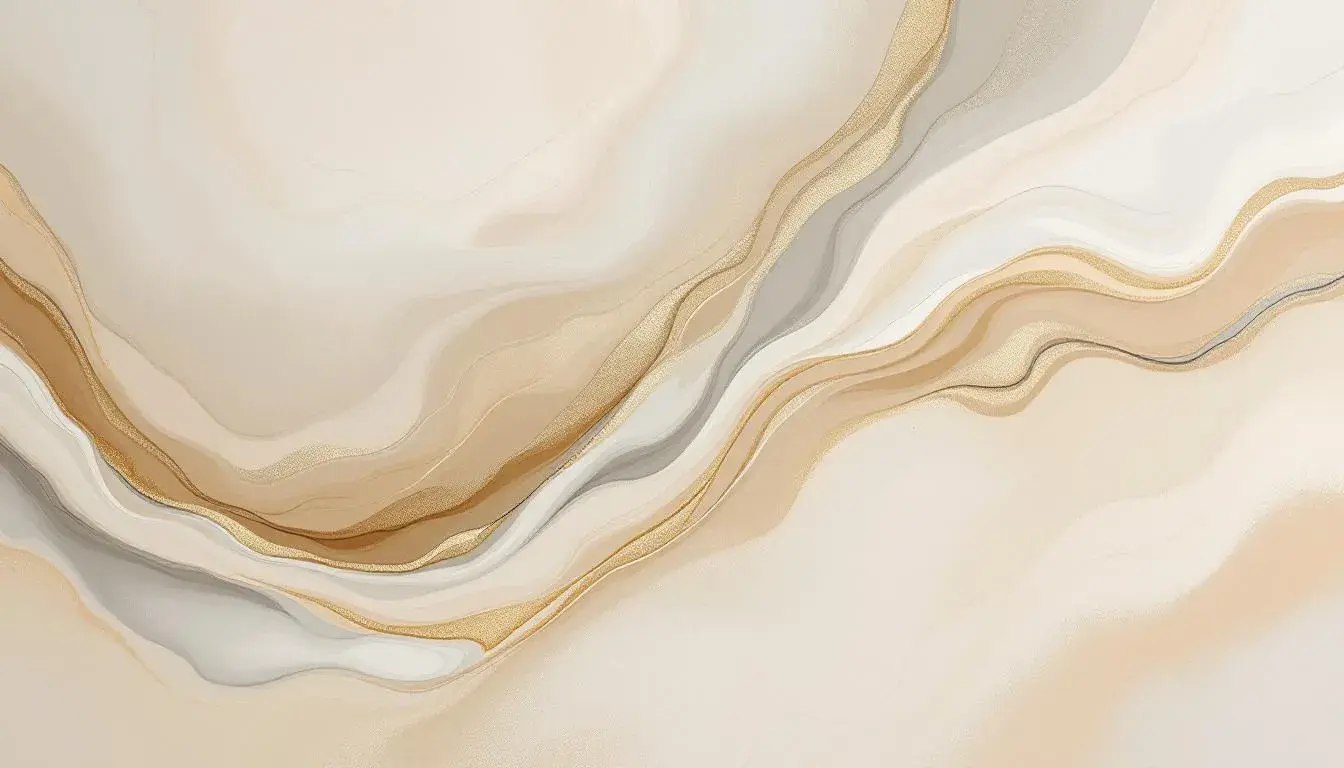
The ‘Neuro Gum’ palette feels crisp, like a breath of fresh air against sun-warmed skin. It is the opening scene of an indie film, a character waking up with a determination born of clarity. The Pure White acts as a canvas, punctuated by the optimistic Light Sky Blue; a promise of open skies. The Seafoam Green acts as a delicate counterpoint, the grounding voice of rationality. A dose of Bright Coral suggests ambition; perfect for someone building a Wellness empire. Olive Green provides strength and stamina; the marathon runner on her final lap. Deep Teal and Vivid Blue add a jolt of energy; to inspire a new endeavor. Crimson Red acts as an alarm to spark action, while Dark Taupe stabilizes. The Jet Black anchors the concept, like the fine print in a business proposal. Together these colors create a story of motivation and drive, a palette best suited for situations that demand focus, precision, and a touch of invigoration. This is the palette for the innovator seeking to disrupt the status quo, the entrepreneur with a vision, its strength is not in its volume, but in the considered interplay between colors and the story they create.
‘Vibrant Spectrum’ sings with youthful energy, reminiscent of childhood and a playfulness without constraints. The spectrum showcases a balance, Pure White and Neutral Gray creating a clean space that’s soon challenged by shades of Sky Blue and Teal Green. The bold Salmon Red grabs your attention with its unapologetic confidence, with Electric Violet injecting a touch of unconventional imagination, while Dark Slate Gray delivers subtle stability. Deep Indigo provides depth to the palette, anchoring these vibrant hues, whilst Bright Red screams action and excitement within the darker shadows of Jet Black. This is an array that would look phenomenal on marketing material for sports teams or a product launch. However, the overall intensity would mean that using this palette in a concentrated manner could be quite overwhelming.
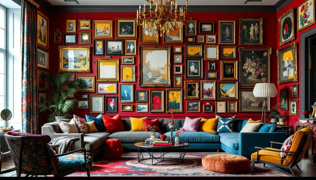
'Vibrant Contrast' is a story told in bold strokes and unexpected harmonies. The palette presents a deliberate clash, Pure White and Deep Charcoal, are interrupted by the brilliance of Lime Green and Emerald Green, colors that invoke youth, nature and happiness, while a hint of Sky Blue opens the doors, creating a breezy sense of adventure. Grayish Beige acts as an anchor, yet is followed by Olive Drab; a strange partner that brings familiarity and comfort. Bright Red creates a disruption and intrigue, offset by the serious Indigo Blue. Burgundy Red adds a touch of elegance and sophistication. "Vibrant Contrast" is perfect for brands that are not afraid to be different, for environments that thrive on creative energy, and for those projects that seek to disrupt the norm. It speaks of dynamism, but also of underlying order, a reflection of how seemingly opposing forces can coexist to inspire.
The ‘Chromatic Burst’ palette is a celebration, a kaleidoscope captured in a sequence of shades. It opens with the clarity of Pure White, quickly spilling into the radiant Lemon Yellow. Lime Green adds freshness - like dew on the grass. The Dusty Lavender then brings an element of ethereal grace, while Emerald Green reminds us of lush landscapes. Vivid Coral injects energy and passion followed by Rusty Brown providing grounding from life's adventures. Deep Indigo brings the confidence while Bright Red demands attention against the depth of the Charcoal Black backdrop. This is a playful sequence, well-suited to environments that spark creativity and inspire freedom of expression.
‘Bold Corporate’ strikes a careful balance between command and approachability. It opens with the reassurance of Pure White, flowing effortlessly into the light of Golden Yellow, with Light Gray providing a neutral harmony. Sky Blue hints at open communication, and Medium Gray adds a layer of professional seriousness. Rose Pink provides a soft, gentle nod followed by Burnt Sienna creating an element of stability. Deep Teal creates trust, while Bright Red demands recognition and Dark Crimson symbolizes strength and determination. This palette feels most at home in environments where authority meets innovation, suitable for brands that want to convey both expertise and approachability. This is a colour palette that doesn’t scream, but confidently articulates an organisation's mission.
Color, therefore, is more than decoration; it is communication. It informs how we feel in a space, how we perceive a brand, and how we interpret the world around us. From the vibrancy to the understated, the language is a diverse array of human emotional experience. Every combination is a narrative and every hue a carefully chosen word in the stories we tell. By understanding this language, we hold the potential to design not just visuals, but entire sensory experiences.