'%3e%3cpath%20fill-rule='evenodd'%20clip-rule='evenodd'%20d='M51.1303%2019.2492C50.7278%2019.913%2050.1346%2020.4426%2049.3508%2020.838C48.5669%2021.2335%2047.6172%2021.4312%2046.5014%2021.4312C44.8208%2021.4312%2043.4367%2021.0216%2042.3492%2020.2025C41.2617%2019.3833%2040.6686%2018.2394%2040.5697%2016.7706H44.4253C44.4818%2017.3355%2044.6831%2017.7804%2045.0291%2018.1052C45.3751%2018.43%2045.8164%2018.5924%2046.3531%2018.5924C46.8192%2018.5924%2047.1864%2018.4653%2047.4547%2018.2111C47.7231%2017.9569%2047.8572%2017.618%2047.8572%2017.1943C47.8572%2016.8129%2047.7337%2016.4952%2047.4865%2016.241C47.2393%2015.9867%2046.9322%2015.7784%2046.565%2015.616C46.1978%2015.4536%2045.6893%2015.2594%2045.0397%2015.0334C44.0934%2014.7086%2043.3202%2014.3944%2042.72%2014.0907C42.1197%2013.7871%2041.6042%2013.3351%2041.1735%2012.7349C40.7427%2012.1347%2040.5273%2011.3544%2040.5273%2010.394C40.5273%209.50418%2040.7533%208.73448%2041.2053%208.08481C41.6572%207.43515%2042.2821%206.93731%2043.0801%206.5913C43.8781%206.24528%2044.7925%206.07227%2045.8235%206.07227C47.49%206.07227%2048.8141%206.46771%2049.7956%207.25861C50.7772%208.04951%2051.3315%209.13698%2051.4586%2010.5211H47.5395C47.4689%2010.0268%2047.2888%209.63483%2046.9993%209.3453C46.7097%209.05578%2046.3178%208.91102%2045.8235%208.91102C45.3998%208.91102%2045.0573%209.024%2044.7961%209.24997C44.5348%209.47594%2044.4041%209.80783%2044.4041%2010.2457C44.4041%2010.5988%2044.5207%2010.8989%2044.7537%2011.146C44.9867%2011.3932%2045.2798%2011.5944%2045.6328%2011.7498C45.9859%2011.9052%2046.4944%2012.1029%2047.1581%2012.343C48.1185%2012.6678%2048.9023%2012.9891%2049.5096%2013.3069C50.1169%2013.6246%2050.6395%2014.0872%2051.0773%2014.6945C51.5151%2015.3018%2051.734%2016.0927%2051.734%2017.0672C51.734%2017.8581%2051.5328%2018.5854%2051.1303%2019.2492ZM59.0242%206.3053V21.2829H55.4016V6.3053H59.0242ZM73.9409%206.3053V9.18642H69.8734V21.2829H66.2296V9.18642H62.2046V6.3053H73.9409ZM80.7438%209.18642V12.3218H85.8069V15.0546H80.7438V18.3806H86.4425V21.2829H77.1212V6.3053H86.4425V9.18642H80.7438ZM99.667%2016.0291V21.2829H96.0444V6.3053H101.913C103.692%206.3053%20105.048%206.74665%20105.98%207.62934C106.912%208.51204%20107.378%209.7019%20107.378%2011.199C107.378%2012.1311%20107.17%2012.9609%20106.753%2013.6882C106.337%2014.4155%20105.719%2014.9875%20104.9%2015.4042C104.08%2015.8208%20103.085%2016.0291%20101.913%2016.0291H99.667ZM103.692%2011.199C103.692%209.8855%20102.965%209.22879%20101.51%209.22879H99.667V13.1268H101.51C102.965%2013.1268%20103.692%2012.4842%20103.692%2011.199ZM120.092%2018.5501H114.478L113.546%2021.2829H109.732L115.219%206.41123H119.393L124.879%2021.2829H121.024L120.092%2018.5501ZM119.16%2015.7961L117.295%2010.2881L115.41%2015.7961H119.16ZM131.555%2018.5077H136.385V21.2829H127.933V6.3053H131.555V18.5077ZM143.337%209.18642V12.3218H148.4V15.0546H143.337V18.3806H149.035V21.2829H139.714V6.3053H149.035V9.18642H143.337ZM163.507%206.3053V9.18642H159.44V21.2829H155.796V9.18642H151.771V6.3053H163.507ZM177.449%206.3053V9.18642H173.382V21.2829H169.738V9.18642H165.713V6.3053H177.449ZM184.252%209.18642V12.3218H189.315V15.0546H184.252V18.3806H189.951V21.2829H180.629V6.3053H189.951V9.18642H184.252Z'%20fill='%23EEF0ED'/%3e%3cmask%20id='mask0_3101_7327'%20style='mask-type:alpha'%20maskUnits='userSpaceOnUse'%20x='0'%20y='0'%20width='27'%20height='28'%3e%3cpath%20d='M23.8328%200.759766H2.64808C1.18559%200.759766%200%201.94535%200%203.40785V24.5925C0%2026.055%201.18559%2027.2406%202.64808%2027.2406H23.8328C25.2952%2027.2406%2026.4808%2026.055%2026.4808%2024.5925V3.40785C26.4808%201.94535%2025.2952%200.759766%2023.8328%200.759766Z'%20fill='white'/%3e%3c/mask%3e%3cg%20mask='url(%23mask0_3101_7327)'%3e%3cpath%20d='M23.8328%200.759766H2.64808C1.18559%200.759766%200%201.94535%200%203.40785V24.5925C0%2026.055%201.18559%2027.2406%202.64808%2027.2406H23.8328C25.2952%2027.2406%2026.4808%2026.055%2026.4808%2024.5925V3.40785C26.4808%201.94535%2025.2952%200.759766%2023.8328%200.759766Z'%20fill='%23D8D8D8'/%3e%3cpath%20d='M13.2404%200.759766H0V14.0001H13.2404V0.759766Z'%20fill='%238C61FF'/%3e%3cpath%20d='M13.2404%2014H0V27.2404H13.2404V14Z'%20fill='%2336C3FE'/%3e%3cpath%20d='M26.4806%2014H13.2402V27.2404H26.4806V14Z'%20fill='%236592FE'/%3e%3cpath%20d='M26.4806%200.759766H13.2402V14.0002H26.4806V0.759766Z'%20fill='%236059F7'/%3e%3c/g%3e%3c/g%3e%3cdefs%3e%3cclipPath%20id='clip0_3101_7327'%3e%3crect%20width='190'%20height='28'%20fill='white'/%3e%3c/clipPath%3e%3c/defs%3e%3c/svg%3e)
'%3e%3cpath%20d='M23.8328%200.759521H2.64808C1.18559%200.759521%200%201.94511%200%203.40761V24.5923C0%2026.0548%201.18559%2027.2404%202.64808%2027.2404H23.8328C25.2952%2027.2404%2026.4808%2026.0548%2026.4808%2024.5923V3.40761C26.4808%201.94511%2025.2952%200.759521%2023.8328%200.759521Z'%20fill='%23D8D8D8'/%3e%3cpath%20d='M13.2404%200.759521H0V13.9999H13.2404V0.759521Z'%20fill='%238C61FF'/%3e%3cpath%20d='M13.2404%2013.9998H0V27.2402H13.2404V13.9998Z'%20fill='%2336C3FE'/%3e%3cpath%20d='M26.4809%2013.9998H13.2405V27.2402H26.4809V13.9998Z'%20fill='%236592FE'/%3e%3cpath%20d='M26.4809%200.759277H13.2405V13.9997H26.4809V0.759277Z'%20fill='%236059F7'/%3e%3c/g%3e%3c/svg%3e)
The Anti-Minimalist Trend: When Color Schemes Collide
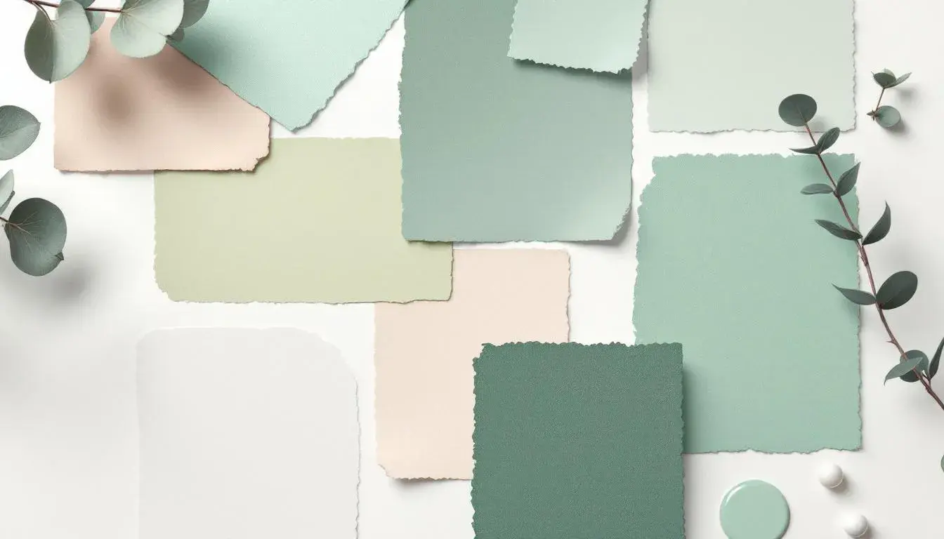
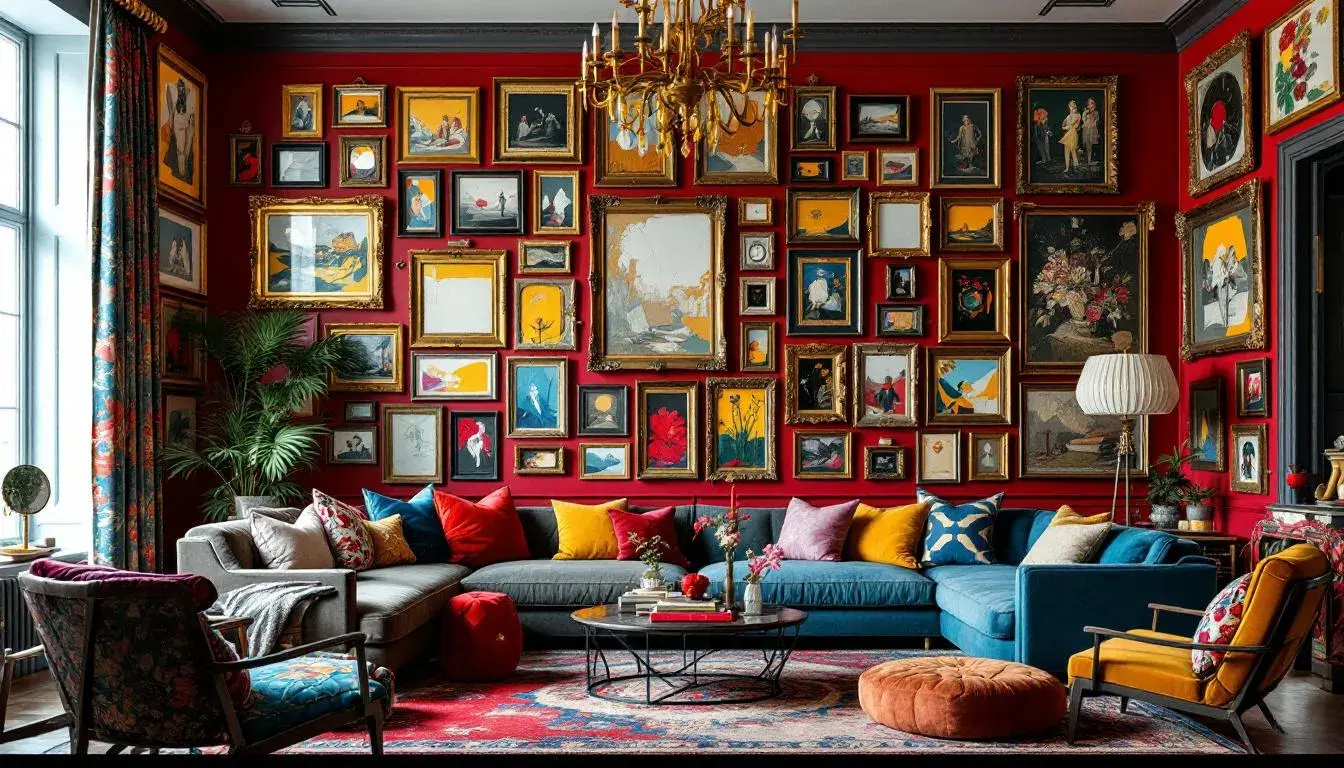
· 8 min readThe reign of serene creams and hushed grays is fading, giving way to a vibrant rebellion. Spaces are no longer sanctuaries of quietude; they pulsate with layered hues, creating environments that stimulate rather than soothe. Think of a gallery wall exploding with a riot of artwork, spilling onto furniture draped in unexpected textures and colours. It's about maximal impact, a purposeful clash of sensibilities, and a deliberate defiance of pared-down aesthetics. The new credo? More is undeniably more. Interiors reject simple stories for complex narratives, inviting personalities to bloom in kaleidoscopic glory. Where once uniformity ruled, now individualism takes centre stage, unapologetically bold and bursting with character. Neutrals make way for saturated shades that, once considered clashing, now harmonize in exciting and unexpected ways. We explore palettes that don't just whisper but shout, boldly combining colour stories in ways that redefine our understanding of visual equilibrium.
The "Vibrant Contrast" palette feels like a summer garden in full bloom, a place where wildflowers disregard expectations and clash in the most delightful ways. Imagine a room where tomato red cushions pop against walls painted a muted green, the darkness of dark asphalt anchoring the exuberance. Pale lime accents could shimmer on decorative objects, enhancing the sense of lively disarray. It’s the kind of palette that welcomes experimentation, where textures amplify the colours, and curated chaos reigns supreme. Think vintage furniture upholstered in daring combinations, against walls scrawled with street art-inspired murals. This is not about quiet contemplation; it’s about sparking conversation, inspiring creativity, and embracing the unexpected. One might imagine this colour story playing out on a sprawling canvas, details added recklessly, until the piece takes on a life of its own. The effect isn't jarring, but inspiring; the eye dances from one element to the next, absorbing details with an almost frantic energy. The tension between the cooler tones and the fiery reds creates a sense of playful unease, a push and pull that mirrors the contradictions of modern life.
"Tech Green", evokes the sleekness of modern technology, but with a twist of organic vibrancy. Picture an office space where pale white walls serve as a backdrop for deep navy accents, punctuated by the surprising introduction of chartreuse yellow. Steel gray furniture adds a touch of sophistication, while areas of dark slate provide a grounding element. The palette breathes innovation, suggesting a workspace that is both professional and invigorating. Envision this colour blend in a tech start-up's common area, plants are used to soften the harder edges, as though nature is reclaiming space. It's an arrangement that invites collaboration, where ideas spark and evolve within a framework of structure. This palette whispers of a tech-forward future, a space where cool logic meets creative fire. The deliberate use of contrasting tones evokes the feeling of complex circuit boards, all wired and ready to perform. This colour story, as such, has immense appeal for spaces looking to project competence, a spirit of technological innovation, and a willingness to push the creative envelope.
"Balanced Harmony" exudes a quiet confidence, a subtle defiance of conventional norms. Imagine a living room where light gray walls create a serene environment, contrasted by indigo blue furniture. The seafoam green accents introduce a pop of unexpected energy, while dusty lavender cushions weave a sense of gentle whimsy. The darkness of dark olive adds depth and grounding, holding the lighter elements together. Think of textured wallpaper offsetting luxurious velvet furniture, accented perhaps by vintage lamps. The palette feels both modern and timeless, inviting a mix of styles and eras. Perhaps on a set of book covers, colours intertwining. It’s a reminder that sophistication doesn't have to mean austerity – that personality can shine through even in the most carefully curated spaces. The cool, balanced saturation levels add a sense of calm, allowing the eye to rest amidst the visual abundance. The choice of colour here gives a sense of the unexpected. The seafoam green is a breath of fresh air against the deeper tones of indigo, creating a space that celebrates individuality.
"Aqua Depths" captures the mysterious beauty of the deep sea, translating it into a palette that feels both calming and invigorating. Picture a space where creamy white walls create a soft foundation, contrasting with accents of electric blue. The subtle addition of mint green evokes the feeling of underwater plants swaying gently in the tide, while light lavender adds a layer of ethereal charm. Steel gray is a subtle nod to the cragginess of coral formations, it grounds the space. Imagine this chromatic selection in a spa, or a doctor's office. The result is never boring; it's always intriguing. One might imagine this palette adorning a piece of digital artwork, with colours rippling into each other. The starkness of deep charcoal anchors the whole thing, while the electric blue offers an element of surprise. The colours create a sense of depth, pulling the eye into a place of quiet contemplation.
"Electric Pink" throbs with a restless energy, a colour story that feels ripped from the pages of a fashion magazine. Picture a boutique painted pale pink, punctuated by flashes of magenta purple. Slate gray elements create a grounded sense of cool, while deep claret adds a touch of sophisticated drama. At its base, a dark espresso is ever-present. This unexpected and assertive grouping of shades would suit website or interior design, spaces that embrace a sense of theatrical flair. Imagine it in a hotel lobby. At the heart of it all, the magenta purple serves as a bold statement of individuality. Instead of trying to fade into the background, its a moment of self-expression. The shades create a striking contrast, a visual push-and-pull that ignites the senses. Electric Pink dares you to be noticed.
"Vibrant Fusion" bursts forth like a fanfare, a celebration of contrasting elements that somehow find a strange equilibrium. Picture a creative studio, the walls a pale mauve canvas for a tangerine sofa. Neutral gray softens the blow, an unexpected but helpful anchor. Olive drab, is an equally grounding element in the space. The result is creative expression brought to life, it's suited to spaces looking to project a hip, youthful energy. Imagine this arrangement on a mural, or an experimental piece. The tangerine injects a feeling of playful optimism, a warmth that offsets the cooler tones. The hues have unique personalities, yet they are unified by an invisible thread of creativity. The use of such distinct colours celebrates imagination and expression, encouraging artists, designers, and dreamers.
The palettes presented invite a re-evaluation of our aesthetic boundaries. "Vibrant Contrast" shows how seemingly disparate colours can create a stimulating environment, full of life and energy. "Tech Green" pushes technology's cool logic through a natural lens. But it is in "Balanced Harmony" that finds unexpected calm, it offers a sophisticated, liveable rebellion against predictability. "Aqua Depths" dives into cool complexity, a reminder that tranquility and energy exist together. "Electric Pink" has a flair for the dramatic, while "Vibrant Fusion" is the boldest of all the palettes, inviting a mix of influences. Together, they represent a rejection of simplistic aesthetics, in favor of spaces that pulse with character, intrigue, and the unapologetic expression of self.