'%3e%3cpath%20fill-rule='evenodd'%20clip-rule='evenodd'%20d='M51.1303%2019.2492C50.7278%2019.913%2050.1346%2020.4426%2049.3508%2020.838C48.5669%2021.2335%2047.6172%2021.4312%2046.5014%2021.4312C44.8208%2021.4312%2043.4367%2021.0216%2042.3492%2020.2025C41.2617%2019.3833%2040.6686%2018.2394%2040.5697%2016.7706H44.4253C44.4818%2017.3355%2044.6831%2017.7804%2045.0291%2018.1052C45.3751%2018.43%2045.8164%2018.5924%2046.3531%2018.5924C46.8192%2018.5924%2047.1864%2018.4653%2047.4547%2018.2111C47.7231%2017.9569%2047.8572%2017.618%2047.8572%2017.1943C47.8572%2016.8129%2047.7337%2016.4952%2047.4865%2016.241C47.2393%2015.9867%2046.9322%2015.7784%2046.565%2015.616C46.1978%2015.4536%2045.6893%2015.2594%2045.0397%2015.0334C44.0934%2014.7086%2043.3202%2014.3944%2042.72%2014.0907C42.1197%2013.7871%2041.6042%2013.3351%2041.1735%2012.7349C40.7427%2012.1347%2040.5273%2011.3544%2040.5273%2010.394C40.5273%209.50418%2040.7533%208.73448%2041.2053%208.08481C41.6572%207.43515%2042.2821%206.93731%2043.0801%206.5913C43.8781%206.24528%2044.7925%206.07227%2045.8235%206.07227C47.49%206.07227%2048.8141%206.46771%2049.7956%207.25861C50.7772%208.04951%2051.3315%209.13698%2051.4586%2010.5211H47.5395C47.4689%2010.0268%2047.2888%209.63483%2046.9993%209.3453C46.7097%209.05578%2046.3178%208.91102%2045.8235%208.91102C45.3998%208.91102%2045.0573%209.024%2044.7961%209.24997C44.5348%209.47594%2044.4041%209.80783%2044.4041%2010.2457C44.4041%2010.5988%2044.5207%2010.8989%2044.7537%2011.146C44.9867%2011.3932%2045.2798%2011.5944%2045.6328%2011.7498C45.9859%2011.9052%2046.4944%2012.1029%2047.1581%2012.343C48.1185%2012.6678%2048.9023%2012.9891%2049.5096%2013.3069C50.1169%2013.6246%2050.6395%2014.0872%2051.0773%2014.6945C51.5151%2015.3018%2051.734%2016.0927%2051.734%2017.0672C51.734%2017.8581%2051.5328%2018.5854%2051.1303%2019.2492ZM59.0242%206.3053V21.2829H55.4016V6.3053H59.0242ZM73.9409%206.3053V9.18642H69.8734V21.2829H66.2296V9.18642H62.2046V6.3053H73.9409ZM80.7438%209.18642V12.3218H85.8069V15.0546H80.7438V18.3806H86.4425V21.2829H77.1212V6.3053H86.4425V9.18642H80.7438ZM99.667%2016.0291V21.2829H96.0444V6.3053H101.913C103.692%206.3053%20105.048%206.74665%20105.98%207.62934C106.912%208.51204%20107.378%209.7019%20107.378%2011.199C107.378%2012.1311%20107.17%2012.9609%20106.753%2013.6882C106.337%2014.4155%20105.719%2014.9875%20104.9%2015.4042C104.08%2015.8208%20103.085%2016.0291%20101.913%2016.0291H99.667ZM103.692%2011.199C103.692%209.8855%20102.965%209.22879%20101.51%209.22879H99.667V13.1268H101.51C102.965%2013.1268%20103.692%2012.4842%20103.692%2011.199ZM120.092%2018.5501H114.478L113.546%2021.2829H109.732L115.219%206.41123H119.393L124.879%2021.2829H121.024L120.092%2018.5501ZM119.16%2015.7961L117.295%2010.2881L115.41%2015.7961H119.16ZM131.555%2018.5077H136.385V21.2829H127.933V6.3053H131.555V18.5077ZM143.337%209.18642V12.3218H148.4V15.0546H143.337V18.3806H149.035V21.2829H139.714V6.3053H149.035V9.18642H143.337ZM163.507%206.3053V9.18642H159.44V21.2829H155.796V9.18642H151.771V6.3053H163.507ZM177.449%206.3053V9.18642H173.382V21.2829H169.738V9.18642H165.713V6.3053H177.449ZM184.252%209.18642V12.3218H189.315V15.0546H184.252V18.3806H189.951V21.2829H180.629V6.3053H189.951V9.18642H184.252Z'%20fill='%23EEF0ED'/%3e%3cmask%20id='mask0_3101_7327'%20style='mask-type:alpha'%20maskUnits='userSpaceOnUse'%20x='0'%20y='0'%20width='27'%20height='28'%3e%3cpath%20d='M23.8328%200.759766H2.64808C1.18559%200.759766%200%201.94535%200%203.40785V24.5925C0%2026.055%201.18559%2027.2406%202.64808%2027.2406H23.8328C25.2952%2027.2406%2026.4808%2026.055%2026.4808%2024.5925V3.40785C26.4808%201.94535%2025.2952%200.759766%2023.8328%200.759766Z'%20fill='white'/%3e%3c/mask%3e%3cg%20mask='url(%23mask0_3101_7327)'%3e%3cpath%20d='M23.8328%200.759766H2.64808C1.18559%200.759766%200%201.94535%200%203.40785V24.5925C0%2026.055%201.18559%2027.2406%202.64808%2027.2406H23.8328C25.2952%2027.2406%2026.4808%2026.055%2026.4808%2024.5925V3.40785C26.4808%201.94535%2025.2952%200.759766%2023.8328%200.759766Z'%20fill='%23D8D8D8'/%3e%3cpath%20d='M13.2404%200.759766H0V14.0001H13.2404V0.759766Z'%20fill='%238C61FF'/%3e%3cpath%20d='M13.2404%2014H0V27.2404H13.2404V14Z'%20fill='%2336C3FE'/%3e%3cpath%20d='M26.4806%2014H13.2402V27.2404H26.4806V14Z'%20fill='%236592FE'/%3e%3cpath%20d='M26.4806%200.759766H13.2402V14.0002H26.4806V0.759766Z'%20fill='%236059F7'/%3e%3c/g%3e%3c/g%3e%3cdefs%3e%3cclipPath%20id='clip0_3101_7327'%3e%3crect%20width='190'%20height='28'%20fill='white'/%3e%3c/clipPath%3e%3c/defs%3e%3c/svg%3e)
'%3e%3cpath%20d='M23.8328%200.759521H2.64808C1.18559%200.759521%200%201.94511%200%203.40761V24.5923C0%2026.0548%201.18559%2027.2404%202.64808%2027.2404H23.8328C25.2952%2027.2404%2026.4808%2026.0548%2026.4808%2024.5923V3.40761C26.4808%201.94511%2025.2952%200.759521%2023.8328%200.759521Z'%20fill='%23D8D8D8'/%3e%3cpath%20d='M13.2404%200.759521H0V13.9999H13.2404V0.759521Z'%20fill='%238C61FF'/%3e%3cpath%20d='M13.2404%2013.9998H0V27.2402H13.2404V13.9998Z'%20fill='%2336C3FE'/%3e%3cpath%20d='M26.4809%2013.9998H13.2405V27.2402H26.4809V13.9998Z'%20fill='%236592FE'/%3e%3cpath%20d='M26.4809%200.759277H13.2405V13.9997H26.4809V0.759277Z'%20fill='%236059F7'/%3e%3c/g%3e%3c/svg%3e)

The Yin and Yang of Warmth and Coolness ⚕️
· 3 min readColor, a language whispered on light, speaks fluently of balance. The ancient symbol of Yin and Yang dances with opposing energies, illustrating a universal yearning for wholeness. Color palettes, when thoughtfully assembled, echo this same dance. Warmth and coolness, light and shadow, boldness and restraint – all play vital parts. A successful palette isn't simply a collection of pleasing hues; it's a conversation, a negotiation between opposing forces resolving into something beautifully complete. It’s the blush of sunrise kissing a frosty field, the reassuring gray of a stormy sky giving way to a burst of emerald green. We seek these balances, consciously or not, in the environments we create, the art we consume, and the clothes we choose. They remind us that contrast is essential, that tension can resolve into something beautiful, that the world is richer for its differences. Consider the narrative power within a palette, how it can soothe, provoke, or gently guide the eye. These are not just colors; they are stories waiting to be told.
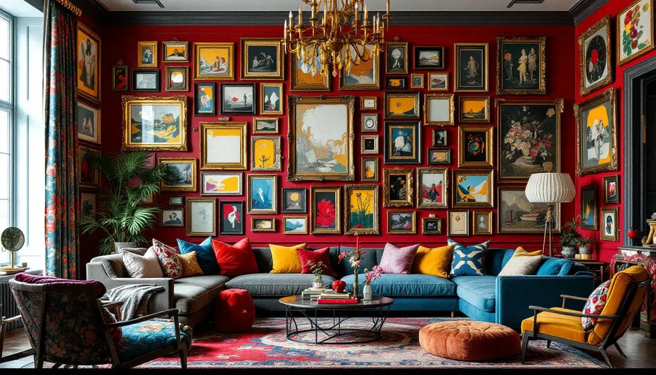
The palette of "Modern Elegance" seems pulled from a hushed gallery on a winter afternoon. Light Silver softly coats the scene like freshly fallen snow, a luminous backdrop against which other stories quietly unfold. Pale Blue whispers of ice and distant skies, a fragile coolness grounding the deeper tones. Layers of Steel Blue gather like shadows in a quiet room, holding secrets close. Then, a grounding presence: Dusty Gray, like worn stone or aged leather, anchors the flight of lighter shades, preventing them from drifting too far. Finally, Onyx Black descends, a firm punctuation, a moment of resolute stillness. This isn't a palette to ignite passions, but rather to cultivate a sense of serene control. Imagine an executive office, a space designed for thoughtful contemplation. Walls breathe with Light Silver, while tailored suits in varying shades of gray and muted blue add subtle depth. This controlled range of cool tones could be the perfect canvas to showcase one bold, singular item – a vibrant floral arrangement, a striking piece of modern art – adding the vital spark of "yang" to its "yin." It whispers of restraint, but also of the quiet power that comes from knowing exactly when and how to introduce a vibrant note of contrast.
"Modern Serenity" feels like the first breath of fresh air after a long winter. Pale Blue-Gray drapes softly like morning mist, evoking a sense of expansive calm. But this tranquility isn't passive. Vivid Green bursts forth, a concentrated pulse of invigorating energy, reminiscent of new leaves unfurling. Deep Teal currents run beneath the surface like a hidden spring, anchoring the lighter hues with its tranquil depths, while Dark Cyan further enriches the coolness. Muted Gray-Blue then blends so well to complete the final cool nuance. To imagine this palette in action, consider the design of a wellness retreat. Imagine a yoga studio where the walls are washed in Pale Blue-Gray, mirroring the early morning sky. The Vivid Green could be incorporated through strategically placed plants, bringing the energy of the natural world inside. Accents of Deep Teal in the cushions and mats reinforce quiet and introspection. Here, the palette achieves a gentle balance: the stillness of cool tones meeting the life-affirming vitality of green, in a space that heals and restores balance. The palette could be powerful in a branding context, for a company looking to establish a feeling of eco-consciousness.
With "Corporate Automotive," a more assertive story unfolds, one of sleek surfaces and controlled power. Vibrant Gold flashes like sunlight on polished chrome, hinting at luxury and success. Dusty Teal then emerges, a calming, sophisticated counterpoint to the brilliance of gold. Next, we see Deep Brown, an earthy foundation, lending a sense of grounded reliability to the overall scene. Bright Scarlet injects a surge of adrenaline, communicating a passionate intensity. Finally, Electric Blue cuts through the other colors with its technological edge, communicating precision. Envision: the showroom of an electric car company. The backdrop may be clad in Dusty Teal, subtly luxurious and calming. A vehicle bathed in Electric Blue sits, gleaming, beneath carefully orchestrated lighting. Unexpectedly, highlights of Bright Scarlet draw the eye to key features. The addition of Vibrant Gold to the company logo embodies prosperity and a bright future. This palette isn't merely about selling cars; it's about selling an experience, a vision where excitement and sophistication effortlessly intertwine.
"Earthy Elegance" gives voice to a more organic world, like a carefully curated autumn landscape. Soft Teal whispers of misty mornings, a gentle invitation to slow down and breathe. Amber Orange glows warmly, reminiscent of sun streaming through changing leaves, an invitation to gather close. Vibrant Orange, brighter than a hearth fire, commands attention, then Dark Green comes like deep earth below. Deep Red pulses like embers in the grate. Imagine a cozy living room, styled for a gathering with friends. Soft Teal walls would be bathed in the soft light of scented candles casting shadows. A roaring fire, reflected in the Amber Orange of throw blankets and cushions, lends warmth. A complex rug, featuring subtle inclusions of Dark Green and Deep Red in its intricate pattern, grounds the space. This is a room to cocoon in, where conversations flow easily and time seems to slow. "Earthy Elegance" provides not just a visual aesthetic, but an atmosphere that encourages connection and a return to simple pleasures.
The "Vibrant Harmony" palette conjures a world of breezy creative collaboration. Light Blue, airy and weightless, provides the serene background. Cool Gray serves to refine while still maintaining an overall cool aesthetic. Next, Bright Teal cuts through them with a note of optimism, a flash of unexpected energy. Slate Gray comes next, a stable counterpoint, lending a touch of serious contemplation, and then last but not least, Deep Blue comes to finish. Consider: a shared creative office space, designed to foster innovation. Walls are painted in pale Light Blue to create a sense of openness and possibility. Bright Teal accents appear in furniture or wall art, creating playful focal points. Individuals gather around a table, Slate Gray, to brainstorm ideas. This space fosters both focus and collaboration, blending the serenity of blues and grays with the exciting spark of bright colors. It's a space where seemingly opposing ideas can come together to lead to something new.
Across these palettes, a clear desire for balance rings true. Whether it's the tranquil control of "Modern Elegance", the invigorating serenity of "Modern Serenity", the assertive sophistication of "Corporate Automotive", the warm comforts of "Earthy Elegance", or the vibrant collaboration of “Vibrant Harmony”, the push and pull of colors creates an atmosphere of completion. The subtle dance of cool and warm, light and shadow enables a space to breathe, to feel complete. Understanding these color dynamics is not merely about aesthetics; it’s about crafting meaningful experiences. Palettes are emotional instruments. They offer glimpses into the human desires for calm, excitement, connection, and innovation. This simple symbol – the interplay of opposite energies – resonates in our environments, our brands, our lives. Cool, warm, whatever the intention, a true palette needs balance.