'%3e%3cpath%20fill-rule='evenodd'%20clip-rule='evenodd'%20d='M51.1303%2019.2492C50.7278%2019.913%2050.1346%2020.4426%2049.3508%2020.838C48.5669%2021.2335%2047.6172%2021.4312%2046.5014%2021.4312C44.8208%2021.4312%2043.4367%2021.0216%2042.3492%2020.2025C41.2617%2019.3833%2040.6686%2018.2394%2040.5697%2016.7706H44.4253C44.4818%2017.3355%2044.6831%2017.7804%2045.0291%2018.1052C45.3751%2018.43%2045.8164%2018.5924%2046.3531%2018.5924C46.8192%2018.5924%2047.1864%2018.4653%2047.4547%2018.2111C47.7231%2017.9569%2047.8572%2017.618%2047.8572%2017.1943C47.8572%2016.8129%2047.7337%2016.4952%2047.4865%2016.241C47.2393%2015.9867%2046.9322%2015.7784%2046.565%2015.616C46.1978%2015.4536%2045.6893%2015.2594%2045.0397%2015.0334C44.0934%2014.7086%2043.3202%2014.3944%2042.72%2014.0907C42.1197%2013.7871%2041.6042%2013.3351%2041.1735%2012.7349C40.7427%2012.1347%2040.5273%2011.3544%2040.5273%2010.394C40.5273%209.50418%2040.7533%208.73448%2041.2053%208.08481C41.6572%207.43515%2042.2821%206.93731%2043.0801%206.5913C43.8781%206.24528%2044.7925%206.07227%2045.8235%206.07227C47.49%206.07227%2048.8141%206.46771%2049.7956%207.25861C50.7772%208.04951%2051.3315%209.13698%2051.4586%2010.5211H47.5395C47.4689%2010.0268%2047.2888%209.63483%2046.9993%209.3453C46.7097%209.05578%2046.3178%208.91102%2045.8235%208.91102C45.3998%208.91102%2045.0573%209.024%2044.7961%209.24997C44.5348%209.47594%2044.4041%209.80783%2044.4041%2010.2457C44.4041%2010.5988%2044.5207%2010.8989%2044.7537%2011.146C44.9867%2011.3932%2045.2798%2011.5944%2045.6328%2011.7498C45.9859%2011.9052%2046.4944%2012.1029%2047.1581%2012.343C48.1185%2012.6678%2048.9023%2012.9891%2049.5096%2013.3069C50.1169%2013.6246%2050.6395%2014.0872%2051.0773%2014.6945C51.5151%2015.3018%2051.734%2016.0927%2051.734%2017.0672C51.734%2017.8581%2051.5328%2018.5854%2051.1303%2019.2492ZM59.0242%206.3053V21.2829H55.4016V6.3053H59.0242ZM73.9409%206.3053V9.18642H69.8734V21.2829H66.2296V9.18642H62.2046V6.3053H73.9409ZM80.7438%209.18642V12.3218H85.8069V15.0546H80.7438V18.3806H86.4425V21.2829H77.1212V6.3053H86.4425V9.18642H80.7438ZM99.667%2016.0291V21.2829H96.0444V6.3053H101.913C103.692%206.3053%20105.048%206.74665%20105.98%207.62934C106.912%208.51204%20107.378%209.7019%20107.378%2011.199C107.378%2012.1311%20107.17%2012.9609%20106.753%2013.6882C106.337%2014.4155%20105.719%2014.9875%20104.9%2015.4042C104.08%2015.8208%20103.085%2016.0291%20101.913%2016.0291H99.667ZM103.692%2011.199C103.692%209.8855%20102.965%209.22879%20101.51%209.22879H99.667V13.1268H101.51C102.965%2013.1268%20103.692%2012.4842%20103.692%2011.199ZM120.092%2018.5501H114.478L113.546%2021.2829H109.732L115.219%206.41123H119.393L124.879%2021.2829H121.024L120.092%2018.5501ZM119.16%2015.7961L117.295%2010.2881L115.41%2015.7961H119.16ZM131.555%2018.5077H136.385V21.2829H127.933V6.3053H131.555V18.5077ZM143.337%209.18642V12.3218H148.4V15.0546H143.337V18.3806H149.035V21.2829H139.714V6.3053H149.035V9.18642H143.337ZM163.507%206.3053V9.18642H159.44V21.2829H155.796V9.18642H151.771V6.3053H163.507ZM177.449%206.3053V9.18642H173.382V21.2829H169.738V9.18642H165.713V6.3053H177.449ZM184.252%209.18642V12.3218H189.315V15.0546H184.252V18.3806H189.951V21.2829H180.629V6.3053H189.951V9.18642H184.252Z'%20fill='%23EEF0ED'/%3e%3cmask%20id='mask0_3101_7327'%20style='mask-type:alpha'%20maskUnits='userSpaceOnUse'%20x='0'%20y='0'%20width='27'%20height='28'%3e%3cpath%20d='M23.8328%200.759766H2.64808C1.18559%200.759766%200%201.94535%200%203.40785V24.5925C0%2026.055%201.18559%2027.2406%202.64808%2027.2406H23.8328C25.2952%2027.2406%2026.4808%2026.055%2026.4808%2024.5925V3.40785C26.4808%201.94535%2025.2952%200.759766%2023.8328%200.759766Z'%20fill='white'/%3e%3c/mask%3e%3cg%20mask='url(%23mask0_3101_7327)'%3e%3cpath%20d='M23.8328%200.759766H2.64808C1.18559%200.759766%200%201.94535%200%203.40785V24.5925C0%2026.055%201.18559%2027.2406%202.64808%2027.2406H23.8328C25.2952%2027.2406%2026.4808%2026.055%2026.4808%2024.5925V3.40785C26.4808%201.94535%2025.2952%200.759766%2023.8328%200.759766Z'%20fill='%23D8D8D8'/%3e%3cpath%20d='M13.2404%200.759766H0V14.0001H13.2404V0.759766Z'%20fill='%238C61FF'/%3e%3cpath%20d='M13.2404%2014H0V27.2404H13.2404V14Z'%20fill='%2336C3FE'/%3e%3cpath%20d='M26.4806%2014H13.2402V27.2404H26.4806V14Z'%20fill='%236592FE'/%3e%3cpath%20d='M26.4806%200.759766H13.2402V14.0002H26.4806V0.759766Z'%20fill='%236059F7'/%3e%3c/g%3e%3c/g%3e%3cdefs%3e%3cclipPath%20id='clip0_3101_7327'%3e%3crect%20width='190'%20height='28'%20fill='white'/%3e%3c/clipPath%3e%3c/defs%3e%3c/svg%3e)
'%3e%3cpath%20d='M23.8328%200.759521H2.64808C1.18559%200.759521%200%201.94511%200%203.40761V24.5923C0%2026.0548%201.18559%2027.2404%202.64808%2027.2404H23.8328C25.2952%2027.2404%2026.4808%2026.0548%2026.4808%2024.5923V3.40761C26.4808%201.94511%2025.2952%200.759521%2023.8328%200.759521Z'%20fill='%23D8D8D8'/%3e%3cpath%20d='M13.2404%200.759521H0V13.9999H13.2404V0.759521Z'%20fill='%238C61FF'/%3e%3cpath%20d='M13.2404%2013.9998H0V27.2402H13.2404V13.9998Z'%20fill='%2336C3FE'/%3e%3cpath%20d='M26.4809%2013.9998H13.2405V27.2402H26.4809V13.9998Z'%20fill='%236592FE'/%3e%3cpath%20d='M26.4809%200.759277H13.2405V13.9997H26.4809V0.759277Z'%20fill='%236059F7'/%3e%3c/g%3e%3c/svg%3e)
Beyond Black and White: Decoding Gray Scale Trends from Predominant Palettes!
· 5 min readFrom the hushed reverence of a museum to the stark efficiency of a modern office, gray possesses a chameleon-like ability to shape our perceptions. More than simply the absence of color, it's a spectrum of possibility, a canvas onto which light and shadow dance to create mood, form, and depth. A world saturated with bright color can be overwhelming; gray offers respite, a grounding force that allows other hues to sing. It is the whispered undertone that amplifies the bold, a quiet strength that speaks volumes. This exploration steps beyond the simplistic "black and white" dichotomy, diving into the heart of expertly curated palettes, revealing how various grays subtly influence and enrich our visual experiences. Each carefully considered combination tells a story, building atmosphere and defining a unique aesthetic. Let's look at how they make us feel and what they make us see.
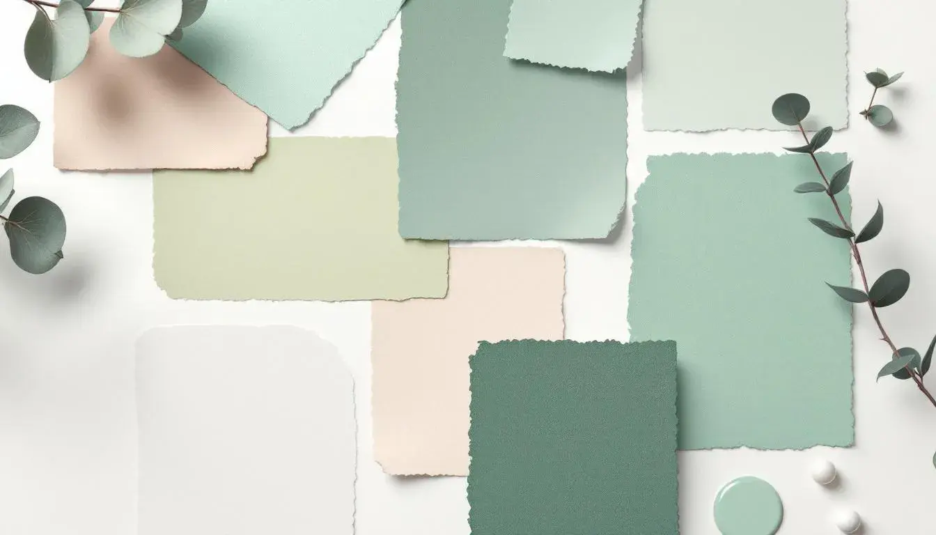
Rosewood Elegance 🪵 presents a study in muted sophistication. Off White lays the foundation, a whisper of neutrality that avoids starkness. Cool Gray blends seamlessly, evoking a sense of calm composure. This is the palette of a well-appointed drawing room, where conversation flows easily and the fire crackles softly in the background. The faint Steel Blue hints at intellectual pursuits, stimulating a sense of measured curiosity. Stone Gray offers an earthy grounding, a reminder of tangible materials, while Dark Slate Gray anchors the entire composition in understated luxury. Imagine textures of brushed velvet and worn leather, gleaming silver and subtly patterned damask. Together, these shades create a space that is both inviting and refined, one that suggests history and timeless appeal – a space where the gentle gradations of gray allow other elements to fully express their own character. The palette embodies a considered approach to beauty, one where comfort doesn't eclipse sophistication, and where the muted tones evoke a sense of lasting value. It hints at heirloom quality, of objects cherished and maintained, and an environment built for thoughtful reflection.
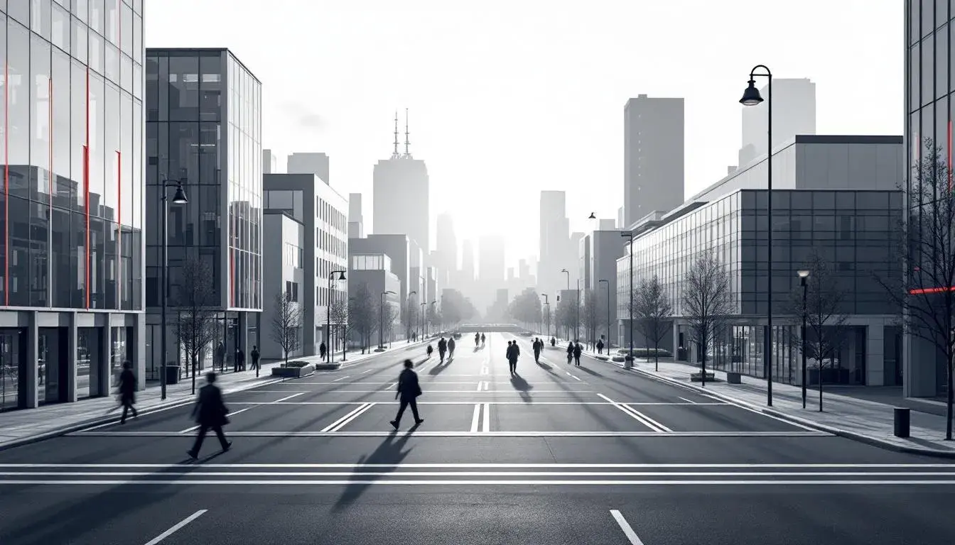
In the realm of Modern Professional 🏢, gray articulates efficiency, intellect, and a forward-thinking sensibility. Light Silver Gray delivers a clean, bright backdrop, suggesting open communication and transparency. Interwoven with it, the Pale Sky Blue infuses the atmosphere with a sense of clarity. Slate Blue injects a touch of corporate energy, evoking innovation and calculated strategies. Meanwhile, Dark Taupe Gray grounds the whole, indicating pragmatism. Deep Charcoal Gray injects a measured formality, like power dressing without the peacock. This palette steers away from frivolity, seeking instead a space that inspires focused teamwork and strategic thought. Think of glass-walled offices overlooking a cityscape, the gentle hum of innovation, and the quiet confidence of informed decisions. The visual language is one that emphasizes reliability and precision, conveying the impression of a well-oiled machine where every detail has been carefully considered. It's a visual identity built to instil a sense of trust and stability, crucial in industries where dependability reigns supreme.
Tech Neutral 💻 approaches gray with a modern detachment, finding beauty in the interplay between technology and human experience. Silver Gray forms the foundation, reflecting the streamlined aesthetic of contemporary devices. Juxtaposed against this is the surprising inclusion of Mint Green, an almost subversive touch of nature in a digital landscape. This tiny spark recalls the organic, reminding us of the natural world that technology enhances, but never fully replaces. Steel Blue lends a sense of depth, evocative of complex systems and intricate networks. Deep Charcoal hints at power and efficiency, its darkness suggestive of the vast computational resources driving innovation. Underpinning everything is a hint of Jet Black, the ultimate expression of digital space. The overall effect is crisp, intelligent, and subtly invigorating. This palette understands that technology, at its best, serves as an extension of ourselves, amplifying human potential without overshadowing it. It signals a commitment to progress, while recognizing the importance of balance and sustainability.
Loop Services 🎨 navigates the professional sphere with a different inflection. The backdrop of Light Gray expresses accessibility and calm. The careful introduction of Stone Gray layers in a sense of solidity. Then, the sudden inclusion of Vibrant Coral shakes things up, injecting an unexpected dose of dynamism and setting the corporate world alive. Neutral Gray balances out the playful disruption with dependable stability, while Dark Slate Gray adds some corporate dignity. This palette acknowledges the importance of both creativity and precision within business itself. It suggests a space where ideas are nurtured, challenges tackled head-on, and innovation is fostered through diverse perspectives. Think of adaptable workspaces, energized brainstorming sessions, and presentations that blend data with compelling storytelling. It signals a brand that is approachable, yet expert; innovative, yet grounded. It doesn't shy away from bold statements, but anchors them in the wisdom of experience.
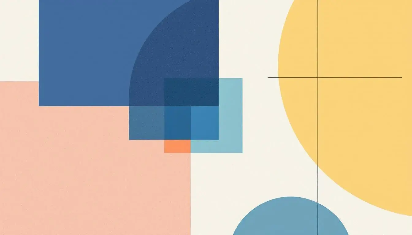
Golden Accent 🌟 makes gray a key element in a vibrant composition – an essential supporting player that allows bolder colors to truly shine. Light Bluish Gray offers a whisper of coolness, a quiet backdrop that enhances the luminosity of the yellows. Here, gray provides respite from the brilliance, an opportunity for the eye to rest and recalibrate. With the interplay of Pale Yellow, Vibrant Yellow, Medium Gray and Dark Midnight Blue the palette is evocative of early evening sunlight and creates visual relief. This palette rejects the notion of gray as dull or lifeless, instead painting it as an essential component of a lively and engaging environment. It’s a color scheme that seeks to find joy and energy, with the thoughtful introduction of a calming, dependable gray.
These palettes prove that gray is far more than a monochromatic afterthought. It is a foundational element, a modulator of mood, and a canvas for creativity. From the hushed elegance of rosewood to the vibrant pulse of contemporary services, gray anchors our visual landscapes and enables other colors to resonate with amplified strength. It is in this subtle power that the true artistry of gray scale lies. Its capacity to shape perceptions and enhance experiences makes it an indispensable tool in the designer's arsenal. By stripping away the noise, we are left with the essential beauty of form, light, and shadow — a world where subtlety speaks volumes.