

Muted Emerald Color Palettes: Industrial Nature Design

Mossy greens meet cold steel in these sophisticated color palettes inspired by reclaimed industrial ruins and abandoned high-tech satellite stations.
· 6 min readEclipse Inspired Color Palettes for Modern Tech Design
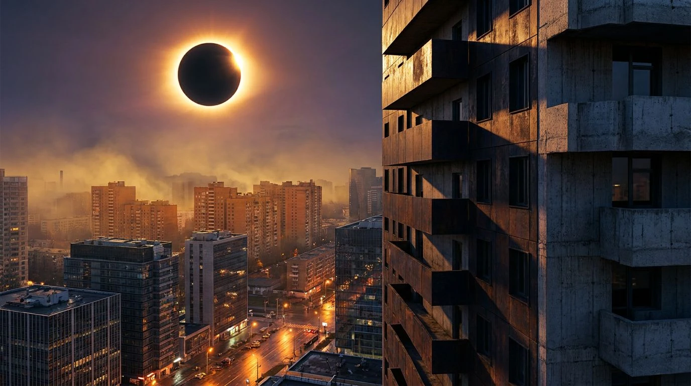
Transform brutalist gray and carbon tech into art with celestial color schemes. These unique palettes bridge the gap between cosmos and concrete.
· 5 min readMid-Century Color Palette Ideas for Modern UI Design

Bold carbon blacks and primary reds transform cold logic into art. Master the rhythmic contrast of pop art geometry for a sensory design experience.
· 6 min readMinimalist Color Palettes for Modern Workspace Design

Industrial slate gray and subway tiles create a disciplined office aesthetic. Master the balance of clinical white and technical grit for focus.
· 6 min readAutumn Color Palettes: Designing Secure Digital Spaces

Terracotta reds and earthy browns redefine cybersecurity design, creating a sense of authority and grounded protection through natural aesthetics.
· 5 min readMuted Red Color Palettes for Better Visual Focus & Design

Scientific research shows muted red and warm neutrals reduce ocular strain. Stabilize user attention and cognitive load during winter transitions.
· 5 min readRustic Clay Color Palette Ideas for Modern EdTech Design

Terracotta red and warm neutrals create a stimulating digital classroom. Upgrade academic UI with earthy tones that balance rigor and comfort.
· 5 min readHospital Color Palette Trends: Cyan and Charcoal Design

Healthcare spaces are ditching sterile white for moody charcoal and vibrant cyan. Modern clinic design now favors sophisticated, healing shadows.
· 5 min readLaw Firm Branding: Warm Earth Tone Color Palettes
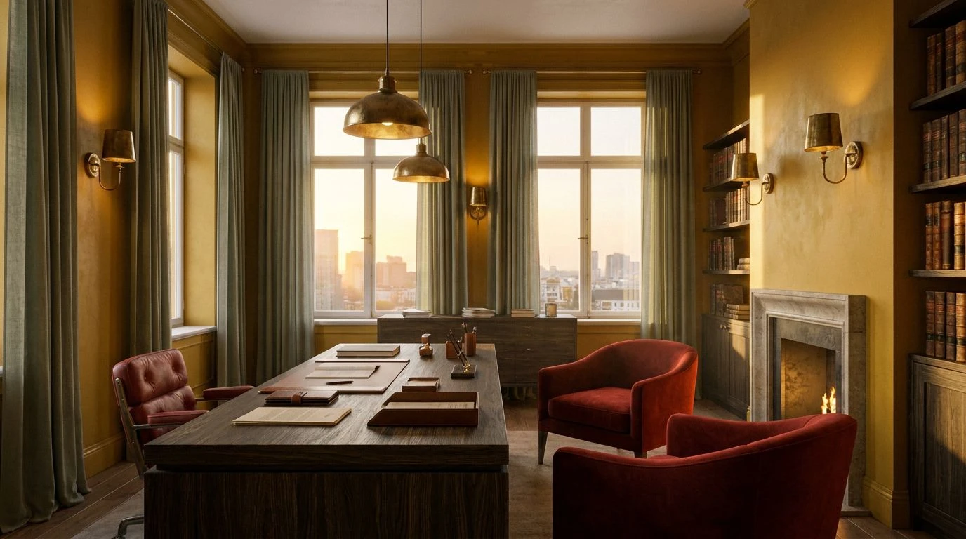
Indian summer ochre and rust tones offer legal brands a sense of stability and trust that sterile corporate blues simply cannot replicate.
· 6 min readGlobal Color Palette Design for Seasonal UI Harmony

Master neutral palettes that bridge spring and winter. This guide balances warmth and coolness to create stable, globally inclusive digital spaces.
· 6 min readEarthy Brown & Slate Grey: A Luxury Color Palette Design

Sophisticated noir design meets mechanical precision. Blend gritty earth tones with cold slate grey to create a high-end, cinematic interior style.
· 6 min readFinTech Design: Bold Indigo and Berry Color Palettes

Transform sterile financial interfaces with high-contrast color pairings. Deep indigo and sharp berry tones bring energy back to modern wealth management.
· 6 min readAggressive Autumn Color Palettes for High-Impact Design

Ditch boring beige for deep reds and scorched oranges. Master high-contrast seasonal transitions that command visual authority in any portfolio.
· 5 min readDark Teal Color Palettes for Sophisticated Design Spaces

Sophisticated dark teals and paper-like neutrals transform digital screens into scholarly sanctuaries, blending academic history with modern UI.
· 6 min readMars Design: Why Teal and Pink Color Palettes Save Space

Space agencies are trading sterile greys for vibrant pastels. Dive into how teal and pink palettes make hostile planets feel like homey retreats.
· 5 min readAI Ethics Color Palettes: Why Mint Green Defines the Future

Midcentury classroom tones and organic neutrals now signal safety in AI design. See how nostalgic colorways ground modern machine learning ethics.
· 6 min readBold Neon Green Color Palettes: Beyond Neutral Interior Design

Ditch boring beige for high-octane bioluminescent shades. These radical palettes challenge traditional wellness decor with electric, toxic energy.
· 5 min readHigh-Contrast Color Palettes Inspired by Dying Stars

Biological responses to deep orange and black design elements create a cinematic user experience. Master optical tension using stellar physics.
· 5 min readNeon Dark Mode Color Palettes for Fintech UI Design

High-contrast Kyoto night market aesthetics transform boring financial apps into electric, focused interfaces using neon accents and deep neutrals.
· 5 min readGlobal Brand Design: Honey Yellow Color Palette Strategies

Honey yellow and charcoal tones bridge the gap between local warmth and global scale, creating secure, approachable visual identities for brands.
· 5 min read