Global Brand Design: Honey Yellow Color Palette Strategies
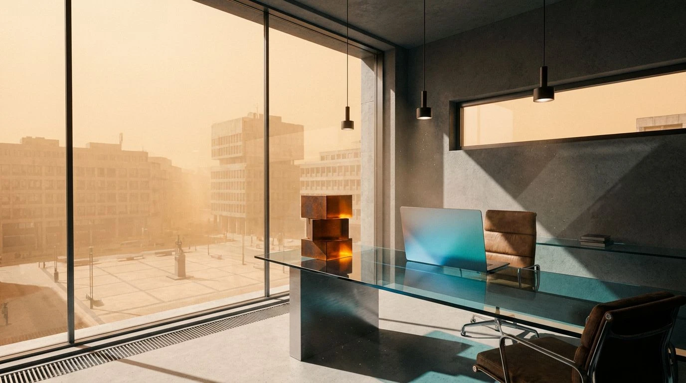
· 5 min readWhen brands outgrow their local borders, visual communication faces a distinct challenge: how to appear universally dependable without feeling distinctly sterile. The answer increasingly points to a specific chromatic equation. Anchoring a brand in rich, sunlit tones alongside grounding darks communicates a dual message of accessibility and robust infrastructure. Honey yellow provides that immediate, welcoming handshake. It breaks down geographical barriers through pure, approachable warmth. Paired with the structural weight of charcoal and the calm authority of deep slate blue, this combination skips past corporate stiffness straight into a confident, worldly posture. It speaks with energy and momentum, ensuring a brand feels familiar on a local street corner yet entirely capable of managing international operations.
Midnight Sun 🌍
The Midnight Sun 🌍 palette creates immediate visual tension, placing aggressive, high-energy tones against absolute neutrals. Crisp White and Obsidian Shadow establish a rigorous, architectural baseline. This stark contrast sets the stage for Electric Lemon to punch through the layout, acting as a beacon of high-speed global commerce. Tarnished Brass adds a more grounded, historical weight to the yellow spectrum, keeping the arrangement from feeling entirely synthetic. Pale Custard softens the edges for interactive elements, while Concrete Grey provides necessary negative space. For global expansion, this color scheme operates like a well-designed transit hub, moving people efficiently while maintaining a bright, highly legible environment. The sharp contrast signals authority, while the vivid yellow accents ensure the brand remains approachable and lively across any cultural context.
Golden Standard ✈️
Steering away from stark extremes, the Golden Standard ✈️ scheme opts for industrial pragmatism paired with dense, flavorful warmth. Aluminum Shell and Urban Slate set a reliable, functional backdrop reminiscent of airport terminals and modern shipping logistics. Against this utilitarian canvas, Taxi Cab Yellow delivers an unmistakable punch of momentum and direction. It is the color of movement and commerce. Spiced Honey anchors this brightness, offering a richer, more established tone that signals long-term reliability rather than just a quick startup phase. Wrought Iron grounds the entire composition, providing enough typographic weight to carry serious messaging. This specific arrangement allows international brands to look both established and highly agile. The warmth of the yellows cuts through the industrial greys, offering a welcoming touchpoint that translates perfectly across varied markets and languages.
Venture Capital 📈
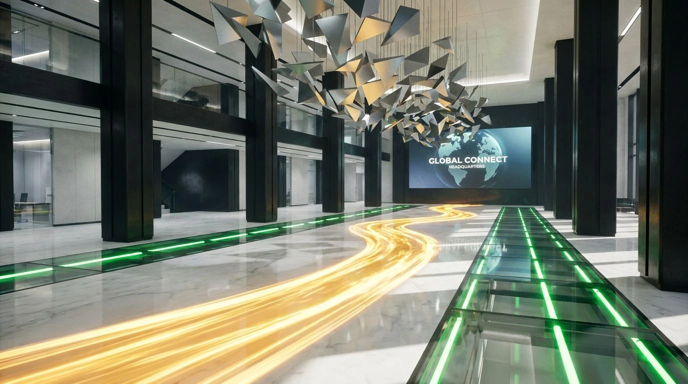
Adding a jolt of unexpected color transforms the Venture Capital 📈 collection from a standard corporate toolkit into a highly active, forward-looking system. Pure Paper and Ink Black provide the essential high-contrast framing required for international legibility. Brushed Silver and Graphite Lead create layers of organizational depth, perfect for complex interfaces or expansive data dashboards. The real magic happens where Wild Honey meets Signal Green. Wild Honey brings that crucial, familiar warmth, ensuring the brand maintains a human touch even at scale. Signal Green acts as an affirmative action color, a universal indicator of success, growth, and forward movement. When these two vibrant shades sit atop the greyscale foundation, they communicate both welcoming accessibility and undeniable progress. It is a visual language built for platforms focused on financial tech, global logistics, or any enterprise requiring absolute trust alongside rapid, visible results.
Terracotta Transit 🛂
The Terracotta Transit 🛂 lineup shifts the traditional yellow into a warmer, earthier territory, bordering on copper and peach. Studio White and Pitch Black hold the perimeter, ensuring strict structural boundaries. Inside those boundaries, Baked Clay serves as the primary energetic force. It carries the approachability of a honey tone but introduces a tactile, crafted quality reminiscent of international architecture and ceramic design. Sunlit Sand acts as a soft, inviting bridge between the heavy darks and the brilliant white. Basalt Rock and Smoked Glass offer varying degrees of shading, allowing for complex layouts without visual clutter. For a company expanding its reach, this scheme feels remarkably human and grounded. It replaces loud neon alerts with steady, confident warmth. The earthy hues suggest a business that respects local environments and traditions, while the stark contrasts ensure the brand operates with professional, global precision.
Solar Network 🌐
Highlighting pure velocity, the Solar Network 🌐 palette uses an aggressively bright spectrum to command attention on a global scale. Arctic Snow and Deep Void form a classic, uncompromising container for the remaining elements. Industrial Steel and Carbon Dust provide mid-level stepping stones, grounding the design in a serious, technical space. The yellow spectrum here is vast and highly active. Antique Brass offers a muted, sophisticated base note, while Mellow Sunlight provides a friendly, expansive background wash. Neon Canary then slices through the composition, acting as a hyper-visible focal point. This arrangement perfectly maps to the demands of rapid international scaling. The dark greys and stark black project an image of secure, impenetrable infrastructure, while the brilliant, unapologetic yellows speak the universal language of energy and innovation. It is an aesthetic designed for maximum impact across multiple time zones.
Navigating international markets demands a visual strategy that communicates security without sacrificing personality. The strategic application of warm, sun-drenched tones alongside rigorous dark greys achieves exactly this balance. These color combinations act as a universal passport, bypassing linguistic hurdles to deliver a feeling of immediate reliability. A bright, inviting accent assures users that a platform is built for human interaction, while dense, structural shadows promise data protection and operational strength. Moving across borders becomes less about translating words and more about projecting the right chromatic signals, creating environments that feel instantly familiar, highly active, and fundamentally secure.