Minimalist Color Palettes for Modern Workspace Design
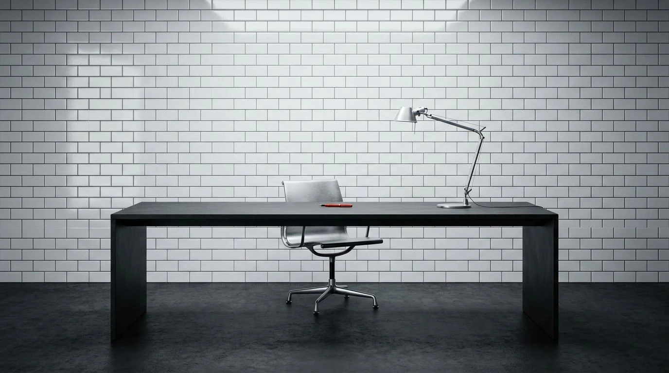
· 6 min readThe modern workspace has largely abandoned the visual clutter of previous decades, retreating into a disciplined aesthetic governed by strict geometry and restrained color. At the forefront of this architectural shift is a reliance on stark, clinical whites paired against the heavy, technical grit of slate gray. This combination borrows heavily from the mid-century International Typographic Style, where structural clarity was paramount and decorative excess was viewed with suspicion. Translated into interior environments, the bright sheen of a subway tile against the matte, utilitarian shadow of exposed concrete creates a psychological reset for the worker. It establishes an atmosphere stripped of distraction, asserting that serious labor requires a canvas of absolute purity. Industrial urbanism meets intellectual focus here, framing the desk not merely as a piece of furniture, but as an austere command center defined by light and shadow.
Geometric Botanica 🌿
The visual language of Geometric Botanica establishes a direct dialogue between the pristine order of modern grid systems and the organic relief of the natural world. Crisp White provides the necessary optical void, acting as the subway tile equivalent that cleanses the visual palate. This stark foundation immediately grounds itself against the utilitarian presence of Brushed Aluminum and Iron Ash, two tones that capture the technical grit of city infrastructure and raw steel framing. Within this rigorous, almost austere framework, a sudden interruption of Architect Green provides crucial psychological relief. In a minimalist workspace defined by slate shadows and sharp corners, this touch of greenery prevents the environment from becoming overly sterile. The interplay suggests a space where focused, analytical work takes precedence, yet acknowledges the human requirement for a tether to the organic. It transforms a rigidly industrial room into a breathable, highly disciplined studio capable of supporting sustained concentration without fatiguing the eye.
Transit Authority 🚇
Drawing heavy inspiration from the subterranean architecture of metropolitan rail networks, Transit Authority offers a disciplined study in cool technicality and muted vibrancy. The foundational contrast between Porcelain White and Asphalt Black mimics the strict legibility found in mid-century wayfinding signage, establishing immediate structural order within a room. Supporting this stark binary are the industrial mid-tones of Concrete Dust and Slate Overcast, introducing the textural reality of poured cement and weathered steel beams. What elevates this collection from a purely brutalist exercise is the introduction of Deep Concourse Green and Patinated Mint, paired unexpectedly with Oxidized Brass. These additions act as historical markers within a minimalist workspace, recalling the glazed tiles and oxidized fixtures of early twentieth-century transit stations. Applied to a modern office, these colors maintain a rigorous, unsentimental atmosphere that promotes efficiency while offering just enough visual depth to prevent the surroundings from feeling entirely mechanical.
Grid & Signal 🚦
In the realm of industrial urbanism, visual quiet is often punctuated by sudden, necessary warnings. Grid & Signal captures this distinct rhythm, utilizing a dominant, monochromatic base to direct attention toward a single, uncompromising focal point. Studio White and Galvanized Silver establish a broad, reflective expanse, reminiscent of clear-span industrial lofts and polished concrete floors. Carbon Shadow and Void Black anchor this lightness, providing the visual weight required to define spatial boundaries and structural elements. Against this highly controlled, almost monochromatic stage, a sharp application of Industrial Vermilion demands immediate notice. In a workspace inspired by the International Typographic Style, this vivid orange acts much like a structural grid's accent color, pointing the eye toward critical zones, marking physical intersections, or highlighting essential tools. The resulting environment feels highly engineered and purposefully stark, designed specifically for individuals who thrive on high-contrast clarity and reject any form of decorative sentimentality.
Metropolitan Archive 🗄️
Metropolitan Archive proposes a more complex reading of the minimalist workspace, expanding the strict parameters of industrial urbanism to include the varied tones of commercial media and civic planning. The foundational anchors remain predictably austere. Archive White, Fog Gray, and India Ink create the essential gradient of shadows and highlights required to simulate an environment constructed of glass and steel. Yet, this collection introduces a surprising spectrum of secondary tones. Safety Amber, Glass Cyan, Blueprint Blue, and Muted Plum operate like archival folders or color-coded index cards within a strictly organized filing system. When applied to an interior designed around the concept of slate shadows and subway tiles, these additions introduce an editorial sensibility. They allow for a space that feels deeply analytical and meticulously organized, yet capable of housing diverse, creative thought. The mood is unmistakably academic and highly structured, providing a cool, intellectual backdrop for an architect or designer mapping out intricate urban projects.
Constructivist Print 📰
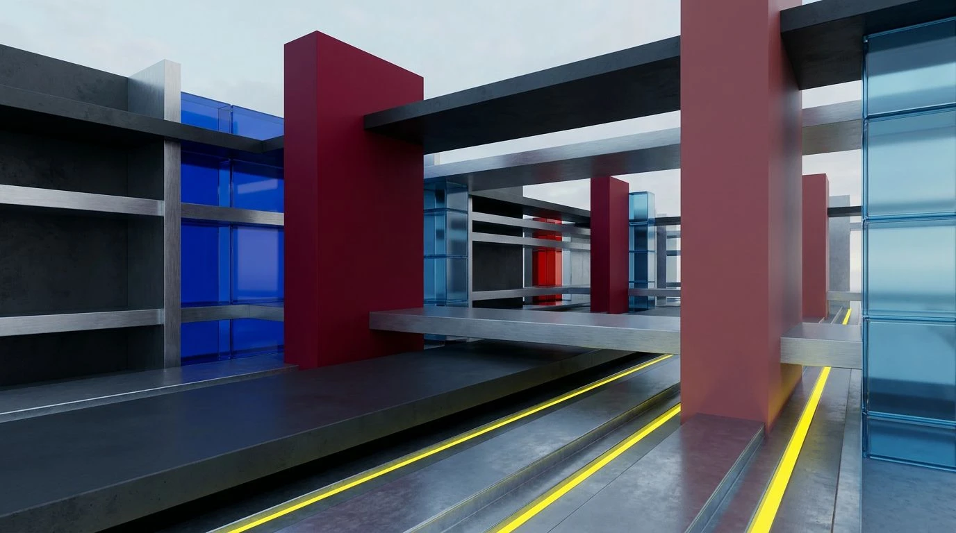
Rooted deeply in the visual aggression of early twentieth-century graphic design, Constructivist Print treats the physical workspace as a three-dimensional poster. Bleached Paper and Factory Slate provide the vast, unyielding background, a nod to the pristine subway tiles and heavy concrete structures that define modern metropolitan interiors. Typesetter Gray and Aluminum Mesh soften the transition between light and dark, establishing a quiet, technical middle ground. However, it is the deliberate use of Hazard Yellow, Rose Madder, and Emergency Red that transforms this collection into a powerful statement on industrial productivity. These primary and near-primary tones cut through the gray with the urgency of a printing press or a factory warning light. In a minimalist office setting, these sharp interventions serve to activate the mind, preventing the slate shadows from inducing lethargy. The result is a highly charged, dynamic room that demands attention and action, favoring raw energy and structural honesty over quiet contemplation.
The contemporary workspace continues to negotiate the boundary between clinical efficiency and the human need for visual stimulation. By grounding an environment in the uncompromising contrast of stark white and heavy, industrial gray, designers create a necessary void. This disciplined backdrop strips away the frivolous, demanding a return to foundational principles of structure, light, and geometry. Yet, as these varying color collections demonstrate, introducing measured, calculated flashes of color prevents the modern office from degrading into a sterile laboratory. Ultimately, these curated environments reflect a broader cultural desire to find focus amidst the chaos of urban life, transforming the simple act of sitting at a desk into an exercise in strict, deliberate purpose.