Neon Dark Mode Color Palettes for Fintech UI Design
· 5 min readFinancial technology has long suffered from a terminal case of the bland. We have been conditioned to accept that managing money requires staring into a sterile void of hospital-scrub blues and apologetic greys, as if excitement might somehow crash the stock market. But staring at a screen measuring personal wealth or global market fluctuations need not feel like reading a spreadsheet in a dentist's waiting room. Imagine instead the visual shock of stepping into a Kyoto alleyway just after dusk. The air is thick with anticipation, and sudden, striking bursts of colored light cut through the gloom. Applying this aesthetic to financial interfaces swaps bureaucratic monotony for a sense of razor-sharp alertness. High-contrast neon accents thrown against pitch-black or bruisingly dark backgrounds trick the eye into paying attention, turning the mundane tracking of expenditures into an experience of electric focus.
Yokocho After Hours 🏮
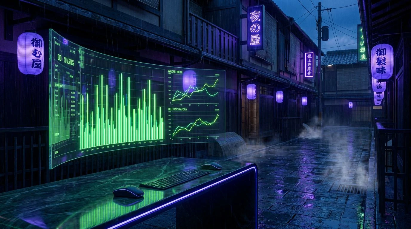
The Yokocho After Hours color selection feels exactly like slipping past a curtained doorway into a secretive, high-stakes local joint. Anchored by the impenetrable depths of Midnight Indigo and Plum Shadow, this collection provides an incredibly grounded base for serious financial tracking. The magic happens when the startlingly bright Wasabi Neon and Electric Matcha are applied to upward-trending graphs or positive account balances. These greens jump off the screen, sharp and unignorable against the darker tones of Deep Moss and Indigo Signage, directing the user's eye precisely where it needs to go. It offers a sophisticated take on the standard green-is-good financial trope, swapping tired spreadsheet colors for the undeniable thrill of glowing street food signs bleeding through the evening mist. This translates to an interface that commands attention without screaming for it.
Salaryman's Commute 🚉
There is a distinct, quiet poetry to the Salaryman's Commute palette. It strips away the aggressive noise of typical modern apps and replaces it with the melancholic, rain-slicked beauty of a late train ride home. The absolute darkness of Pontocho Void creates an expansive theater for tracking data, while Concrete Ash and Paper Lantern Silver construct an architecture of calm, readable text. The introduction of Holographic Rain acts as the sudden flash of a smartphone screen in a dark carriage, perfect for highlighting active investments or urgent notifications. Meanwhile, Twilight Aubergine waits in the background, adding just enough warmth to prevent the interface from feeling coldly mechanical. It is a mature, restrained approach to financial design that respects the user's time and intelligence, presenting wealth management as something both serious and strangely cinematic.
Kamo River Cyberpunk 🍜
For interfaces demanding a pulse-quickening tempo, the Kamo River Cyberpunk scheme offers a masterclass in controlled chaos. This is not for a cautious, slow-moving retirement fund; it screams real-time crypto trading or aggressive venture portfolios. Against the heavy, industrial weight of Asphalt Smoke, the aggressive pop of Tokyo Magenta and Yuzu Flash feels almost confrontational, mimicking the dizzying reflections of overlapping signs on river water. Using Ultraviolet Arcade and Lavender Haze for secondary data points creates a shifting, deep-layered visual field that keeps the user constantly engaged. The unexpected inclusion of Roasted Chestnut grounds the wilder neons, ensuring the screen remains legible rather than dissolving into an overwhelming nightclub aesthetic. It is exactly the right amount of danger to make reading a daily profit and loss statement feel like a high-speed pursuit.
Vending Machine Glow 🥤
Walking down a deserted street, there is nothing quite like the solitary, humming presence of an automated drinks dispenser cutting through the dark. The Vending Machine Glow palette captures that exact sensation of solitary reliability. Alleyway Black and Steel Shutter form an uncompromisingly solid foundation, a visual representation of secure, uncrackable encryption. Over this stark backdrop, the piercing clarity of Cyan Glint and Cobalt Current draws the eye to immediate calls to action or positive market indicators. Violet Ledger serves as a brilliant alternative for charting volatile metrics, standing out starkly without clashing with the colder blues. The resulting interface feels incredibly modern, turning the often anxiety-inducing act of checking one's finances into an interaction that feels as crisp, refreshing, and dependable as an ice-cold can pulled from a glowing street corner machine.
Fushimi Inari Overdrive 🦊
Throwing restraint completely out the window, the Fushimi Inari Overdrive collection demands full visual commitment. It takes the ancient, earthly tones of Worn Terracotta and Stone Torii and aggressively collides them with the futuristic anxiety of Lilac Static and Foxfire Pink. Rooted in the vast emptiness of Ink Night, the brighter colors, particularly the jarring, brilliant Arcade Blue and Amber Soba, serve to categorize complex, multifaceted financial portfolios. You might use the searing pinks for high-risk assets while reserving the deeper Imperial Grape for stable, long-term holds. The sheer variety of bold tones allows for a highly differentiated data visualization strategy, preventing the user's gaze from glazing over. It is an adventurous, maximalist approach that proves money management apps can be visually spectacular, transforming tedious numbers into a vivid, glowing map of personal wealth.
Ditching the safety of sterile corporate blues for the intense, contrasting atmospheres of nighttime Kyoto is an act of design rebellion. Treating a wealth management app like a glowing alleyway transforms a historically stressful chore into a compelling visual experience. By wrapping stable, impenetrable dark backgrounds in sudden, aggressive flashes of color, these combinations guide the user's attention with absolute precision. The resulting interfaces do not just look distinctly modern; they feel alive, reactive, and remarkably clear. It proves that tracking the flow of capital can be as visually gripping as navigating an unfamiliar city after dark, turning every interaction into an exercise in focused, electric alertness.