'%3e%3cpath%20fill-rule='evenodd'%20clip-rule='evenodd'%20d='M51.1303%2019.2492C50.7278%2019.913%2050.1346%2020.4426%2049.3508%2020.838C48.5669%2021.2335%2047.6172%2021.4312%2046.5014%2021.4312C44.8208%2021.4312%2043.4367%2021.0216%2042.3492%2020.2025C41.2617%2019.3833%2040.6686%2018.2394%2040.5697%2016.7706H44.4253C44.4818%2017.3355%2044.6831%2017.7804%2045.0291%2018.1052C45.3751%2018.43%2045.8164%2018.5924%2046.3531%2018.5924C46.8192%2018.5924%2047.1864%2018.4653%2047.4547%2018.2111C47.7231%2017.9569%2047.8572%2017.618%2047.8572%2017.1943C47.8572%2016.8129%2047.7337%2016.4952%2047.4865%2016.241C47.2393%2015.9867%2046.9322%2015.7784%2046.565%2015.616C46.1978%2015.4536%2045.6893%2015.2594%2045.0397%2015.0334C44.0934%2014.7086%2043.3202%2014.3944%2042.72%2014.0907C42.1197%2013.7871%2041.6042%2013.3351%2041.1735%2012.7349C40.7427%2012.1347%2040.5273%2011.3544%2040.5273%2010.394C40.5273%209.50418%2040.7533%208.73448%2041.2053%208.08481C41.6572%207.43515%2042.2821%206.93731%2043.0801%206.5913C43.8781%206.24528%2044.7925%206.07227%2045.8235%206.07227C47.49%206.07227%2048.8141%206.46771%2049.7956%207.25861C50.7772%208.04951%2051.3315%209.13698%2051.4586%2010.5211H47.5395C47.4689%2010.0268%2047.2888%209.63483%2046.9993%209.3453C46.7097%209.05578%2046.3178%208.91102%2045.8235%208.91102C45.3998%208.91102%2045.0573%209.024%2044.7961%209.24997C44.5348%209.47594%2044.4041%209.80783%2044.4041%2010.2457C44.4041%2010.5988%2044.5207%2010.8989%2044.7537%2011.146C44.9867%2011.3932%2045.2798%2011.5944%2045.6328%2011.7498C45.9859%2011.9052%2046.4944%2012.1029%2047.1581%2012.343C48.1185%2012.6678%2048.9023%2012.9891%2049.5096%2013.3069C50.1169%2013.6246%2050.6395%2014.0872%2051.0773%2014.6945C51.5151%2015.3018%2051.734%2016.0927%2051.734%2017.0672C51.734%2017.8581%2051.5328%2018.5854%2051.1303%2019.2492ZM59.0242%206.3053V21.2829H55.4016V6.3053H59.0242ZM73.9409%206.3053V9.18642H69.8734V21.2829H66.2296V9.18642H62.2046V6.3053H73.9409ZM80.7438%209.18642V12.3218H85.8069V15.0546H80.7438V18.3806H86.4425V21.2829H77.1212V6.3053H86.4425V9.18642H80.7438ZM99.667%2016.0291V21.2829H96.0444V6.3053H101.913C103.692%206.3053%20105.048%206.74665%20105.98%207.62934C106.912%208.51204%20107.378%209.7019%20107.378%2011.199C107.378%2012.1311%20107.17%2012.9609%20106.753%2013.6882C106.337%2014.4155%20105.719%2014.9875%20104.9%2015.4042C104.08%2015.8208%20103.085%2016.0291%20101.913%2016.0291H99.667ZM103.692%2011.199C103.692%209.8855%20102.965%209.22879%20101.51%209.22879H99.667V13.1268H101.51C102.965%2013.1268%20103.692%2012.4842%20103.692%2011.199ZM120.092%2018.5501H114.478L113.546%2021.2829H109.732L115.219%206.41123H119.393L124.879%2021.2829H121.024L120.092%2018.5501ZM119.16%2015.7961L117.295%2010.2881L115.41%2015.7961H119.16ZM131.555%2018.5077H136.385V21.2829H127.933V6.3053H131.555V18.5077ZM143.337%209.18642V12.3218H148.4V15.0546H143.337V18.3806H149.035V21.2829H139.714V6.3053H149.035V9.18642H143.337ZM163.507%206.3053V9.18642H159.44V21.2829H155.796V9.18642H151.771V6.3053H163.507ZM177.449%206.3053V9.18642H173.382V21.2829H169.738V9.18642H165.713V6.3053H177.449ZM184.252%209.18642V12.3218H189.315V15.0546H184.252V18.3806H189.951V21.2829H180.629V6.3053H189.951V9.18642H184.252Z'%20fill='%23EEF0ED'/%3e%3cmask%20id='mask0_3101_7327'%20style='mask-type:alpha'%20maskUnits='userSpaceOnUse'%20x='0'%20y='0'%20width='27'%20height='28'%3e%3cpath%20d='M23.8328%200.759766H2.64808C1.18559%200.759766%200%201.94535%200%203.40785V24.5925C0%2026.055%201.18559%2027.2406%202.64808%2027.2406H23.8328C25.2952%2027.2406%2026.4808%2026.055%2026.4808%2024.5925V3.40785C26.4808%201.94535%2025.2952%200.759766%2023.8328%200.759766Z'%20fill='white'/%3e%3c/mask%3e%3cg%20mask='url(%23mask0_3101_7327)'%3e%3cpath%20d='M23.8328%200.759766H2.64808C1.18559%200.759766%200%201.94535%200%203.40785V24.5925C0%2026.055%201.18559%2027.2406%202.64808%2027.2406H23.8328C25.2952%2027.2406%2026.4808%2026.055%2026.4808%2024.5925V3.40785C26.4808%201.94535%2025.2952%200.759766%2023.8328%200.759766Z'%20fill='%23D8D8D8'/%3e%3cpath%20d='M13.2404%200.759766H0V14.0001H13.2404V0.759766Z'%20fill='%238C61FF'/%3e%3cpath%20d='M13.2404%2014H0V27.2404H13.2404V14Z'%20fill='%2336C3FE'/%3e%3cpath%20d='M26.4806%2014H13.2402V27.2404H26.4806V14Z'%20fill='%236592FE'/%3e%3cpath%20d='M26.4806%200.759766H13.2402V14.0002H26.4806V0.759766Z'%20fill='%236059F7'/%3e%3c/g%3e%3c/g%3e%3cdefs%3e%3cclipPath%20id='clip0_3101_7327'%3e%3crect%20width='190'%20height='28'%20fill='white'/%3e%3c/clipPath%3e%3c/defs%3e%3c/svg%3e)
'%3e%3cpath%20d='M23.8328%200.759521H2.64808C1.18559%200.759521%200%201.94511%200%203.40761V24.5923C0%2026.0548%201.18559%2027.2404%202.64808%2027.2404H23.8328C25.2952%2027.2404%2026.4808%2026.0548%2026.4808%2024.5923V3.40761C26.4808%201.94511%2025.2952%200.759521%2023.8328%200.759521Z'%20fill='%23D8D8D8'/%3e%3cpath%20d='M13.2404%200.759521H0V13.9999H13.2404V0.759521Z'%20fill='%238C61FF'/%3e%3cpath%20d='M13.2404%2013.9998H0V27.2402H13.2404V13.9998Z'%20fill='%2336C3FE'/%3e%3cpath%20d='M26.4809%2013.9998H13.2405V27.2402H26.4809V13.9998Z'%20fill='%236592FE'/%3e%3cpath%20d='M26.4809%200.759277H13.2405V13.9997H26.4809V0.759277Z'%20fill='%236059F7'/%3e%3c/g%3e%3c/svg%3e)
Gorpcore Color Palettes for Professional Urban Design

Transform rugged outerwear into sophisticated interiors with charcoal and cool gray tones inspired by London’s moody, cinematic morning commute.
· 5 min readDark Noir Color Palettes for High-Stakes Fintech Design
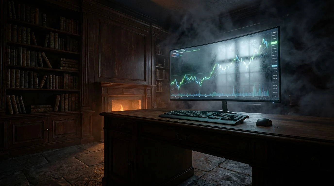
Transform trading apps with high-contrast, moody aesthetics. Use deep charcoals and earthy tones to boost focus and signal professional trust.
· 7 min readHumanizing Tech Brands With Farm-Inspired Color Palettes
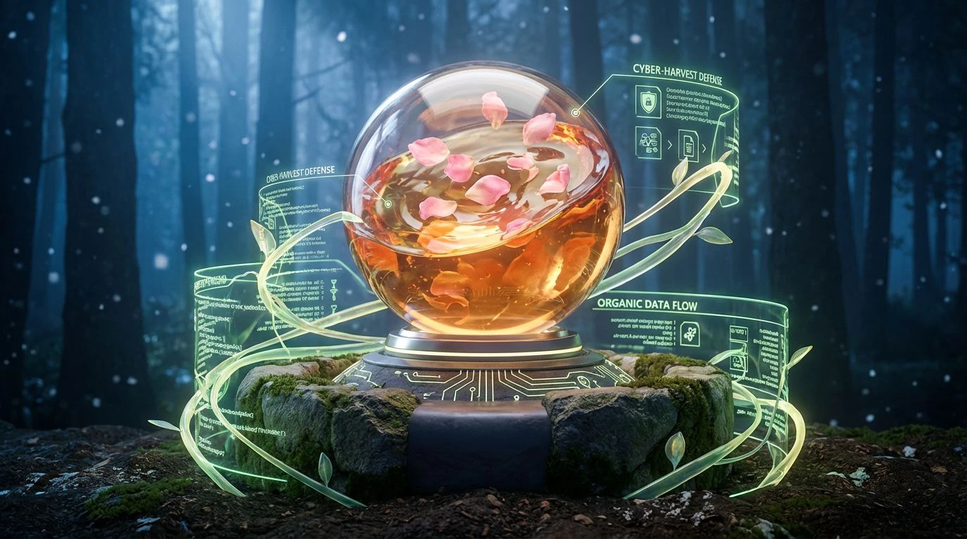
Agrarian tones like peach and leaf green bridge the gap between cold digital security and human trust through organic, grounded design choices.
· 5 min readNatural Color Palette Ideas for Modern Tech Event Design
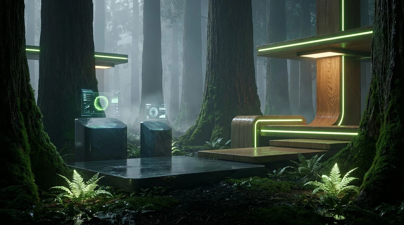
Replace sterile office blues with biophilic cedar grove tones and forest-inspired greens to transform high-tech summits into restorative spaces.
· 6 min readBold Fintech Interface Color Palettes: Luxury UX Design
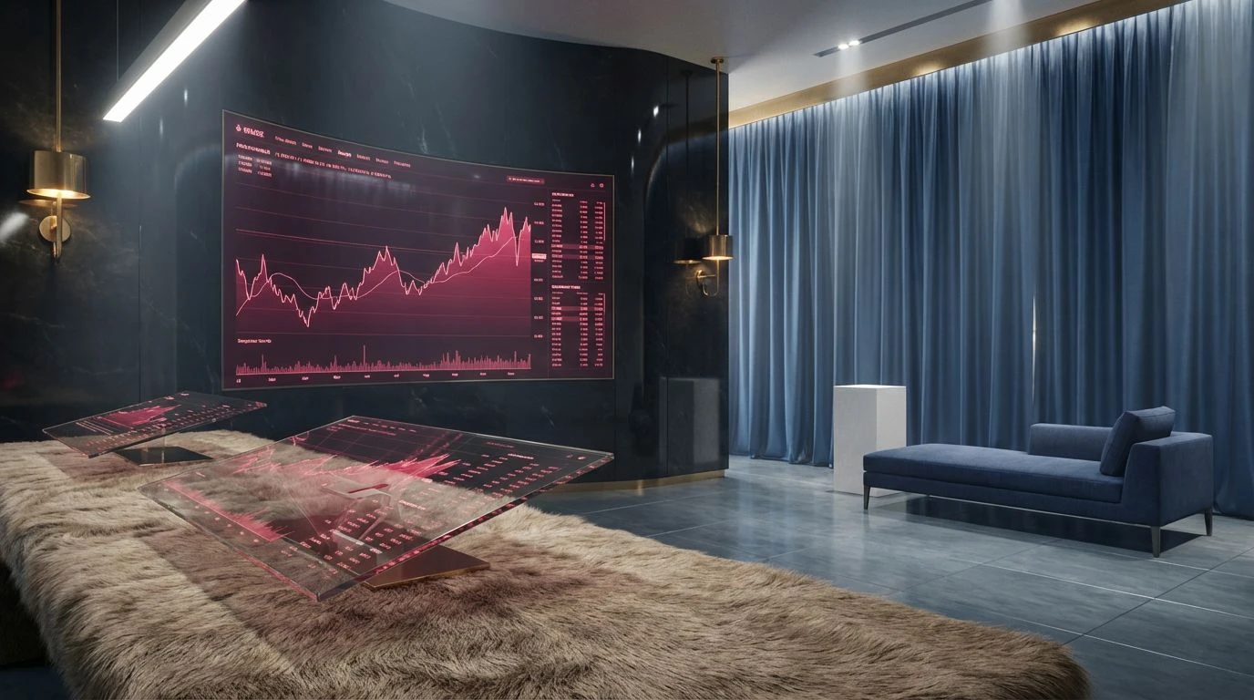
High-fashion jewel tones and discordant palettes redefine fintech interfaces, transforming stale wealth management dashboards into luxury digital assets.
· 5 min readRetro Color Palettes Can Fix Social Media Stress Levels
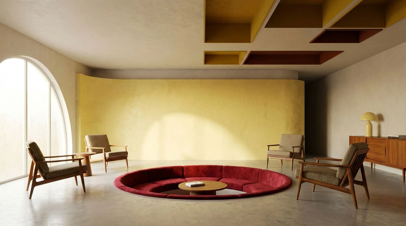
70s educational film aesthetics and warm earth tones create digital safety, lowering the cognitive load and emotional heat of modern online spaces.
· 6 min readCarbon Fiber & Lavender Color Palettes for Luxury Design
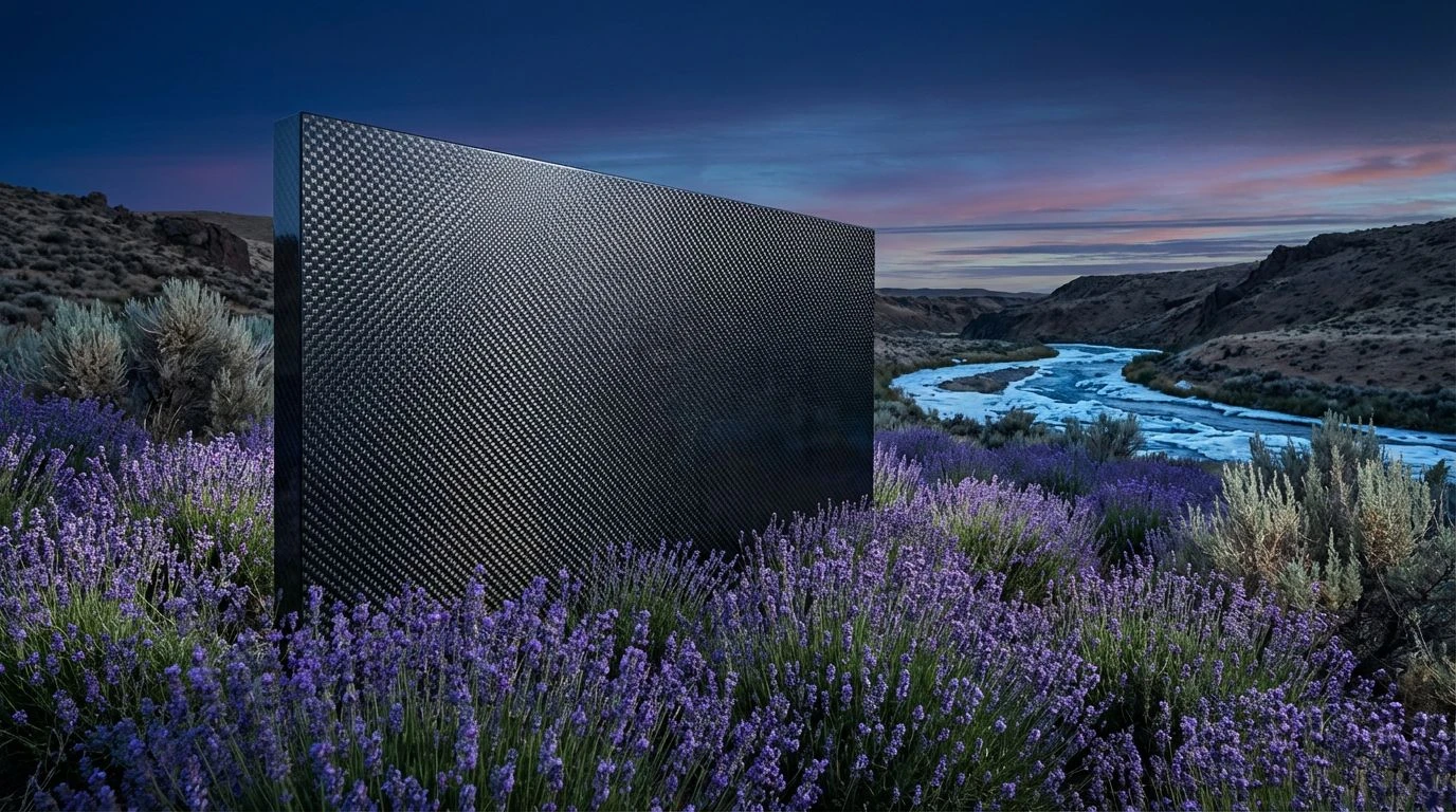
High-performance industrial textures meet botanical softness in this unique aesthetic study. Master the art of high-contrast luxury color schemes.
· 6 min readBiotech Color Palettes: Beyond Sterile White Design
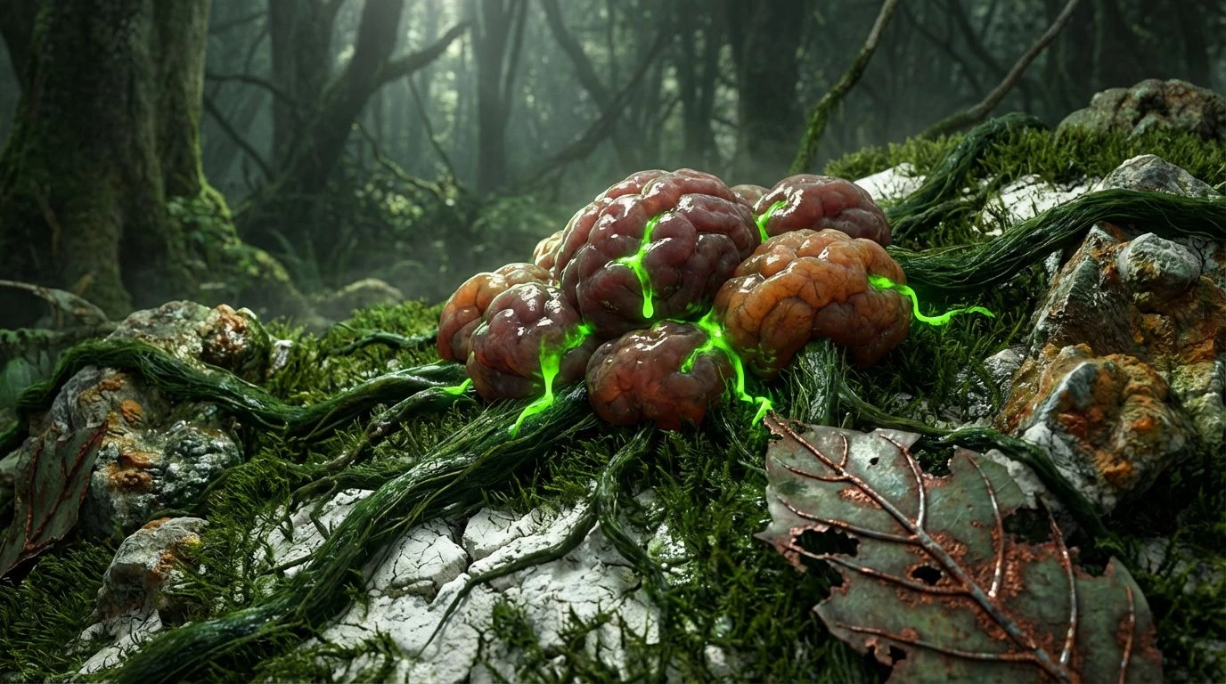
Biotech branding is evolving. Replace clinical whites with forest floor greens and earthy grays to represent the raw vitality of living systems.
· 5 min readNordic Ice Breaker Color Palettes for Creative Leadership
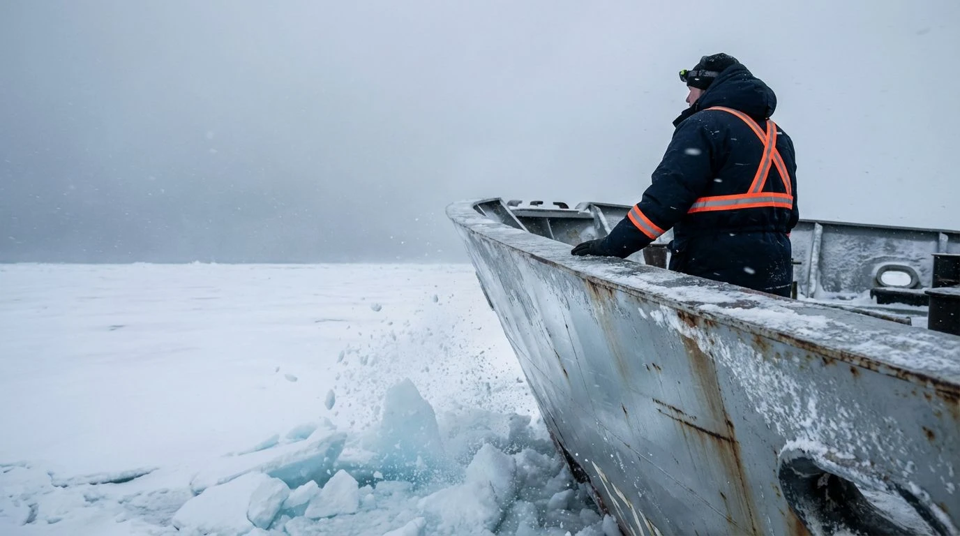
Master professional branding with industrial maritime hues. These high-contrast color palettes command authority using metallic and oceanic tones.
· 4 min readIndustrial Color Palettes for Trust in Tech Design

Bridge the gap between aerospace precision and farm reliability using rusty orange and deep iron tones to build instant brand credibility.
· 5 min readEarth Tone Color Palettes for Sustainable Fashion Design
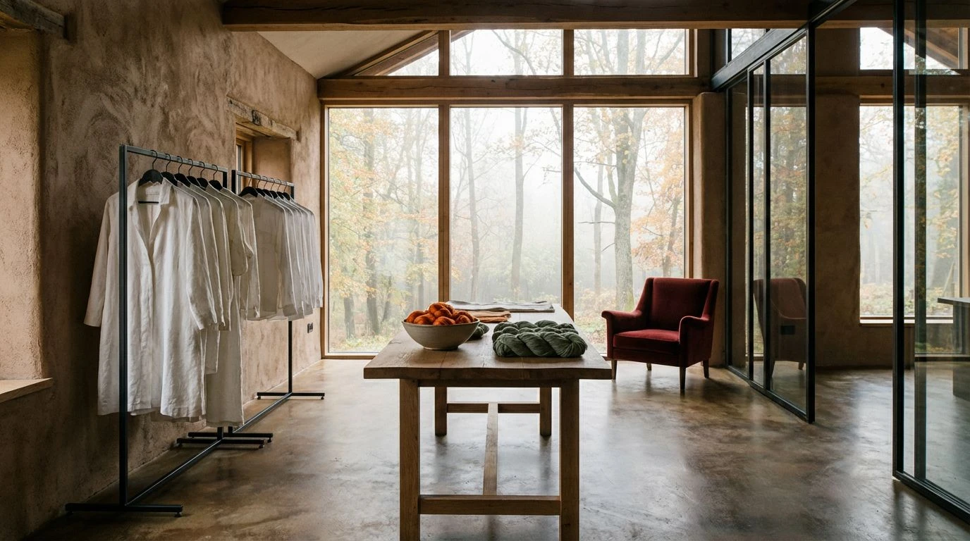
Historical Saint Martin’s Day harvest tones offer a raw, eco-conscious aesthetic for textile brands seeking authentic, sustainable color palettes.
· 6 min readDesert Oasis Color Palettes for Luxury Creative Design
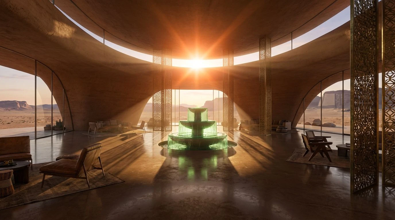
Sophisticated desert color palettes help creative agencies blend nomadic luxury with scorched earth tones to build adventurous, premium workspaces.
· 5 min readUse Alpine Rescue Color Palettes for Reliable Brand Design

High-visibility cyan and slate gray palettes evoke peak performance and trust. Infuse industrial branding with the stability of mountain safety.
· 7 min readUse K-Pop Color Palettes to Rebrand Boring Design Spaces
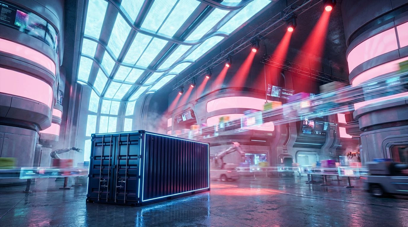
Transform utilitarian logistics with electric teals and hot magentas. Use hyper-vibrant saturation to turn cold industrial brands into high-energy experiences.
· 6 min readIndustrial Soviet Metro Color Palettes for App Design
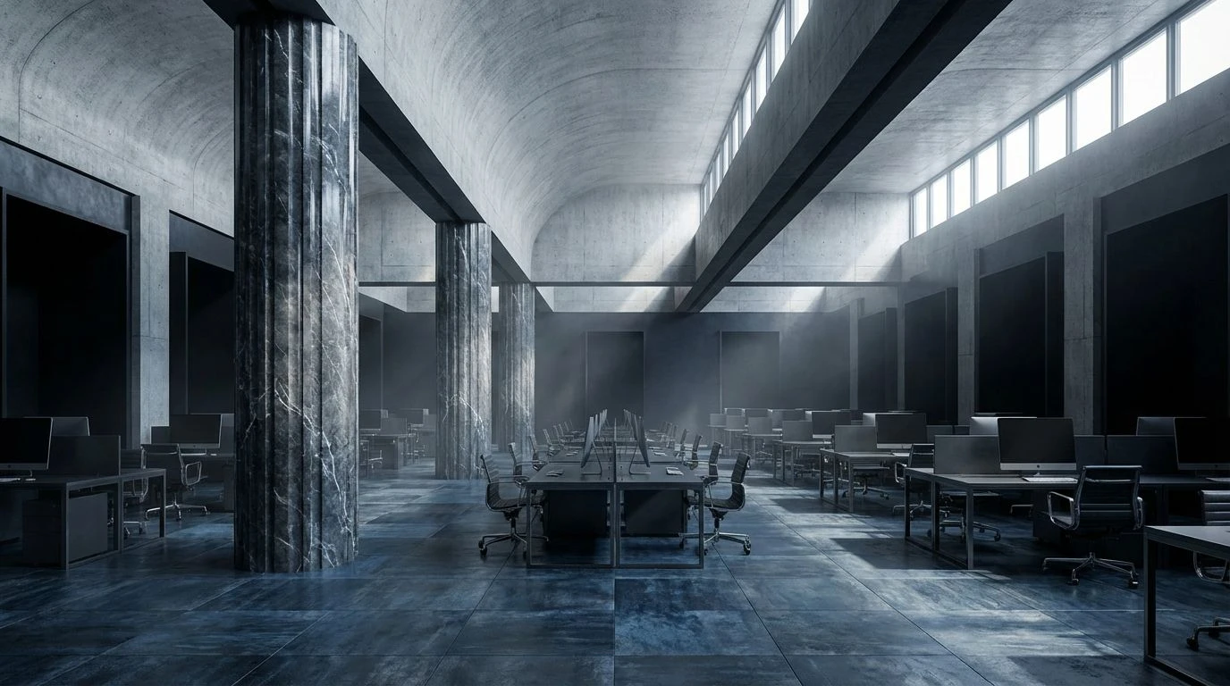
Transform digital tools into high-performance workspaces using brutalist steel grays and concrete tones that command focus and deep productivity.
· 5 min readLuxury Mediterranean Color Palettes for Interior Design
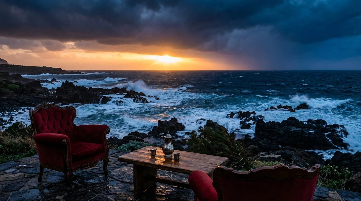
Dramatic Sicilian winter aesthetics redefine hospitality design by blending moody coastal tones with opulent metallic accents for high-end spaces.
· 6 min readIndustrial Color Palettes: Navy and Nude Design Trends
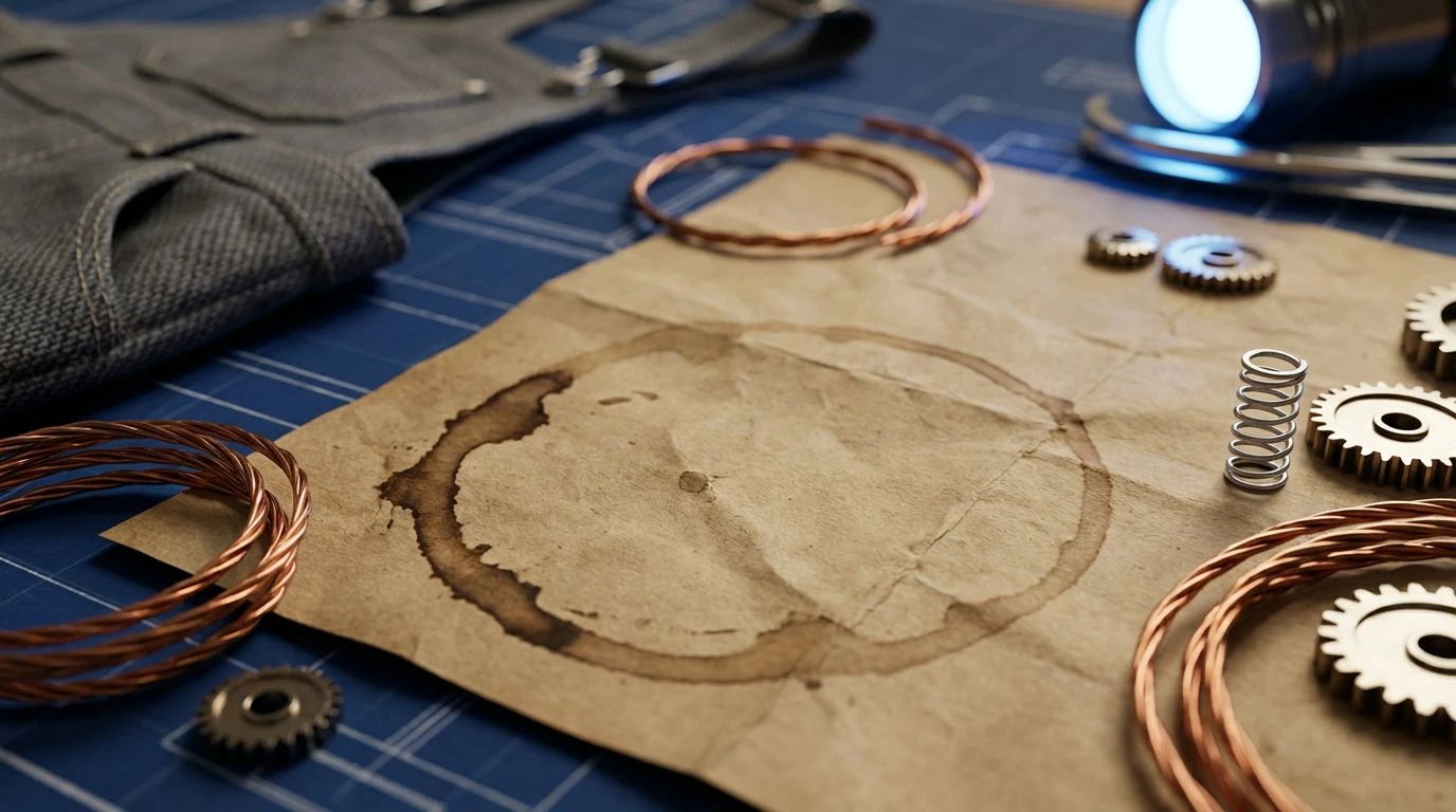
Industrial design meets human warmth through navy blue and nude color palettes, transforming sterile factories into sophisticated, empathetic spaces.
· 6 min readLogistics Color Palettes: Outlaw Red vs Corporate Blue
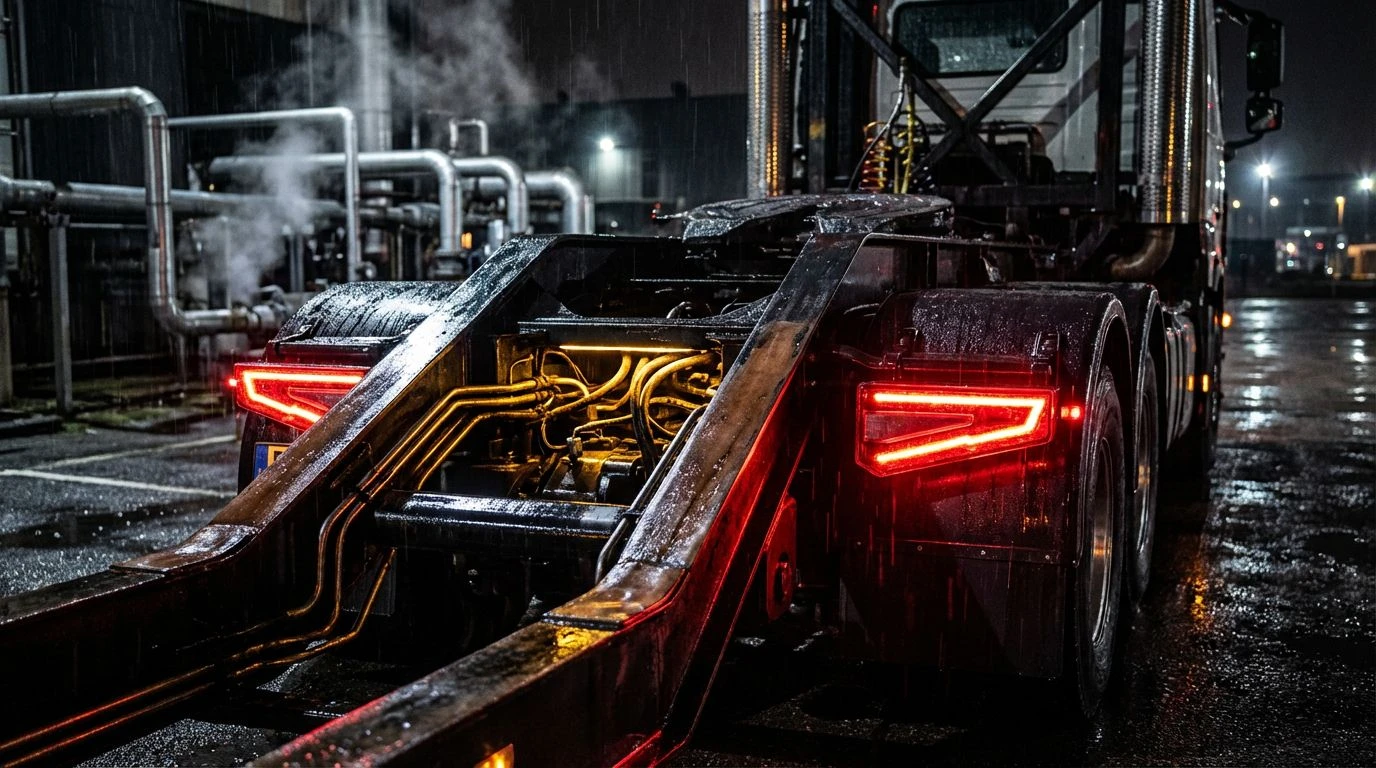
Bold crimson and charcoal hues disrupt boring supply chain branding. Apply high-stakes energy to logistics design using rebellious industrial tones.
· 6 min readIndustrial Color Palettes for Toddler Game Design Trends
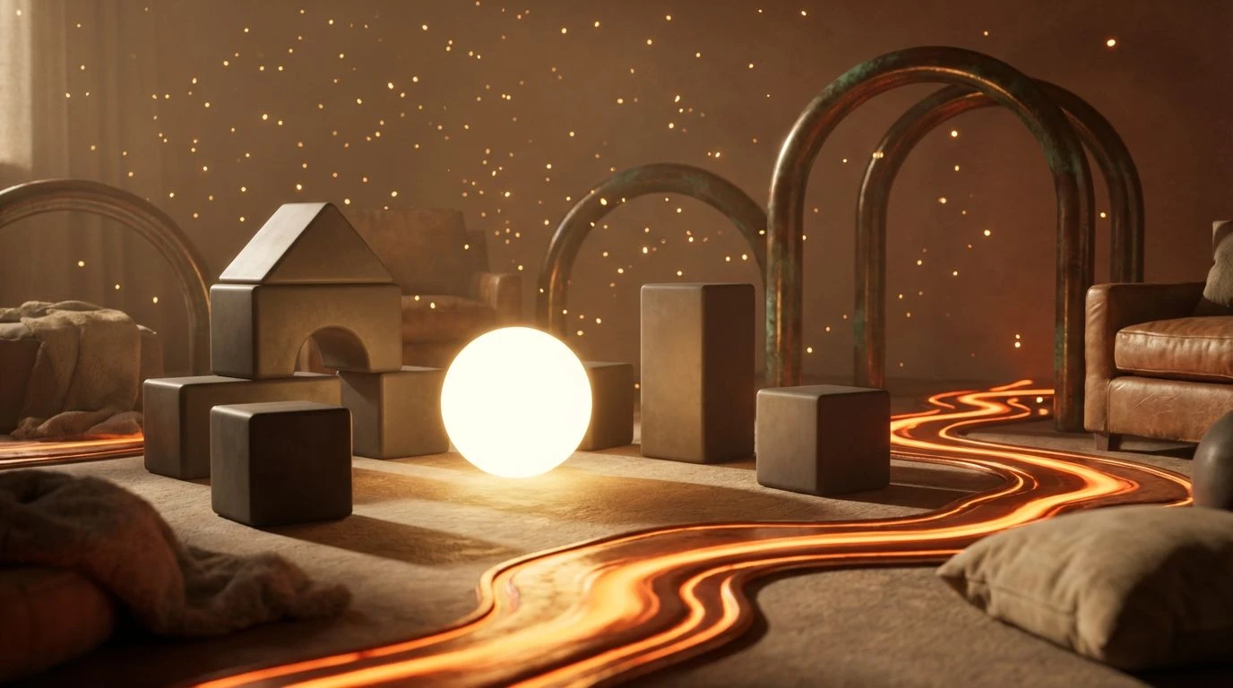
The amber glow of metalwork creates a focused visual language for kids. Use warm ochre and radiant iron tones to reduce digital sensory fatigue.
· 5 min read90s Neon Color Palettes Reviving Modern Software Design

High-visibility neon accents and deep navy shades break corporate monotony to bring athletic energy and bold creativity back to digital workspaces.
· 4 min read