'%3e%3cpath%20fill-rule='evenodd'%20clip-rule='evenodd'%20d='M51.1303%2019.2492C50.7278%2019.913%2050.1346%2020.4426%2049.3508%2020.838C48.5669%2021.2335%2047.6172%2021.4312%2046.5014%2021.4312C44.8208%2021.4312%2043.4367%2021.0216%2042.3492%2020.2025C41.2617%2019.3833%2040.6686%2018.2394%2040.5697%2016.7706H44.4253C44.4818%2017.3355%2044.6831%2017.7804%2045.0291%2018.1052C45.3751%2018.43%2045.8164%2018.5924%2046.3531%2018.5924C46.8192%2018.5924%2047.1864%2018.4653%2047.4547%2018.2111C47.7231%2017.9569%2047.8572%2017.618%2047.8572%2017.1943C47.8572%2016.8129%2047.7337%2016.4952%2047.4865%2016.241C47.2393%2015.9867%2046.9322%2015.7784%2046.565%2015.616C46.1978%2015.4536%2045.6893%2015.2594%2045.0397%2015.0334C44.0934%2014.7086%2043.3202%2014.3944%2042.72%2014.0907C42.1197%2013.7871%2041.6042%2013.3351%2041.1735%2012.7349C40.7427%2012.1347%2040.5273%2011.3544%2040.5273%2010.394C40.5273%209.50418%2040.7533%208.73448%2041.2053%208.08481C41.6572%207.43515%2042.2821%206.93731%2043.0801%206.5913C43.8781%206.24528%2044.7925%206.07227%2045.8235%206.07227C47.49%206.07227%2048.8141%206.46771%2049.7956%207.25861C50.7772%208.04951%2051.3315%209.13698%2051.4586%2010.5211H47.5395C47.4689%2010.0268%2047.2888%209.63483%2046.9993%209.3453C46.7097%209.05578%2046.3178%208.91102%2045.8235%208.91102C45.3998%208.91102%2045.0573%209.024%2044.7961%209.24997C44.5348%209.47594%2044.4041%209.80783%2044.4041%2010.2457C44.4041%2010.5988%2044.5207%2010.8989%2044.7537%2011.146C44.9867%2011.3932%2045.2798%2011.5944%2045.6328%2011.7498C45.9859%2011.9052%2046.4944%2012.1029%2047.1581%2012.343C48.1185%2012.6678%2048.9023%2012.9891%2049.5096%2013.3069C50.1169%2013.6246%2050.6395%2014.0872%2051.0773%2014.6945C51.5151%2015.3018%2051.734%2016.0927%2051.734%2017.0672C51.734%2017.8581%2051.5328%2018.5854%2051.1303%2019.2492ZM59.0242%206.3053V21.2829H55.4016V6.3053H59.0242ZM73.9409%206.3053V9.18642H69.8734V21.2829H66.2296V9.18642H62.2046V6.3053H73.9409ZM80.7438%209.18642V12.3218H85.8069V15.0546H80.7438V18.3806H86.4425V21.2829H77.1212V6.3053H86.4425V9.18642H80.7438ZM99.667%2016.0291V21.2829H96.0444V6.3053H101.913C103.692%206.3053%20105.048%206.74665%20105.98%207.62934C106.912%208.51204%20107.378%209.7019%20107.378%2011.199C107.378%2012.1311%20107.17%2012.9609%20106.753%2013.6882C106.337%2014.4155%20105.719%2014.9875%20104.9%2015.4042C104.08%2015.8208%20103.085%2016.0291%20101.913%2016.0291H99.667ZM103.692%2011.199C103.692%209.8855%20102.965%209.22879%20101.51%209.22879H99.667V13.1268H101.51C102.965%2013.1268%20103.692%2012.4842%20103.692%2011.199ZM120.092%2018.5501H114.478L113.546%2021.2829H109.732L115.219%206.41123H119.393L124.879%2021.2829H121.024L120.092%2018.5501ZM119.16%2015.7961L117.295%2010.2881L115.41%2015.7961H119.16ZM131.555%2018.5077H136.385V21.2829H127.933V6.3053H131.555V18.5077ZM143.337%209.18642V12.3218H148.4V15.0546H143.337V18.3806H149.035V21.2829H139.714V6.3053H149.035V9.18642H143.337ZM163.507%206.3053V9.18642H159.44V21.2829H155.796V9.18642H151.771V6.3053H163.507ZM177.449%206.3053V9.18642H173.382V21.2829H169.738V9.18642H165.713V6.3053H177.449ZM184.252%209.18642V12.3218H189.315V15.0546H184.252V18.3806H189.951V21.2829H180.629V6.3053H189.951V9.18642H184.252Z'%20fill='%23EEF0ED'/%3e%3cmask%20id='mask0_3101_7327'%20style='mask-type:alpha'%20maskUnits='userSpaceOnUse'%20x='0'%20y='0'%20width='27'%20height='28'%3e%3cpath%20d='M23.8328%200.759766H2.64808C1.18559%200.759766%200%201.94535%200%203.40785V24.5925C0%2026.055%201.18559%2027.2406%202.64808%2027.2406H23.8328C25.2952%2027.2406%2026.4808%2026.055%2026.4808%2024.5925V3.40785C26.4808%201.94535%2025.2952%200.759766%2023.8328%200.759766Z'%20fill='white'/%3e%3c/mask%3e%3cg%20mask='url(%23mask0_3101_7327)'%3e%3cpath%20d='M23.8328%200.759766H2.64808C1.18559%200.759766%200%201.94535%200%203.40785V24.5925C0%2026.055%201.18559%2027.2406%202.64808%2027.2406H23.8328C25.2952%2027.2406%2026.4808%2026.055%2026.4808%2024.5925V3.40785C26.4808%201.94535%2025.2952%200.759766%2023.8328%200.759766Z'%20fill='%23D8D8D8'/%3e%3cpath%20d='M13.2404%200.759766H0V14.0001H13.2404V0.759766Z'%20fill='%238C61FF'/%3e%3cpath%20d='M13.2404%2014H0V27.2404H13.2404V14Z'%20fill='%2336C3FE'/%3e%3cpath%20d='M26.4806%2014H13.2402V27.2404H26.4806V14Z'%20fill='%236592FE'/%3e%3cpath%20d='M26.4806%200.759766H13.2402V14.0002H26.4806V0.759766Z'%20fill='%236059F7'/%3e%3c/g%3e%3c/g%3e%3cdefs%3e%3cclipPath%20id='clip0_3101_7327'%3e%3crect%20width='190'%20height='28'%20fill='white'/%3e%3c/clipPath%3e%3c/defs%3e%3c/svg%3e)
'%3e%3cpath%20d='M23.8328%200.759521H2.64808C1.18559%200.759521%200%201.94511%200%203.40761V24.5923C0%2026.0548%201.18559%2027.2404%202.64808%2027.2404H23.8328C25.2952%2027.2404%2026.4808%2026.0548%2026.4808%2024.5923V3.40761C26.4808%201.94511%2025.2952%200.759521%2023.8328%200.759521Z'%20fill='%23D8D8D8'/%3e%3cpath%20d='M13.2404%200.759521H0V13.9999H13.2404V0.759521Z'%20fill='%238C61FF'/%3e%3cpath%20d='M13.2404%2013.9998H0V27.2402H13.2404V13.9998Z'%20fill='%2336C3FE'/%3e%3cpath%20d='M26.4809%2013.9998H13.2405V27.2402H26.4809V13.9998Z'%20fill='%236592FE'/%3e%3cpath%20d='M26.4809%200.759277H13.2405V13.9997H26.4809V0.759277Z'%20fill='%236059F7'/%3e%3c/g%3e%3c/svg%3e)
De Stijl to Scandinavian Design: Modern Color Palettes
· 5 min readIt might seem like a stretch to connect the rigid, primary-colored grids of early twentieth-century Holland with the impossibly serene, sheepskin-draped interiors of modern Stockholm. Yet, trace the lineage of functionalism long enough, and the dots clearly connect. Mondrian and his radical contemporaries stripped art down to its most basic elements, removing the clutter of the old world. Fast forward a century, and that same desire for spatial honesty has been softened, sanded down, and wrapped in warm oak. The sharp blue rectangles of De Stijl have simply migrated, transforming from strict ideological declarations into the cool, pragmatic accents of Nordic domesticity. It is a quiet dialogue between the stark utopian ideals of the past and the tactile, lived-in reality of contemporary design.
Utrecht Awakening ☕
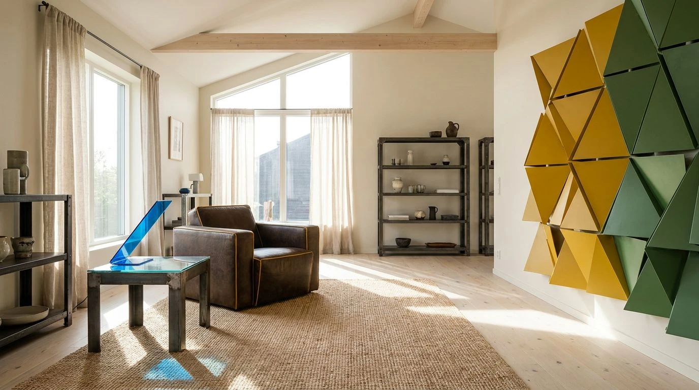
There is a distinct mid-century optimism pulsing through Utrecht Awakening, where the ideological rigidity of Dutch modernism is gently persuaded to relax. Deep Espresso and Faded Khaki provide a grounded, earthly foundation, a far cry from the severe black lines conventional neoplasticism relied on. Instead of strict geometric borders, these organic darks bracket a surprisingly playful trio of Ochre Yellow, Kelly Green, and Primary Blue. It feels like walking through a Stockholm gallery where strict abstraction meets the soft imperfections of human habitation. The canvas is primed with Oat Milk, allowing the louder pigments to pop without screaming. By swapping structural black for softer browns and introducing Pale Mustard, this collection of domestic shades bridges a century-old divide. It takes the unapologetic boldness of early twentieth-century geometry and makes it entirely palatable for a sunlit, contemporary living room filled with birchwood and quiet mornings.
Rietveld's Lounge 🛋️
Imagine taking the sharpest corners of a classic modernist chair and wrapping them in thick wool. That is precisely the mood Rietveld's Lounge strikes, trading stark idealism for an inviting, tactile reality. Midnight Charcoal assumes the role of the structural grid, giving undeniable order to the arrangement. But rather than filling those squares with flat, theoretical pigments, we find the deeply organic Burnt Walnut and Raw Leather. These natural additions bring an immediate warmth, softening the intellectual distance of classic Dutch abstraction. Cobalt Strike acts as the sharp, ideological focal point, while Industrial Zinc and Fjord Blue wash over the remaining space like weak winter sunlight through a large steel-framed window. Even Racing Green makes an appearance, hinting at potted indoor flora rather than abstract theory. It is a brilliant compromise between strict discipline and the deeply human need for comfort.
Swedish Geometry 📐
Strict mathematical lines often feel cold, but Swedish Geometry proves that structural honesty can survive the transition into northern climates. This spectrum relies heavily on Matte Obsidian to draw boundaries, a direct inheritance from early twentieth-century painters who insisted on firm delineations. However, the spaces between these heavy lines are filled with the soft, atmospheric melancholy of Storm Grey and Concrete Ash. It is as if a stark modernist painting was left outside during a mild drizzle. To prevent the mood from plunging into total austerity, Malachite and Nordic Sky offer tight, controlled bursts of optimism. They function as quiet counterpoints, alongside the rich, warming presence of Gilded Teak. This specific golden brown ties the entire visual experience back to natural timber, proving that even the most rigorous design principles look better when they share the room with well-crafted, honest materials.
Minimalist Thaw 🧊
A true dialogue between form and color requires restraint, knowing exactly when to stay quiet and when to speak up. Minimalist Thaw executes this brilliantly, presenting an almost entirely neutral landscape that suddenly cracks open to reveal a shocking brightness. The foundation is built on Chalk Dust and Pumice Stone, chalky, unassuming whites and pale greys that mimic a blank, snow-covered expanse. Chestnut Bark and Taupe Shadow add just enough anchor to keep the visual weight from floating away entirely, suggesting sturdy wooden furniture resting quietly in the corner of a room. Then, slicing through the calm entirely unannounced, is Electric Glacier. This vivid, unrepentant blue acts as the singular nod to modernist eccentricity, proving that a single, sharp rectangle of color can redefine an entire space. It strips the historical weight from structural theory, leaving behind a playful wink wrapped heavily in understated domesticity.
Stockholm Grid 🏙️
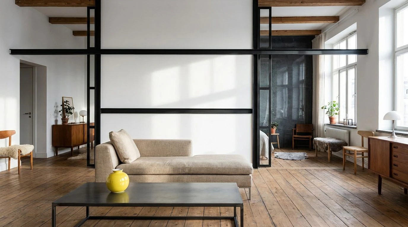
Taking a direct cue from the iconic grids of 1920s abstract painting, Stockholm Grid rewrites the rules for a contemporary, comfort-driven era. The stark canvas of Pure White is divided aggressively by Ink Black and Graphite Lead, maintaining the architectural rigor that defined a generation of radical Dutch thinkers. Yet, instead of confronting the viewer with blazing reds or impenetrable blues, the remaining squares are occupied by soft, human-centric tones. Flax Linen and Toasted Oak ground the abstract theory in recognizable, earthly elements, offering a tactile familiarity. Baltic Slate stands in for the traditional primary blue, heavily muted as if bleached by the sun, while Lemon Rind provides just a sliver of tart, welcoming cheer. The result is an environment that respects the strict logic of historical modernism but refuses to sacrifice livability, proving that radical aesthetic movements can age into something remarkably gentle.
Tracing the long line from early Dutch modernism to contemporary Nordic spaces reveals a fascinating shift in our relationship with our surroundings. What began as a fierce, intellectual rebellion against the ornate clutter of the Victorian era has slowly settled into a softer, more accommodating visual language. High theory has given way to high comfort. By trading severe primary pigments for muted slates, earthy woods, and just the occasional shock of bright blue or yellow, these aesthetic frameworks demonstrate how strict geometry learned to relax. We no longer need art and design to aggressively challenge us within our own homes; we just need it to work gently alongside our daily routines.