'%3e%3cpath%20fill-rule='evenodd'%20clip-rule='evenodd'%20d='M51.1303%2019.2492C50.7278%2019.913%2050.1346%2020.4426%2049.3508%2020.838C48.5669%2021.2335%2047.6172%2021.4312%2046.5014%2021.4312C44.8208%2021.4312%2043.4367%2021.0216%2042.3492%2020.2025C41.2617%2019.3833%2040.6686%2018.2394%2040.5697%2016.7706H44.4253C44.4818%2017.3355%2044.6831%2017.7804%2045.0291%2018.1052C45.3751%2018.43%2045.8164%2018.5924%2046.3531%2018.5924C46.8192%2018.5924%2047.1864%2018.4653%2047.4547%2018.2111C47.7231%2017.9569%2047.8572%2017.618%2047.8572%2017.1943C47.8572%2016.8129%2047.7337%2016.4952%2047.4865%2016.241C47.2393%2015.9867%2046.9322%2015.7784%2046.565%2015.616C46.1978%2015.4536%2045.6893%2015.2594%2045.0397%2015.0334C44.0934%2014.7086%2043.3202%2014.3944%2042.72%2014.0907C42.1197%2013.7871%2041.6042%2013.3351%2041.1735%2012.7349C40.7427%2012.1347%2040.5273%2011.3544%2040.5273%2010.394C40.5273%209.50418%2040.7533%208.73448%2041.2053%208.08481C41.6572%207.43515%2042.2821%206.93731%2043.0801%206.5913C43.8781%206.24528%2044.7925%206.07227%2045.8235%206.07227C47.49%206.07227%2048.8141%206.46771%2049.7956%207.25861C50.7772%208.04951%2051.3315%209.13698%2051.4586%2010.5211H47.5395C47.4689%2010.0268%2047.2888%209.63483%2046.9993%209.3453C46.7097%209.05578%2046.3178%208.91102%2045.8235%208.91102C45.3998%208.91102%2045.0573%209.024%2044.7961%209.24997C44.5348%209.47594%2044.4041%209.80783%2044.4041%2010.2457C44.4041%2010.5988%2044.5207%2010.8989%2044.7537%2011.146C44.9867%2011.3932%2045.2798%2011.5944%2045.6328%2011.7498C45.9859%2011.9052%2046.4944%2012.1029%2047.1581%2012.343C48.1185%2012.6678%2048.9023%2012.9891%2049.5096%2013.3069C50.1169%2013.6246%2050.6395%2014.0872%2051.0773%2014.6945C51.5151%2015.3018%2051.734%2016.0927%2051.734%2017.0672C51.734%2017.8581%2051.5328%2018.5854%2051.1303%2019.2492ZM59.0242%206.3053V21.2829H55.4016V6.3053H59.0242ZM73.9409%206.3053V9.18642H69.8734V21.2829H66.2296V9.18642H62.2046V6.3053H73.9409ZM80.7438%209.18642V12.3218H85.8069V15.0546H80.7438V18.3806H86.4425V21.2829H77.1212V6.3053H86.4425V9.18642H80.7438ZM99.667%2016.0291V21.2829H96.0444V6.3053H101.913C103.692%206.3053%20105.048%206.74665%20105.98%207.62934C106.912%208.51204%20107.378%209.7019%20107.378%2011.199C107.378%2012.1311%20107.17%2012.9609%20106.753%2013.6882C106.337%2014.4155%20105.719%2014.9875%20104.9%2015.4042C104.08%2015.8208%20103.085%2016.0291%20101.913%2016.0291H99.667ZM103.692%2011.199C103.692%209.8855%20102.965%209.22879%20101.51%209.22879H99.667V13.1268H101.51C102.965%2013.1268%20103.692%2012.4842%20103.692%2011.199ZM120.092%2018.5501H114.478L113.546%2021.2829H109.732L115.219%206.41123H119.393L124.879%2021.2829H121.024L120.092%2018.5501ZM119.16%2015.7961L117.295%2010.2881L115.41%2015.7961H119.16ZM131.555%2018.5077H136.385V21.2829H127.933V6.3053H131.555V18.5077ZM143.337%209.18642V12.3218H148.4V15.0546H143.337V18.3806H149.035V21.2829H139.714V6.3053H149.035V9.18642H143.337ZM163.507%206.3053V9.18642H159.44V21.2829H155.796V9.18642H151.771V6.3053H163.507ZM177.449%206.3053V9.18642H173.382V21.2829H169.738V9.18642H165.713V6.3053H177.449ZM184.252%209.18642V12.3218H189.315V15.0546H184.252V18.3806H189.951V21.2829H180.629V6.3053H189.951V9.18642H184.252Z'%20fill='%23EEF0ED'/%3e%3cmask%20id='mask0_3101_7327'%20style='mask-type:alpha'%20maskUnits='userSpaceOnUse'%20x='0'%20y='0'%20width='27'%20height='28'%3e%3cpath%20d='M23.8328%200.759766H2.64808C1.18559%200.759766%200%201.94535%200%203.40785V24.5925C0%2026.055%201.18559%2027.2406%202.64808%2027.2406H23.8328C25.2952%2027.2406%2026.4808%2026.055%2026.4808%2024.5925V3.40785C26.4808%201.94535%2025.2952%200.759766%2023.8328%200.759766Z'%20fill='white'/%3e%3c/mask%3e%3cg%20mask='url(%23mask0_3101_7327)'%3e%3cpath%20d='M23.8328%200.759766H2.64808C1.18559%200.759766%200%201.94535%200%203.40785V24.5925C0%2026.055%201.18559%2027.2406%202.64808%2027.2406H23.8328C25.2952%2027.2406%2026.4808%2026.055%2026.4808%2024.5925V3.40785C26.4808%201.94535%2025.2952%200.759766%2023.8328%200.759766Z'%20fill='%23D8D8D8'/%3e%3cpath%20d='M13.2404%200.759766H0V14.0001H13.2404V0.759766Z'%20fill='%238C61FF'/%3e%3cpath%20d='M13.2404%2014H0V27.2404H13.2404V14Z'%20fill='%2336C3FE'/%3e%3cpath%20d='M26.4806%2014H13.2402V27.2404H26.4806V14Z'%20fill='%236592FE'/%3e%3cpath%20d='M26.4806%200.759766H13.2402V14.0002H26.4806V0.759766Z'%20fill='%236059F7'/%3e%3c/g%3e%3c/g%3e%3cdefs%3e%3cclipPath%20id='clip0_3101_7327'%3e%3crect%20width='190'%20height='28'%20fill='white'/%3e%3c/clipPath%3e%3c/defs%3e%3c/svg%3e)
'%3e%3cpath%20d='M23.8328%200.759521H2.64808C1.18559%200.759521%200%201.94511%200%203.40761V24.5923C0%2026.0548%201.18559%2027.2404%202.64808%2027.2404H23.8328C25.2952%2027.2404%2026.4808%2026.0548%2026.4808%2024.5923V3.40761C26.4808%201.94511%2025.2952%200.759521%2023.8328%200.759521Z'%20fill='%23D8D8D8'/%3e%3cpath%20d='M13.2404%200.759521H0V13.9999H13.2404V0.759521Z'%20fill='%238C61FF'/%3e%3cpath%20d='M13.2404%2013.9998H0V27.2402H13.2404V13.9998Z'%20fill='%2336C3FE'/%3e%3cpath%20d='M26.4809%2013.9998H13.2405V27.2402H26.4809V13.9998Z'%20fill='%236592FE'/%3e%3cpath%20d='M26.4809%200.759277H13.2405V13.9997H26.4809V0.759277Z'%20fill='%236059F7'/%3e%3c/g%3e%3c/svg%3e)
2035 Smart Home Color Palettes: Muted Bauhaus Design
· 5 min readThe era of floating glass panels and hyper-skeuomorphic widgets is quietly making its exit, clearing the room for a future that looks surprisingly like an archival German design school sketch. Fast forward to 2035, and the smart home interface strips away the excess. We are looking at a strict return to functionalism, where domestic operating systems prioritize crisp geometric layouts and unapologetic contrast. Think deep, matte charcoals acting as the grounding architecture, punctuated by punchy primary greens, reds, and yellows that signal alerts or room temperatures with absolute clarity. This aesthetic marries a distinct, playful utility with a low-key, minimalist cyberpunk edge. It is a visual language that feels entirely futuristic precisely because it strips technology back to its visual foundations, placing raw information inside beautifully restrained, color-blocked containers.
Architectural Glitch 📐
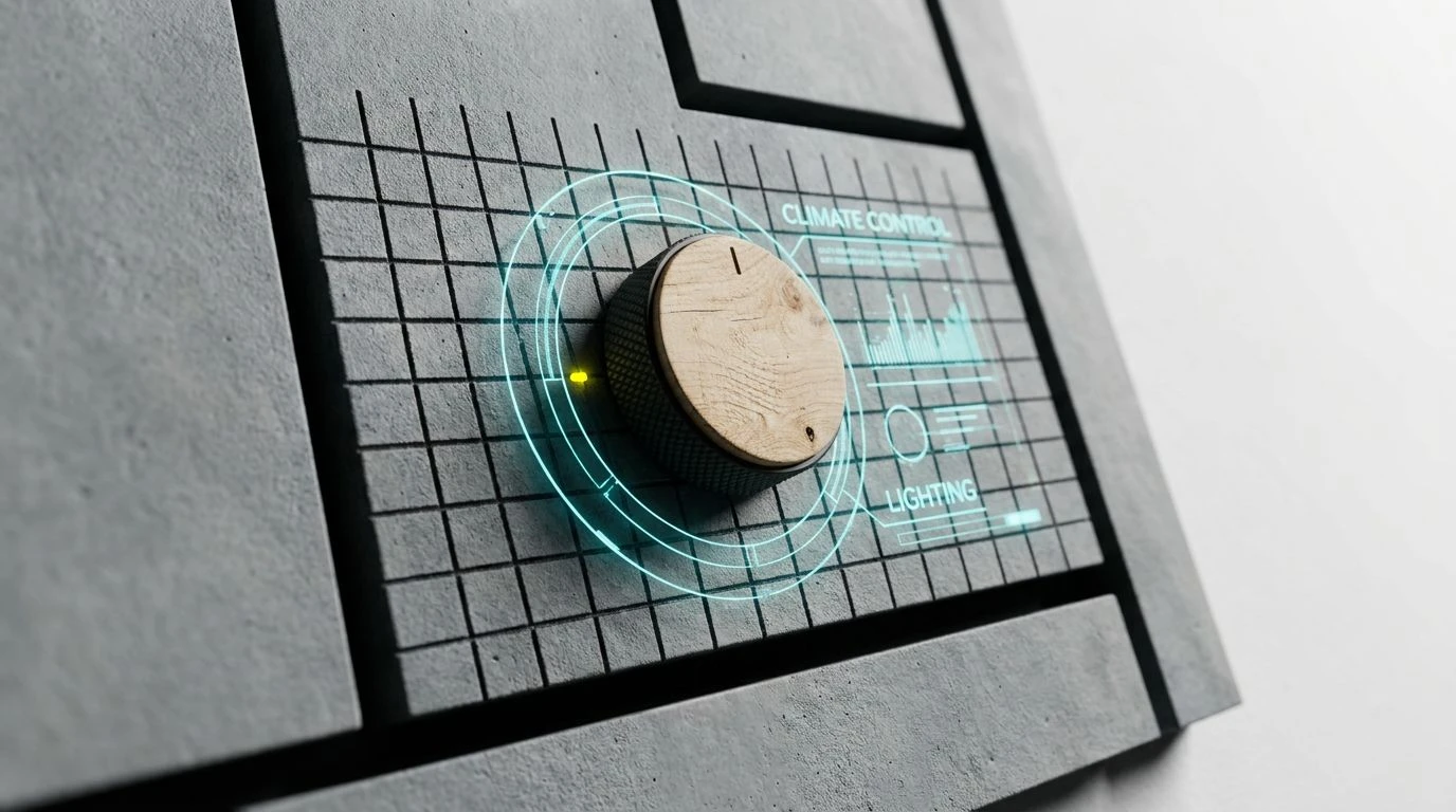
The combination of Matte Carbon and Concrete Skeleton creates a brutally simple background for an IoT dashboard, absorbing ambient room lighting without glare. Against this stark canvas, Warning Sign Red and Electric Cyan flash with an almost retro-futuristic urgency. This is the exact palette you expect to see running the security and climate controls of a pared-back, brutalist apartment. The strict adherence to grayscale, violently interrupted by intensely vivid, primary-adjacent digital tones, brings that playful yet strictly utilitarian Bauhaus attitude into a near-future setting. The red and cyan function as strict wayfinding tools, directing the eye instantly to a dropped connection or an unlocked door, proving that high-contrast minimalism remains the ultimate tool for visual clarity.
Neoplastic Node 🎛️
Shifting slightly away from warm primaries, this palette relies on an entirely cool, synthetic spectrum to organize the domestic habitat. Midnight Terminal acts as the dark mode foundation, anchoring a user interface that feels both deeply technical and soothingly quiet. Industrial Aluminum and Frosted Glass map out the borders, sliders, and structural grids, keeping the layout legible. What brings this setup to life is the jolt of Ultraviolet Status and Screen Glare Cyan. These cold, vibrant flashes dictate interaction, turning ordinary tasks like dimming lights or scheduling appliances into an interactive, graphic experience. It feels like a late-night coding environment adapted for relaxed domestic living, merging an unapologetic tech aesthetic with refined interaction design.
Analogue Override 🕹️
There is a tactile, almost mechanical quality to this layout of colors. By pairing Vantablack Housing with Drafting Lead and Plaster Wall, the interface mimics the physical presence of a high-end stereo receiver or vintage control panel. The warmth of Oxidized Copper grounds the design, making the digital screen feel strangely organic. But the true functionalist magic happens when Emergency Brake and Phosphor Teal enter the frame. These two intensely bold, highly active shades operate as binary indicators—perhaps red for offline devices and teal for active, optimal running states. The visual hierarchy is absolute, leaving zero room for confusion. It perfectly captures that 2035 prediction where the house is incredibly smart, but the interface pretends to be an analogue switchboard, celebrating raw geometry and purposeful interaction.
Primary Assembly 🛠️
Here we find the most direct lineage to mid-century modernism, updated for a screen-based environment. The stark contrast between Blank Canvas and Absolute Ink delivers maximum legibility, mimicking ink printed sharply onto paper. It is an aesthetic choice that rejects the muddy gradients of earlier tech generations. The star of the show is the combination of High-Vis Yellow and Raw Plywood, a duo that injects warmth and a sense of construction into the interface. This bright yellow serves as the primary action color, bringing a playful, energetic spark to a dashboard that might otherwise feel too academic. Cool Cement and Drafting Blueprint step in as secondary background tones, organizing widget modules or charting weekly energy usage without fighting for attention. It feels like navigating a beautiful poster rather than operating a machine.
Constructivist Grid 🗂️
This expansive set acts as a complete toolkit for a highly complex, multi-room OS. Server Rack Black and Studio White provide the extreme poles of the contrast spectrum, ensuring the layout remains sharp in any lighting condition. What makes this arrangement feel incredibly forward-thinking is the sheer unapologetic use of primary-adjacent punch. Solar Yellow, Acid Green, and Crimson Ledger do not politely mix; they pop off the screen as active states, warnings, and success messages with absolute confidence. The inclusion of Marine Ceramic softens the aggressive tech feel just a fraction, offering a calming metric display for ambient data like air quality or humidity. The overall effect is a highly technical, slightly retro-arcade approach to home management, turning daily routines into a colorful, highly structured game of domestic logistics.
The progression toward these stark, geometry-driven interfaces proves that the future of domestic technology does not need to look like invisible magic. Instead, by returning to foundational aesthetic principles, design by 2035 embraces its mechanical nature. Deep charcoals create restful environments, while intensely vivid, primary-leaning tones direct the eye precisely where it needs to go. This approach strips away visual clutter, leaving only what is entirely necessary. The result is an interaction style that feels remarkably grounded, giving users a sense of control and clarity through bold color blocking and rigorous structural restraint.