'%3e%3cpath%20fill-rule='evenodd'%20clip-rule='evenodd'%20d='M51.1303%2019.2492C50.7278%2019.913%2050.1346%2020.4426%2049.3508%2020.838C48.5669%2021.2335%2047.6172%2021.4312%2046.5014%2021.4312C44.8208%2021.4312%2043.4367%2021.0216%2042.3492%2020.2025C41.2617%2019.3833%2040.6686%2018.2394%2040.5697%2016.7706H44.4253C44.4818%2017.3355%2044.6831%2017.7804%2045.0291%2018.1052C45.3751%2018.43%2045.8164%2018.5924%2046.3531%2018.5924C46.8192%2018.5924%2047.1864%2018.4653%2047.4547%2018.2111C47.7231%2017.9569%2047.8572%2017.618%2047.8572%2017.1943C47.8572%2016.8129%2047.7337%2016.4952%2047.4865%2016.241C47.2393%2015.9867%2046.9322%2015.7784%2046.565%2015.616C46.1978%2015.4536%2045.6893%2015.2594%2045.0397%2015.0334C44.0934%2014.7086%2043.3202%2014.3944%2042.72%2014.0907C42.1197%2013.7871%2041.6042%2013.3351%2041.1735%2012.7349C40.7427%2012.1347%2040.5273%2011.3544%2040.5273%2010.394C40.5273%209.50418%2040.7533%208.73448%2041.2053%208.08481C41.6572%207.43515%2042.2821%206.93731%2043.0801%206.5913C43.8781%206.24528%2044.7925%206.07227%2045.8235%206.07227C47.49%206.07227%2048.8141%206.46771%2049.7956%207.25861C50.7772%208.04951%2051.3315%209.13698%2051.4586%2010.5211H47.5395C47.4689%2010.0268%2047.2888%209.63483%2046.9993%209.3453C46.7097%209.05578%2046.3178%208.91102%2045.8235%208.91102C45.3998%208.91102%2045.0573%209.024%2044.7961%209.24997C44.5348%209.47594%2044.4041%209.80783%2044.4041%2010.2457C44.4041%2010.5988%2044.5207%2010.8989%2044.7537%2011.146C44.9867%2011.3932%2045.2798%2011.5944%2045.6328%2011.7498C45.9859%2011.9052%2046.4944%2012.1029%2047.1581%2012.343C48.1185%2012.6678%2048.9023%2012.9891%2049.5096%2013.3069C50.1169%2013.6246%2050.6395%2014.0872%2051.0773%2014.6945C51.5151%2015.3018%2051.734%2016.0927%2051.734%2017.0672C51.734%2017.8581%2051.5328%2018.5854%2051.1303%2019.2492ZM59.0242%206.3053V21.2829H55.4016V6.3053H59.0242ZM73.9409%206.3053V9.18642H69.8734V21.2829H66.2296V9.18642H62.2046V6.3053H73.9409ZM80.7438%209.18642V12.3218H85.8069V15.0546H80.7438V18.3806H86.4425V21.2829H77.1212V6.3053H86.4425V9.18642H80.7438ZM99.667%2016.0291V21.2829H96.0444V6.3053H101.913C103.692%206.3053%20105.048%206.74665%20105.98%207.62934C106.912%208.51204%20107.378%209.7019%20107.378%2011.199C107.378%2012.1311%20107.17%2012.9609%20106.753%2013.6882C106.337%2014.4155%20105.719%2014.9875%20104.9%2015.4042C104.08%2015.8208%20103.085%2016.0291%20101.913%2016.0291H99.667ZM103.692%2011.199C103.692%209.8855%20102.965%209.22879%20101.51%209.22879H99.667V13.1268H101.51C102.965%2013.1268%20103.692%2012.4842%20103.692%2011.199ZM120.092%2018.5501H114.478L113.546%2021.2829H109.732L115.219%206.41123H119.393L124.879%2021.2829H121.024L120.092%2018.5501ZM119.16%2015.7961L117.295%2010.2881L115.41%2015.7961H119.16ZM131.555%2018.5077H136.385V21.2829H127.933V6.3053H131.555V18.5077ZM143.337%209.18642V12.3218H148.4V15.0546H143.337V18.3806H149.035V21.2829H139.714V6.3053H149.035V9.18642H143.337ZM163.507%206.3053V9.18642H159.44V21.2829H155.796V9.18642H151.771V6.3053H163.507ZM177.449%206.3053V9.18642H173.382V21.2829H169.738V9.18642H165.713V6.3053H177.449ZM184.252%209.18642V12.3218H189.315V15.0546H184.252V18.3806H189.951V21.2829H180.629V6.3053H189.951V9.18642H184.252Z'%20fill='%23EEF0ED'/%3e%3cmask%20id='mask0_3101_7327'%20style='mask-type:alpha'%20maskUnits='userSpaceOnUse'%20x='0'%20y='0'%20width='27'%20height='28'%3e%3cpath%20d='M23.8328%200.759766H2.64808C1.18559%200.759766%200%201.94535%200%203.40785V24.5925C0%2026.055%201.18559%2027.2406%202.64808%2027.2406H23.8328C25.2952%2027.2406%2026.4808%2026.055%2026.4808%2024.5925V3.40785C26.4808%201.94535%2025.2952%200.759766%2023.8328%200.759766Z'%20fill='white'/%3e%3c/mask%3e%3cg%20mask='url(%23mask0_3101_7327)'%3e%3cpath%20d='M23.8328%200.759766H2.64808C1.18559%200.759766%200%201.94535%200%203.40785V24.5925C0%2026.055%201.18559%2027.2406%202.64808%2027.2406H23.8328C25.2952%2027.2406%2026.4808%2026.055%2026.4808%2024.5925V3.40785C26.4808%201.94535%2025.2952%200.759766%2023.8328%200.759766Z'%20fill='%23D8D8D8'/%3e%3cpath%20d='M13.2404%200.759766H0V14.0001H13.2404V0.759766Z'%20fill='%238C61FF'/%3e%3cpath%20d='M13.2404%2014H0V27.2404H13.2404V14Z'%20fill='%2336C3FE'/%3e%3cpath%20d='M26.4806%2014H13.2402V27.2404H26.4806V14Z'%20fill='%236592FE'/%3e%3cpath%20d='M26.4806%200.759766H13.2402V14.0002H26.4806V0.759766Z'%20fill='%236059F7'/%3e%3c/g%3e%3c/g%3e%3cdefs%3e%3cclipPath%20id='clip0_3101_7327'%3e%3crect%20width='190'%20height='28'%20fill='white'/%3e%3c/clipPath%3e%3c/defs%3e%3c/svg%3e)
'%3e%3cpath%20d='M23.8328%200.759521H2.64808C1.18559%200.759521%200%201.94511%200%203.40761V24.5923C0%2026.0548%201.18559%2027.2404%202.64808%2027.2404H23.8328C25.2952%2027.2404%2026.4808%2026.0548%2026.4808%2024.5923V3.40761C26.4808%201.94511%2025.2952%200.759521%2023.8328%200.759521Z'%20fill='%23D8D8D8'/%3e%3cpath%20d='M13.2404%200.759521H0V13.9999H13.2404V0.759521Z'%20fill='%238C61FF'/%3e%3cpath%20d='M13.2404%2013.9998H0V27.2402H13.2404V13.9998Z'%20fill='%2336C3FE'/%3e%3cpath%20d='M26.4809%2013.9998H13.2405V27.2402H26.4809V13.9998Z'%20fill='%236592FE'/%3e%3cpath%20d='M26.4809%200.759277H13.2405V13.9997H26.4809V0.759277Z'%20fill='%236059F7'/%3e%3c/g%3e%3c/svg%3e)
Baroque Color Palette Trends: Indigo and Gold Design
· 6 min readThere is a reason the great painters of the seventeenth century painted their subjects emerging from impenetrable shadow. It forces you to look. When high-end digital spaces borrow this trick, swapping out gallery walls for pixels, the effect remains entirely potent. We are dragged out of the endless glare of the modern internet and plunged into spaces that demand a slower, perhaps more deliberate kind of attention. Dripping a screen in shades of ink and molten brass is not just an aesthetic choice, it is a quiet rebellion against the flat, hyper-lit sterility of contemporary design. Bringing the theatricality of old oils into a browser window requires nerve, relying on heavy shadows and calculated flashes of light to command authority and court a very specific brand of sophistication.
Chiaroscuro Tides 🌊
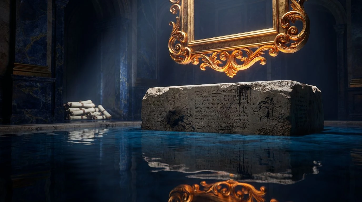
Looking at Chiaroscuro Tides feels rather like stepping into a damp, opulent cathedral just as the sun hits a stained glass window. The tension here relies on an undeniable tug-of-war between the heavy, suffocating weight of Midnight Indigo and the sharp, almost arrogant streak of Gilded Frame. It is a brilliant bit of visual manipulation. By anchoring the lighter Cerulean Glaze and Venetian Canal within the vast emptiness of darker tones, any digital space adopting these shades immediately acquires an air of history and intense gravity. The inclusion of Stone Plinth and Parchment White ensures the entire affair does not tip into utter melodrama, offering just enough breathing room so the visitor does not feel entirely swallowed by the gloom. It creates an atmosphere that is deeply serious, vaguely mystical, and perfectly attuned to an audience expecting a touch of the extraordinary without having it screamed in their faces.
Vault of the Medicis 🏛️
Vault of the Medicis does away with the polite middle ground entirely. This is a collection of extremes, preferring the stark confrontation between Pitch Void and the blinding purity of Marble Dust. It owes much to the aggressive lighting schemes of early modern portraiture, where the subject demands absolute focus. Here, Golden Fleece acts as the single sharp spotlight in a darkened room, a trick that feels utterly manipulative and highly effective. The cooler tones, Prussian Blue and Powdered Sky, sit quietly in the background like fading murals, providing a necessary chill to offset the searing heat of the gold. Employing this sequence of pigments online builds an environment that feels exclusive, perhaps a little dangerous, and thoroughly unapologetic. It perfectly mimics the sensation of unlocking something historically significant, turning an ordinary screen into a velvet-lined cabinet of curiosities governed by strict, old-world authority.
The Caravaggio Heist 🖼️
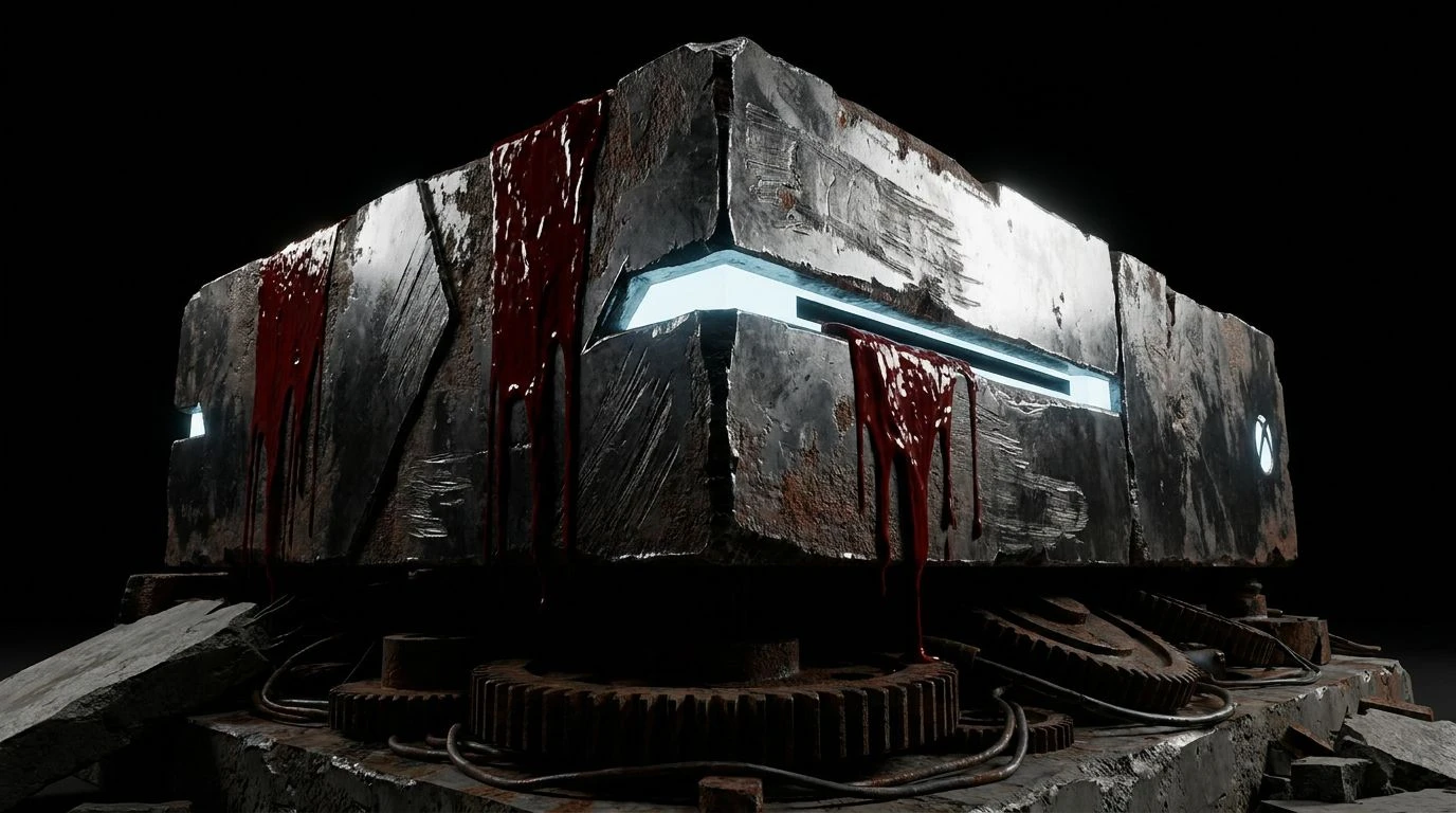
If one were to rob an art museum at midnight, The Caravaggio Heist provides the perfect backdrop. There is an almost violent theatricality happening with the sudden, sharp flashes of Crimson Lake and Veronese Green cutting right through the oppressive density of Total Eclipse. This is not polite decoration. It is highly choreographed drama meant to disorient and impress the viewer in equal measure. Tarnished Brass and Sunlit Halo act as the guiding lanterns through the dimness, catching the eye and pulling it exactly where the designer intends. The cooler interruptions of Pewter Cast and Charcoal Sketch ground the experience, preventing the bright primary flashes from feeling cheap or overly modern. Instead, they read like priceless artifacts briefly caught in the sweep of a flashlight. Navigating an interface built on these tones feels illicit and grand, demanding a sort of hushed reverence usually reserved for confronting a masterpiece in the flesh.
Twilight at Versailles 🌙
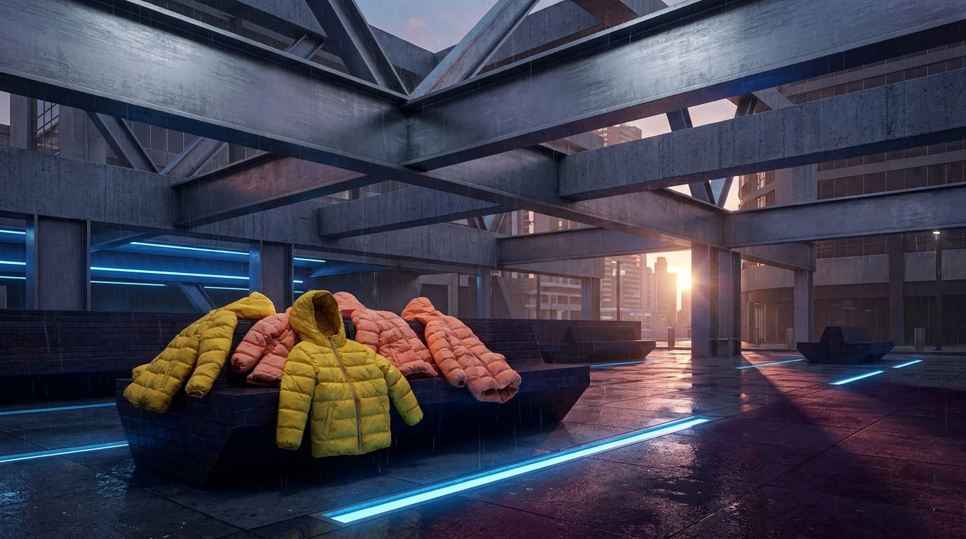
There is a stifling, magnificent kind of luxury to Twilight at Versailles, a collection that smells vaguely of polished wood and burning wax. The absolute lack of pure black is telling, relying instead on the crushing weight of Royal Night to plunge the viewer into shadow. Against this abyssal blue, Saffron Gown and Candle Flame glow with a heat that feels entirely intimate, like a secret shared in a dark corridor. Woven Brocade and Faded Gobelin act as the supporting cast, giving texture and age to the composition so that the gold does not look newly minted, but inherited. It is a brilliant way to communicate sophistication online without resorting to tired minimalist tropes. By wrapping everything in the plush, suffocating velvet of the dark blues and letting the golds do the heavy lifting, the resulting atmosphere is one of immense privilege and quiet power, functioning as a sort of digital velvet rope keeping the riffraff at bay.
Echoes of Antiquity 🏺
Echoes of Antiquity feels like an old room where the furniture has been covered in sheets for a century. It is remarkably restrained, leaning heavily into the gloom of Slate Vault and allowing the muted glow of Antiquarian Gold to provide the only real flicker of life. This austere approach is precisely what makes it so commanding. Without the distraction of vibrant secondary features, the eye is forced to reckon with the stark contrast between the heavy indigo-grey and the startling, cold purity of Alabaster Bust. Fog Shroud acts as a polite intermediary, softening the transition so the contrast does not brutalize the retina. It is a deeply serious arrangement, designed for environments that have no interest in entertaining the viewer with cheap tricks. Instead, it offers a stoic, monumental presence, turning any digital interaction into something that feels vast, ancient, and quietly intimidating.
Plunging an audience into a digital recreation of a seventeenth-century canvas is a bold refusal of the bright, sanitised aesthetic that currently dominates our screens. These sequences of shadow and metallic light prove that true authority online often lies in what is hidden rather than what is entirely exposed. By forcing a viewer to navigate through dense indigos and sudden flashes of gold, developers can manufacture a sense of theatre that holds attention far longer than plain text on a white background ever could. The shadows add weight, the gold adds consequence, and the resulting experience feels less like browsing and more like wandering through a private, highly guarded gallery. It is a reminder that drama, when executed with precision and a healthy respect for the dark, remains one of our most effective tools for leaving a lasting mark.