

Weathered Copper Color Palette: Terracotta & Cyan Design

Oxidized metal meets warm clay tones in this unique design guide. Master the balance of verdigris and terracotta for a sophisticated home aesthetic.
· 6 min readScandinavian Color Palettes for Modern Clinical Design
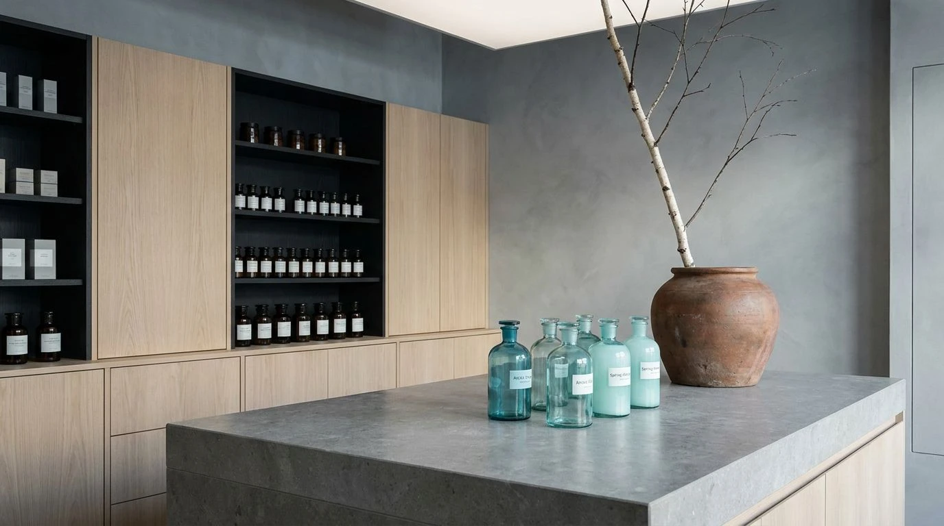
Icy blues and forest greens create a sterile yet hospitable atmosphere. Master the art of cool neutrals to transform medical spaces into sanctuaries.
· 6 min readTeal and White Color Palettes for High-Energy Design

Surgical-inspired teals and bright whites balance high-stakes energy with professional calm. Master this clinical aesthetic for modern spaces.
· 6 min readFuturistic Color Palettes for Martian Greenhouse Design
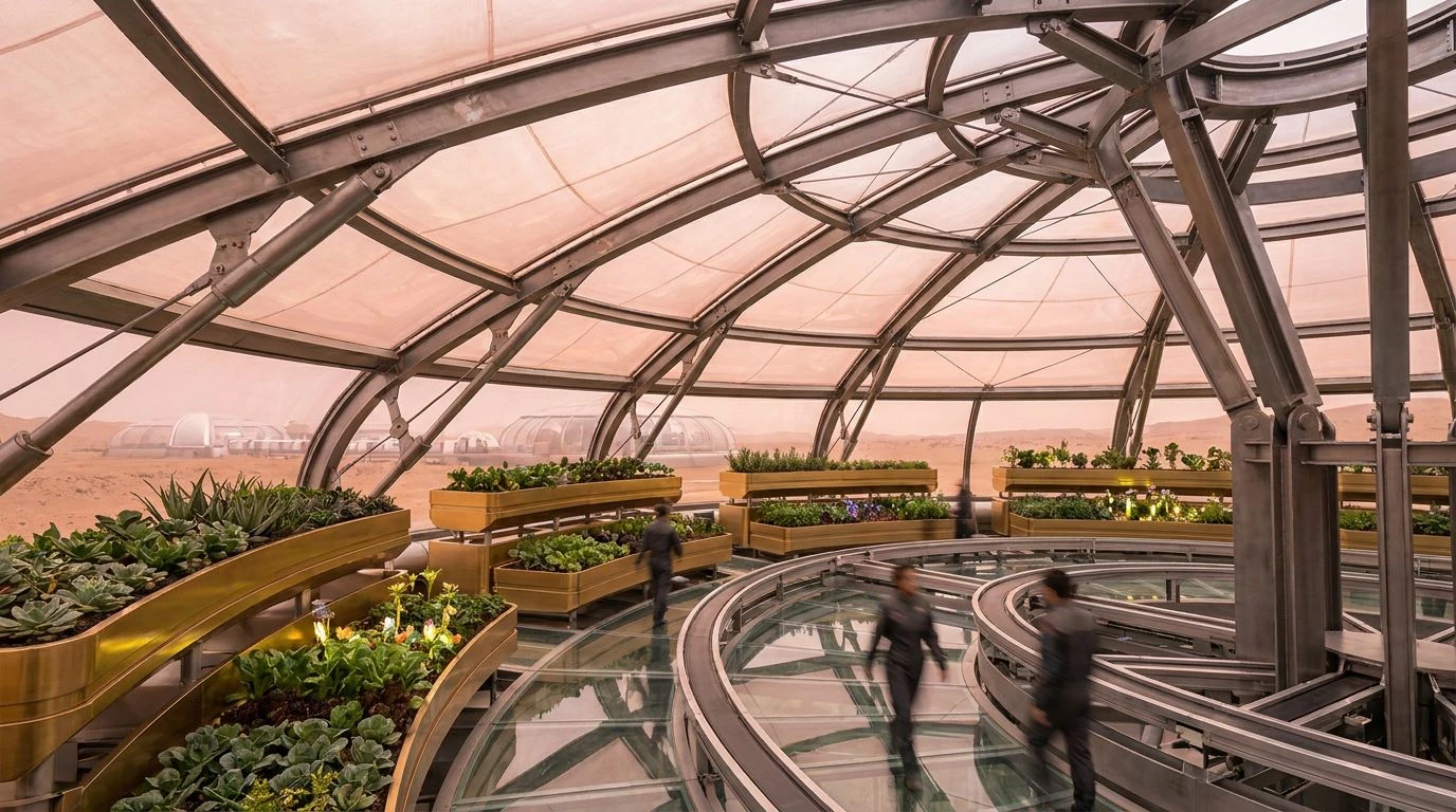
Boost astronaut wellbeing using pink and yellow tones paired with industrial steel to create vibrant, sustainable off-world farming environments.
· 6 min readIndustrial Green Color Palettes for Sustainable Design
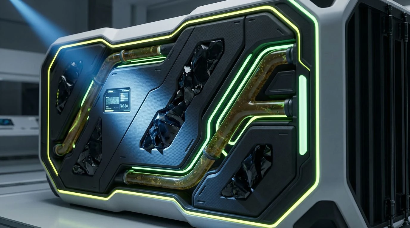
Ditch boring brown for vibrant green. These bold palettes redefine eco-friendly branding with high-energy, scientific, and industrial aesthetics.
· 5 min readHigh-Energy Yellow Color Palettes for Luxury Real Estate
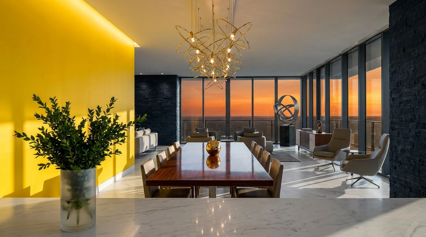
Transform property listings with lemon yellow palettes that stimulate buyer appetite and replace sterile corporate blues with editorial luxury.
· 5 min readAmber Color Palettes: The New Standard for Design Trust
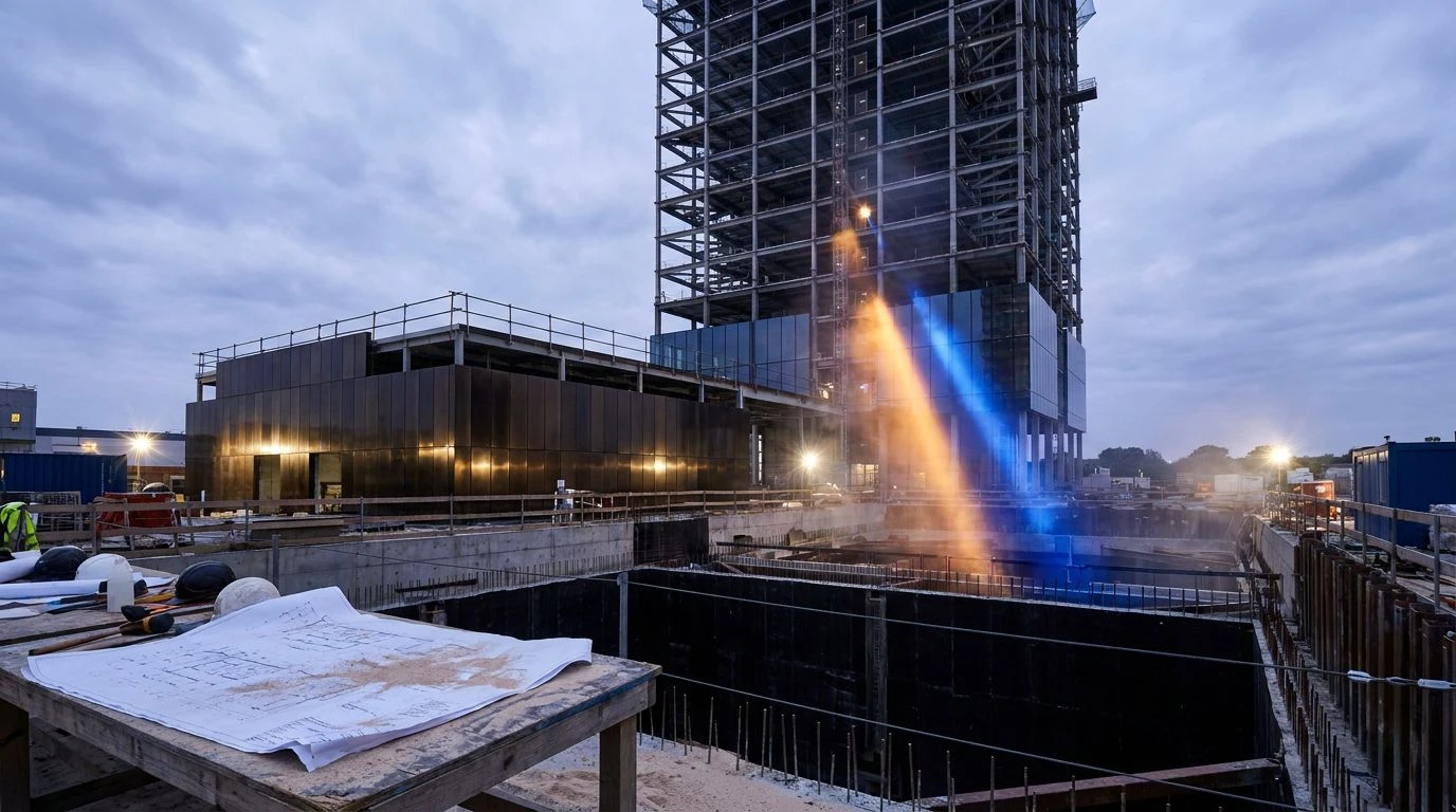
Modern construction brands are ditching neon for amber and blue to signal reliability. See how these sophisticated palettes redefine professional design.
· 6 min readTokyo Industrial Color Palettes for Tech Brand Design
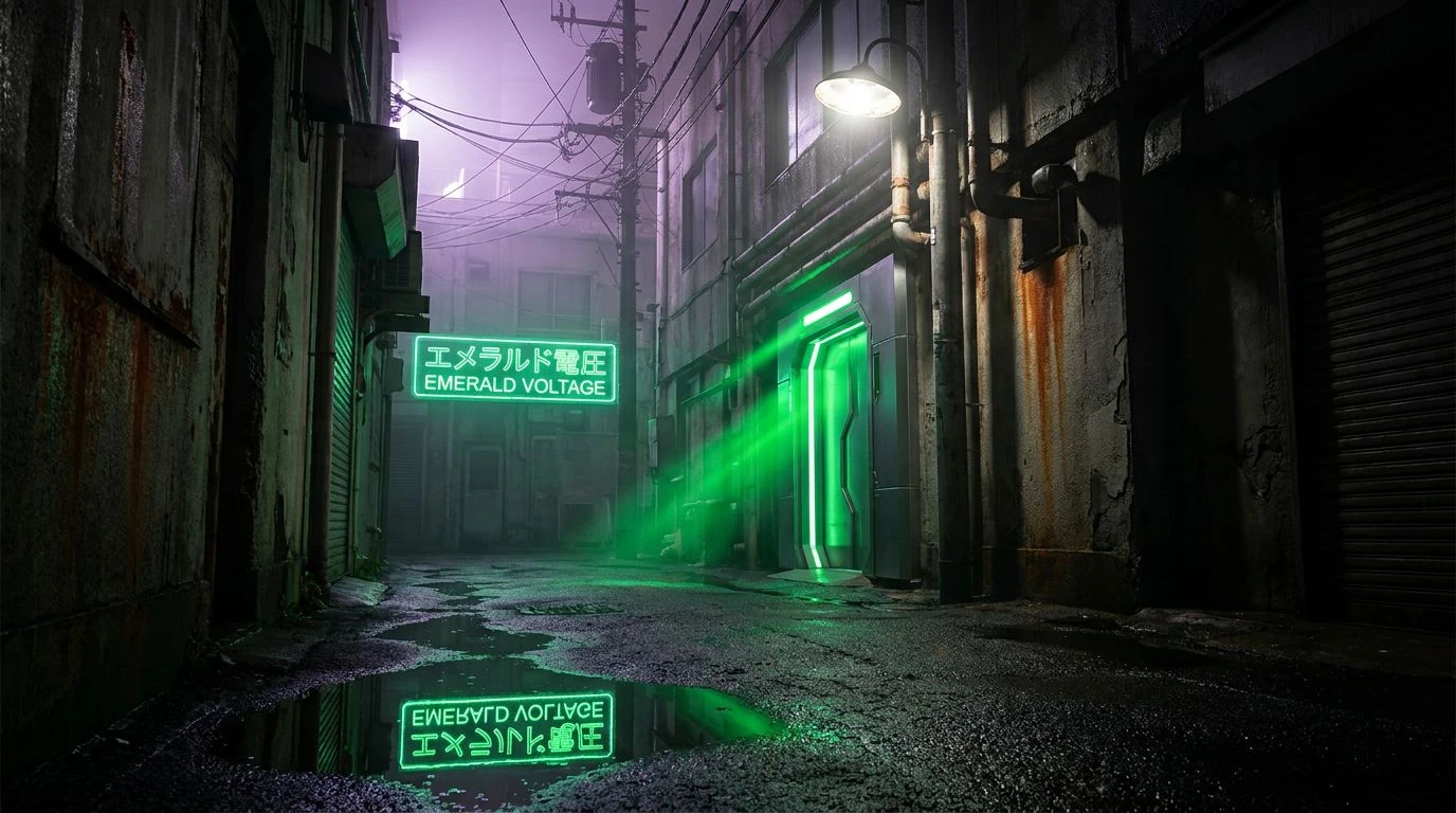
Cyberpunk aesthetics meet modern branding. This guide translates Tokyo's neon-grime contrast into high-energy color schemes for cutting-edge tech.
· 5 min readUse Electric Yellow Color Palettes to Boost Coding Focus
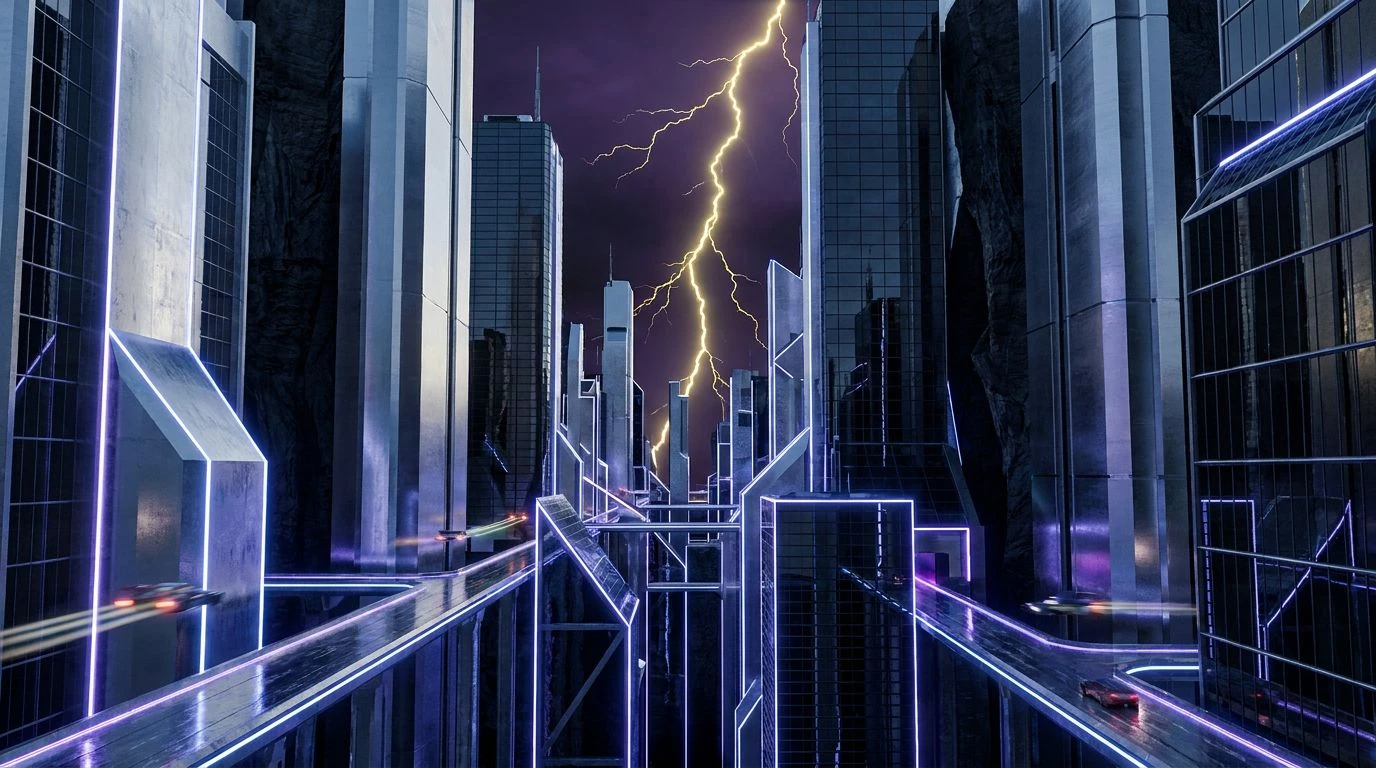
Electric yellow acts as a mental compass when paired with cool tones, driving deep intellectual flow and productivity during complex tasks.
· 6 min readModern Color Palettes Inspired by 1920s Railway Design

Navy and gold hues link vintage railway signage to modern logistics. Trace the evolution of high-contrast design in this unique transport history.
· 6 min readUsing Deep Charcoal Color Palettes for VR Design Stability
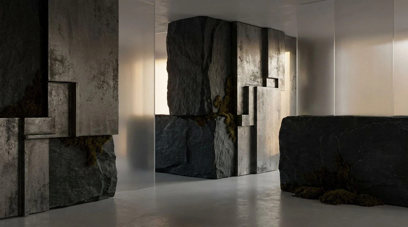
Charcoal black and murky teal provide psychological ballast in VR. Anchor digital spaces with these heavy color palettes to simulate gravity.
· 5 min readVictorian Gothic Color Palettes for Modern Digital Design
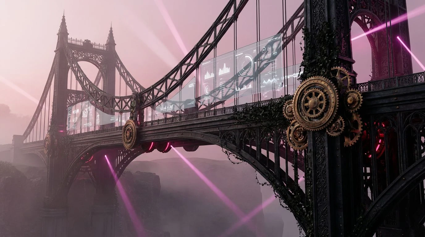
Historical wrought iron aesthetics bring structural weight to interfaces through deep charcoal, slate gray, and iron-inspired color schemes.
· 5 min read1950s Americana Charcoal Color Palettes for Moody Design
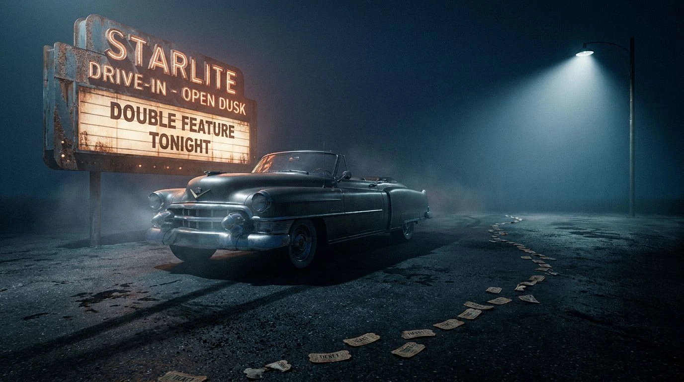
Mid-century optimism meets cinematic shadows. These atmospheric charcoal color schemes transform classic Americana into a sophisticated aesthetic.
· 6 min readFinTech Color Palette Trends: The Rise of Kitsch Design
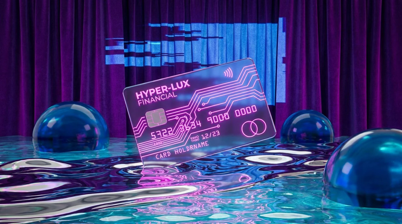
Nostalgic color schemes and kitsch graphics are transforming banking apps into visual experiences, masking financial stress with high-energy hues.
· 6 min readHigh-Contrast Color Palettes for Bold App Design Trends

Bold aesthetic strategies use high-energy tones to command attention. Master late 20th-century color theory to disrupt modern visual habituation.
· 5 min read2026 Crypto Design: Renaissance Alchemist Color Palettes
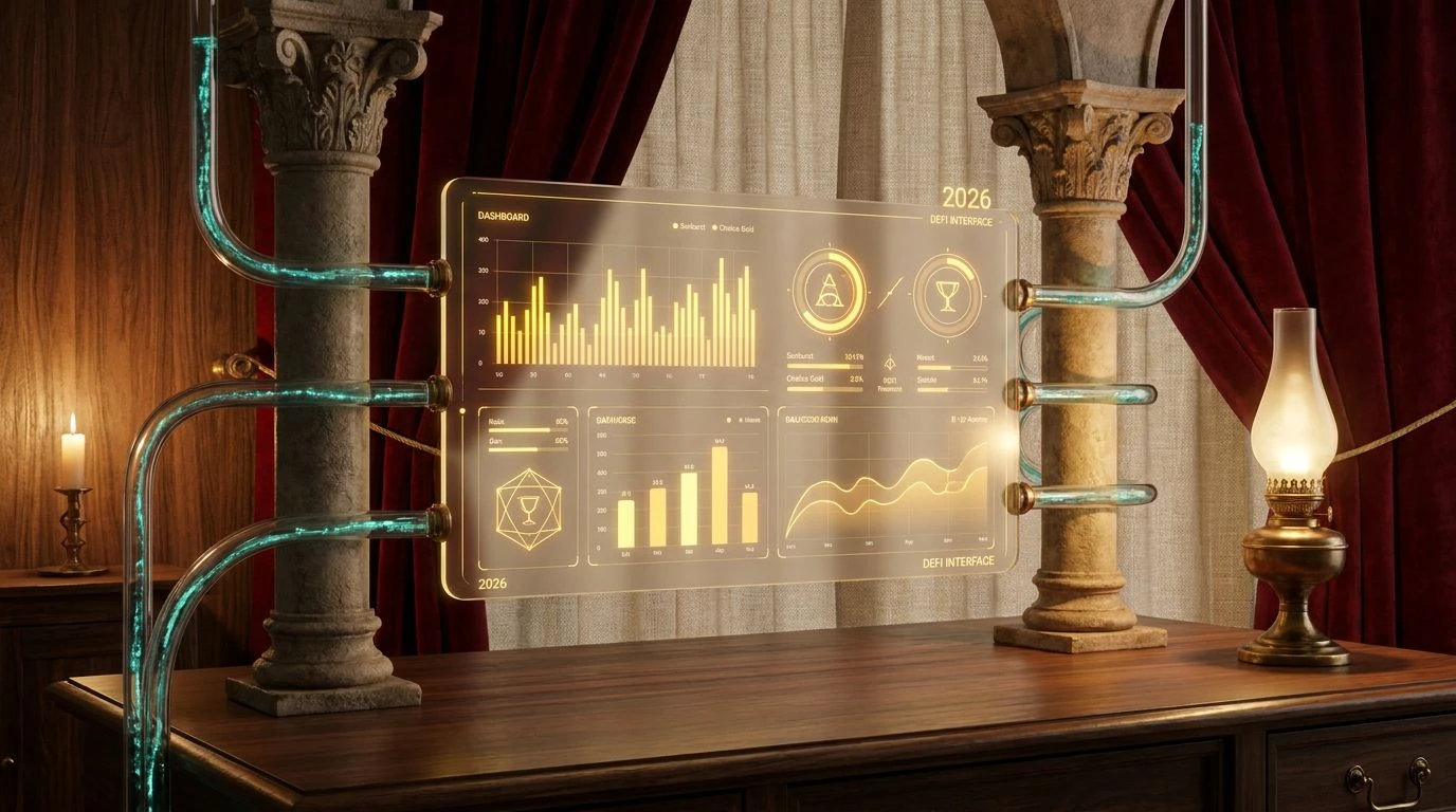
Redefine fintech with deep crimsons and antique golds. This guide blends sixteenth-century mysticism with digital assets for a tactile UI.
· 5 min read90s Rave Color Palettes for Professional Office Design
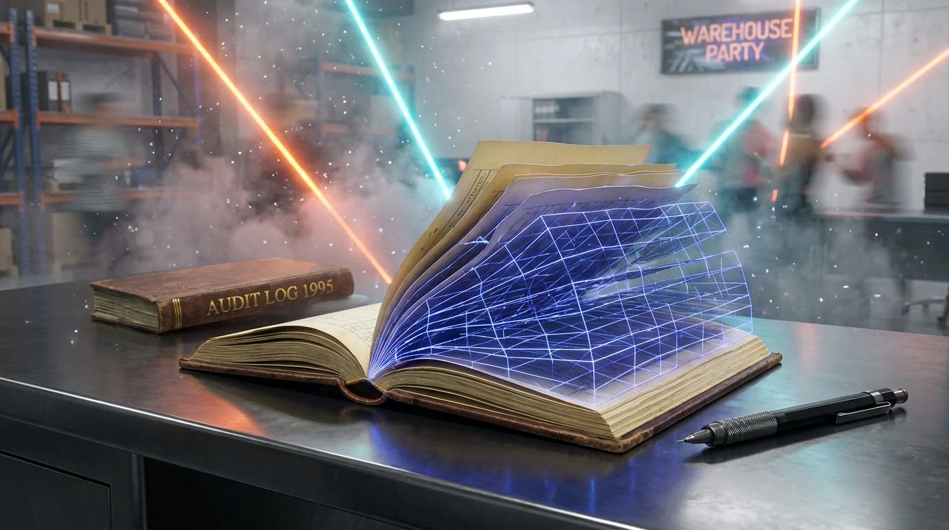
High-energy neon accents meet corporate neutral tones in this guide to balancing underground aesthetic with functional business environments.
· 5 min readPost-Modern Emerald Green Color Palette for Power Decor
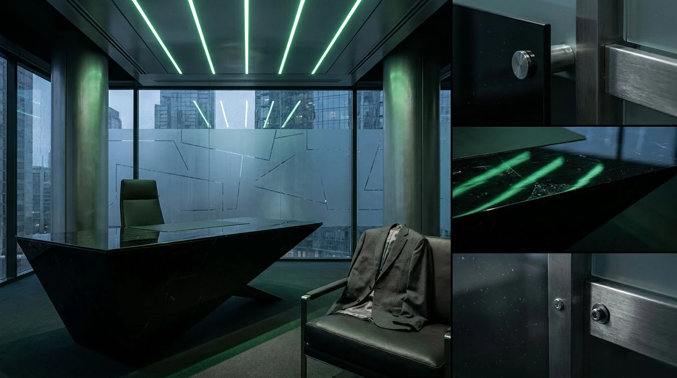
Master the art of authority with deep emerald and obsidian tones. This guide details how saturated green palettes create high-stakes executive style.
· 5 min readArt Deco Color Palettes for Industrial Interior Design
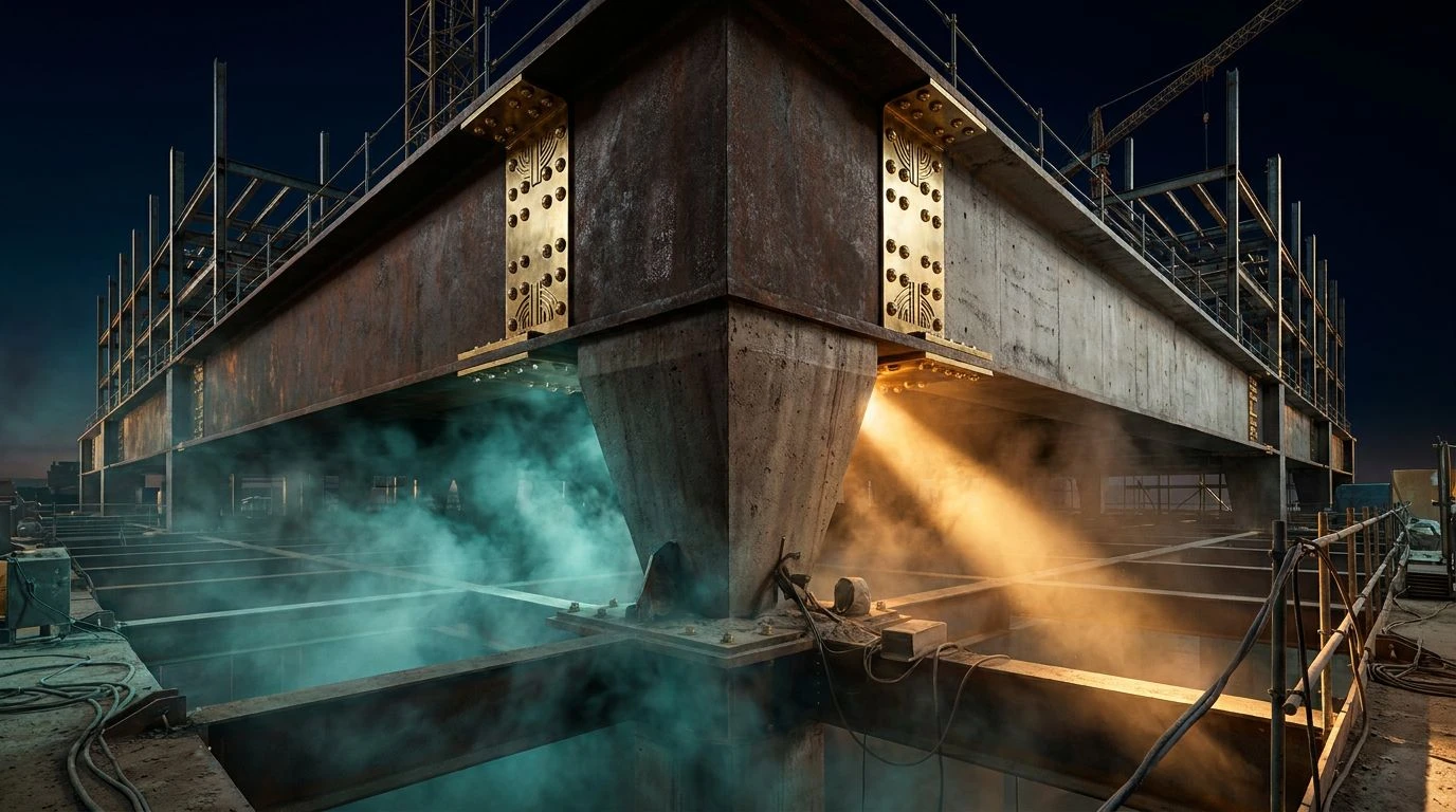
Visual psychology meets raw labor as Art Deco gold and geometric luxury collide with rugged steel and concrete in these five unique palettes.
· 5 min read80s Synthwave Color Palettes Without Using Neon Tones
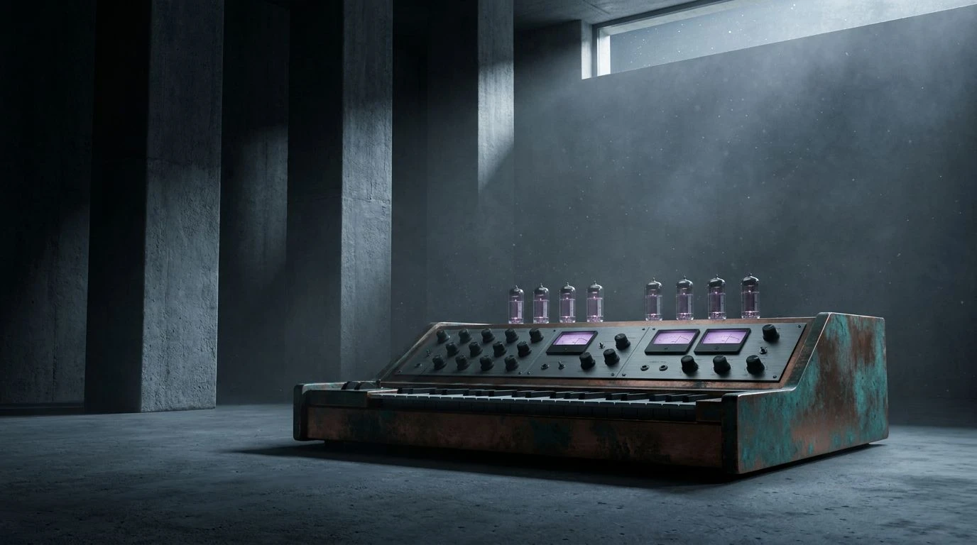
Master sophisticated interior design using midnight blue and earth tones to evoke a nostalgic 1980s aesthetic without aggressive magenta hues.
· 5 min read