Art Deco Color Palettes for Industrial Interior Design
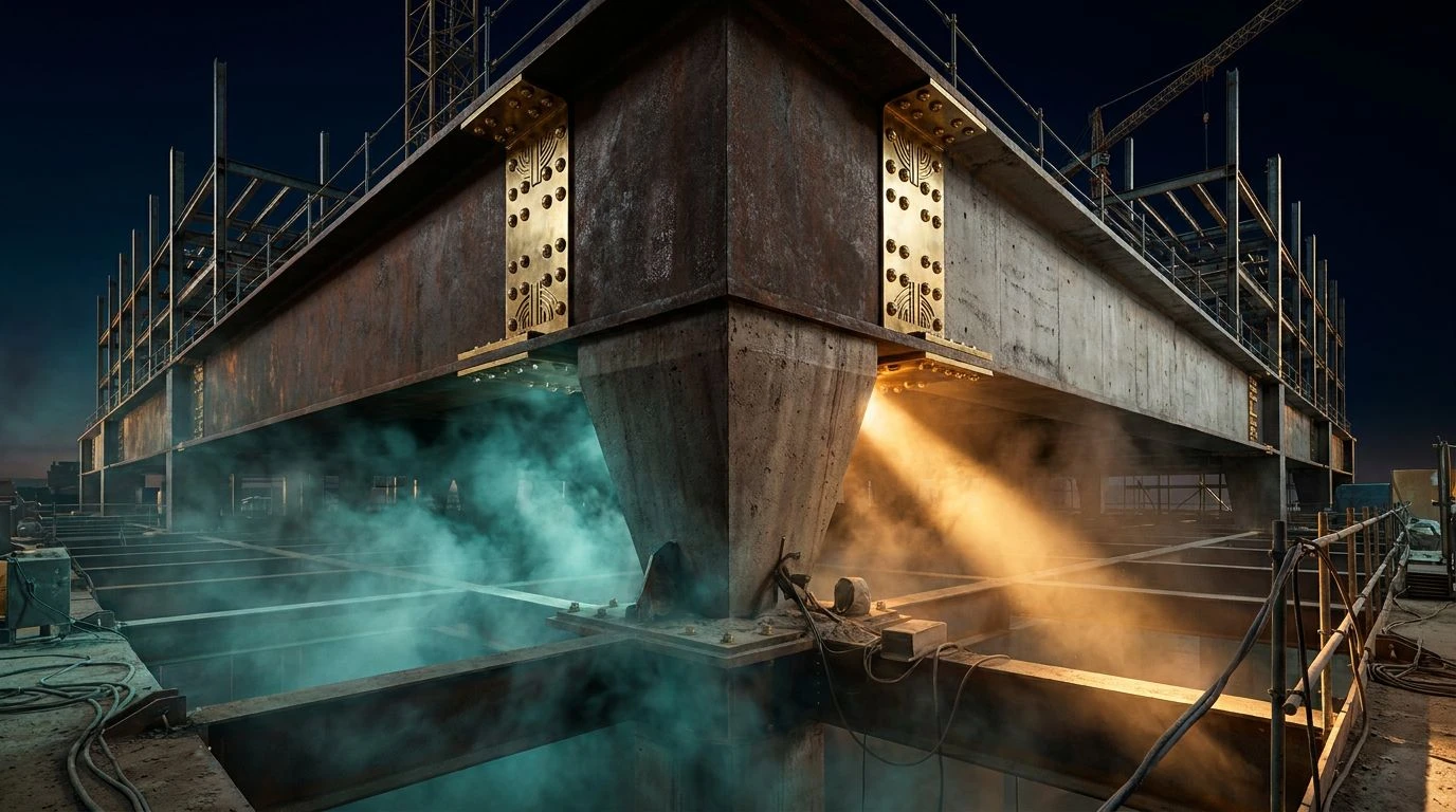
· 5 min readThe human visual system relies on context to decode meaning from color. We are conditioned to interpret the high-contrast pairing of reflective metals and deep shadows as a signal of wealth, a perceptual shortcut rooted in the opulent geometry of the 1920s. Conversely, muted grays and oxidized tones trigger associations with raw labor, structural load, and industrial environments. When an ornamental palette collides with a site of physical labor, it produces an unexpected cognitive friction. The eye is forced to reconcile the visual signals of antique gold and deep shadow with the utilitarian reality of steel, dust, and concrete. This perceptual crossover challenges our assumptions about where beauty belongs, proving that aesthetic durability and physical toughness can share the exact same visual frequency. The resulting environment feels simultaneously monumental and fiercely practical.
Metropolis Blueprint 🏗️
In the perceptual landscape of Metropolis Blueprint, the optic nerve is immediately drawn to the high-visibility wavelength of Warning Flash, a hue typically processed by the brain as an alert signal in hazardous zones. Yet, this urgent signal is stabilized by the heavy, light-absorbing mass of Obsidian Void and the textural coolness of Cured Concrete. The psychological weight of these dark, industrial shades provides a solid anchor for the highly ornamental Brass Rivet. This specific metallic tone recalls the gilded elevators and geometric grilles of early twentieth-century architecture, tricking the brain into perceiving a polished surface amid raw materials. The addition of Patina Teal introduces a chemical oxidation effect, mirroring the natural aging of copper exposed to the elements. The visual result is a sophisticated push and pull between the precision of historical design and the messy, reliable physics of heavy industry.
Gilded Scaffolding ⚙️
Gilded Scaffolding demonstrates how luminosity alters our psychological reading of a physical space. The pure, unadulterated reflectance of Arc Flash White creates a blinding contrast against the deep light-swallowing properties of Soot Shadow, a pairing historically used to define the sharp, stepped profiles of historical monuments. Here, that same high-contrast mechanism is dropped into an environment defined by Excavated Loam and Scaffold Steel. The warm, earthy soil tone grounds the visual experience in physical exertion and raw geology, while the metallic gray introduces a frequency of tensile strength and load-bearing logic. Straddling these two worlds is Heavy Machinery Gold, a hue that shares the spectral properties of both expensive historical ornamentation and the protective yellow paint used on bulldozers and cranes. The brain bridges this gap, interpreting the visual data as something both incredibly tough and historically valuable.
Industrial Opulence 🦺
The visual processing of Industrial Opulence relies heavily on grayscale mapping, allowing the singular saturated hue to dictate the emotional response. Carbon Dust and Cast Iron establish a low-light foundation, mimicking the shadows found in deep excavation sites or structural trenches. Against this dark, absorbing background, the bright, reflective properties of Deco Brass become heavily pronounced. The human eye is naturally attuned to seek out this kind of warmth in a cold environment, reading the golden tone as a marker of quality and precision engineering. The transition between these extremes is managed by Aluminum Strut and Gypsum Powder, mid-tone and highlight grays that simulate the particulate matter of a working site. This specific distribution of light and shadow forces the viewer to process the environment as highly structured. It creates a psychological sensation of safety and permanence, proving that utilitarian materials can project an air of sophisticated endurance.
Roaring Twenties Retrofit 🛠️
Roaring Twenties Retrofit presents a complex optical challenge, introducing highly saturated, unexpected wavelengths into a conventionally muted domain. The stark polarity of Tar Pitch and Floodlight Glare creates a rigid, structural grid in the visual cortex, setting a stage of extreme lighting conditions typical of night-shift labor. Within this high-contrast scaffolding, Emergency Valve acts as an immediate biological trigger, drawing the eye with the urgency of a stop sign or a hazardous materials warning. However, the scene is complicated by the intrusion of Sandstone Facade and Oxidized Copper, tones that carry the historical weight of early metropolitan skyscrapers and weathered statues. The true perceptual anomaly arrives with Neon Chalk and Plumb Bob Purple. These fluorescent, twilight frequencies mimic the highly visible marking paints used by surveyors on raw concrete. The resulting visual data forces the observer to reconcile the playful, vibrant energy of the jazz age with the strict, procedural safety codes of a modern building project.
Masonry Moderne 🧱
The limited spectral range of Masonry Moderne allows for a highly controlled study of visual temperature and texture. By stripping away overwhelming saturation, the eye becomes hyper-sensitive to subtle shifts in hue. Steel Slag and Plaster Dust provide the maximum achievable contrast, setting up a harsh, unforgiving geometric boundary that mirrors the skeletal phase of steel-frame construction. Into this stark, binary environment, Pale Rivet introduces a faint, luminescent warmth. This low-saturation gold operates on the boundary of metallic reflection and dry sawdust, providing a subtle nod to historical luxury without overwhelming the utilitarian context. The final color, Crushed Brick, lowers the visual temperature with a muted, dusty red wavelength. This tone stimulates associations with pulverized masonry and terracotta tiles, materials that bridge the gap between structural necessity and architectural ornamentation. The psychological effect is one of quiet reliability, a visual space where heavy labor feels remarkably refined.
The interaction between highly ornamental metallic frequencies and the muted, light-absorbing tones of physical labor demonstrates a fascinating quirk of visual psychology. By combining the stark geometric contrasts favored by early modern architecture with the dirt, rust, and safety signals of heavy industry, these visual arrangements rewrite our spatial expectations. The optic nerve processes the raw durability of a work site, while the brain simultaneously decodes the signals of wealth, precision, and historical luxury. This cognitive overlap proves that aesthetic refinement and utilitarian toughness are not mutually exclusive. Instead, when properly balanced, they generate a visual environment that is both structurally imposing and undeniably sophisticated, turning ordinary physical exertion into an act of monumental design.