Victorian Gothic Color Palettes for Modern Digital Design
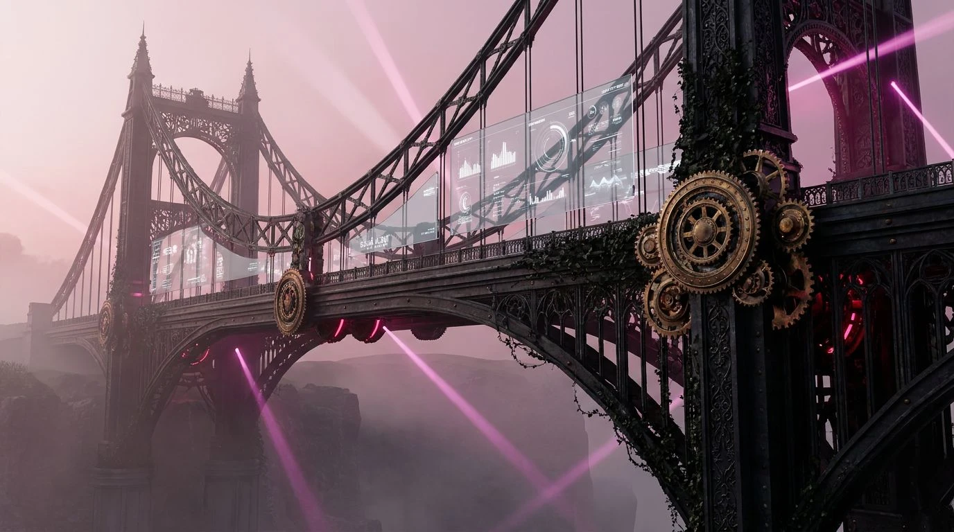
· 5 min readThe architecture of the digital realm often defaults to weightless minimalism, stripping away history in favor of frictionless space. Yet, when designers seek to communicate permanence and structural exactitude, they look backward to the imposing presence of the nineteenth century. Victorian Gothic wrought iron, with its heavy shadows and rigid geometry, offers a visual language of absolute precision. By translating the deep charcoal and heavy black of cast metal into user interfaces, paired with the crispness of slate light gray, modern platforms can construct an environment of undeniable reliability. Color becomes the structural mortar. These palettes establish a digital environment that feels as sturdy as a suspension bridge and as intricately forged as a cathedral gate, demanding respect while guiding the user with an authoritative hand.
Gaslight Conservatory 🥀
The Gaslight Conservatory palette bridges the severe lines of nineteenth-century engineering with the opulent interiors of the era. Midnight Iron and Porcelain serve as the high-contrast structural foundation, creating sharp, highly legible boundaries within an interface that mimic the rigid struts of a glasshouse roof. Against this austere backdrop, Crimson Velvet and Tarnished Brass function as deliberate interactive signals, drawing the eye toward critical actions with the urgency of a velvet rope or a polished brass handle. The addition of Ivy Shadow, Faded Rose, and Plum Damask introduces an organic softness, reminiscent of cultivated botanical gardens pressing against cold metal. In a digital application, this sequence establishes a profound sense of historical gravity and curated beauty, allowing users to navigate complex information architectures with absolute confidence and a feeling of refined enclosure.
Foundry Ledger 🖋️
A disciplined approach to digital design requires a foundation of industrial exactitude, perfectly captured in the Foundry Ledger collection. Parchment White and Weathered Zinc provide a spacious, neutral background, reading like an architect’s drafting table lit by morning sun. The transition into Iron Smut and deep Soot grounds the visual hierarchy, establishing the heavy, unyielding borders necessary for data-dense applications or financial dashboards. Gilded Rivet offers a muted flash of wealth and security, an ideal selector for active states or premium tiers. Unexpectedly, the sharp inclusion of Verdigris Flash interrupts the somber grayscale, acting as an assertive confirmation signal that cuts through the visual noise like oxidized copper against a dark skyline. This combination builds an atmosphere of calculated efficiency and unshakeable trust, assuring the user that the system is built to endure.
Wrought Iron Forge 🔥
Drawing directly from the intense heat and raw materials of Victorian industry, the Wrought Iron Forge sequence is unapologetically tactile. Chalk and Cast Iron create an uncompromising binary, ensuring that typography and navigational structures remain stark and instantly recognizable. Graphite and Cold Ash step in to soften the transition, providing the necessary slate grays to construct secondary menus and subtle dividers without diluting the overall strength of the layout. The defining characteristic of this arrangement is the warmth introduced by Embers and Pale Oak. These tones replicate the glow of a furnace and the raw timber of a factory floor, giving the interface a localized intensity. By applying these warmer colors to progress bars or loading states, designers can create a rhythmic, mechanical pulse within the interface, communicating active processing while maintaining a firm, authoritative presence.
Industrial Stained Glass 🕍
The Industrial Stained Glass selection translates the ecclesiastical grandeur of the Gothic Revival into a contemporary digital framework. Frost and Obsidian lay a high-contrast groundwork, while Lead Carning and Steel Cable provide the mid-tone grays that mimic the structural soldering holding a complex composition together. What elevates this sequence is the brilliant intrusion of modern, almost electric colors. Cyan Glaze, Amethyst Glass, and Rose Window act as the light piercing through the dark iron framework, assigning highly specific meaning to distinct user interactions or categorical tags. This arrangement is particularly effective in complex tracking systems or educational platforms, where categorical distinction is critical. The stark darkness ensures precision and focus, while the brilliant jewel tones provide swift, intuitive wayfinding, resulting in a user journey that feels both rigorously organized and visually spectacular.
Locomotive Blueprint 🚂
Transporting the sheer mechanical ambition of the nineteenth century into modern screen design, the Locomotive Blueprint palette relies on stark, purposeful contrasts. Draft Paper and Engine Black form the primary reading environment, ensuring that content delivery is treated with the utmost seriousness. Slate Cinder and Fog build out the necessary spatial layering, giving depth to sidebars and modal windows, akin to the precise shading found on archival engineering schematics. The structural austerity is punctuated by Blueprint Ink and Rusted Spike. The deep denim blue serves as a highly dependable interactive color, communicating stability and established protocol, while the rusted brown tone adds a touch of historical realism for alerts or warnings. This deliberate, measured use of color transforms a standard digital experience into a highly controlled, reliable instrument, reflecting a deep respect for mechanical precision.
Reimagining nineteenth-century wrought iron for the digital screen demonstrates that historical weight and modern usability are not mutually exclusive. By grounding interfaces in deep charcoals and stark blacks, punctuated by slate grays and deliberate accent tones, designers can construct environments of profound reliability. These color sequences do more than decorate a page; they engineer an atmosphere of permanence. They assure the user that the digital structure they are navigating is built with the same uncompromising exactitude as a suspension bridge. The result is a user experience that commands respect, turning fleeting digital interactions into monuments of digital craftsmanship.