Deep Teal Color Palettes and Professional Appliance Design
· 5 min readWhen we walk into a kitchen, our brains immediately process thousands of visual cues, sorting them into categories of danger, utility, and comfort. Historically, kitchen appliances communicated pure function through stark white enamel or polished chrome. Yet, a shift is occurring in industrial design, migrating toward palettes that trigger entirely different neurological pathways. By applying specific wavelengths of light, such as the rich, short-wave absorption of deep teal or the metallic luminance of gold, designers can manipulate our perception of a simple toaster. Instead of a mundane tool for crisping bread, the appliance projects an aura of commanding competence. This perceptual transformation relies on how human vision processes color temperature and contrast to assign social and operational gravity to inanimate objects.
Chromatic Competence 🍞
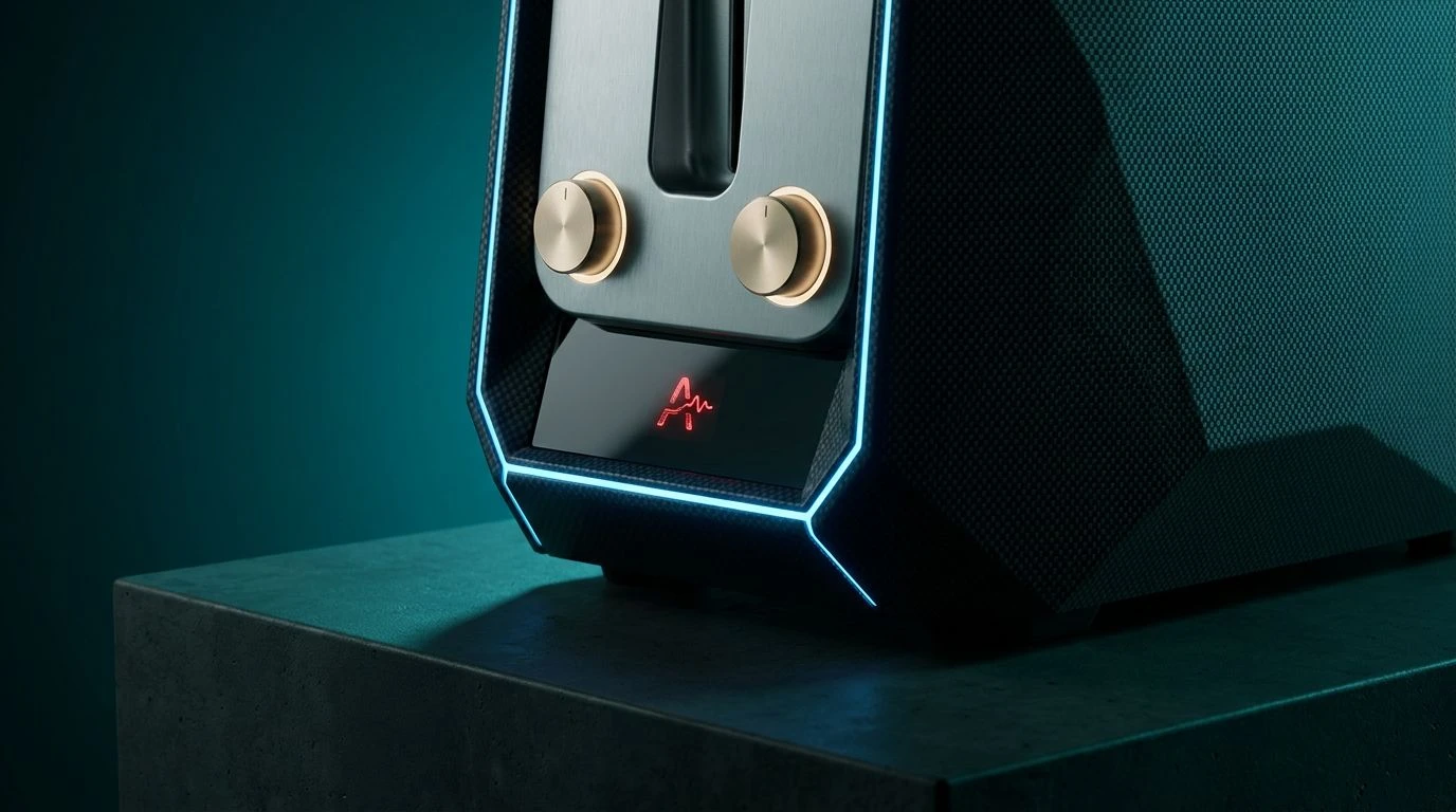
The psychological weight of Chromatic Competence relies heavily on the interaction between cold industrial tones and sudden peaks of visual stimulation. The anchor here is Oceanic Command, a teal that absorbs longer light wavelengths, signaling depth and stability to the human eye. When wrapped around the chassis of a smart toaster, this deep blue-green hue suppresses the visual noise typically associated with countertop clutter. Against this stabilizing background, Pale Brass provides a soft, reflective contrast that human vision associates with precision instruments, rather than cheap plastic. Matte Aluminum and Carbon Casing act as neutral grounding elements, allowing the appliance to recede into the spatial geometry of the kitchen. However, it is the sharp, high-frequency intrusion of Alert Red that truly commands attention. In a user interface, this specific wavelength triggers immediate physiological recognition, ensuring the human operator understands exactly when the toasting cycle requires intervention, turning an everyday breakfast routine into an exercise in strict operational efficiency.
Wavelength Authority 🎛️
Human visual processing assigns hierarchy based on luminosity and saturation. Wavelength Authority exploits this biological quirk by surrounding the deep, light-absorbing Abyssal Teal with highly reflective accents. A toaster utilizing this specific spectrum no longer reads as a passive appliance. Oxidized Gold and Machined Steel trick the brain into perceiving heavy, durable materials, elevating the perceived density of the object. The introduction of Void Black creates extreme optical boundaries, defining the edges of the machine with absolute precision. This stark contrast makes the brighter, shorter wavelengths of Cyan Glare and Frost Interface appear artificially luminous, perfect for LED displays or status indicators. Surprisingly, the inclusion of Thermal Pink disrupts the strict authoritarian visual field. This sudden burst of warm, long-wavelength energy mimics the physical heat of the toaster heating coils, providing users with an intuitive, non-verbal indicator of thermal activity while maintaining an overall atmosphere of calculated technological superiority.
Neural Circuitry 🔌
The physiological response to deep black is a perception of infinite density and structural permanence. By establishing Obsidian Chassis as the foundational base, Neural Circuitry immediately projects an unyielding, serious presence on the kitchen counter. Paired with Conductive Copper, the visual system detects the classic signature of electrical engineering. The human eye is highly sensitive to the warm reflection of copper tones, which historically denote energy transfer and high-grade machinery. To prevent the toaster from appearing too archaic or industrial, Mint Phosphor introduces a mid-spectrum wavelength that modernizes the visual profile. This specific green-blue hybrid reads as clean, sterile, and hyper-efficient. Alongside Titanium Shell, the appliance maintains a cool, calculating exterior. When Electric Azure is used for interactive touchpoints or power indicators, the high-frequency blue light cuts through the visual weight of the darker tones, giving the user immediate, high-contrast feedback regarding the machine operational status.
Thermal Kinetics 🔬
Our human biology has conditioned us to recognize earth tones as safe, grounding elements. Thermal Kinetics plays upon this instinct by flanking the highly technical Submarine Teal with organic, long-wavelength hues like Radiant Bronze and Scorched Earth. When a consumer interacts with a kitchen gadget utilizing this spectrum, their brain simultaneously processes the warmth of a hearth and the precision of a laboratory. The deep Submarine Teal acts as a psychological coolant, projecting a calculated, emotionless efficiency that demands respect. Ceramic Insulator provides high-albedo contrast, reflecting ambient light to define the structural housing of the appliance. Absolute Shadow and Oxide Gray establish a framework of shadows and midtones, creating an illusion of mechanical complexity and heavy construction. Finally, Plasma Blue provides the necessary digital signaling. This sharp, artificial blue suggests advanced sensory capabilities, implying that the toaster is not merely heating bread, but actively monitoring complex thermal algorithms.
Spectrum Calibration ⚙️
High-contrast color arrangements force the optic nerve to constantly adjust, maintaining a state of mild physiological arousal and acute awareness. Spectrum Calibration applies this biological mechanism through an aggressive combination of extreme lights, darks, and heavily saturated primary wavelengths. The foundation consists of Brushed Silver, Vantablack Frame, and Slate Tungsten, which together absorb and reflect light in a way that mimics professional-grade laboratory equipment. Against this austere background, the presence of Aquatic Sensor introduces the required teal signature, communicating intelligent automation and systematic control. The true power of this visual array lies in its warning and status colors. Laser Crimson and Molten Amber represent the raw, physical reality of the toaster heating elements, triggering primal associations with fire and caution. Conversely, Synthetic Cobalt offers a cold, high-energy wavelength that the brain processes as digital or electronic activity, resulting in an appliance that looks visually equipped to handle demanding, high-stakes culinary tasks.
The visual processing of everyday objects reveals profound connections between optical physics and human behavior. By carefully manipulating the wavelengths bouncing off a consumer gadget, designers can bypass conscious thought and trigger deep-seated neurological responses. The strategic application of deep, light-absorbing blues and greens paired with the metallic reflectivity of golds and grays alters our spatial relationship with these machines. A simple kitchen appliance is no longer just a heating coil in a metal box. Through precise chromatic tuning, it projects an aura of commanding competence, proving that our perception of technology is entirely dependent on the specific light frequencies it reflects into our eyes.