'%3e%3cpath%20fill-rule='evenodd'%20clip-rule='evenodd'%20d='M51.1303%2019.2492C50.7278%2019.913%2050.1346%2020.4426%2049.3508%2020.838C48.5669%2021.2335%2047.6172%2021.4312%2046.5014%2021.4312C44.8208%2021.4312%2043.4367%2021.0216%2042.3492%2020.2025C41.2617%2019.3833%2040.6686%2018.2394%2040.5697%2016.7706H44.4253C44.4818%2017.3355%2044.6831%2017.7804%2045.0291%2018.1052C45.3751%2018.43%2045.8164%2018.5924%2046.3531%2018.5924C46.8192%2018.5924%2047.1864%2018.4653%2047.4547%2018.2111C47.7231%2017.9569%2047.8572%2017.618%2047.8572%2017.1943C47.8572%2016.8129%2047.7337%2016.4952%2047.4865%2016.241C47.2393%2015.9867%2046.9322%2015.7784%2046.565%2015.616C46.1978%2015.4536%2045.6893%2015.2594%2045.0397%2015.0334C44.0934%2014.7086%2043.3202%2014.3944%2042.72%2014.0907C42.1197%2013.7871%2041.6042%2013.3351%2041.1735%2012.7349C40.7427%2012.1347%2040.5273%2011.3544%2040.5273%2010.394C40.5273%209.50418%2040.7533%208.73448%2041.2053%208.08481C41.6572%207.43515%2042.2821%206.93731%2043.0801%206.5913C43.8781%206.24528%2044.7925%206.07227%2045.8235%206.07227C47.49%206.07227%2048.8141%206.46771%2049.7956%207.25861C50.7772%208.04951%2051.3315%209.13698%2051.4586%2010.5211H47.5395C47.4689%2010.0268%2047.2888%209.63483%2046.9993%209.3453C46.7097%209.05578%2046.3178%208.91102%2045.8235%208.91102C45.3998%208.91102%2045.0573%209.024%2044.7961%209.24997C44.5348%209.47594%2044.4041%209.80783%2044.4041%2010.2457C44.4041%2010.5988%2044.5207%2010.8989%2044.7537%2011.146C44.9867%2011.3932%2045.2798%2011.5944%2045.6328%2011.7498C45.9859%2011.9052%2046.4944%2012.1029%2047.1581%2012.343C48.1185%2012.6678%2048.9023%2012.9891%2049.5096%2013.3069C50.1169%2013.6246%2050.6395%2014.0872%2051.0773%2014.6945C51.5151%2015.3018%2051.734%2016.0927%2051.734%2017.0672C51.734%2017.8581%2051.5328%2018.5854%2051.1303%2019.2492ZM59.0242%206.3053V21.2829H55.4016V6.3053H59.0242ZM73.9409%206.3053V9.18642H69.8734V21.2829H66.2296V9.18642H62.2046V6.3053H73.9409ZM80.7438%209.18642V12.3218H85.8069V15.0546H80.7438V18.3806H86.4425V21.2829H77.1212V6.3053H86.4425V9.18642H80.7438ZM99.667%2016.0291V21.2829H96.0444V6.3053H101.913C103.692%206.3053%20105.048%206.74665%20105.98%207.62934C106.912%208.51204%20107.378%209.7019%20107.378%2011.199C107.378%2012.1311%20107.17%2012.9609%20106.753%2013.6882C106.337%2014.4155%20105.719%2014.9875%20104.9%2015.4042C104.08%2015.8208%20103.085%2016.0291%20101.913%2016.0291H99.667ZM103.692%2011.199C103.692%209.8855%20102.965%209.22879%20101.51%209.22879H99.667V13.1268H101.51C102.965%2013.1268%20103.692%2012.4842%20103.692%2011.199ZM120.092%2018.5501H114.478L113.546%2021.2829H109.732L115.219%206.41123H119.393L124.879%2021.2829H121.024L120.092%2018.5501ZM119.16%2015.7961L117.295%2010.2881L115.41%2015.7961H119.16ZM131.555%2018.5077H136.385V21.2829H127.933V6.3053H131.555V18.5077ZM143.337%209.18642V12.3218H148.4V15.0546H143.337V18.3806H149.035V21.2829H139.714V6.3053H149.035V9.18642H143.337ZM163.507%206.3053V9.18642H159.44V21.2829H155.796V9.18642H151.771V6.3053H163.507ZM177.449%206.3053V9.18642H173.382V21.2829H169.738V9.18642H165.713V6.3053H177.449ZM184.252%209.18642V12.3218H189.315V15.0546H184.252V18.3806H189.951V21.2829H180.629V6.3053H189.951V9.18642H184.252Z'%20fill='%23EEF0ED'/%3e%3cmask%20id='mask0_3101_7327'%20style='mask-type:alpha'%20maskUnits='userSpaceOnUse'%20x='0'%20y='0'%20width='27'%20height='28'%3e%3cpath%20d='M23.8328%200.759766H2.64808C1.18559%200.759766%200%201.94535%200%203.40785V24.5925C0%2026.055%201.18559%2027.2406%202.64808%2027.2406H23.8328C25.2952%2027.2406%2026.4808%2026.055%2026.4808%2024.5925V3.40785C26.4808%201.94535%2025.2952%200.759766%2023.8328%200.759766Z'%20fill='white'/%3e%3c/mask%3e%3cg%20mask='url(%23mask0_3101_7327)'%3e%3cpath%20d='M23.8328%200.759766H2.64808C1.18559%200.759766%200%201.94535%200%203.40785V24.5925C0%2026.055%201.18559%2027.2406%202.64808%2027.2406H23.8328C25.2952%2027.2406%2026.4808%2026.055%2026.4808%2024.5925V3.40785C26.4808%201.94535%2025.2952%200.759766%2023.8328%200.759766Z'%20fill='%23D8D8D8'/%3e%3cpath%20d='M13.2404%200.759766H0V14.0001H13.2404V0.759766Z'%20fill='%238C61FF'/%3e%3cpath%20d='M13.2404%2014H0V27.2404H13.2404V14Z'%20fill='%2336C3FE'/%3e%3cpath%20d='M26.4806%2014H13.2402V27.2404H26.4806V14Z'%20fill='%236592FE'/%3e%3cpath%20d='M26.4806%200.759766H13.2402V14.0002H26.4806V0.759766Z'%20fill='%236059F7'/%3e%3c/g%3e%3c/g%3e%3cdefs%3e%3cclipPath%20id='clip0_3101_7327'%3e%3crect%20width='190'%20height='28'%20fill='white'/%3e%3c/clipPath%3e%3c/defs%3e%3c/svg%3e)
'%3e%3cpath%20d='M23.8328%200.759521H2.64808C1.18559%200.759521%200%201.94511%200%203.40761V24.5923C0%2026.0548%201.18559%2027.2404%202.64808%2027.2404H23.8328C25.2952%2027.2404%2026.4808%2026.0548%2026.4808%2024.5923V3.40761C26.4808%201.94511%2025.2952%200.759521%2023.8328%200.759521Z'%20fill='%23D8D8D8'/%3e%3cpath%20d='M13.2404%200.759521H0V13.9999H13.2404V0.759521Z'%20fill='%238C61FF'/%3e%3cpath%20d='M13.2404%2013.9998H0V27.2402H13.2404V13.9998Z'%20fill='%2336C3FE'/%3e%3cpath%20d='M26.4809%2013.9998H13.2405V27.2402H26.4809V13.9998Z'%20fill='%236592FE'/%3e%3cpath%20d='M26.4809%200.759277H13.2405V13.9997H26.4809V0.759277Z'%20fill='%236059F7'/%3e%3c/g%3e%3c/svg%3e)
Use Bold Color Palettes to Upgrade Architecture Portfolios
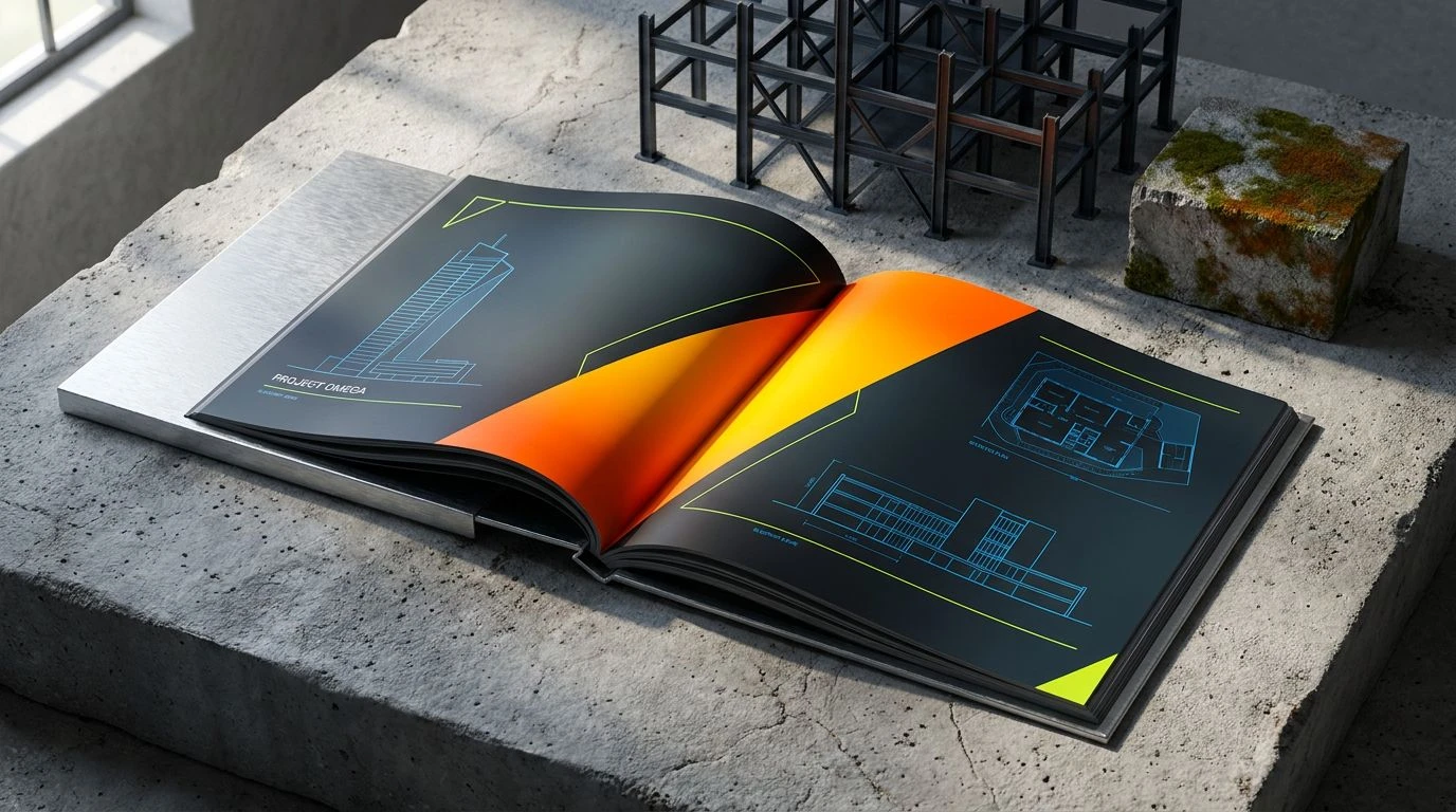
· 5 min readArchitecture portfolios have long been trapped in a sea of tasteful greige. Designers rely on muted linen textures and soft graphite lines to signal professionalism, terrified that anything louder might distract from the floor plans. But this playing-it-safe mentality creates endless stacks of identical, whisper-quiet booklets. Introducing aggressive industrial colours completely disrupts this expected politeness. Grabbing a vibrant, unapologetic safety hue directly from the construction site and pasting it across a clean layout signals a confident shift. It creates an immediate graphic punch. By clashing raw visibility against highly disciplined formatting, a layout transforms from a passive archive into an active piece of graphic communication. The aesthetic of the hardhat zone brings a frantic, urgent energy to the otherwise sterile world of architectural presentation, demanding attention the second it lands on a creative director's desk.
Structural Contrast 🏗️
The Structural Contrast collection acts as a masterclass in controlled chaos. By pairing Brushed Aluminum and Concrete Powder against the shocking intensity of High-Vis Blaze, this selection mimics the visual experience of walking through an active building site. The cooler tones of Blueprint Azure and Midnight Steel keep the layout anchored in serious, analytical territory, while accents of Hi-Vis Lime add an acidic jolt that cuts right through the noise. When designing presentation documents, dragging a stark line of that blazing orange across a vast spread of Carbon Shadow black creates an arresting graphic hierarchy. Readers are forced to look exactly where the colour demands. It feels loud, unapologetic, and highly engineered, proving that structural drawings do not need to be boring to be taken seriously. This arrangement treats the page like a piece of raw infrastructure, using bright signals to guide the viewer through complex spatial ideas.
Brutalist Intervention 🚧
With Brutalist Intervention, the aesthetic leans heavily into the rugged reality of physical materials. Void Black and Exposed Aggregate form a dense, heavy base, mimicking poured concrete walls and deep structural shadows. When Caution Tape is introduced against this heavy masonry backdrop, the visual shock is immediate and effective. The softer Rust Peeling and Timber Formwork tones add warmth, saving the layout from feeling completely sterile, while Faded Cyanotype provides a clever nod to traditional drafting techniques. Applying this selection to an architectural presentation means treating typography and geometric grids like structural load-bearing elements, using bright accents to highlight cross-sections or crucial annotations. It borrows the visual language of hazard signs and heavy machinery, communicating that the projects inside are practical, grounded, and unafraid of getting dirty. The result is a booklet that feels less like a precious art book and more like an operational manual for the built environment.
Athletic Infrastructure 🦺
Athletic Infrastructure takes the raw intensity of a sports arena and applies it to professional formatting. Rusted Rebar and Asphalt Binder provide the gritty foundation, allowing the hyper-visible Neon Clay to jump off the page. The inclusion of Stadium Turf and Crane Yellow brings a kinetic, multi-coloured energy, moving away from purely monochrome backgrounds. Structural Glazing and Frost Panel offer moments of cooling relief, much like expansive glass facades on a towering skyscraper. In a presentation setting, these varied but intense hues allow a designer to colour-code massive grids or differentiate between distinct project phases with striking clarity. The aesthetic feels fast and modern, stripping away the slow, precious quality of traditional drawing folios and replacing it with the brisk efficiency of wayfinding signage. It forces a bold, confident execution where every line weight and solid fill screams for absolute attention, turning standard diagrams into aggressive graphic art.
Monolithic Pop 💥
The Monolithic Pop selection relies on extreme values to build dramatic tension. Stark Gallery and Vantablack Voids create an endlessly high-contrast canvas, the perfect, silent void for architectural photography and sharp line work. Into this completely binary space drops Traffic Cone, an aggressive slash of colour that acts like a visual siren. This stark juxtaposition is supported by Oxidized Copper and Galvanized Blue, which introduce quiet material references without softening the blow of the primary hues. Using this specific array in a booklet mimics the modern gallery experience, where industrial objects are placed against pristine white walls. Highlighting project titles or binding a book in that intense blazing hue turns the physical document into an architectural intervention itself. The eye bounces rapidly between deep shadows, bright flashes, and the cold neutrality of Anodized Silver and Basalt Shadow, making the reading experience feel sharp, fast-paced, and highly precise.
Industrial Warning ⚠️
Industrial Warning strips the visual language back to its most basic, demanding elements. A gradient of raw materiality spans from Scalloped Concrete through Milled Steel down to Pitch Tar, constructing an impenetrable, heavy backdrop. Slashing across this gloom is Welder's Spark, an aggressive burst of heat that instantly commands the viewer's gaze. Touches of Faded Primer and Sodium Flare offer alternative highlight options, mimicking the glaring lights and painted markers found in subterranean utility tunnels. In editorial design, applying these exact tones translates to a fearless, brutal layout strategy. A massive, edge-to-edge spread coated entirely in that searing orange, interrupted only by stark black typography, creates an unforgettable tactile object. It rejects the delicate, airy formatting taught in design schools, opting instead for the punchy, utilitarian confidence of danger warnings and construction scaffolding, making the designer's work feel intensely present and physical.
Choosing to inject these highly visible, warning-grade hues into professional layouts is a deliberate act of graphic defiance. It pulls the raw, sweating reality of the construction site right onto the printed page, forcing viewers to interact with the work on a much more visceral level. Rather than whispering politely, these documents grip the attention of the room, proving that serious structural thinking can still pack an aggressive visual punch. Abandoning the safety of greyscale allows designers to treat their presentation materials as actual extensions of their built environment ideology, resulting in collections that are loud, deliberate, and impossible to ignore.