'%3e%3cpath%20fill-rule='evenodd'%20clip-rule='evenodd'%20d='M51.1303%2019.2492C50.7278%2019.913%2050.1346%2020.4426%2049.3508%2020.838C48.5669%2021.2335%2047.6172%2021.4312%2046.5014%2021.4312C44.8208%2021.4312%2043.4367%2021.0216%2042.3492%2020.2025C41.2617%2019.3833%2040.6686%2018.2394%2040.5697%2016.7706H44.4253C44.4818%2017.3355%2044.6831%2017.7804%2045.0291%2018.1052C45.3751%2018.43%2045.8164%2018.5924%2046.3531%2018.5924C46.8192%2018.5924%2047.1864%2018.4653%2047.4547%2018.2111C47.7231%2017.9569%2047.8572%2017.618%2047.8572%2017.1943C47.8572%2016.8129%2047.7337%2016.4952%2047.4865%2016.241C47.2393%2015.9867%2046.9322%2015.7784%2046.565%2015.616C46.1978%2015.4536%2045.6893%2015.2594%2045.0397%2015.0334C44.0934%2014.7086%2043.3202%2014.3944%2042.72%2014.0907C42.1197%2013.7871%2041.6042%2013.3351%2041.1735%2012.7349C40.7427%2012.1347%2040.5273%2011.3544%2040.5273%2010.394C40.5273%209.50418%2040.7533%208.73448%2041.2053%208.08481C41.6572%207.43515%2042.2821%206.93731%2043.0801%206.5913C43.8781%206.24528%2044.7925%206.07227%2045.8235%206.07227C47.49%206.07227%2048.8141%206.46771%2049.7956%207.25861C50.7772%208.04951%2051.3315%209.13698%2051.4586%2010.5211H47.5395C47.4689%2010.0268%2047.2888%209.63483%2046.9993%209.3453C46.7097%209.05578%2046.3178%208.91102%2045.8235%208.91102C45.3998%208.91102%2045.0573%209.024%2044.7961%209.24997C44.5348%209.47594%2044.4041%209.80783%2044.4041%2010.2457C44.4041%2010.5988%2044.5207%2010.8989%2044.7537%2011.146C44.9867%2011.3932%2045.2798%2011.5944%2045.6328%2011.7498C45.9859%2011.9052%2046.4944%2012.1029%2047.1581%2012.343C48.1185%2012.6678%2048.9023%2012.9891%2049.5096%2013.3069C50.1169%2013.6246%2050.6395%2014.0872%2051.0773%2014.6945C51.5151%2015.3018%2051.734%2016.0927%2051.734%2017.0672C51.734%2017.8581%2051.5328%2018.5854%2051.1303%2019.2492ZM59.0242%206.3053V21.2829H55.4016V6.3053H59.0242ZM73.9409%206.3053V9.18642H69.8734V21.2829H66.2296V9.18642H62.2046V6.3053H73.9409ZM80.7438%209.18642V12.3218H85.8069V15.0546H80.7438V18.3806H86.4425V21.2829H77.1212V6.3053H86.4425V9.18642H80.7438ZM99.667%2016.0291V21.2829H96.0444V6.3053H101.913C103.692%206.3053%20105.048%206.74665%20105.98%207.62934C106.912%208.51204%20107.378%209.7019%20107.378%2011.199C107.378%2012.1311%20107.17%2012.9609%20106.753%2013.6882C106.337%2014.4155%20105.719%2014.9875%20104.9%2015.4042C104.08%2015.8208%20103.085%2016.0291%20101.913%2016.0291H99.667ZM103.692%2011.199C103.692%209.8855%20102.965%209.22879%20101.51%209.22879H99.667V13.1268H101.51C102.965%2013.1268%20103.692%2012.4842%20103.692%2011.199ZM120.092%2018.5501H114.478L113.546%2021.2829H109.732L115.219%206.41123H119.393L124.879%2021.2829H121.024L120.092%2018.5501ZM119.16%2015.7961L117.295%2010.2881L115.41%2015.7961H119.16ZM131.555%2018.5077H136.385V21.2829H127.933V6.3053H131.555V18.5077ZM143.337%209.18642V12.3218H148.4V15.0546H143.337V18.3806H149.035V21.2829H139.714V6.3053H149.035V9.18642H143.337ZM163.507%206.3053V9.18642H159.44V21.2829H155.796V9.18642H151.771V6.3053H163.507ZM177.449%206.3053V9.18642H173.382V21.2829H169.738V9.18642H165.713V6.3053H177.449ZM184.252%209.18642V12.3218H189.315V15.0546H184.252V18.3806H189.951V21.2829H180.629V6.3053H189.951V9.18642H184.252Z'%20fill='%23EEF0ED'/%3e%3cmask%20id='mask0_3101_7327'%20style='mask-type:alpha'%20maskUnits='userSpaceOnUse'%20x='0'%20y='0'%20width='27'%20height='28'%3e%3cpath%20d='M23.8328%200.759766H2.64808C1.18559%200.759766%200%201.94535%200%203.40785V24.5925C0%2026.055%201.18559%2027.2406%202.64808%2027.2406H23.8328C25.2952%2027.2406%2026.4808%2026.055%2026.4808%2024.5925V3.40785C26.4808%201.94535%2025.2952%200.759766%2023.8328%200.759766Z'%20fill='white'/%3e%3c/mask%3e%3cg%20mask='url(%23mask0_3101_7327)'%3e%3cpath%20d='M23.8328%200.759766H2.64808C1.18559%200.759766%200%201.94535%200%203.40785V24.5925C0%2026.055%201.18559%2027.2406%202.64808%2027.2406H23.8328C25.2952%2027.2406%2026.4808%2026.055%2026.4808%2024.5925V3.40785C26.4808%201.94535%2025.2952%200.759766%2023.8328%200.759766Z'%20fill='%23D8D8D8'/%3e%3cpath%20d='M13.2404%200.759766H0V14.0001H13.2404V0.759766Z'%20fill='%238C61FF'/%3e%3cpath%20d='M13.2404%2014H0V27.2404H13.2404V14Z'%20fill='%2336C3FE'/%3e%3cpath%20d='M26.4806%2014H13.2402V27.2404H26.4806V14Z'%20fill='%236592FE'/%3e%3cpath%20d='M26.4806%200.759766H13.2402V14.0002H26.4806V0.759766Z'%20fill='%236059F7'/%3e%3c/g%3e%3c/g%3e%3cdefs%3e%3cclipPath%20id='clip0_3101_7327'%3e%3crect%20width='190'%20height='28'%20fill='white'/%3e%3c/clipPath%3e%3c/defs%3e%3c/svg%3e)
'%3e%3cpath%20d='M23.8328%200.759521H2.64808C1.18559%200.759521%200%201.94511%200%203.40761V24.5923C0%2026.0548%201.18559%2027.2404%202.64808%2027.2404H23.8328C25.2952%2027.2404%2026.4808%2026.0548%2026.4808%2024.5923V3.40761C26.4808%201.94511%2025.2952%200.759521%2023.8328%200.759521Z'%20fill='%23D8D8D8'/%3e%3cpath%20d='M13.2404%200.759521H0V13.9999H13.2404V0.759521Z'%20fill='%238C61FF'/%3e%3cpath%20d='M13.2404%2013.9998H0V27.2402H13.2404V13.9998Z'%20fill='%2336C3FE'/%3e%3cpath%20d='M26.4809%2013.9998H13.2405V27.2402H26.4809V13.9998Z'%20fill='%236592FE'/%3e%3cpath%20d='M26.4809%200.759277H13.2405V13.9997H26.4809V0.759277Z'%20fill='%236059F7'/%3e%3c/g%3e%3c/svg%3e)
Why 90s Dark Teal Color Palettes Drive Modern Design
· 5 min readHuman color perception operates as a powerful psychological anchor, linking specific optical frequencies to deeply encoded autobiographical memories. For Generation X and older generations who came of age during the technological boom of the late twentieth century, the visual landscape of early computing was dominated by specific wavelengths of deep teal and cool charcoal. Now, as these professionals ascend to executive leadership, environmental psychologists notice a distinct migration back to these precise shades. This phenomenon goes far beyond basic nostalgia. The visual system processes these grounded, mid-spectrum blues and light-absorbing dark grays as signals of permanence and structure. By reintroducing these specific light frequencies onto corporate landing pages, modern leadership asserts psychological stability, countering the overly vibrant, flat illustrations of recent web design eras with visual cues that communicate seasoned professionalism and empirical reliability.
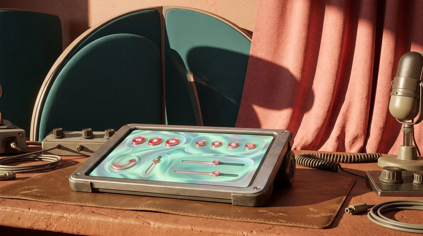
Nineties Cybernetic 💾
Nineties Cybernetic operates on visual contrasts that stimulate cognitive arousal while maintaining an anchor in professional authority. The visual pathway first registers the grounding presence of Industrial Charcoal and CRT Shadow, providing a dense, light-absorbing base that minimizes optical fatigue during long periods of screen exposure. Against this heavy foundation, Deep Nineties Teal acts as a psychological stabilizer, drawing on collective memory to signal technological competence. The sudden spikes of Electric Cyan and Ultraviolet Ray introduce high-frequency optical energy, mimicking the glow of early cathode-ray tube monitors. This careful manipulation of light and shadow captures the attention of middle-aged professionals through a sense of engineered precision. For a corporate presence, it acts as a visual shorthand for established innovation, indicating a company that survived the initial web boom and carries that hard-won computational expertise into the present day.
Corporate Earth and Ether 🌐
The arrangement of Corporate Earth and Ether traces the historical transition from physical office materials into the digital realm. The optical warmth of Rosewood Desk and Manilla Folder mimics the reflective properties of organic materials, triggering sensory memories of a tactile work environment. As the eye moves across the spectrum, it encounters the synthetic chill of Ethernet Blue and Cyanotype Teal. This dualistic temperature map mirrors the neuroplastic adaptation of a generation that bridged analog paperwork and digital networking. From a psychological standpoint, combining the grounding wavelength of earth tones with the high-alert frequency of intense blue commands a specific type of respect. Visitors encountering this sequence read the visual information as a marker of grounded authority combined with rapid data processing, making it highly effective for institutions that want to broadcast both heritage and high-speed connectivity.
Neoclassical Tech Boom 📈
Neoclassical Tech Boom relies heavily on the psychophysics of attention through selective color isolation. The severe, light-absorbing qualities of Graphite and Absolute Void suppress peripheral visual noise, forcing the optic nerve to focus entirely on the highly reflective elements. Silicon Mustard and Post-it Yellow function as chromatic alarm bells, their specific wavelengths cutting through the darkness with exactly the same urgency as analog markers on a physical desk. Introducing Accounting Seafoam prevents the stark contrast from becoming aggressive, offering a mid-range frequency that the human eye processes with restorative ease. This specific formula maps directly onto the executive desire for clear, unambiguous communication. By arranging these light frequencies, a digital space eliminates ambiguity, projecting an atmosphere of severe competence where critical information is delivered without unnecessary visual distraction or frivolous ornamentation.
Executive Marine ⛴️
Executive Marine represents the most direct translation of twentieth-century corporate psychology into modern digital space. The spectrum prioritizes visual comfort and sustained attention, limiting extreme shifts in light intensity. Depths of Teal anchors the arrangement, offering a wavelength that human vision associates with deep water and vast spaces, triggering a parasympathetic nervous system response that lowers cognitive stress. The transition from Pitch Charcoal through Sidewalk Cement and finally to Printer Paper provides a predictable, step-by-step optical gradient that guides the eye effortlessly across a screen. The sudden clarity of Horizon Blue offers just enough chromatic variation to prevent visual monotony. For seasoned decision-makers, this careful calibration of low-arousal colors projects an environment of quiet confidence. It communicates that the entity observing these boundaries possesses the experience required to handle complex corporate challenges without resorting to frantic, attention-seeking displays.
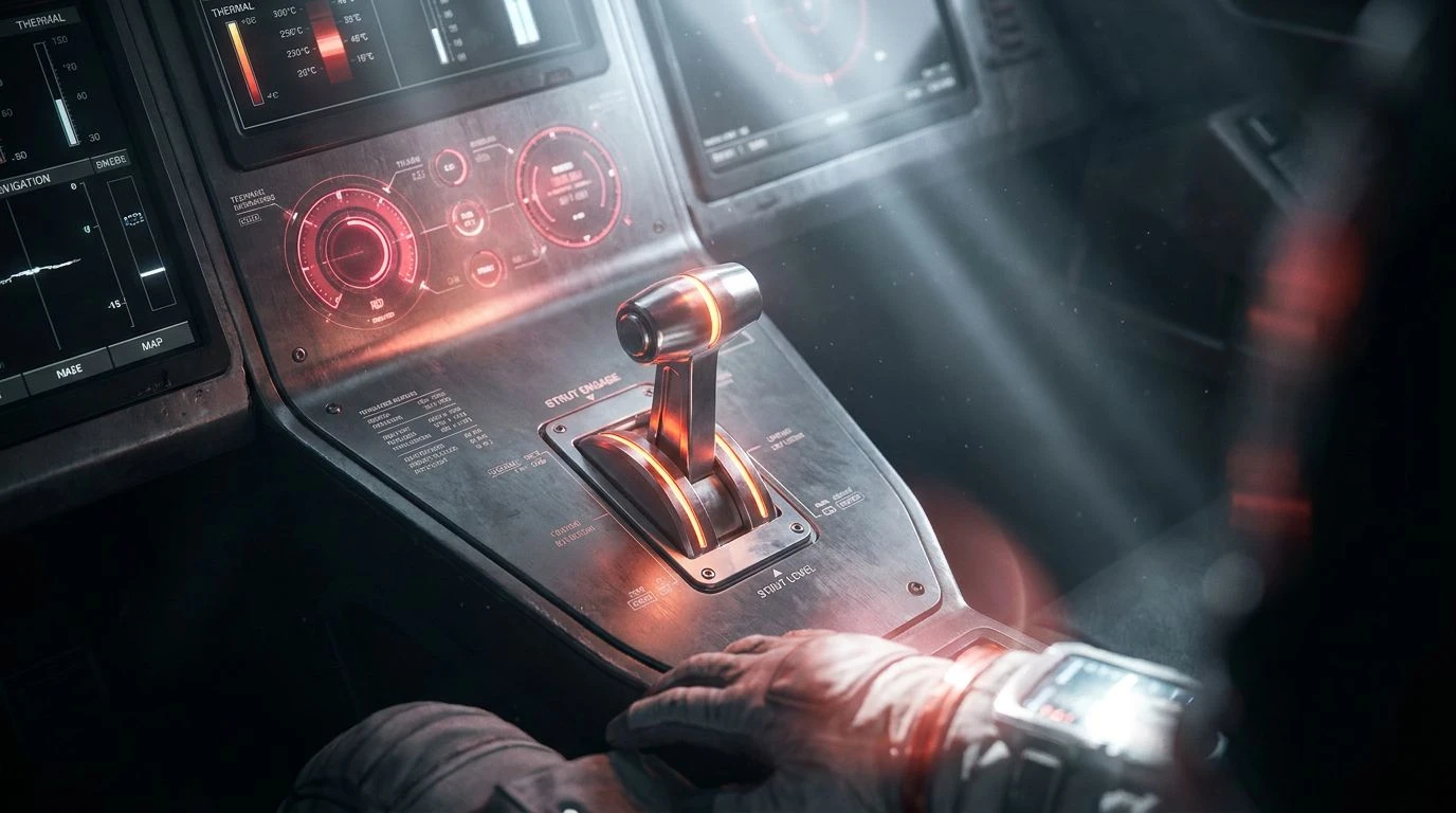
Analog Transition 📠
Analog Transition explores the visual tension between raw materiality and digital information processing. The low-frequency warmth of Copper Wire activates receptors associated with conductivity and grounded circuitry, while Cyan Carbon and Glacial Aqua provide an immediate thermal contrast. This opposition of perceived temperatures requires the brain to actively reconcile the visual data, keeping the viewer engaged without causing overstimulation. The structural framework supplied by Pure White and Obsidian establishes maximum legibility, separating the specialized shades into distinct optical compartments. Violet Shadow adds an unexpected dark hue that operates almost subliminally, offering depth where a standard gray would flatten the perspective. This deliberate juxtaposition appeals directly to leaders who understand both the physical infrastructure of business and its modern digital expression. It creates a digital architecture that feels substantial, engineered, and distinctly mature.
The optical shift toward these specific mid-spectrum blues and deep grays represents a fascinating neurological response to the modern digital environment. By selecting wavelengths that reduce visual fatigue and trigger established pathways of competence, early internet pioneers reassert their presence in a mature digital economy. The visual processing of these shades bypasses conscious thought, speaking directly to spatial memory and learned professional behavior. Rather than chasing the erratic light frequencies of passing trends, this demographic relies on the documented psychological heavy lifting of cool, structured color systems. The resulting visual spaces project an atmosphere of measurable reliability and seasoned calculation, proving that the human brain still associates certain specific combinations of light with the very concept of enduring leadership and structural permanence.