'%3e%3cpath%20fill-rule='evenodd'%20clip-rule='evenodd'%20d='M51.1303%2019.2492C50.7278%2019.913%2050.1346%2020.4426%2049.3508%2020.838C48.5669%2021.2335%2047.6172%2021.4312%2046.5014%2021.4312C44.8208%2021.4312%2043.4367%2021.0216%2042.3492%2020.2025C41.2617%2019.3833%2040.6686%2018.2394%2040.5697%2016.7706H44.4253C44.4818%2017.3355%2044.6831%2017.7804%2045.0291%2018.1052C45.3751%2018.43%2045.8164%2018.5924%2046.3531%2018.5924C46.8192%2018.5924%2047.1864%2018.4653%2047.4547%2018.2111C47.7231%2017.9569%2047.8572%2017.618%2047.8572%2017.1943C47.8572%2016.8129%2047.7337%2016.4952%2047.4865%2016.241C47.2393%2015.9867%2046.9322%2015.7784%2046.565%2015.616C46.1978%2015.4536%2045.6893%2015.2594%2045.0397%2015.0334C44.0934%2014.7086%2043.3202%2014.3944%2042.72%2014.0907C42.1197%2013.7871%2041.6042%2013.3351%2041.1735%2012.7349C40.7427%2012.1347%2040.5273%2011.3544%2040.5273%2010.394C40.5273%209.50418%2040.7533%208.73448%2041.2053%208.08481C41.6572%207.43515%2042.2821%206.93731%2043.0801%206.5913C43.8781%206.24528%2044.7925%206.07227%2045.8235%206.07227C47.49%206.07227%2048.8141%206.46771%2049.7956%207.25861C50.7772%208.04951%2051.3315%209.13698%2051.4586%2010.5211H47.5395C47.4689%2010.0268%2047.2888%209.63483%2046.9993%209.3453C46.7097%209.05578%2046.3178%208.91102%2045.8235%208.91102C45.3998%208.91102%2045.0573%209.024%2044.7961%209.24997C44.5348%209.47594%2044.4041%209.80783%2044.4041%2010.2457C44.4041%2010.5988%2044.5207%2010.8989%2044.7537%2011.146C44.9867%2011.3932%2045.2798%2011.5944%2045.6328%2011.7498C45.9859%2011.9052%2046.4944%2012.1029%2047.1581%2012.343C48.1185%2012.6678%2048.9023%2012.9891%2049.5096%2013.3069C50.1169%2013.6246%2050.6395%2014.0872%2051.0773%2014.6945C51.5151%2015.3018%2051.734%2016.0927%2051.734%2017.0672C51.734%2017.8581%2051.5328%2018.5854%2051.1303%2019.2492ZM59.0242%206.3053V21.2829H55.4016V6.3053H59.0242ZM73.9409%206.3053V9.18642H69.8734V21.2829H66.2296V9.18642H62.2046V6.3053H73.9409ZM80.7438%209.18642V12.3218H85.8069V15.0546H80.7438V18.3806H86.4425V21.2829H77.1212V6.3053H86.4425V9.18642H80.7438ZM99.667%2016.0291V21.2829H96.0444V6.3053H101.913C103.692%206.3053%20105.048%206.74665%20105.98%207.62934C106.912%208.51204%20107.378%209.7019%20107.378%2011.199C107.378%2012.1311%20107.17%2012.9609%20106.753%2013.6882C106.337%2014.4155%20105.719%2014.9875%20104.9%2015.4042C104.08%2015.8208%20103.085%2016.0291%20101.913%2016.0291H99.667ZM103.692%2011.199C103.692%209.8855%20102.965%209.22879%20101.51%209.22879H99.667V13.1268H101.51C102.965%2013.1268%20103.692%2012.4842%20103.692%2011.199ZM120.092%2018.5501H114.478L113.546%2021.2829H109.732L115.219%206.41123H119.393L124.879%2021.2829H121.024L120.092%2018.5501ZM119.16%2015.7961L117.295%2010.2881L115.41%2015.7961H119.16ZM131.555%2018.5077H136.385V21.2829H127.933V6.3053H131.555V18.5077ZM143.337%209.18642V12.3218H148.4V15.0546H143.337V18.3806H149.035V21.2829H139.714V6.3053H149.035V9.18642H143.337ZM163.507%206.3053V9.18642H159.44V21.2829H155.796V9.18642H151.771V6.3053H163.507ZM177.449%206.3053V9.18642H173.382V21.2829H169.738V9.18642H165.713V6.3053H177.449ZM184.252%209.18642V12.3218H189.315V15.0546H184.252V18.3806H189.951V21.2829H180.629V6.3053H189.951V9.18642H184.252Z'%20fill='%23EEF0ED'/%3e%3cmask%20id='mask0_3101_7327'%20style='mask-type:alpha'%20maskUnits='userSpaceOnUse'%20x='0'%20y='0'%20width='27'%20height='28'%3e%3cpath%20d='M23.8328%200.759766H2.64808C1.18559%200.759766%200%201.94535%200%203.40785V24.5925C0%2026.055%201.18559%2027.2406%202.64808%2027.2406H23.8328C25.2952%2027.2406%2026.4808%2026.055%2026.4808%2024.5925V3.40785C26.4808%201.94535%2025.2952%200.759766%2023.8328%200.759766Z'%20fill='white'/%3e%3c/mask%3e%3cg%20mask='url(%23mask0_3101_7327)'%3e%3cpath%20d='M23.8328%200.759766H2.64808C1.18559%200.759766%200%201.94535%200%203.40785V24.5925C0%2026.055%201.18559%2027.2406%202.64808%2027.2406H23.8328C25.2952%2027.2406%2026.4808%2026.055%2026.4808%2024.5925V3.40785C26.4808%201.94535%2025.2952%200.759766%2023.8328%200.759766Z'%20fill='%23D8D8D8'/%3e%3cpath%20d='M13.2404%200.759766H0V14.0001H13.2404V0.759766Z'%20fill='%238C61FF'/%3e%3cpath%20d='M13.2404%2014H0V27.2404H13.2404V14Z'%20fill='%2336C3FE'/%3e%3cpath%20d='M26.4806%2014H13.2402V27.2404H26.4806V14Z'%20fill='%236592FE'/%3e%3cpath%20d='M26.4806%200.759766H13.2402V14.0002H26.4806V0.759766Z'%20fill='%236059F7'/%3e%3c/g%3e%3c/g%3e%3cdefs%3e%3cclipPath%20id='clip0_3101_7327'%3e%3crect%20width='190'%20height='28'%20fill='white'/%3e%3c/clipPath%3e%3c/defs%3e%3c/svg%3e)
'%3e%3cpath%20d='M23.8328%200.759521H2.64808C1.18559%200.759521%200%201.94511%200%203.40761V24.5923C0%2026.0548%201.18559%2027.2404%202.64808%2027.2404H23.8328C25.2952%2027.2404%2026.4808%2026.0548%2026.4808%2024.5923V3.40761C26.4808%201.94511%2025.2952%200.759521%2023.8328%200.759521Z'%20fill='%23D8D8D8'/%3e%3cpath%20d='M13.2404%200.759521H0V13.9999H13.2404V0.759521Z'%20fill='%238C61FF'/%3e%3cpath%20d='M13.2404%2013.9998H0V27.2402H13.2404V13.9998Z'%20fill='%2336C3FE'/%3e%3cpath%20d='M26.4809%2013.9998H13.2405V27.2402H26.4809V13.9998Z'%20fill='%236592FE'/%3e%3cpath%20d='M26.4809%200.759277H13.2405V13.9997H26.4809V0.759277Z'%20fill='%236059F7'/%3e%3c/g%3e%3c/svg%3e)
Retro 70s Sportswear Color Palettes for Modern UI Design
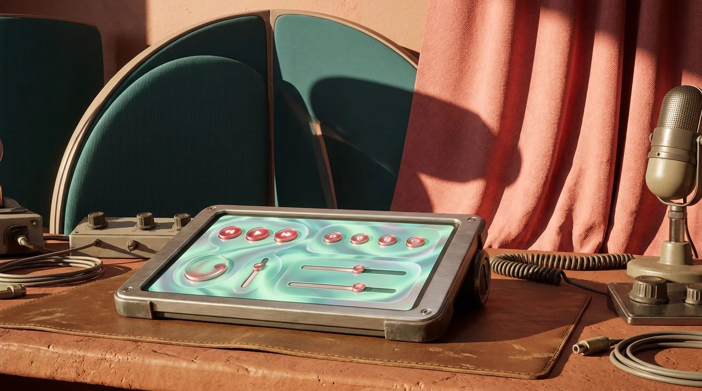
· 5 min readModern interface design frequently looks to the past for unexpected visual language, and the distinct aesthetic of mid-seventies sportswear offers a surprisingly fresh typographic and structural vocabulary. The specific timeline of a mid-June 1974 vacation presents a stark contrast to today's glass-morphism and flat vectors. We are navigating back to a period dominated by experimental synthetics, where garments woven from stiff nylon, glossy polyester, and thick cotton toweling determined the visual culture. Translating the physical qualities of these materials into contemporary digital products means looking closely at how colors like dusty teal and chalky salmon interact on a screen. By extracting the bold, contrasting palettes of retro tracksuits, heavy canvas totes, and neon accessories, digital creators can build interfaces that feel simultaneously deeply grounded and eclectically active. This approach introduces a raw, tactile modernism into clean UI layouts, transforming simple wireframes into vibrant, nostalgic ecosystems that feel distinctly alive and actively playful.
Court Side Leisure 🎾
The Court Side Leisure palette directly channels the heavy zippers and crisp piping found on vintage tennis apparel. Applying Tracksuit Asphalt and Court White establishes a sharp, high-contrast base for modern mobile applications, allowing the softer, distinctly retro mid-tones to command user attention. Sunbaked Salmon acts as an ideal primary call to action, offering a washed out but highly visible alternative to standard warning reds. It pairs effortlessly with Aerobic Teal, an energetic tone that mimics the sheen of synthetic running shorts. Wrapping application menus or secondary navigation bars in Dive Pool Deep anchors the airy lightness of the lighter shades, preventing the interface from floating away. Bleacher Grey serves as a stabilizing background, reminiscent of sun-faded concrete stadium seating. Together, these tones shape a clean, active interface that feels like flipping through a vintage sporting catalog, bringing an energetic, tactile geometry to straightforward digital layouts.
Weekend Club Racket 🏸
Moving towards an arguably moodier athleisure aesthetic, Weekend Club Racket captures the slightly sun-damaged, utilitarian side of a seventies vacation. Vinyl Pitch Black and Chalked Line offer the necessary high-contrast typographic foundation for digital readability. In this application context, Heathered Sweatband functions as a soft, textured container color, breaking up harsh negative space without overpowering the leading visual elements. The heavy lifting comes from the pairing of Pine Court and Faded Pink Plastic, a moodier interpretation of the classic teal and salmon pairing that feels pulled straight from an old squash club locker room. Using Vintage Windbreaker for state changes or active tags adds a deeply saturated, unexpected punch of jewel-toned color that immediately modernizes the entire setup. This specific combination brings a highly stylized retro-sporting attitude to fitness trackers, scheduling tools, or any web presence demanding a robust, slightly moody take on physical activity.
Acid Sweatband Arcade 🛼
Bursting with electric, uncompromising energy, Acid Sweatband Arcade captures the maximum volume of a coastal boardwalk in peak summer. This is where eclectic activity meets extreme visibility. High-Vis Astroturf and Lemon Visor break away from subdued pastels, injecting pure, unadulterated electric glow into digital spaces. When applied to dark mode interfaces, these highlighter tones provide staggering contrast for wayfinding elements, loading animations, or achievement badges in gamified fitness apps. Roller Rink Teal grounds the hyperactive brightness, acting as a structural accent that ties the intense shades back to the prevailing 1974 sportswear narrative. Synthetic Vermilion and Bubblegum Shoelace operate brilliantly as alert badges or interactive toggle states, ensuring that user interactions are impossible to miss. Building a user interface with this selection screams high summer activity, stripping away quiet minimalism in favor of loud, confident, and highly kinetic graphic interactions.
Midsummer Marathon 🎟️
Grounding the synthetic theme in earthy realism, Midsummer Marathon connects the brightly dyed nylons of the seventies with the natural textures of an outdoor running track. Rubber Tread and Cinder Track provide deep, matte background layers that absorb light similar to porous athletic surfaces, setting a distinct stage for softer, chalky interface components. Bleached Clay acts as the delicate vintage salmon substitute here, softening the harsh edges of digital typography while remaining highly readable. When juxtaposed with Poolside Mint, the resulting aesthetic feels incredibly fresh and breathable, perfectly suited for wellness or outdoor recreation software. Tanned Leather warms up the digital environment as a reliable secondary accent, while Starting Gun Red effectively draws the eye for critical action items or alert states. This selection crafts a deeply physical digital experience, exchanging cold silicon perfection for the tactile, dusty warmth of an outdoor summer tournament.
Canvas Tote Utility ⛺
Focusing entirely on the weather-resistant materials necessary for a summer expedition, Canvas Tote Utility dials back the neon for a highly functional, stripped-down visual toolkit. Heavy Nylon Black and Crisp Cotton White produce an unyielding, high-contrast framework that forces content to take priority, making it perfectly tailored for text-heavy editorial platforms or organizational dashboards. Surplus Tent Green offers a muted, utilitarian primary accent that easily replaces traditional hyper-blue links and buttons with something significantly more grounded and mature. Weathered Anorak Blue acts as a quiet supporting player, ideal for inactive states, soft background panels, or gentle border delineations. By strictly limiting the available colors, this grouping forces designers into a rigorous, cleanly structured visual hierarchy that echoes the straightforward, no-nonsense construction of durable 1974 camping gear, proving that an effective retro aesthetic does not always require loud or dizzying contrasts.
The visual vocabulary of a 1974 summer holiday offers far more than simple decorative nostalgia; it provides a highly functional, distinct framework for contemporary digital products. By looking critically at the dyed synthetics, matte canvas, and high-visibility neon plastics of the era, designers can inject a much-needed sense of physical reality into flat screens. Whether leaning into the hyperactive electricity of roller rink arcades or the muted, dusty realism of a local tennis club, these combinations challenge the current standards of minimalist user interfaces. They prove that looking back at historical material culture offers endless inspiration for building interactive layouts that are highly usable, structurally sound, and radically engaging to navigate.