'%3e%3cpath%20fill-rule='evenodd'%20clip-rule='evenodd'%20d='M51.1303%2019.2492C50.7278%2019.913%2050.1346%2020.4426%2049.3508%2020.838C48.5669%2021.2335%2047.6172%2021.4312%2046.5014%2021.4312C44.8208%2021.4312%2043.4367%2021.0216%2042.3492%2020.2025C41.2617%2019.3833%2040.6686%2018.2394%2040.5697%2016.7706H44.4253C44.4818%2017.3355%2044.6831%2017.7804%2045.0291%2018.1052C45.3751%2018.43%2045.8164%2018.5924%2046.3531%2018.5924C46.8192%2018.5924%2047.1864%2018.4653%2047.4547%2018.2111C47.7231%2017.9569%2047.8572%2017.618%2047.8572%2017.1943C47.8572%2016.8129%2047.7337%2016.4952%2047.4865%2016.241C47.2393%2015.9867%2046.9322%2015.7784%2046.565%2015.616C46.1978%2015.4536%2045.6893%2015.2594%2045.0397%2015.0334C44.0934%2014.7086%2043.3202%2014.3944%2042.72%2014.0907C42.1197%2013.7871%2041.6042%2013.3351%2041.1735%2012.7349C40.7427%2012.1347%2040.5273%2011.3544%2040.5273%2010.394C40.5273%209.50418%2040.7533%208.73448%2041.2053%208.08481C41.6572%207.43515%2042.2821%206.93731%2043.0801%206.5913C43.8781%206.24528%2044.7925%206.07227%2045.8235%206.07227C47.49%206.07227%2048.8141%206.46771%2049.7956%207.25861C50.7772%208.04951%2051.3315%209.13698%2051.4586%2010.5211H47.5395C47.4689%2010.0268%2047.2888%209.63483%2046.9993%209.3453C46.7097%209.05578%2046.3178%208.91102%2045.8235%208.91102C45.3998%208.91102%2045.0573%209.024%2044.7961%209.24997C44.5348%209.47594%2044.4041%209.80783%2044.4041%2010.2457C44.4041%2010.5988%2044.5207%2010.8989%2044.7537%2011.146C44.9867%2011.3932%2045.2798%2011.5944%2045.6328%2011.7498C45.9859%2011.9052%2046.4944%2012.1029%2047.1581%2012.343C48.1185%2012.6678%2048.9023%2012.9891%2049.5096%2013.3069C50.1169%2013.6246%2050.6395%2014.0872%2051.0773%2014.6945C51.5151%2015.3018%2051.734%2016.0927%2051.734%2017.0672C51.734%2017.8581%2051.5328%2018.5854%2051.1303%2019.2492ZM59.0242%206.3053V21.2829H55.4016V6.3053H59.0242ZM73.9409%206.3053V9.18642H69.8734V21.2829H66.2296V9.18642H62.2046V6.3053H73.9409ZM80.7438%209.18642V12.3218H85.8069V15.0546H80.7438V18.3806H86.4425V21.2829H77.1212V6.3053H86.4425V9.18642H80.7438ZM99.667%2016.0291V21.2829H96.0444V6.3053H101.913C103.692%206.3053%20105.048%206.74665%20105.98%207.62934C106.912%208.51204%20107.378%209.7019%20107.378%2011.199C107.378%2012.1311%20107.17%2012.9609%20106.753%2013.6882C106.337%2014.4155%20105.719%2014.9875%20104.9%2015.4042C104.08%2015.8208%20103.085%2016.0291%20101.913%2016.0291H99.667ZM103.692%2011.199C103.692%209.8855%20102.965%209.22879%20101.51%209.22879H99.667V13.1268H101.51C102.965%2013.1268%20103.692%2012.4842%20103.692%2011.199ZM120.092%2018.5501H114.478L113.546%2021.2829H109.732L115.219%206.41123H119.393L124.879%2021.2829H121.024L120.092%2018.5501ZM119.16%2015.7961L117.295%2010.2881L115.41%2015.7961H119.16ZM131.555%2018.5077H136.385V21.2829H127.933V6.3053H131.555V18.5077ZM143.337%209.18642V12.3218H148.4V15.0546H143.337V18.3806H149.035V21.2829H139.714V6.3053H149.035V9.18642H143.337ZM163.507%206.3053V9.18642H159.44V21.2829H155.796V9.18642H151.771V6.3053H163.507ZM177.449%206.3053V9.18642H173.382V21.2829H169.738V9.18642H165.713V6.3053H177.449ZM184.252%209.18642V12.3218H189.315V15.0546H184.252V18.3806H189.951V21.2829H180.629V6.3053H189.951V9.18642H184.252Z'%20fill='%23EEF0ED'/%3e%3cmask%20id='mask0_3101_7327'%20style='mask-type:alpha'%20maskUnits='userSpaceOnUse'%20x='0'%20y='0'%20width='27'%20height='28'%3e%3cpath%20d='M23.8328%200.759766H2.64808C1.18559%200.759766%200%201.94535%200%203.40785V24.5925C0%2026.055%201.18559%2027.2406%202.64808%2027.2406H23.8328C25.2952%2027.2406%2026.4808%2026.055%2026.4808%2024.5925V3.40785C26.4808%201.94535%2025.2952%200.759766%2023.8328%200.759766Z'%20fill='white'/%3e%3c/mask%3e%3cg%20mask='url(%23mask0_3101_7327)'%3e%3cpath%20d='M23.8328%200.759766H2.64808C1.18559%200.759766%200%201.94535%200%203.40785V24.5925C0%2026.055%201.18559%2027.2406%202.64808%2027.2406H23.8328C25.2952%2027.2406%2026.4808%2026.055%2026.4808%2024.5925V3.40785C26.4808%201.94535%2025.2952%200.759766%2023.8328%200.759766Z'%20fill='%23D8D8D8'/%3e%3cpath%20d='M13.2404%200.759766H0V14.0001H13.2404V0.759766Z'%20fill='%238C61FF'/%3e%3cpath%20d='M13.2404%2014H0V27.2404H13.2404V14Z'%20fill='%2336C3FE'/%3e%3cpath%20d='M26.4806%2014H13.2402V27.2404H26.4806V14Z'%20fill='%236592FE'/%3e%3cpath%20d='M26.4806%200.759766H13.2402V14.0002H26.4806V0.759766Z'%20fill='%236059F7'/%3e%3c/g%3e%3c/g%3e%3cdefs%3e%3cclipPath%20id='clip0_3101_7327'%3e%3crect%20width='190'%20height='28'%20fill='white'/%3e%3c/clipPath%3e%3c/defs%3e%3c/svg%3e)
'%3e%3cpath%20d='M23.8328%200.759521H2.64808C1.18559%200.759521%200%201.94511%200%203.40761V24.5923C0%2026.0548%201.18559%2027.2404%202.64808%2027.2404H23.8328C25.2952%2027.2404%2026.4808%2026.0548%2026.4808%2024.5923V3.40761C26.4808%201.94511%2025.2952%200.759521%2023.8328%200.759521Z'%20fill='%23D8D8D8'/%3e%3cpath%20d='M13.2404%200.759521H0V13.9999H13.2404V0.759521Z'%20fill='%238C61FF'/%3e%3cpath%20d='M13.2404%2013.9998H0V27.2402H13.2404V13.9998Z'%20fill='%2336C3FE'/%3e%3cpath%20d='M26.4809%2013.9998H13.2405V27.2402H26.4809V13.9998Z'%20fill='%236592FE'/%3e%3cpath%20d='M26.4809%200.759277H13.2405V13.9997H26.4809V0.759277Z'%20fill='%236059F7'/%3e%3c/g%3e%3c/svg%3e)
Summer Color Palette Trends for Corporate Design Styling
· 6 min readWinter corporate identity is a relatively easy affair. It smells like dark mahogany, heavy wool tailored coats, and a certain kind of unearned, enclosed confidence. But when midsummer arrives and the tarmac outside starts radiating visible waves of heat, nobody wants a heavy, warm brand presence. Suddenly, professionalism demands a brutal, refreshing coldness. We trade the fireside aesthetic for coastal modernism a visual vocabulary built entirely on polished stone, sea salt, and highly effective air-conditioning. It is a peculiar sort of corporate pantomime where businesses attempt to look as though they are operating out of a stark glass box overlooking the Baltic Sea, rather than struggling in a sweltering business district. To command respect in the high heat of July, visual identities rely on off-white, watery blues, and sandy golds an arrangement that suggests extreme competence via strict thermal regulation.
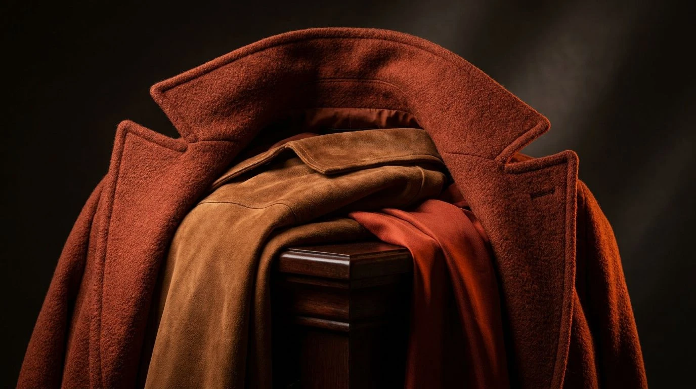
The Amalfi Executive 🪨
A strange thing happens to office aesthetics when the temperature flares; we begin looking for immediate visual relief in the form of deep aquatic tones. The Amalfi Executive introduces a sudden jolt into the usual summer stoicism. Gilt Sand and Cool Granite offer the expected, respectable grounding of a high-end coastal bank lobby clean, unmarked, and entirely unbothered by the miserable heat outside. Aegean Deep and Seafoam Grey provide the necessary oceanic chill, mimicking the precise feeling of an iced beverage condensing on a marble counter. But the real stroke of genius here is the unexpected arrival of Shocking Bougainvillea, snapping aggressively against the dark, serious weight of Midnight Trench. It is the visual equivalent of wearing a sharp, pale linen suit with an entirely unreasonable bright pink pocket square. This grouping speaks to a brand that takes its summertime operations seriously but refuses to disappear into a monotonous wash of safe, watery pastels.
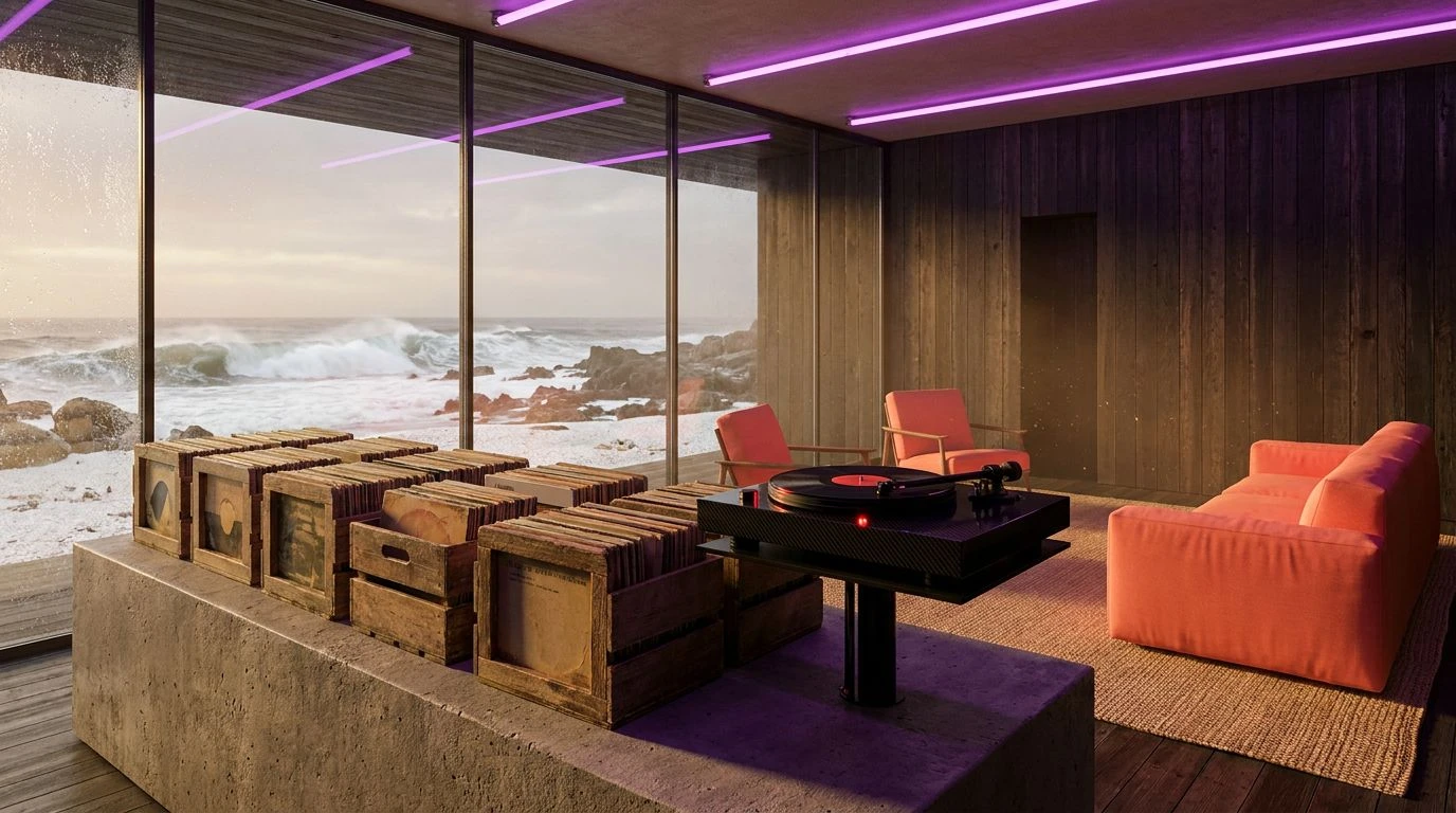
Midsummer Boardroom 🌊
There is a remarkably fine line between looking like a serious financial institution and looking like a weekend yacht club, and the Midsummer Boardroom walks it perfectly. When the humidity climbs, standard corporate navy feels entirely too heavy, almost suffocating to look at. This specific palette replaces that crushing winter weight with Maritime Navy and Horizon Wash, colours that suggest a breezy, open-air perspective rather than a stifling corner office locked in deep December. Setting these oceanic tones against the blindingly clean Crisp Linen mimics the visual relief of fresh summer tailoring. Solar Flare injects a highly controlled burst of afternoon heat, while Olive Grove grounds the whole affair with a dry, earthly maturity. You can practically hear the quiet, expensive hum of a perfectly calibrated climate control unit just looking at it. This arrangement allows a brand to appear approachable without losing a shred of its required authority, proving that you can absolutely look commanding while loosely referencing a Mediterranean coastline.
Brutalist Beachhouse 🏛️
For businesses that find traditional maritime themes too whimsical or relaxed, the Brutalist Beachhouse offers a distinctly modern, highly disciplined alternative. This is certainly not the summer of beachballs and ice cream; this is a highly architectural, deeply serious July. It relies heavily on Frosted Cement and Bleached Canvas to create large, uninterrupted zones of visual silence, much like a rigidly minimalist gallery space designed to keep out the punishing midday sun. The inclusion of Wet Teak and Rattan warms up the absolute zero of the greys just enough to prevent the whole look from feeling overly surgical or unnecessarily harsh. Meanwhile, Iron Ore asserts a quiet, industrial strength that anchors the entire scheme. It speaks of untreated surfaces, impeccably polished stone, and high-end artisanal office furniture. Companies adopting this approach appear effortlessly modern, projecting an attitude that their daily operations are clean, sustainable, and entirely unaffected by the chaotic heatwaves experienced by the general public.
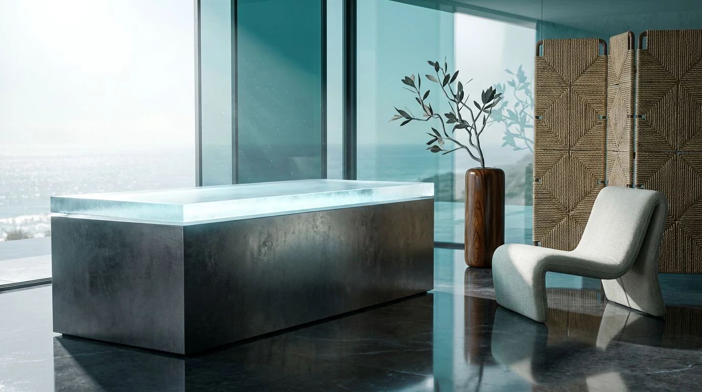
High-Tide Monolith 🧊
Nothing says corporate stability in the dog days of summer quite like staring directly at large, cold rocks. The High-Tide Monolith strips away any unnecessary warmth, relying almost entirely on a strict geological severity. Sea Salt and Driftwood Ash provide an expansive, stark background, recalling the wind-scoured surfaces of a mid-century coastal retreat where nobody is allowed to wear shoes indoors. Shale and Basalt add an unyielding, immovable weight, ensuring the identity never floats away into mere vacation scenery. But just as the eye settles into this austere, rocky expanse, Cerulean Strike drops in like a sharp intake of breath. This single, aggressive splash of blue functions as a brilliant focal point, acting like a solitary wave crashing violently against concrete sea fortifications. It tells the viewer that while the brand is solid and unflappable, it is far from asleep at the wheel. The result is an incredibly disciplined aesthetic, ideal for tech firms or consultancies wanting to project absolute control while the rest of the world melts into a puddle.
The Riviera Consultant ⛱️
The Riviera Consultant manages to capture the highly specific atmosphere of a ruthlessly productive morning spent working next to a large, chlorinated body of water. Moving away from the heavy-handed seriousness of traditional corporate messaging, this arrangement utilises Chalk White and Overcast Morning to create a sprawling, breathable canvas that refuses to crowd the viewer. The transition into Slate Shingle offers a measured, professional depth without ever resorting to the oppressive nature of a flat, heat-absorbing black. Poolside Cyan brings an unmistakable optimism, delivering a clear, refreshing zip that cuts right through the visual noise of the marketplace. Countering this coolness, Weathered Sandstone and Amber Glass provide a sophisticated, highly tactile warmth, looking somewhat like a perfectly aged leather folio left briefly sitting out in the sun. Deep Kelp ties the entire group together with an earthy, grounding shadow. It forms a visual identity that is phenomenally sharp, highly considered, and totally unflustered by the seasonal heat.
Swapping out the dark, heavily paneled aesthetics of the winter months for cooler, stone-based visuals requires more than simply lowering the thermostat on a brand's presence. It is a calculated exercise in psychological management. By relying on oceanic blues, stark off-whites, and the precise colours of untreated marble and beach sand, organisations can project an image of absolute composure during the most uncomfortable months of the year. The visual shift from heavy, warm tones to an almost clinical coastal modernism communicates a message of high-level adaptability and calm authority. These precise colour choices do not merely survive the oppressive summer season; they actively conquer it, allowing corporate messaging to feel remarkably sharp, highly structured, and comfortably out of the blistering sun.