'%3e%3cpath%20fill-rule='evenodd'%20clip-rule='evenodd'%20d='M51.1303%2019.2492C50.7278%2019.913%2050.1346%2020.4426%2049.3508%2020.838C48.5669%2021.2335%2047.6172%2021.4312%2046.5014%2021.4312C44.8208%2021.4312%2043.4367%2021.0216%2042.3492%2020.2025C41.2617%2019.3833%2040.6686%2018.2394%2040.5697%2016.7706H44.4253C44.4818%2017.3355%2044.6831%2017.7804%2045.0291%2018.1052C45.3751%2018.43%2045.8164%2018.5924%2046.3531%2018.5924C46.8192%2018.5924%2047.1864%2018.4653%2047.4547%2018.2111C47.7231%2017.9569%2047.8572%2017.618%2047.8572%2017.1943C47.8572%2016.8129%2047.7337%2016.4952%2047.4865%2016.241C47.2393%2015.9867%2046.9322%2015.7784%2046.565%2015.616C46.1978%2015.4536%2045.6893%2015.2594%2045.0397%2015.0334C44.0934%2014.7086%2043.3202%2014.3944%2042.72%2014.0907C42.1197%2013.7871%2041.6042%2013.3351%2041.1735%2012.7349C40.7427%2012.1347%2040.5273%2011.3544%2040.5273%2010.394C40.5273%209.50418%2040.7533%208.73448%2041.2053%208.08481C41.6572%207.43515%2042.2821%206.93731%2043.0801%206.5913C43.8781%206.24528%2044.7925%206.07227%2045.8235%206.07227C47.49%206.07227%2048.8141%206.46771%2049.7956%207.25861C50.7772%208.04951%2051.3315%209.13698%2051.4586%2010.5211H47.5395C47.4689%2010.0268%2047.2888%209.63483%2046.9993%209.3453C46.7097%209.05578%2046.3178%208.91102%2045.8235%208.91102C45.3998%208.91102%2045.0573%209.024%2044.7961%209.24997C44.5348%209.47594%2044.4041%209.80783%2044.4041%2010.2457C44.4041%2010.5988%2044.5207%2010.8989%2044.7537%2011.146C44.9867%2011.3932%2045.2798%2011.5944%2045.6328%2011.7498C45.9859%2011.9052%2046.4944%2012.1029%2047.1581%2012.343C48.1185%2012.6678%2048.9023%2012.9891%2049.5096%2013.3069C50.1169%2013.6246%2050.6395%2014.0872%2051.0773%2014.6945C51.5151%2015.3018%2051.734%2016.0927%2051.734%2017.0672C51.734%2017.8581%2051.5328%2018.5854%2051.1303%2019.2492ZM59.0242%206.3053V21.2829H55.4016V6.3053H59.0242ZM73.9409%206.3053V9.18642H69.8734V21.2829H66.2296V9.18642H62.2046V6.3053H73.9409ZM80.7438%209.18642V12.3218H85.8069V15.0546H80.7438V18.3806H86.4425V21.2829H77.1212V6.3053H86.4425V9.18642H80.7438ZM99.667%2016.0291V21.2829H96.0444V6.3053H101.913C103.692%206.3053%20105.048%206.74665%20105.98%207.62934C106.912%208.51204%20107.378%209.7019%20107.378%2011.199C107.378%2012.1311%20107.17%2012.9609%20106.753%2013.6882C106.337%2014.4155%20105.719%2014.9875%20104.9%2015.4042C104.08%2015.8208%20103.085%2016.0291%20101.913%2016.0291H99.667ZM103.692%2011.199C103.692%209.8855%20102.965%209.22879%20101.51%209.22879H99.667V13.1268H101.51C102.965%2013.1268%20103.692%2012.4842%20103.692%2011.199ZM120.092%2018.5501H114.478L113.546%2021.2829H109.732L115.219%206.41123H119.393L124.879%2021.2829H121.024L120.092%2018.5501ZM119.16%2015.7961L117.295%2010.2881L115.41%2015.7961H119.16ZM131.555%2018.5077H136.385V21.2829H127.933V6.3053H131.555V18.5077ZM143.337%209.18642V12.3218H148.4V15.0546H143.337V18.3806H149.035V21.2829H139.714V6.3053H149.035V9.18642H143.337ZM163.507%206.3053V9.18642H159.44V21.2829H155.796V9.18642H151.771V6.3053H163.507ZM177.449%206.3053V9.18642H173.382V21.2829H169.738V9.18642H165.713V6.3053H177.449ZM184.252%209.18642V12.3218H189.315V15.0546H184.252V18.3806H189.951V21.2829H180.629V6.3053H189.951V9.18642H184.252Z'%20fill='%23EEF0ED'/%3e%3cmask%20id='mask0_3101_7327'%20style='mask-type:alpha'%20maskUnits='userSpaceOnUse'%20x='0'%20y='0'%20width='27'%20height='28'%3e%3cpath%20d='M23.8328%200.759766H2.64808C1.18559%200.759766%200%201.94535%200%203.40785V24.5925C0%2026.055%201.18559%2027.2406%202.64808%2027.2406H23.8328C25.2952%2027.2406%2026.4808%2026.055%2026.4808%2024.5925V3.40785C26.4808%201.94535%2025.2952%200.759766%2023.8328%200.759766Z'%20fill='white'/%3e%3c/mask%3e%3cg%20mask='url(%23mask0_3101_7327)'%3e%3cpath%20d='M23.8328%200.759766H2.64808C1.18559%200.759766%200%201.94535%200%203.40785V24.5925C0%2026.055%201.18559%2027.2406%202.64808%2027.2406H23.8328C25.2952%2027.2406%2026.4808%2026.055%2026.4808%2024.5925V3.40785C26.4808%201.94535%2025.2952%200.759766%2023.8328%200.759766Z'%20fill='%23D8D8D8'/%3e%3cpath%20d='M13.2404%200.759766H0V14.0001H13.2404V0.759766Z'%20fill='%238C61FF'/%3e%3cpath%20d='M13.2404%2014H0V27.2404H13.2404V14Z'%20fill='%2336C3FE'/%3e%3cpath%20d='M26.4806%2014H13.2402V27.2404H26.4806V14Z'%20fill='%236592FE'/%3e%3cpath%20d='M26.4806%200.759766H13.2402V14.0002H26.4806V0.759766Z'%20fill='%236059F7'/%3e%3c/g%3e%3c/g%3e%3cdefs%3e%3cclipPath%20id='clip0_3101_7327'%3e%3crect%20width='190'%20height='28'%20fill='white'/%3e%3c/clipPath%3e%3c/defs%3e%3c/svg%3e)
'%3e%3cpath%20d='M23.8328%200.759521H2.64808C1.18559%200.759521%200%201.94511%200%203.40761V24.5923C0%2026.0548%201.18559%2027.2404%202.64808%2027.2404H23.8328C25.2952%2027.2404%2026.4808%2026.0548%2026.4808%2024.5923V3.40761C26.4808%201.94511%2025.2952%200.759521%2023.8328%200.759521Z'%20fill='%23D8D8D8'/%3e%3cpath%20d='M13.2404%200.759521H0V13.9999H13.2404V0.759521Z'%20fill='%238C61FF'/%3e%3cpath%20d='M13.2404%2013.9998H0V27.2402H13.2404V13.9998Z'%20fill='%2336C3FE'/%3e%3cpath%20d='M26.4809%2013.9998H13.2405V27.2402H26.4809V13.9998Z'%20fill='%236592FE'/%3e%3cpath%20d='M26.4809%200.759277H13.2405V13.9997H26.4809V0.759277Z'%20fill='%236059F7'/%3e%3c/g%3e%3c/svg%3e)
Terracotta Color Palettes for 2025 Fintech UI Design
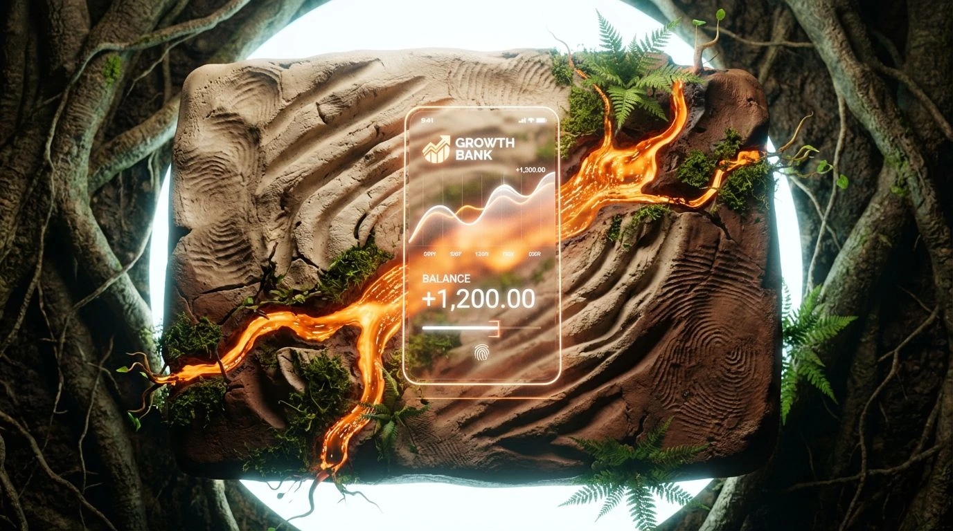
· 6 min readThere is a curious irony in the way we handle money in the mid-2020s. As our assets dissolve into pure code, floating in the ether of decentralized servers, our aesthetic cravings have engaged in a sharp u-turn toward the dirt. We want our banking apps to look like they were dug out of a hillside in Tuscany. It is a protective mechanism, perhaps. When the economy feels like a hallucination, we demand the visual reassurance of baked earth. This is the visual language of the new financial era: not the cold blue of the traditional high street lender, but the warm, clumsy reliability of clay. It suggests that your savings are not just numbers, but seeds planted in fertile ground. We are witnessing the commodification of stability, where the interface mimics the permanence of agriculture to soothe the anxiety of the instant transfer. The screen may be glass, but the pixel wants to be mud.
Ledger in the Loam 🏺
This arrangement speaks to the accountant who secretly yearns to run a vineyard. The dominant Wet Topsoil provides a heavy, reassuring anchor, suggesting that underneath the algorithm, there is actual land to stand on. It pairs surprisingly well with Balance Sheet White, creating a contrast that feels legible yet tactile, avoiding the sterility of standard corporate design. Fired Clay adds that necessary punch of warmth, preventing the scheme from sliding into a muddy depression. It is the color of a pot that holds water, a subtle promise of retention in a leaky economy. Using Oxidized Sage here offers a quiet whisper of vegetation, just enough to suggest growth without shouting about it. This is interface design for those who want their neobank to feel as permanent as a rock face. It creates a user experience that feels less like checking a balance and more like inspecting the foundations of a house.
The Unfired Brick 🧱
There is a powdery softness here that feels distinctly un-corporate. The Unfired Brick steps away from the screaming urgency of stock tickers and instead offers the calm of a pottery studio. Dusty Terracotta is the protagonist, sitting comfortably against the neutral backdrop of Limestone Wash and Gallery Wall. It feels porous, breathable. In a digital wallet, these tones act as a visual sedative. They tell the user to slow down, that the transaction is safe, that wealth is a slow accumulation like layers of sediment rather than a frantic race. Cured Mud adds a necessary shadow, a bit of grit to keep things from looking too cosmetic or polite. It is an aesthetic of patience, arguably the rarest commodity in modern finance. The vibe is of raw potential, of materials gathered but not yet forced into the kiln, suggesting a bank that values the long game over the quick win.
Algorithmic Harvest 🌾
Here we see the tension between the machine and the garden fully realized. It is loud, unapologetic, and surprisingly functional. Scorched Earth provides a violent burst of energy, the color of clay baked a little too long, standing in stark opposition to the industrial coldness of Server Room Grey. But then comes Mossy Bank and Digital Sprout, introducing a verdant biological element that softens the blow. It suggests a future where high-frequency trading is somehow ecologically sound. Heirloom Apricot bridges the gap, a sweet, fleshy tone that makes the harsher elements palatable. This is for the platform that wants to look radical, mixing the danger of volatility with the promise of a bumper crop. It feels aggressive yet organic, targeted at a demographic that invests in cryptocurrency but buys exclusively organic vegetables. It is a visual argument that the future is messy, but profitable.
Yield & Clay 🌱
There is a distinct lack of cynicism in this selection. It feels wholesome, almost dangerously so for a banking app. Root System and Raw Slip provide a foundation that is undeniably human; these are the colors of hands working the soil. When accented by the sharp, leafy vibrancy of Growth Green, the message becomes one of tangible, organic profit. It moves past the abstract concept of interest and towards the more primal idea of yield. Pumpkin Futures creates a bright, energetic focal point, drawing the eye like a ripe fruit. It tells a story of nourishment. Using this scheme implies that the institution cares less about shareholders and more about the rainfall. A lovely fiction, of course, but one that effectively lowers the blood pressure of the user. It transforms the act of saving money into a act of gardening, creating a user interface that feels alive.
Pottery & Disruption 🏺
This is where the ancient world crashes into the disruption economy. The presence of Acid Moss, a jarring, distinctly synthetic yellow, interrupts the otherwise pastoral quiet of Ancient Kiln and Dried Wheat. It serves as a visual wake-up call, reminding us that while we may fetishize the past, we are still staring at an OLED screen. Coffee Grounds provides the deep, dark contrast needed to stop the yellow from vibrating off the page. It is a complicated, slightly messy look, perfect for a fintech startup that claims to be breaking the mold while frantically trying to glue it back together. It feels experimental, like a hybrid strain of corn or a risky derivative structured from loam. The inclusion of Oat Milk softens the edges, offering a creamy respite for the eye, but the overall effect is one of agitated stability. It captures the nervous energy of 2025 perfectly.
Ultimately, this shift towards the agricultural and the earthen in financial interface design signals a collective anxiety. We are trying to ground our digital lives in something that feels older than the internet. By painting our banking portals in the heavy, reliable hues of terracotta and loam, we are engaging in a form of sympathetic magic, hoping that some of that physical durability transfers to our volatile investments. It is a necessary visual lie. The world moves at the speed of fiber optics, but our eyes still seek the comfort of slow-drying clay. Whether through the violent energy of scorched earth tones or the quiet reliability of beige mud, these colors offer a psychological anchor. They allow us to navigate the invisible currents of the economy while feeling, however briefly, that we are standing on solid ground, waiting for a harvest that feels real.